| Active TopicsSearchRegisterLogin |
| WIP (Work In Progress) | |
| |
  |
| Author | Message | |
|
ceddo
Commander 
Joined: 01 June 2020 Online Status: Offline Posts: 466 |
  Topic: Lock. Topic: Lock.Posted: 16 November 2006 at 1:17pm |
|
|
No, I don't want this locked.
I want some help with my lock :) Original: 
Progress: 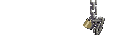


That's what I've got so far. It's mostly for practice with metallic/reflective surfaces, but I make forum signatures for a game, so I thought that I could use it at a "sold" sign for them. I know it's not much to comment on, but as you see, it's not exactly very shiny looking... I really want this chain to look uber-polished! Thanks, .c PS @ jal: the guide doesn't really help me that much. i see how they made it, but it's not really in the style I want my chain/lock to be in :( I really want the Mozco tutorial back!!  Edited by ceddo - 19 November 2006 at 3:58am |
||
 IP Logged IP Logged |
||
|
Pixel_Outlaw
Commander
Joined: 01 September 2005 Online Status: Offline Posts: 3829 |
Posted: 16 November 2006 at 1:49pm |
|
Edited by Pixel_Outlaw - 16 November 2006 at 2:03pm |
||

|
||
|
IP Logged |
||
|
brianna
Seaman 
Joined: 02 November 2006 Online Status: Offline Posts: 27 |
Posted: 16 November 2006 at 4:53pm |
|
|
Pixel_Outlaw's lock is right, but I wanted to comment in case a different explanation makes it easier to understand. Basically, shiny comes down to three things in order of importance: 1 - specular highlights (within the highlight areas, shiny things show a reflection of the light source itself, making a small very bright highlight -- the white part of PO's example), 2- reflected light IN the shadow (see in PO's picture how the right
side of the gradient would normally be the darkest part, but it's
lighter instead) 3 - reflections (the random spots of lighter that don't exactly follow the curve in PO's example).
So to shine up your chain, you'd add a very small very bright extra highlight inside the highlight you have (specular highlights -- usually put right on the edge of the "bevel"). Then you'd add a small section of the midtone you're using to the edge where your shadow is, (reflected light). Then if you want to go further you'd add some somewhat random variations to this to show that something is reflecting on it. (If you want to go even further -- the reflected light is the light that's reflecting off items in the background, so where the chain is closest to the lock, those parts would take on the color of the other item. Reflected light in the chain should be gold, etc.) Here's a number I started for the pixel clock. It's pretty messy and not well done or near finished, but you can see the first two principles in it.  |
||
|
IP Logged |
||
|
Pixel_Outlaw
Commander
Joined: 01 September 2005 Online Status: Offline Posts: 3829 |
Posted: 16 November 2006 at 9:11pm |
|
|
Basically think of it as wrapping a background image over a shape then shading the shape normally with hard shines.
|
||
|
|
||
|
IP Logged |
||
|
ceddo
Commander
Joined: 01 June 2020 Online Status: Offline Posts: 466 |
Posted: 17 November 2006 at 9:46am |
|
|
Alright, many thanks for those posts, helped me a lot. Here's where I've gone with them:
I tried adding more texture to the chain. I think I will add another dark shade for the chains. What do you think? I also started on the lock. I have no idea where I'm going though. My light source was on the right, but that would mean that the lock would receive no light... .c |
||
|
IP Logged |
||
|
Blueberry_pie
Rear Admiral 
Joined: 24 July 2015 Online Status: Offline Posts: 2176 |
Posted: 17 November 2006 at 11:46am |
|
|
I think before shading all this you should clean up the line art first. Most of it looks quite jaggy.
|
||
|
IP Logged |
||
|
ceddo
Commander
Joined: 01 June 2020 Online Status: Offline Posts: 466 |
Posted: 17 November 2006 at 3:49pm |
|
|
Alright, I fixed what I think is most of the jaggedness..
I also added a fourth, darker tone in this, and made more of that ambient lighting stuff.. specular lighting. Here it is!
As you can see, I failed miserably with the lock. Still need more advice on that, I just can't get it to work! |
||
|
IP Logged |
||
|
Aleiav
Commander
Joined: 08 April 2016 Online Status: Offline Posts: 2380 |
Posted: 18 November 2006 at 3:14pm |
|
|
The chains are looking so much better. Great work!
I would get rid of the black outline on the lock, though. |
||
|
IP Logged |
||
|
Anlina S.
Commander
Joined: 30 June 2006 Online Status: Offline Posts: 139 |
Posted: 18 November 2006 at 3:36pm |
|
|
I think the chain looks very nice, though it's far too textured if you're going for the uber-poliched look that you mentioned in the first post. Right now it looks like it's been well used - a bit scratched up, a bit dirty. Personally, I'd keep it as is, but if you do want it to look new and shiny, then I'd suggest cleaning up the stray pixels and use clean lines and progressive steps in your curves. I'd also add more white to your highlights, since steel is really more of a white metal than grey. Don't forget that the shackle part of the lock should reflect the chain as well.
Hope that makes sense. I'm not so sure about the reflection and palette you've got on the lock. I can honestly say that I can't recall ever seeing a brass lock that was really shiny - they've all been made of brushed metal, which gives a very warm and soft reflection with very little specularity. The surface of your lock is curved, so your primary highlights should run parallel to the edges of your lock, with more subtle, soft reflections following the direction of your horizon. The highlights you have on it right now don't make a lot of sense to me. |
||
|
IP Logged |
||
|
ceddo
Commander
Joined: 01 June 2020 Online Status: Offline Posts: 466 |
Posted: 19 November 2006 at 1:34am |
|
|
Tried again, failed again...
I think my main problem is the colors. I'm having lots of trouble finding the right colors for the lock. ... & it's looking ditherreatic now. |
||
|
IP Logged |
||
|
EyeCraft
Commander
Joined: 07 July 2005 Location: Australia Online Status: Offline Posts: 425 |
Posted: 19 November 2006 at 2:31am |
|
|
Howdy. You've got to think very carefully about how the light is behaving in the scene. The way the chain is shaded suggests the primary lightsource is shining from the top right.
You've got a strong highlight in the reflection on the lock, which just doesn't seem right. You should tone down that highlight. |
||
|
IP Logged |
||
|
ceddo
Commander
Joined: 01 June 2020 Online Status: Offline Posts: 466 |
Posted: 19 November 2006 at 2:50am |
|
|
Alright, I asked my mom about how the light would behave. I'll soon edit this post with another update... hopefully a better one lol.
|
||
|
IP Logged |
||
|
EyeCraft
Commander
Joined: 07 July 2005 Location: Australia Online Status: Offline Posts: 425 |
Posted: 19 November 2006 at 2:53am |
|
|
Mum always knows best

|
||
|
IP Logged |
||
|
ceddo
Commander
Joined: 01 June 2020 Online Status: Offline Posts: 466 |
Posted: 19 November 2006 at 3:32am |
|
|
Yay! Mommy rocks!
I think it looks more realistic now, but there is room for improvement. c+c pl0x :) |
||
|
IP Logged |
||
|
EyeCraft
Commander
Joined: 07 July 2005 Location: Australia Online Status: Offline Posts: 425 |
Posted: 19 November 2006 at 4:29am |
|
|
Much better definition of texture! The lighting is getting there, but your highlights are just scattered everywhere almost incorehently. Highlights appear in accordance to where the lightsource directly hits. Nowhere else.
 Here's an edit. I introduced 1 or 2 more padlock colours and reshaded a couple of the chain links to try to point you in the right direction. Also, my edit ignores shadows which would be cast by the chain, they should be considered also, now that i look at it. Edited by EyeCraft - 19 November 2006 at 4:30am |
||
|
IP Logged |
||
|
ceddo
Commander
Joined: 01 June 2020 Online Status: Offline Posts: 466 |
Posted: 19 November 2006 at 5:29am |
|
|
@eyecraft: thank you for the update! I reshaded the parts accordingly, and added the shadows the chain would cast on them. However, I think I will keep the rugged texture on the chains, because they are supposed to be old.
All right, I think I'm done!!! here it is! 
|
||
|
IP Logged |
||
| |
||
Forum Jump |
You cannot post new topics in this forum You cannot reply to topics in this forum You cannot delete your posts in this forum You cannot edit your posts in this forum You cannot create polls in this forum You cannot vote in polls in this forum |
|

