| Active TopicsSearchRegisterLogin |
| WIP (Work In Progress) | |
| |
  |
| Author | Message |
|
Daller
Seaman 
Joined: 12 December 2006 Location: Australia Online Status: Offline Posts: 5 |
  Topic: WIP: game character Topic: WIP: game characterPosted: 12 December 2006 at 11:53pm |
|
Aight, first, heya everyone. I'm new.
I'm looking for some advice on these two, well, basically sprite sheets that I've been doing. Not actually for a game, but the idea is to look like they'd fit into one - I'm going for a sort of SNES RPG look, and it's best to view these at 4x scale, which is what I had in mind when drawing them. 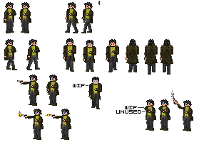 Top left are the two left and right standing poses. Directly to the right of them and directly below are left and right walking animations. Further to the right are the up and down walking animations. The one labeled WIP is only a tiny difference, it was my first attempt at eyes. Don't think it worked too well. To the left of that one are the two frames of the drawing weapon animation - the one where he's holding the gun straight out was actually the first one I drew, and I'm not sure the gun is the best idea - it was originally a staff, but someone told me the way his arm was sticking out really looked like he should be holding a gun. Below those are the two still rather unfinished firing animation frames. These are still very much WIPs, and I'd appreciate any advice on them. Finally, bottom right are just a few sprites that I drew and then decided not to use. *phew* Okay. Any advice? |
|

|
|
 IP Logged IP Logged |
|
|
jalonso
Admiral 
Joined: 29 November 2022 Online Status: Offline Posts: 13537 |
Posted: 13 December 2006 at 12:05am |
|
(viewing at 4X) The face, hands and hair don't seem to match the pixel style of the clothing and guns. May be the outlining. The guns and clothing use a lot of shades. Maybe a blend of the two. More detail on the fece/hands/hair less on the rest.
The front facing ones are taller or look taller than the side views. What is that on the side of the face? The wip one's eyes are ugly. |
|
|
|
|
|
IP Logged |
|
|
Daller
Seaman
Joined: 12 December 2006 Location: Australia Online Status: Offline Posts: 5 |
Posted: 13 December 2006 at 5:26am |
|
The face, hands and hair don't seem to match the pixel style of the
clothing and guns. May be the outlining. The guns and clothing use a
lot of shades. Maybe a blend of the two. More detail on the
fece/hands/hair less on the rest. This is semi-intentional. The idea was to give pretty much the entire sprite comparatively dark edges so that it'd show up better against the predominantly bright background - no changes needed for the coat and the rest of the clothes, but the face needed to be outlined. I'll try a bit of shading on the face and hands after I get the head/hair redesign done. The front facing ones are taller or look taller than the side views. I'm solving this one the easy way by just deleting a few groups of pixels in the middle of each figure and then shifting up and down - I'll edit in other changes onto these ones once I get them working for the sideways ones. 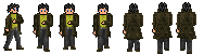 What is that on the side of the face? This is the more complicated part. I realised that the way that the head and the hair looked right now was fundamentally flawed, and so I spent a while redrawing them to look more realistic, then I tried to get the hair to look sorta like the way it did before I edited it. About halfway through (the one with the arrow below it), I thought the hair sorta looked like a tricorne hat, so for the hell of it I drew a tricorne hat on. Not sure if it's better or worse than the hatless ones. 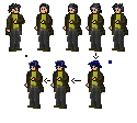 |
|
|
|
|
|
IP Logged |
|
|
jalonso
Admiral
Joined: 29 November 2022 Online Status: Offline Posts: 13537 |
Posted: 13 December 2006 at 9:38pm |
|
I like the hat because it makes it more unique looking than some random dude. It can be bigger still.
The front/back ones still have a little height difference. The coat is much longer on back view than the side views. This would really funk up an animation. |
|
|
|
|
|
IP Logged |
|
|
Daller
Seaman
Joined: 12 December 2006 Location: Australia Online Status: Offline Posts: 5 |
Posted: 15 December 2006 at 8:00am |
|
Apologies for the late reply, I've been a bit busy lately and didn't have time to work on it until now.
 That's the new, bigger, actually tri-cornered tricorne hat design. I also tried a bit of shading on the face and hands - I haven't quite gotten the hang of skin colouring yet, so it could probably look quite a bit better.  Tried again on the height thing - I did manage to get the coattails, feet and tops of hair all at about the same level this time, but there's probably still a bit of proportion to work out. |
|
|
|
|
|
IP Logged |
|
|
Daller
Seaman
Joined: 12 December 2006 Location: Australia Online Status: Offline Posts: 5 |
Posted: 16 December 2006 at 5:17am |
|
Uh, admitted double post but also an update: I put tricorne hats on all the poses, cleaned up the proportions slightly and put the main directional frames into a sprite-sheet-like set of boxes.
Any more advice? |
|
|
|
|
|
IP Logged |
|
| |
||
Forum Jump |
You cannot post new topics in this forum You cannot reply to topics in this forum You cannot delete your posts in this forum You cannot edit your posts in this forum You cannot create polls in this forum You cannot vote in polls in this forum |
|
