| Active TopicsSearchRegisterLogin |
| The Joint | |
| |
  |
| Author | Message |
|
SamSam
Seaman 
Joined: 15 December 2006 Online Status: Offline Posts: 10 |
  Topic: im a new guy(A NOOB =] ) Topic: im a new guy(A NOOB =] )Posted: 17 December 2006 at 12:13pm |
|
hey guys and gals
im new here, and new to pixel art. i only started doing it on thursday.
and i want some advice, now iknow whay i need to know is spread about the forums.
but could people please leave me a link or tell me what i need to know about all of this pixel stuff. lol
anyways.. on to what im psoting about.
i submited TWO pixel joint apartment.. but says *Needs revision before approvel* now.. i need to know what i need to do.
they are both completed, one for the joint appartments.. and one is the 1st thing i did. just uploaded it, to get people to see it. i dont want this one uploaded to the apparments.....
now for the 100x100 image.. i simpley shrunk the image.. and i was told not to do that by someone.
(What do i do for the 100x100 image)
ermm... i dont know whay else i need to ask about. or what i need to know.
hope to hear form anyone.. hope to be welcomed warmly to this online pixel community.
thanks guy
speak to some of you soon
Regards Sam
|
|
 IP Logged IP Logged |
|
|
SamSam
Seaman
Joined: 15 December 2006 Online Status: Offline Posts: 10 |
Posted: 17 December 2006 at 12:25pm |
|
hey... just thought i would put my two pixel arts in
Edited by SamSam - 17 December 2006 at 4:49pm |
|
|
IP Logged |
|
|
thesalus
Midshipman 
Joined: 11 December 2021 Online Status: Offline Posts: 97 |
Posted: 17 December 2006 at 3:22pm |
|
One piece of advice is to not double post unless necessary to bump your topic from obscurity.
And every piece of pixel art must be approved for quality [a relative term] and appropriateness. This takes time. And resizing pixel art usually doesn't give the piece justice, so clip out a representative 100x100 piece from your piece and use that. Otherwise... welcome. :p |
|
|
IP Logged |
|
|
leel
Commander 
Joined: 29 June 2005 Online Status: Offline Posts: 3001 |
Posted: 17 December 2006 at 4:23pm |
|
Resizing an image makes it not-pixelart, therefore you shouldn't do that. It gets blurred and stuff, so it's really not plesant!
As for the apartments, well, there's much to be improved, which is understandable for someone so new. So I'll let our dear friend Jalonso tell you all the iso rules and such.
How about you start by posting these in the WIP section (or better yet, ask a mod to move this topic) and describe what you intended for these rooms. Then we'll be able to give you ideas for textures and colors to get that look.
|
|
|
IP Logged |
|
|
pixelblink
Commander
Joined: 19 February 2023 Online Status: Offline Posts: 2865 |
Posted: 17 December 2006 at 11:24pm |
|
moved this to the proper category.
And yes, there is much you could improve on. Get some feedback from the community and try to learn from them to improve on your pieces. |
|
|
IP Logged |
|
|
jalonso
Admiral 
Joined: 29 November 2022 Online Status: Offline Posts: 13537 |
Posted: 18 December 2006 at 12:03am |
|
Welcome.
Seems you need the basics first. This n00btorial may help you out some. Your rooms seem to have stopped at #4. Zoom in and study how to take your rooms from #4 to #5 first. Leave going to #6 for later.  Photoshop is fine for pixelling ;) |
|
|
|
|
|
IP Logged |
|
|
SamSam
Seaman
Joined: 15 December 2006 Online Status: Offline Posts: 10 |
Posted: 18 December 2006 at 3:51am |
|
Thats all very well and good telling me what to improve, telling me its no good yet
but how about actualy showing me, one on one, where and how i can improve things
the tut that was posted it a help.. but i have no idea what other colour to added.. where to add them and what not.
sorry if i sound a bit moody... but hey.. i reayl want to learn this.
if someone could get my feet off the ground
then i will be away
thanks again
|
|
|
IP Logged |
|
|
jalonso
Admiral
Joined: 29 November 2022 Online Status: Offline Posts: 13537 |
Posted: 18 December 2006 at 6:08am |
|
We all learned to pixel by asking questions, looking at other pixels and mostly through trial and error. Because we like to spend our time pixelling too, finding someone to stop and walk you though things is not realistic.
Take what you have. Use the zoom feature here and in the gallery and inspect closely to discover how things are done. Then post updates and learn as you go. You picked colors just fine on your rooms and you may not be confident but your color sense is not terrible. Its the techniques you have to improve on. Again, nobody learned to pixel with a single tutor. We all learn to pixel from each other. Your assignment for now is to discover how to go from step #4 to step #5. |
|
|
|
|
|
IP Logged |
|
|
SamSam
Seaman
Joined: 15 December 2006 Online Status: Offline Posts: 10 |
Posted: 19 December 2006 at 3:54pm |
|
ok guys. i changed it all about
tried to add depth
in what little time i had
NEW VERSION
OLD VERSION
|
|
|
IP Logged |
|
|
jalonso
Admiral
Joined: 29 November 2022 Online Status: Offline Posts: 13537 |
Posted: 19 December 2006 at 8:19pm |
|
Since my tut didn't help, here is another way of saying the same thing.
Your room is not bad but I will focus on the things that make it gallery ready only so only crits follow. Here is an edit that hopefully shows you how to pixel better AND to get you to think of making your room interesting/funny or whatever, pick one. I did not know what was going on so I made a stupid thief that is cutting a hole in the floor in the wrong place, right in front of the guards. You come up with something else. I'm only illustrating my points here. You have a yellow line which is a 'cutoff' point visually. With the floor as you have it the lines go in the same direction so it does not convey a 'stop'. I made my floor go in opposite direction to illustrate this. You have two guards and two chairs. This is boring to the eye. I put 3 chairs to illustrate that they (guards) are level, anything outside the yellow line is not. Zoom in to inspect pixelling techniques which I kept in your style and level, I hope.  On a techincal side your image has 111 colors, way too much. Notice how mine is more colorful yet uses far fewer colors. Keep an eye on that.  Use these suggestion and ideas on this room and the other one too. You sir are challenged. edit: typos and I just noticed the trashcan is a little too small :/ Edited by jalonso - 19 December 2006 at 8:48pm |
|
|
|
|
|
IP Logged |
|
|
SamSam
Seaman
Joined: 15 December 2006 Online Status: Offline Posts: 10 |
Posted: 20 December 2006 at 11:46am |
|
ok, thanks for the tips.. i'll see what i can do with it
|
|

 |
|
|
IP Logged |
|
|
Monkey 'o Doom
Commander
Joined: 24 September 2005 Online Status: Offline Posts: 2994 |
Posted: 20 December 2006 at 12:15pm |
|
Do you think you could tone down the sig? Some places it's normal to use large banners as sig images, but here the custom is a small image and/or a line or two of text.
I really like the cameras you have in your room, but like jalonso's tutorial and edit showed, you should add a lighter color on all the corners that stick out. You might also want to make the walls a color other than plain grey, as it's rather uninteresting to look at and you don't often see plain grey walls in real life.
|
|

RPG is numberwang. |
|
|
IP Logged |
|
|
Pixel_Outlaw
Commander
Joined: 01 September 2005 Online Status: Offline Posts: 3829 |
Posted: 20 December 2006 at 1:12pm |
|
So what is the formula for color counts to determine it art is submittable? I want concrete rules. There should be a set total size to max color ratio. One of the best pieces in the showcase (That elf thing) had many colors in it. I'm no color abuser myself but we should atleast have some concrete rules or atleast say what Sedge counts as hostable.87 colors
Edited by Pixel_Outlaw - 20 December 2006 at 1:16pm |
|

|
|
|
IP Logged |
|
|
jalonso
Admiral
Joined: 29 November 2022 Online Status: Offline Posts: 13537 |
Posted: 20 December 2006 at 10:46pm |
|
There are no rules that apply to color count. Its mostly about getting your image across with as few as possible for the job at hand. To the casual viewer color count is not that important at all. However, for the pixel pixelart fan when a piece comes across as 'complete' and the color count is low, it garners respect for the artist's pixelling skills. In PJ like other pixel communities its a skill that garners much respect. Because SamSam is new and wishes to learn the pixel ways. I think good pixelling habits are a critical thing to know as you get into it.
ps: I agree on the siggy comment ;) Edited by jalonso - 20 December 2006 at 10:49pm |
|
|
|
|
|
IP Logged |
|
|
SamSam
Seaman
Joined: 15 December 2006 Online Status: Offline Posts: 10 |
Posted: 21 December 2006 at 5:47pm |
|
ok, been messing about, got it down to 66 colours.. still to many??
 its looking better, teh floor.. im not feeling so much,, but its much better
working on the walls and new seats.. or one long bench
as for my sigs...................... Nope, they are staying
they are not "large banners" as someone said
they are average size sigs,,,,,,,
|
|
|
|
|
|
IP Logged |
|
|
jalonso
Admiral
Joined: 29 November 2022 Online Status: Offline Posts: 13537 |
Posted: 21 December 2006 at 5:53pm |
|
Glad to see you upadate and learn new things. Look forward to more updtaes.
ps: Its our custom here not to have overpowering siggys so that we may concentrate on the pixels. I understand cuz I'm a rebel at heart but, sometimes its best to fit in ;) |
|
|
|
|
|
IP Logged |
|
|
SamSam
Seaman
Joined: 15 December 2006 Online Status: Offline Posts: 10 |
Posted: 22 December 2006 at 10:53am |
 down to 57 colours now
added some shadows
and a brick texture to the walls..
also a hole into the wall.. i hope it looks like a hole =p
lol
|
|
|
|
|
|
IP Logged |
|
|
MattJ
Seaman
Joined: 19 February 2025 Online Status: Offline Posts: 3 |
Posted: 29 December 2006 at 11:23pm |
|
looking better and better, but why so many colors? most of your colors are so close its not noticeable, you could probably do that with 12 colors max, and no1 will notice a difference.
 Remember theres nothing wrong with using lots of color, its just rather pointless if they have no visible use, when colors get to close together and not noticeable theirs no point for them to be their. Edited by MattJ - 29 December 2006 at 11:32pm |
|
|
IP Logged |
|
|
SamSam
Seaman
Joined: 15 December 2006 Online Status: Offline Posts: 10 |
Posted: 20 January 2007 at 8:26am |
|
yeah, i noticed them.. they all look the same.. and ive no idea why.I have been limiting my colours.. but ive no idea why they keep getting to unnoticable and look the same.
i scraped that room, started over on a new room, but have not had much time, since starting a new job, and lots of college work
but i will post my new room once i get it sorted out
thanks for all the help guys and girls!!
 |
|
|
|
|
|
IP Logged |
|
|
Dra_chan
Commander
Joined: 20 February 2006 Online Status: Offline Posts: 628 |
Posted: 09 March 2007 at 11:22am |
|
Hi. Here is a tip to find find all those almost identical pixels and delete them to reduce your color count (in photoshop)
Go to your menu and click on "select", then "color range", the eyedroper tool will appear, set the fuzziness to 0 and select a color. When the color in the picture is already selected, zoom in and look at the color selection, you should notice some pixels or parts that are not selected, now that you found them destroy them! (meaning paint them with the correct color) Here is an example, I clicked on the floor with the eyedrop tool and look at how a color that looks identical to the rest was not selected: 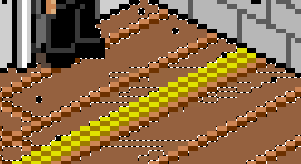 If you do that with all the colors you will be able to get rid of all those unecesary shades Edited by Dra_chan - 09 March 2007 at 11:32am |
|
|
IP Logged |
|
| |
||
Forum Jump |
You cannot post new topics in this forum You cannot reply to topics in this forum You cannot delete your posts in this forum You cannot edit your posts in this forum You cannot create polls in this forum You cannot vote in polls in this forum |
|
