| Active TopicsSearchRegisterLogin |
| WIP (Work In Progress) | |
| |
  |
| Author | Message |
|
klav
Commander 
Joined: 01 December 2006 Online Status: Offline Posts: 128 |
  Topic: koi wip Topic: koi wipPosted: 28 February 2007 at 5:26am |
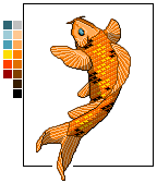 i've been working on this guy for a while... its based on traditional japanese tattoo's. I cant decide on whether simply splash some water around him or place him into a traditional compostion... any idea's would be helpful. cheers. |
|
 IP Logged IP Logged |
|
|
Omegavolt
Commander
Joined: 03 March 2005 Location: United States Online Status: Offline Posts: 227 |
Posted: 28 February 2007 at 5:41am |
|
I think that adding the water will look nice. The blue will go well with the orange and gold. I would suggest adding a highlight tone as well to make him shine and round him out a bit. :)
|
|
|
IP Logged |
|
|
Aleiav
Commander
Joined: 08 April 2016 Online Status: Offline Posts: 2380 |
Posted: 28 February 2007 at 11:13am |
|
Wow, excellent detail! The twist of the tail seems odd, maybe you should put some creases in the fish's gills to indicate he's twisting.
|
|
|
IP Logged |
|
|
schrumpfkopf
Seaman 
Joined: 19 May 2014 Online Status: Offline Posts: 38 |
Posted: 02 March 2007 at 1:47pm |
|
yup very nice so far - add antialias, play with the palette.
|
|
|
IP Logged |
|
|
Omegavolt
Commander
Joined: 03 March 2005 Location: United States Online Status: Offline Posts: 227 |
Posted: 02 March 2007 at 8:17pm |
|
I've just noticed this too, its not so much of the missing highlight tone thats flattening him, its the missing curve of his scales. The scale lines should curve to give the body more depth. ;)
|
|
|
IP Logged |
|
| |
||
Forum Jump |
You cannot post new topics in this forum You cannot reply to topics in this forum You cannot delete your posts in this forum You cannot edit your posts in this forum You cannot create polls in this forum You cannot vote in polls in this forum |
|
