| Active TopicsSearchRegisterLogin |
| WIP (Work In Progress) | |
| |
  |
| Author | Message |
|
Doppleganger
Midshipman 
Joined: 24 February 2026 Online Status: Offline Posts: 72 |
  Topic: [Newly INCOMPLETE] Kirin vs Giant Bat Topic: [Newly INCOMPLETE] Kirin vs Giant BatPosted: 20 November 2006 at 2:54pm |
 OLD VERSION  NEW VERSION It's no longer all done. I am redoing every aspect of this piece in my free time which is very hard to come by. Basically the only thing I've reworked so far are parts of the Ki Rin's tail and the background. While the Kirin will basically stay the same minus some new texturing and general smoothing out, everything else will be receiving a huge overhaul. There is already a good example of what I can do with the fire in this topic so crits aren't as necessary here as they are for other parts. I am well aware of most of the flaws I'd like to fix but crits are always welcome. I'm not sure when I'll be getting to this but, like I said, I'll be fixing it up when I have time. I figured I'd just update this first post since the topic was revived and I still am doing stuff with it. Edited by Doppleganger - 14 March 2007 at 7:52am |
|
 IP Logged IP Logged |
|
|
Equinoxx
Commander 
Joined: 16 December 2005 Online Status: Offline Posts: 164 |
Posted: 20 November 2006 at 3:01pm |
|
oh wow that's perty
|
|
|
IP Logged |
|
|
jalonso
Admiral 
Joined: 29 November 2022 Online Status: Offline Posts: 13537 |
Posted: 20 November 2006 at 7:35pm |
|
red X :(
|
|
|
|
|
|
IP Logged |
|
|
Doppleganger
Midshipman
Joined: 24 February 2026 Online Status: Offline Posts: 72 |
Posted: 20 November 2006 at 7:39pm |
|
Really? That sucks. I figured photobucket was dependable but this'd be the second time that someone wasn't able to see something of mine.
|
|
|
IP Logged |
|
|
Souly
Commander
Joined: 13 December 2020 Online Status: Offline Posts: 2451 |
Posted: 20 November 2006 at 7:48pm |
|
http://imagehost.ensellitis.com FTW.
|
|

I am the jesus of PJ. |
|
|
IP Logged |
|
|
Scruffs
Midshipman
Joined: 13 September 2005 Location: United States Online Status: Offline Posts: 79 |
Posted: 20 November 2006 at 7:55pm |
|
haha thats awesome dude, love how the fire is turning out. a couple things i noticed: - the texurte of the bat is good but the blue is a fairly large jump in hue. Make it more of a purplish hue and itll look great. Also desaturate it a bit. -also i assume you'll have some start highlights on the bat and lower person because of the large fire pillar?
other than that looking good dude, looking forward to more progress. Really like the wizard too.
Edited by Scruffs - 20 November 2006 at 7:56pm |
|
|
IP Logged |
|
|
Doppleganger
Midshipman
Joined: 24 February 2026 Online Status: Offline Posts: 72 |
Posted: 20 November 2006 at 8:07pm |
|
Good point about the blue on the bat. That blue is shared with the wizard robe so it'll be a slight change. Not too drastic.
And yeah, I'll be highlighting the bat and girl too. Although I'm wondering just how much I should highlight them. Since the flame is a huge lightsource, you'd think there'd be a lot of yellows on them however, I fear that it'd clash too much. Or, rather, I don't have enough faith to douse a nicely shaded bat with yellow. |
|
|
IP Logged |
|
|
jalonso
Admiral
Joined: 29 November 2022 Online Status: Offline Posts: 13537 |
Posted: 20 November 2006 at 8:13pm |
|
Yay, image works now
 I see what you mean about yellows on the bat. It does need it badly however. ps: Do show efinal even if its a hybrid piece. Looks great so far. |
|
|
|
|
|
IP Logged |
|
|
Doppleganger
Midshipman
Joined: 24 February 2026 Online Status: Offline Posts: 72 |
Posted: 21 November 2006 at 2:59pm |
 I did the bat lighting and worked on the kirin. Any crits on the bat lighting or my dithering would be appreciated. And of course, whatever else you got is appreciated too. |
|
|
IP Logged |
|
|
jalonso
Admiral
Joined: 29 November 2022 Online Status: Offline Posts: 13537 |
Posted: 21 November 2006 at 6:43pm |
|
Looks fantastic, the yellow lighting on the bat helps alot. You may not need to go overboard with it but it definetely wanted some. Does the horn have to be so big, seems almost out of scale. The only thing that I would mention is that unless there is a reason for it. The flame that is the 'mane' changes direction on the tail. If nothing else the fireblast would blow it in the same direction as the fireball.
|
|
|
|
|
|
IP Logged |
|
|
Doppleganger
Midshipman
Joined: 24 February 2026 Online Status: Offline Posts: 72 |
Posted: 21 November 2006 at 7:12pm |
|
Shrinking the horn might not be a bad idea. And yeah, the fireball blast probably would send the tail flames the same way. I was thinking that the flames were going in the direction the tail was moving but...they're actually going the wrong way anyways. XD
|
|
|
IP Logged |
|
|
Doppleganger
Midshipman
Joined: 24 February 2026 Online Status: Offline Posts: 72 |
Posted: 22 November 2006 at 2:33pm |
|
Updated the complete piece! This is more or less a bump which is more or less against the rules but...that's just how I roll. I can handle a warning if need be. ;)
|
|
|
IP Logged |
|
|
Shadowgamers
Seaman 
Joined: 10 July 2005 Location: United Kingdom Online Status: Offline Posts: 22 |
Posted: 22 November 2006 at 2:36pm |
|
Jesus christ, the white on bright yellow kills my eyes at the bottom :<
|
|
|
IP Logged |
|
|
Doppleganger
Midshipman
Joined: 24 February 2026 Online Status: Offline Posts: 72 |
Posted: 22 November 2006 at 2:56pm |
|
then my goal is achieved. Giant blasts of fire in your face aren't sposed to be gentle on your eyes.
Just kidding! :p But don't worry, the piece is toned down in the NPA version. I'll be sure to post that one too. |
|
|
IP Logged |
|
|
jalonso
Admiral
Joined: 29 November 2022 Online Status: Offline Posts: 13537 |
Posted: 22 November 2006 at 5:05pm |
|
Originally posted by Doppleganger ...I doubt my employer would be too keen on me spending much more time on this piece... I know that feeeling :/ Looks great anyhow. Don't forget to show the final hybrid version, k |
|
|
|
|
|
IP Logged |
|
|
Doppleganger
Midshipman
Joined: 24 February 2026 Online Status: Offline Posts: 72 |
Posted: 23 November 2006 at 6:49am |
|
The hybrid version is there. You have to copy and paste the link from the top into your browser cuz I'm "retarded".
|
|
|
IP Logged |
|
|
Akira
Commander
Joined: 03 March 2005 Location: New Zealand Online Status: Offline Posts: 220 |
Posted: 23 November 2006 at 4:45pm |
|
hrm the npa and pixelled parts don't mesh together very well. also i feel that you need a darker grey to get better depth in the smoke. nice work overall though.
|
|
|
IP Logged |
|
|
Videl
Seaman
Joined: 19 November 2006 Online Status: Offline Posts: 8 |
Posted: 23 November 2006 at 11:59pm |
|
Originally posted by Shadowgamers Jesus christ, the white on bright yellow kills my eyes at the bottom :< Wow it sure does! That's a great piece of art! |
|
|
IP Logged |
|
|
yuko511
Seaman
Joined: 23 November 2005 Online Status: Offline Posts: 7 |
Posted: 24 November 2006 at 3:57am |
|
you are a god :: bows ::
|
|
|
IP Logged |
|
|
Equinoxx
Commander
Joined: 16 December 2005 Online Status: Offline Posts: 164 |
Posted: 24 November 2006 at 4:29am |
|
looks friggin ace.
one thing that brings it slightly down imo is the start of the firecloud. it could use way more contrast there. but perhaps that's nitpicking on a piece like this |
|
|
IP Logged |
|
|
Swiifty
Midshipman
Joined: 26 May 2006 Online Status: Offline Posts: 63 |
Posted: 24 November 2006 at 8:45am |
|
The dragons tail looks a little flat in the middle point. Otherwise it looks nice.
|
|
|
IP Logged |
|
|
jalonso
Admiral
Joined: 29 November 2022 Online Status: Offline Posts: 13537 |
Posted: 24 November 2006 at 12:50pm |
|
The hybrid certainly could have blended better. Since this was a commission and the client obviously approved, its all good.
|
|
|
|
|
|
IP Logged |
|
|
MurrMan
Commander
Joined: 19 January 2006 Online Status: Offline Posts: 177 |
Posted: 24 November 2006 at 5:36pm |
|
is it just me or is the white darker than the brightest yellow in the flame?
|
|
|
I have plenty of emotions; It is Sleep that i lack
|
|
|
IP Logged |
|
|
PixelSnader
Commander
Not a troll! Joined: 21 May 2026 Online Status: Offline Posts: 3194 |
Posted: 24 November 2006 at 5:41pm |
|
no, but its a blueish white, which, combined with the overall yellow/orange hue of the flames causes it to be interpreted as a shadow, thus causing yout eye to see it as a darker shade
|
|
|
▄▄█ ▄▄█ ▄█▄ ▄█▄ |
|
|
IP Logged |
|
|
jalonso
Admiral
Joined: 29 November 2022 Online Status: Offline Posts: 13537 |
Posted: 24 November 2006 at 5:51pm |
|
exactly!
|
|
|
|
|
|
IP Logged |
|
|
Blick
Commander
Joined: 19 November 2025 Online Status: Offline Posts: 389 |
Posted: 24 November 2006 at 11:01pm |
|
There are some things that have bothered me about this image the whole time and I just hoped you'd address it on your own since I didn't want to bother pointing it out.
The horse/dragon's cheek, neck, transition between the back and front end, and the point of origin of the fire spell. First, the neck and transition between back and front end of the horse/dragon. They're very linear and stiff looking. There's no fluent movement, just straight lines. The underbelly of the horse is like linear and I can't comprehend how it'd form into the tail. Here's a silhouette of what I'm seeing the covered part as:  I think the underbelly should curve in a bit before it's overlapped by the spell, making it slightly convex rather than straight to make the unseen transition more believable. To fix the neck, I think a smoother transition into the head rather than a sudden 45 degree angle would help it a lot. The cheek has too dark of a shadow and makes me think of when people fill their mouth with air and their cheeks puff out. The shadow separating the cheek from the rest of the face should be lighter, shallower, I think. It's a noticeable problem throughout the piece, these unnecessarily deep shadows turn up on the horse's forelegs, the giant bat rider's ass, and on the origin of the fire spell being cast. Which leads me to my last problem, the start of the fire spell is so dark and uniform that it doesn't even look like fire to me. The flames from the wand don't transition into the circular pieces, nor do they do so at the edges of the fire blasts on the sides of the spell very well either. I think the way to fix the circular bits making the spell look too dark at the origin can be fixed by making a straight blast of flame coming from the wand and keeping the recoiling circular bits isolated at the bottom where the impact seems to be coming from. Something like: 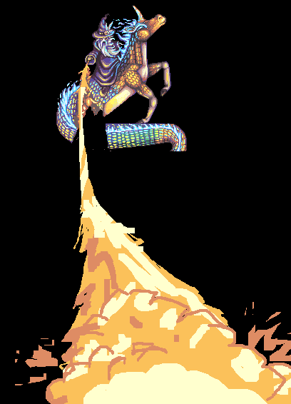 It's complete now though, so I suppose it doesn't matter much. Edited by Blick - 24 November 2006 at 11:11pm |
|

|
|
|
IP Logged |
|
|
Doppleganger
Midshipman
Joined: 24 February 2026 Online Status: Offline Posts: 72 |
Posted: 25 November 2006 at 8:55am |
|
Those are some pretty good points blick. I might be putting in some pro bono work on this piece just to make it look better. If I end up having the time, I'll certainly take into account what you have said.
Thanks for the crits. |
|
|
IP Logged |
|
|
fil_razorback
Commander
Joined: 17 December 2005 Online Status: Offline Posts: 215 |
Posted: 04 March 2007 at 8:31am |
|
I hope you don't mind I post this for you ?
http://www.arcadetown.com/battlemachyjadebandit/game.asp =) |
|
|
IP Logged |
|
|
Wakka
Seaman
Joined: 18 February 2007 Online Status: Offline Posts: 22 |
Posted: 04 March 2007 at 9:43am |
|
I smell another Hall Of Famer.
|
|
|
IP Logged |
|
|
Doppleganger
Midshipman
Joined: 24 February 2026 Online Status: Offline Posts: 72 |
Posted: 07 March 2007 at 7:56am |
|
Thanks Fil!
I forgot all about this topic. I'm actually redoing this title screen in my spare time with more colors and the experience I've gained since I originally made it before I put this up at pixel joint....so it may be ages before it's up. The game Fil posted is one of a series of I don't even know but there'll be more to come. It's pretty fun, albeit hard if you haven't the patience to figure it out. But when you only have 5 levels and want to keep people entertained for a while, the difficulty curve has to be pretty high. Yeah, this is the wip of the redeux. Much much better...although I really have only changed the kirin tail and wizard shading so far. The fire really bothers me so that'll probably be next. Edited by Doppleganger - 07 March 2007 at 7:58am |
|
|
IP Logged |
|
|
Kfuchoin
Commander
Joined: 11 March 2007 Online Status: Offline Posts: 740 |
Posted: 13 March 2007 at 5:24pm |
|
i think that is way to pixel.. you should A.A more o.o
forgettign that i like it o.o great job
|
|
|
IP Logged |
|
|
Fhqwhgads
Midshipman
Joined: 08 September 2005 Online Status: Offline Posts: 83 |
Posted: 13 March 2007 at 10:34pm |
|
Wow, great job!
|
|
|
IP Logged |
|
|
Jonathan
Seaman
Joined: 08 March 2007 Online Status: Offline Posts: 13 |
Posted: 14 March 2007 at 12:46am |
|
Wow, this one is great ;)
I like the detail in the skins of the animals...
|
|
|
IP Logged |
|
|
Serendor
Midshipman
Joined: 27 February 2007 Online Status: Offline Posts: 79 |
Posted: 14 March 2007 at 11:38pm |
|
The wip of the reduxed should be more in motion I think... would look even better :D
Very nice work |
|
|
IP Logged |
|
|
Kfuchoin
Commander
Joined: 11 March 2007 Online Status: Offline Posts: 740 |
Posted: 15 March 2007 at 3:17pm |
|
oooh now smaller looks way cool o.o...
|
|
|
IP Logged |
|
|
Feron
Midshipman
Joined: 17 September 2006 Online Status: Offline Posts: 99 |
Posted: 16 March 2007 at 6:00pm |
|
the tail looks too square.
good job. |
|
|
hmmmm.
|
|
|
IP Logged |
|
| |
||
Forum Jump |
You cannot post new topics in this forum You cannot reply to topics in this forum You cannot delete your posts in this forum You cannot edit your posts in this forum You cannot create polls in this forum You cannot vote in polls in this forum |
|

