| Active TopicsSearchRegisterLogin |
| WIP (Work In Progress) | |
| |
  |
| Author | Message |
|
Hatch
Admiral 
Joined: 05 August 2015 Online Status: Offline Posts: 1387 |
  Topic: My Favorite Subject Matter Topic: My Favorite Subject MatterPosted: 20 June 2007 at 9:38pm |
|
Me! Well, me if I were somewhat more attractive and could grow a fuller beard. 
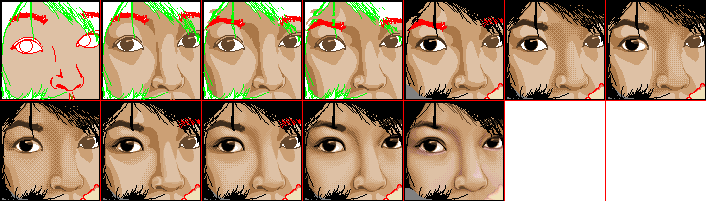
Obviously the aforementioned beard and the hair and moustache are not finished. I'm also not happy with the lips. I also am sort of liking the simple style, so I probably won't heavily dither this piece, if at all. And yes, I did use a reference photo. I laid it into Photoshop as its own layer, and traced right on top of it to get the position and shape of the major facial features down. After that I shelved the photo and did not look at it again; I didn't want to end up with a boring duplicate. I deliberately chose a different lightsource than the photo, too. One last note: I was working in the wrong colorspace when I made this, so the palette isn't as nice as it should be. I'll fix it on the next edit. Edited by Hatch - 23 June 2007 at 12:43pm |
|
 IP Logged IP Logged |
|
|
Aleiav
Commander 
Joined: 08 April 2016 Online Status: Offline Posts: 2380 |
Posted: 21 June 2007 at 6:37am |
|
good work so far. :)
|
|
|
IP Logged |
|
|
Hatch
Admiral
Joined: 05 August 2015 Online Status: Offline Posts: 1387 |
Posted: 21 June 2007 at 8:04pm |
|
A minor update:
Haven't had much time to work on this yet 
I'd love some more opinions/criticisms, especially regarding lighting and shading. Kind of feel like I'm shooting in the dark so far. Edited by Hatch - 21 June 2007 at 8:17pm |
|
|
IP Logged |
|
|
Aleiav
Commander
Joined: 08 April 2016 Online Status: Offline Posts: 2380 |
Posted: 22 June 2007 at 5:00am |
|
I would think your hair needs to be a bit bigger on the top of your head.
|
|
|
IP Logged |
|
|
Hatch
Admiral
Joined: 05 August 2015 Online Status: Offline Posts: 1387 |
Posted: 22 June 2007 at 4:14pm |
|
Update
Not so sure about the forehead shading. Can't get my moustache right. I'm much happier with my schnoz, but it still needs work. Aleiav: Still haven't really worked onto the hair yet. Thank you for the comment though; I willl take it into account when I do. |
|
|
IP Logged |
|
|
leel
Commander
Joined: 29 June 2005 Online Status: Offline Posts: 3001 |
Posted: 22 June 2007 at 6:03pm |
|
After that I shelved the photo and did not look at it again; I didn't want to end up with a boring duplicate this isn't anything specific to the portrait, but just a note - if you don't want a boring copy of the picture then it's ok not to use a ref, but at least have a mirror or something, because making stuff up as you go along isn't too helpful either. You're doing pretty well so far, maybe some variation in the colors? |
|
|
IP Logged |
|
|
Hatch
Admiral
Joined: 05 August 2015 Online Status: Offline Posts: 1387 |
Posted: 22 June 2007 at 7:22pm |
|
Can't... Resist... Urge... TO DITHER!
leel: Firstly, yes, of course I've been using a mirror. This thing would be (even more) hideous if I hadn't been 
Secondly, I'm wary of changing or adding to the palette this far in. Just not brave enough! If you REALLY think it's a good idea, I may take a daring stab at it. 
EDIT: Poor sentence composition. Edited by Hatch - 22 June 2007 at 7:28pm |
|
|
IP Logged |
|
|
leel
Commander
Joined: 29 June 2005 Online Status: Offline Posts: 3001 |
Posted: 22 June 2007 at 8:36pm |
|
It's good to try, if you don't like it, well at least you'll have had some practice for next time when it does end up looking better.
But that can come later I guess, finish up the empty spaces now, ya hear? P.S. you could use some lower eye lids |
|
|
IP Logged |
|
|
Hatch
Admiral
Joined: 05 August 2015 Online Status: Offline Posts: 1387 |
Posted: 22 June 2007 at 8:48pm |
|
In my reference photo I have these giant terrifying eyes. I've already lowered the eyelids quite a bit, believe it or not.
|
|
|
IP Logged |
|
|
Hatch
Admiral
Joined: 05 August 2015 Online Status: Offline Posts: 1387 |
Posted: 22 June 2007 at 10:00pm |
|
Not so sure about the palette change. (I'm pretty sure it's not what you meant anyhow) Oh well. Going to bed. |
|
|
IP Logged |
|
|
pixelblink
Commander
Joined: 19 February 2023 Online Status: Offline Posts: 2865 |
Posted: 22 June 2007 at 10:11pm |
|
I wanna see this so-called reference photo because DAMN, that's one big ass chin. Who's balls you got resting on that? The Green Giant's?
Seriously though, as a professional goatee-wearer, I implore that you do something about that mess. Also, I strongly suggest against dithering until you've completed everything else. (I'm not a big fan of it to begin with. Another thing I tried on your picture is some good ol' fashioned hue shifting. It reall makes the face pop... in a good way. Lastly (and firstly), let's see that reference |
|
|
IP Logged |
|
|
Hatch
Admiral
Joined: 05 August 2015 Online Status: Offline Posts: 1387 |
Posted: 22 June 2007 at 10:23pm |
|
Amazingly, I have managed to lose my original reference photo.
EDIT: I should probably explain. I started this piece about 6 months ago and I didn't get much further than just tracing the photo, then sort of forgot about it. Since then I've had a couple of hard drives fail and a bunch of my photos got lost in the shuffle. But looking at the piece again, you're right, the chin is too large. I will fix it. Also, I haven't done a whole lot of pixel art (in case it wasn't painfully obvious) but I have found that I adore dithering and get to it as quickly as I can. God help me. I'm sure it's not correct and I'm sure I'll regret it at some point. I'm frankly amazed I refrained from dithering on this piece as long as I did. And as for the hue shift: yeah, I figured that's what leel was talking about, but I have much to learn about color choice (again, in case it wasn't painfully obvious) and I couldn't find a shift that looked decent. Would you mind posting your edit? I'm keen to see what you've done. Also, do you have any criticisms on the shading, lighting, or anatomy? (Jay Leno chin notwithstanding) Those were my primary weak points I was hoping to begin to address with this piece. Thanks. I think I'm gonna go to bed for real now. Edited by Hatch - 22 June 2007 at 10:31pm |
|
|
IP Logged |
|
|
pixelblink
Commander
Joined: 19 February 2023 Online Status: Offline Posts: 2865 |
Posted: 22 June 2007 at 10:48pm |
|
here's my edit... added a bit more - an ear, fixed the hair a bit, etc.
 not perfect, but I hope it helps |
|
|
IP Logged |
|
|
alkaline
Commander
Joined: 25 August 2020 Online Status: Offline Posts: 868 |
Posted: 23 June 2007 at 7:06am |
|
not sure about the yellowish color. it's a liiiiitttle odd. but I like the other edits you made.
|
|
|
IP Logged |
|
|
Hatch
Admiral
Joined: 05 August 2015 Online Status: Offline Posts: 1387 |
Posted: 23 June 2007 at 11:56am |
|
Originally posted by pixelblink
here's my edit... added a bit more - an ear, fixed the hair a bit, etc. not perfect, but I hope it helpsAck, I've gotten 10 years older at the hands of pb! 
Seriously though, thanks for the edit. I'll analyze it and make some changes. I don't think I'm ready to abandon my beloved dither though
|
|
|
IP Logged |
|
|
Hatch
Admiral
Joined: 05 August 2015 Online Status: Offline Posts: 1387 |
Posted: 23 June 2007 at 12:39pm |
|
I'm sick to death of looking at my face so I think I'll start on the hair. |
|
|
IP Logged |
|
|
Aleiav
Commander
Joined: 08 April 2016 Online Status: Offline Posts: 2380 |
Posted: 23 June 2007 at 2:03pm |
|
Coming along nicely, but I'd like to see it with a neck.
|
|
|
IP Logged |
|
|
Hatch
Admiral
Joined: 05 August 2015 Online Status: Offline Posts: 1387 |
Posted: 23 June 2007 at 2:42pm |
|
Originally posted by Aleiav
I'd like to see it with a neck. I know I'm no looker, but do you really have to refer to me as "it"?
But seriosuly, folks. Yeah, next step is hair and neck/shoulders. |
|
|
IP Logged |
|
|
Kfuchoin
Commander
Joined: 11 March 2007 Online Status: Offline Posts: 740 |
Posted: 23 June 2007 at 3:10pm |
|
dude i think that the diether killed it..
it= art
so don't fell ofended =D
|
|
|
may the pixels be with you..
~Kfuchoin eMo looking for people for an RPG info: http://www.pixeljoint.com/forum/forum_posts.asp?TID=4903 |
|
|
IP Logged |
|
|
Hatch
Admiral
Joined: 05 August 2015 Online Status: Offline Posts: 1387 |
Posted: 23 June 2007 at 3:18pm |
|
Originally posted by Kfuchoin
dude i think that the diether killed it.. Ouch... Originally posted by Kfuchoin
it= art so don't fell ofended =D I was joking :P |
|
|
IP Logged |
|
|
AdrianJensen
Commander
Joined: 18 January 2007 Online Status: Offline Posts: 238 |
Posted: 23 June 2007 at 3:19pm |
|
lol.
|
|
|
My gallery lives here:
http://www.pixeljoint.com/p/8355.htm?pg=1&sec=icons |
|
|
IP Logged |
|
|
Hatch
Admiral
Joined: 05 August 2015 Online Status: Offline Posts: 1387 |
Posted: 23 June 2007 at 3:26pm |
|
Ahem.
I'm terrible at anatomy (and, well, everything else). Is this any good? |
|
|
IP Logged |
|
|
leel
Commander
Joined: 29 June 2005 Online Status: Offline Posts: 3001 |
Posted: 23 June 2007 at 3:27pm |
|
I'm gonna have to agree with Kfu. The dither is too contrasted and gives you a very neat zitty texture. It should be used to smooth out the different shades, but when the contrast is too great, it creates a rough texture and you don't really want that on your face :P
|
|
|
IP Logged |
|
|
Hatch
Admiral
Joined: 05 August 2015 Online Status: Offline Posts: 1387 |
Posted: 23 June 2007 at 3:30pm |
|
Before I dithered it it looked like I was made of shiny plastic. Is it color choice issue or do I need to pull the dither off altogether?
|
|
|
IP Logged |
|
|
leel
Commander
Joined: 29 June 2005 Online Status: Offline Posts: 3001 |
Posted: 23 June 2007 at 3:44pm |
|
i think it's a mix of both - tone down the colors a teeny bit and also the dithers.. you dont need dithers everywhere. That was my big issue too at one point. Maybe this will help you, maybe not, but I remember having the same problem when I worked on this portrait:
 I went from overcrazy dither to just soft skin, and im not saying that it's the perfect example, but i think the dither has a nice effect in the final:  |
|
|
IP Logged |
|
|
Hatch
Admiral
Joined: 05 August 2015 Online Status: Offline Posts: 1387 |
Posted: 23 June 2007 at 3:46pm |
|
Note to self: Listen to people who are more experienced than you! 
EDIT: Posted this before you posted your example. Yeah, I see now that I really overdithered and made bad color choices. This one's probably underdithered but I think I'm much happier with it. I will continue to slowly plod forward. EDIT2: Your example looks really amazing. It inspires me to strive to one day not suck Edited by Hatch - 23 June 2007 at 3:49pm |
|
|
IP Logged |
|
| |
||
Forum Jump |
You cannot post new topics in this forum You cannot reply to topics in this forum You cannot delete your posts in this forum You cannot edit your posts in this forum You cannot create polls in this forum You cannot vote in polls in this forum |
|
