| Active TopicsSearchRegisterLogin |
| WIP (Work In Progress) | |
| |
  |
| Author | Message |
|
BlingShyne2
Midshipman 
Joined: 21 June 2007 Online Status: Offline Posts: 47 |
  Topic: All of my art needs revision? Why? Topic: All of my art needs revision? Why?Posted: 30 June 2007 at 10:53am |
|
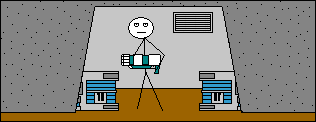
So the first thing that needed revision was this: I can see why, it's short, and it's not very pretty, but it still is pixel art, it took a good 2 hours to make that. It's really old though... I can understand needing to revise that, but then there's these two:
 And this one, which is actually my first attempt at shading and I just made a couple days ago (This cactus is my first time touching pixels in about 2 years btw):
And I currenlty don't have internet, so I'm at an internet cafe, so whenever I come back and see that none of my artwork has gone through it really kind of gets frustrating, especially when all I get is "Sorry your work requires approval, and we're not going to tell you why".
Could someone just give me an explanation, even if it's right in front of me, could you at least point it out?
Thank you. Edited by BlingShyne2 - 30 June 2007 at 11:12am |
|
 IP Logged IP Logged |
|
|
Fluffy
Seaman 
Joined: 06 July 2006 Location: United States Online Status: Offline Posts: 23 |
Posted: 30 June 2007 at 11:14am |
|
This goes under Resources and Support. The cactus I think is ok and I like it. But the other two aren't really pixel art. Its like stick figures.
Do more stuff like the cactus and you'll be ok.
|
|
|
IP Logged |
|
|
PixelSnader
Commander 
Not a troll! Joined: 21 May 2026 Online Status: Offline Posts: 3194 |
Posted: 30 June 2007 at 11:19am |
|
the first two things are just scribbly and messy.
the cactus looks fine to me, maybe the admins thought you used too many colours. i dunno.
however, as fluffy said, there's a special section for this. could a mod move this?
|
|
|
▄▄█ ▄▄█ ▄█▄ ▄█▄ |
|
|
IP Logged |
|
|
pixelblink
Commander
Joined: 19 February 2023 Online Status: Offline Posts: 2865 |
Posted: 30 June 2007 at 11:58am |
|
I already moved this to the WIP.
also, I am sure you received this message: "We're sorry to inform you that your submission does not meet our quality standards or the art needs revision for some miscellaneous reason." which generally means it's a quality issue 99% of the time, including this time. Your work, while I'm sure you spent more than an hour or two on each of them, lack any sense of artistic form or technique that we use in our work here. I suggest also learning basic anatomy skills. Take the time to learn off the other members by listening to their advice or just zooming in to learn their techniques. 'nuff said |
|
|
IP Logged |
|
|
BlingShyne2
Midshipman
Joined: 21 June 2007 Online Status: Offline Posts: 47 |
Posted: 30 June 2007 at 12:35pm |
|
What about the cactus?
I spent like a whole day on it and tucked every single pixel into there beds with love and care and I think it turned out rather nicely. The sky and the sand dunes were my first attempt ever at dithering something.
|
|
|
IP Logged |
|
|
Monkey 'o Doom
Commander
Joined: 24 September 2005 Online Status: Offline Posts: 2994 |
Posted: 30 June 2007 at 1:41pm |
|
It really sucks to hear it, but effort isn't equal to result. You may have spent a lot of time on the cactus, and it shows compared to your other works, but it still isn't up to the standards of the gallery. You can almost definitely bring it up to the bar by taking a few suggestions and working with us to fix up the piece so you can submit it to the gallery.
So far, the piece looks very saturated--saturation is how pure a color is, and without any saturation at all a color is a shade of grey. You should edit the palette to decrease the saturation of the cactus a bit so it isn't so bright and unnatural looking, and the sand dunes in the distance could be desaturated according to how far away they are.
The black outlines are also holding this piece back; try using darker versions of the colors things are as the color of their outlines.
Good luck getting the piece improved and accepted into the gallery.
|
|

RPG is numberwang. |
|
|
IP Logged |
|
|
BlingShyne2
Midshipman
Joined: 21 June 2007 Online Status: Offline Posts: 47 |
Posted: 30 June 2007 at 1:59pm |
|
But I mean, come on, I want it to look like a cartoony cactus, it's supposed to be goofy.
So seriously, that piece isn't up to the standards of the gallery but these are?:
I mean, I'm not knocking those guys, the pictures are cute, but they look like they took about 5 minutes to make. I posted my cactus because I wanted a neat little avatar and i've been going back and forth from this internet cafe and when it finally gets looked at by a mod it's not even good enough to get into the gallery.
Is it because I was a noob and posted a thread saying hi when I first came here? If so, I'm sorry.
You know, I thought this was a pretty neat site where I could post some of the things I've made using pixels and get feedback and criticism so i could get better at something I'm really interested in.
But I guess not, if one of you mods could kindly point me to a site that allows users to post sh*tty and poorly done pixel art I'll be happy to be on my way.
|
|
|
IP Logged |
|
|
Monkey 'o Doom
Commander
Joined: 24 September 2005 Online Status: Offline Posts: 2994 |
Posted: 30 June 2007 at 2:21pm |
|
The first piece I must agree about; it is below what I personally consider the standards for the gallery. As for the other two, they are simplistic but show competent pixelling skill. I think I remember a bit of debate over the gallery-worthiness of the second piece, but I'll need to check and edit to be sure. [EDIT: The comments don't show anything unusual, but it was in the public queue for a LONG time and that usually means something's wrong.]
I'm pretty sure it wasn't because of an oversight you made on the forum that your art was rejected. It was an honest mistake and the moderators are supposed to consider your art, not behavior, anyway.
You were right in thinking that pixeljoint was the place to improve with helpful comments on your art. But the gallery is the home for art finished and worked over many times in the forums or elsewhere. Here on the forums, pieces like yours that aren't where they could be are critiqued and improved through constructive criticism and cooperation. I really hope you decide to stay here and use this topic to recieve comments on your art and get help to bring it to the level of quality we can help you achieve. But if not, there's always Deviant Art. Edited by Monkey 'o Doom - 30 June 2007 at 2:22pm |
|
|
RPG is numberwang. |
|
|
IP Logged |
|
|
eckered
Midshipman
Joined: 16 October 2006 Online Status: Offline Posts: 61 |
Posted: 30 June 2007 at 2:41pm |
|
now, by posting these on the w.i.p forums, i am under the impression that you are going to improve these. thus the reason that the forum is called 'Work In Progress'
the first one, plain and simple, is kinda crappy, and i think that you would basicly have to redoo the whole thing, with more carefull placement of pixels and colors, to be accepted.
the second one is slightly better then the first, but again. carefull placement of pixels, and less relying on the circle, line, and spraycan tool will probably get this one accepted.
lastone. dunno, i think i would have let this one slide. but then again, if you are up for improving it, here goes nothing.
ill break this down into a few parts for you, so i dont confuse you, or myself.
color usage: the sky is fine, but it could be improved. first, the highlight at the top isnt really visible at 1x. i would remove it all together, or boost up the contrast. the spraycan dither is kinda a cop-out. try some 50/50 dither, or maby mix it up with some more random patterns?
the hills are prety much the same deal. the highlight on the forground is useless, and can be disgarded. there is to much spraycan'ing in the back hills. take away the dithering there, and make it 2 colors: the dark one, and the light one. then, take the mid tone, and use it to aa the light into the dark. repeat this with the midtone you are only useing in the forground, but not in the background. this will make it look much less destracting, and a bit more pleasing to the eyes.
outlining: black outlineing is fine, but take that dark brown that you only are using on the roots, and aa everything. it will eliminate the jaggedies, and help smooth the transition between sand and sky.
Forground: take out the third lightest tone and replace it with the second darkest. AA all the cactus spines, and the eyes with that dark brown. use that highlight tone to add a little shine on the top right (your lightsource?)
/critique
im tired, and im late for an appointment. excuse me if i sound like a jerk, im really not, but im kinda in a rush, and i dont really have time to type this out all in a propper way >.>
|
|
|
IP Logged |
|
|
jalonso
Admiral 
Joined: 29 November 2022 Online Status: Offline Posts: 13537 |
Posted: 30 June 2007 at 5:54pm |
|
I approved this because it rocks in its pixel goodness. Soda (the artist) is working hard at developing a style and finessing them before expanding to scenes and maybe comics. His effort shows. This is an avatar and while very simple it meets the standards for an avatar (logo-ish). I give you the other one, which I felt should be sent back. ...but about you, The cactus seems weak only because the sky and sand dunes are somewhat complex in coloring thus making the cactus itself seem unrefined and too simple within context. If you seek a cartoony look then use it all over. I actually would have allowed that one in. The first example you show is too oekaki/scrappy/messy. The second has potential and may have been great looking if the canvas was say a third the size. The canvas size you chose there only makes the pixels seem simple. Certain frames have very little going on. If you rework that into a 50x100 pixel using the same pixelling style it would look better defined and more complete. Colors, size, idea, etc. it all needs to come together. Perhaps you should use the forum WIPs to help you refine your pixels to their best potential with future pixels. Rejection is not a diss or a reason to get down if this has happened. Its an opportunity to learn and further develop your skills. |
|
|
|
|
|
IP Logged |
|
|
BlingShyne2
Midshipman
Joined: 21 June 2007 Online Status: Offline Posts: 47 |
Posted: 30 June 2007 at 6:45pm |
|
I see, I didn't spraycan on the cactus one though, I just didn't dither to a pattern at all.
Anyways, I'll definetely do some revising, If I do put the first 2 in my gallery I'm just going to completely re-do them, I have some neat ideas for the cactus one... But anyways, thanks for the feedback everyone.
|
|
|
IP Logged |
|
|
Pixel_Outlaw
Commander
Joined: 01 September 2005 Online Status: Offline Posts: 3829 |
Posted: 30 June 2007 at 8:05pm |
|
Yeah this shows an indepth understanding of shading and form. I love how it expresses an inaccurate understanding of both tubular form and shading.
|
|
|
IP Logged |
|
|
Aleiav
Commander
Joined: 08 April 2016 Online Status: Offline Posts: 2380 |
Posted: 01 July 2007 at 4:31am |
|
I've gotta agree with P_O. I don't think that piece should be in the gallery at all. It's not a style, it's bad.
|
|
|
IP Logged |
|
|
Pixel_Outlaw
Commander
Joined: 01 September 2005 Online Status: Offline Posts: 3829 |
Posted: 01 July 2007 at 7:11pm |
|
Originally posted by Aleiav
I've gotta agree with P_O. ...good heavens. Edited by Pixel_Outlaw - 01 July 2007 at 7:11pm |
|
|
IP Logged |
|
| |
||
Forum Jump |
You cannot post new topics in this forum You cannot reply to topics in this forum You cannot delete your posts in this forum You cannot edit your posts in this forum You cannot create polls in this forum You cannot vote in polls in this forum |
|
