| Active TopicsSearchRegisterLogin |
| WIP (Work In Progress) | |
| |
  |
| Author | Message |
|
cele1989
Commander 
Joined: 25 December 2021 Location: Belgium Online Status: Offline Posts: 163 |
  Topic: [WIP] Avatar Topic: [WIP] AvatarPosted: 27 June 2007 at 5:06am |
|
I like to make an avatar in different sizes with inspiration this picture
http://www.celes.co.nr/avatar.jpg (i'm sorry for the link, the image-thingy doesn't work over here...) With layers or just look at the picture and draw it...? I haven't any expirience in portaits... so any help would be welcome |
|
 IP Logged IP Logged |
|
|
eckered
Midshipman 
Joined: 16 October 2006 Online Status: Offline Posts: 61 |
Posted: 27 June 2007 at 5:13am |
|
gone. Edited by eckered - 01 July 2007 at 5:02am |
|
|
IP Logged |
|
|
PixelSnader
Commander
Not a troll! Joined: 05 June 2014 Online Status: Offline Posts: 3194 |
Posted: 27 June 2007 at 5:14am |
|
Either technique will work.
However, tracing will not help you get better as an artist, and eyeballing will, so i'd say just looking at it and drawing it would be the best option.
If i were you i'd scale the image down first though.. a lot.
|
|
|
▄▄█ ▄▄█ ▄█▄ ▄█▄ |
|
|
IP Logged |
|
|
cele1989
Commander
Joined: 25 December 2021 Location: Belgium Online Status: Offline Posts: 163 |
Posted: 27 June 2007 at 6:05am |
  I decided to take another picture... Is the form of the sketch ok? If yes, what to do next? if no, what to change? Edited by cele1989 - 28 June 2007 at 5:01am |
|
|
IP Logged |
|
|
Aleiav
Commander
Joined: 08 April 2016 Online Status: Offline Posts: 2380 |
Posted: 27 June 2007 at 12:13pm |
|
EDIT: Is this even pixel art? if it's not, you need to put NPA in the title.
PS. your link doesn't work. try using photobucket or image shack. Edited by Aleiav - 27 June 2007 at 12:14pm |
|
|
IP Logged |
|
|
cele1989
Commander
Joined: 25 December 2021 Location: Belgium Online Status: Offline Posts: 163 |
Posted: 28 June 2007 at 5:02am |
 it is supposed to become pixel art, I most of the time start with a sketch in ms paint, to get the right shape. So I resized it and cleaned the outline... I already tried colouring it, but it's so hard to make a nice pallet... Can anyone help me? Edited by cele1989 - 28 June 2007 at 5:58am |
|
|
IP Logged |
|
|
Aleiav
Commander
Joined: 08 April 2016 Online Status: Offline Posts: 2380 |
Posted: 28 June 2007 at 1:15pm |
|
Ah okay. If you're having trouble choosing a skin pallate, try starting off with a weird color like blue or something then changing the shades.
|
|
|
IP Logged |
|
|
cele1989
Commander
Joined: 25 December 2021 Location: Belgium Online Status: Offline Posts: 163 |
Posted: 29 June 2007 at 3:13am |
 I tried to pick colours for the skin...is this ok? Edited by cele1989 - 29 June 2007 at 3:13am |
|
|
IP Logged |
|
|
eckered
Midshipman
Joined: 16 October 2006 Online Status: Offline Posts: 61 |
Posted: 29 June 2007 at 3:48am |
|
http://img179.imageshack.us/img179/8092/palegreenxx9.png
|
|
|
IP Logged |
|
|
Aleiav
Commander
Joined: 08 April 2016 Online Status: Offline Posts: 2380 |
Posted: 29 June 2007 at 8:14am |
|
The skin colors could use some more contrast. right now it's looking kind of flat, even on the edits.
|
|
|
IP Logged |
|
|
cele1989
Commander
Joined: 25 December 2021 Location: Belgium Online Status: Offline Posts: 163 |
Posted: 30 June 2007 at 9:56am |
 I worked with the colours of eckered And dit some dithering on the piece... The colours look ok to me, much better then the one i've picked out... But i'm wondering how you go select the colours? Like the hair and background, i'm stuck again... |
|
|
IP Logged |
|
|
PixelSnader
Commander
Not a troll! Joined: 05 June 2014 Online Status: Offline Posts: 3194 |
Posted: 30 June 2007 at 11:35am |
|
you're just messing with the hues..
i'd say you should shade first, using a simple straight-ish ramp, to create depth, and mess with the colours later
it allso helps to first block in and then refine, instead of doing it piece by piece.
blocking in makes a more solid shape in general
-you made yourself look sorta bald in the pixel
-i think the jawline is a bit exaggerated and makes you skinny/manly
-i'd move the back of the neck back a bit, and the front of the neck too(but less)
-i'd say the lips are too erm.. high..? like.. vertical size, not positioning
|
|
|
▄▄█ ▄▄█ ▄█▄ ▄█▄ |
|
|
IP Logged |
|
|
Monkey 'o Doom
Commander
Joined: 24 September 2005 Online Status: Offline Posts: 2994 |
Posted: 30 June 2007 at 11:43am |
|
A lot of it is instinct gained from experience and practice, but generally colors are picked in the HSV color space according to a few guidelines:
Try to use colors with moderate saturation--you probably don't need colors any more saturated than 90% or you start getting complaints about the MS Paint palette and burning eyes out. You may find it useful to employ hue shifting (using different hue values for the same general object) to show the blue tint of shadows, etc. Also, try to make sure your colors are distinguishable without looking unrelated because of a huge jump in H, S, and V values.
One term you might want to know while you're at it is "ramp," which is the set of colors used for shading a certain color of object--you have a skin ramp now and you'll be adding ramps for the hair and probably shirt. You can conserve colors by using the same colors on multiple ramps in some cases; at the extremes of value like the dark shadows and brightest highlights, saturation and hue don't matter much, so you can get away with a shared color on multiple ramps. In fact, when using restrictions like those of the commodore 64, most ramps share several colors and the overall apparent hue of an object can be determined by a single or a few colors that are different from the ramps of the surroundings.
|
|

RPG is numberwang. |
|
|
IP Logged |
|
|
eckered
Midshipman
Joined: 16 October 2006 Online Status: Offline Posts: 61 |
Posted: 30 June 2007 at 2:49pm |
|
gone. Edited by eckered - 01 July 2007 at 5:02am |
|
|
IP Logged |
|
|
PixelSnader
Commander
Not a troll! Joined: 05 June 2014 Online Status: Offline Posts: 3194 |
Posted: 30 June 2007 at 6:51pm |
|
hahaha. no dude. you're seeing ghosts there eckered.
and random colours =/= good idea
|
|
|
▄▄█ ▄▄█ ▄█▄ ▄█▄ |
|
|
IP Logged |
|
|
eckered
Midshipman
Joined: 16 October 2006 Online Status: Offline Posts: 61 |
Posted: 30 June 2007 at 6:58pm |
|
gone. Edited by eckered - 01 July 2007 at 5:03am |
|
|
IP Logged |
|
|
Fuzzyleaves
Commander
Joined: 23 June 2007 Online Status: Offline Posts: 147 |
Posted: 30 June 2007 at 8:38pm |
|
Haha I do random colors, I dont really understand the saturation stuff and hue shifting, Is there a good tutorial explaining all that? That would be awesome to make my pixel better. Please post or Pm would be better.
Oh, This might help on shiny spots (a person called Chessmasterriley, told me this) Skin - below average specular, specular depends on how sweaty the skin is. |
|
|
IP Logged |
|
|
cele1989
Commander
Joined: 25 December 2021 Location: Belgium Online Status: Offline Posts: 163 |
Posted: 14 July 2007 at 11:49am |
|
I'm sorry for my late reply, been busy for a while, but I definitally need to work on this piece again ^^
I read your explaination but don't really get what you mean... Can you give some examples of what you mean by hue shifting. And which colours do you use for a ramp? I don't exactly get it. Is it just greytones to see the dept? Or something else? |
|
|
IP Logged |
|
|
pmprog
Midshipman
Joined: 11 May 2005 Online Status: Offline Posts: 83 |
Posted: 14 July 2007 at 12:18pm |
|
Oooh, never seen an image describing like this, but it should help.
http://en.wikipedia.org/wiki/Image:Color_cones.png Linked from the Wiki page on HSL http://en.wikipedia.org/wiki/HSL_color_space Following the "H" around the disc changes it's colour, and this is Hue Shifting |
|
|
IP Logged |
|
|
EyeCraft
Commander
Joined: 07 July 2005 Location: Australia Online Status: Offline Posts: 425 |
Posted: 14 July 2007 at 4:05pm |
|
Read what snader said. Don't concern yourself with colours at this point in the drawing, just shade. Use greys with lots of contrast. Colours can pretty much come last in the piece, imo.
|
|
|
IP Logged |
|
|
cele1989
Commander
Joined: 25 December 2021 Location: Belgium Online Status: Offline Posts: 163 |
Posted: 15 July 2007 at 5:39am |
|
Edit: I tried some new colours for the skin
I made the pallet myself :p  Comment please! And info on what to do next... Edited by cele1989 - 16 July 2007 at 10:42am |
|
|
IP Logged |
|
|
cele1989
Commander
Joined: 25 December 2021 Location: Belgium Online Status: Offline Posts: 163 |
Posted: 01 August 2007 at 4:07am |
|
hi all folks
I had a long and hard week at work but i'm ready to pixel again... so I updated a time ago but i didn't got any help so far... can someone give me some tips etc? thanks guys! |
|
|
IP Logged |
|
|
ceddo
Commander
Joined: 01 June 2020 Online Status: Offline Posts: 466 |
Posted: 01 August 2007 at 7:15am |
|
Cele,
Nice update! These colors definitely work better than the previous ones! It seems to me like you've made the cheekbone on our left too low. The stronger highlight should start a bit higher, I think. The forehead also isn't lit like that in the picture, it's pretty dark at the top, but has some ambient lighting from the right. I don't think the shadow from the hair should be that strong either. Keep up the good work! |
|
|
IP Logged |
|
|
EyeCraft
Commander
Joined: 07 July 2005 Location: Australia Online Status: Offline Posts: 425 |
Posted: 01 August 2007 at 8:08am |
|
Your shading is off; you've invented contours and such which aren't apparent in the reference picture. The neck is a stark example. I think you need to lower the contrast, or add another tone or two in the midtones area of your palette so you can portray smoother forms.
Refer to your reference picture with more scrutiny. Squinting helps too. Edited by EyeCraft - 01 August 2007 at 8:08am |
|
|
IP Logged |
|
|
ceddo
Commander
Joined: 01 June 2020 Online Status: Offline Posts: 466 |
Posted: 01 August 2007 at 9:33am |
|
Grayscale will probably help you do shading done correctly first, then you can apply colors.
|
|
|
IP Logged |
|
|
cele1989
Commander
Joined: 25 December 2021 Location: Belgium Online Status: Offline Posts: 163 |
Posted: 05 August 2007 at 11:01am |
 I added some shading on the mouth and glasses, changed the shading on the face Is this ok? What can I do next? |
|
|
IP Logged |
|
|
Hatch
Admiral 
Joined: 05 August 2015 Online Status: Offline Posts: 1387 |
Posted: 05 August 2007 at 9:20pm |
|
I think you need to simplify.
Yours, mine: 
You had a whole lot of internal black (or very dark) lines that were very confusing and made it look messy, at least to my eye. I addressed those in my edit and also simplified the shading (in the process I'm pretty sure I made your light source inconsistent, but the point is there). |
|
|
IP Logged |
|
|
cele1989
Commander
Joined: 25 December 2021 Location: Belgium Online Status: Offline Posts: 163 |
Posted: 14 August 2007 at 6:57am |

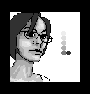
I tried to do some colouring again.
I don't really know if this is okay, and what I can do next?
|
|
|
IP Logged |
|
|
Zorgus
Seaman 
Joined: 14 August 2007 Online Status: Offline Posts: 6 |
Posted: 15 August 2007 at 4:42am |
|
you forgot to drew the pimples

|
|
|
IP Logged |
|
|
cele1989
Commander
Joined: 25 December 2021 Location: Belgium Online Status: Offline Posts: 163 |
Posted: 16 August 2007 at 5:49am |
|
Those spots aren't pimples, they are birthmarks...
Yeah, it's really ugly, I ain't going to draw them, you know... Edit: Back to the point... besides the birthmarks "I forgot" are the colours okay and what can I do next? Edited by cele1989 - 16 August 2007 at 5:51am |
|
|
IP Logged |
|
|
theguy
Commander
Joined: 03 November 2023 Online Status: Offline Posts: 417 |
Posted: 16 August 2007 at 7:30am |
|
right now the colors are the best they've been so far they are awesome right now and you've shaded it very well too, good job
|
|
|
IP Logged |
|
| |
||
Forum Jump |
You cannot post new topics in this forum You cannot reply to topics in this forum You cannot delete your posts in this forum You cannot edit your posts in this forum You cannot create polls in this forum You cannot vote in polls in this forum |
|
