| Active TopicsSearchRegisterLogin |
| WIP (Work In Progress) | |
| |
  |
| Author | Message |
|
chess
Commander 
Joined: 11 October 2006 Location: Germany Online Status: Offline Posts: 249 |
  Topic: Uber angelboss Topic: Uber angelbossPosted: 06 August 2007 at 1:08pm |

Two creations in one. with sword, shield and lance. + cockscomb |
|
 IP Logged IP Logged |
|
|
jalonso
Admiral 
Joined: 29 November 2022 Online Status: Offline Posts: 13537 |
Posted: 06 August 2007 at 6:42pm |
|
A bit over AAd on the lance. Is AA even needed there? I think salout would be fine.
|
|
|
|
|
|
IP Logged |
|
|
MashPotato
Commander
Joined: 05 February 2007 Online Status: Offline Posts: 237 |
Posted: 06 August 2007 at 7:11pm |
|
Looks neat
 Are the angles of the lance and the pointy thing on the right supposed to be different from the rest of the body, however? Everything else appears to be straight-on, while those two structures are pointed more downward. Are the angles of the lance and the pointy thing on the right supposed to be different from the rest of the body, however? Everything else appears to be straight-on, while those two structures are pointed more downward. |
|
|
IP Logged |
|
|
leel
Commander
Joined: 29 June 2005 Online Status: Offline Posts: 3001 |
Posted: 06 August 2007 at 8:03pm |
|
The lance looks a little messy to me, especially with.. almost a dither there but not quite? I think it doesn't go with the style, so I tried to make it cleaner, and more sleek and shiny. Maybe I overdid it, but i definitely think you should clean it up a bit.
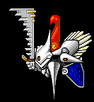 also, aa on the outside? kind of unnecessary, especially since the only other part of the outline that's also aa'ed is more subtle.. |
|
|
IP Logged |
|
|
chess
Commander
Joined: 11 October 2006 Location: Germany Online Status: Offline Posts: 249 |
Posted: 07 August 2007 at 7:42am |
|
Originally posted by jalonso
A bit over AAd on the lance. Is AA even needed there? I think salout would be fine. hey honey  i`ve fixed the lance. i`ve fixed the lance.
Originally posted by MashPotato
Looks neat Are the angles of the lance and the pointy thing on the right supposed to be different from the rest of the body, however? Everything else appears to be straight-on, while those two structures are pointed more downward.Thank you MashPotato The directions are simply mixed.
Originally posted by leel
The lance looks a little messy to me, especially with.. almost a dither there but not quite? I think it doesn't go with the style, so I tried to make it cleaner, and more sleek and shiny. Maybe I overdid it, but i definitely think you should clean it up a bit. also, aa on the outside? kind of unnecessary, especially since the only other part of the outline that's also aa'ed is more subtle..
Thank you leel! i learned a lot from your example, thank you for the edit. i have fixed it my way and hope to match the qualitystandards. Here it is:  Edited by chess - 07 August 2007 at 9:31am |
|
|
IP Logged |
|
|
Squirrelsquid
Commander
Joined: 18 July 2023 Online Status: Offline Posts: 259 |
Posted: 07 August 2007 at 2:13pm |
|
The new lance is a vast improvement! I think the the shield could use a
bit better shading on the blue part... currently it looks like a blue
wall with light blue sprinkles.
|
|
|
IP Logged |
|
| |
||
Forum Jump |
You cannot post new topics in this forum You cannot reply to topics in this forum You cannot delete your posts in this forum You cannot edit your posts in this forum You cannot create polls in this forum You cannot vote in polls in this forum |
|
