| Active TopicsSearchRegisterLogin |
| WIP (Work In Progress) | |
 Topic: Titlescreen/WEAPON SELECT Topic: Titlescreen/WEAPON SELECT |
  |
| Author | Message |
|
Squirrelsquid
Commander 
Joined: 18 July 2023 Online Status: Offline Posts: 259 |
  Topic: Titlescreen/WEAPON SELECT Topic: Titlescreen/WEAPON SELECTPosted: 09 September 2007 at 2:57pm |
|
the new logo/title screen from my shoot em up.
still heavy WIP. 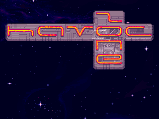 will update this thread as it progresses. feedback welcome! EDIT1: 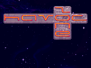 more progress on the metal Edited by Squirrelsquid - 19 October 2007 at 7:51pm |
|
 IP Logged IP Logged |
|
|
Monkey 'o Doom
Commander
Joined: 24 September 2005 Online Status: Offline Posts: 2994 |
Posted: 09 September 2007 at 4:04pm |
|
I think the text could be a lot more readable if you changed the h and z--the h to a H and the middle part of the z to a / instead of the current |.
|
|

RPG is numberwang. |
|
|
IP Logged |
|
|
Aleiav
Commander
Joined: 08 April 2016 Online Status: Offline Posts: 2380 |
Posted: 09 September 2007 at 8:36pm |
|
I like the font but I think it seems a bit odd. I'd put the "zone" below havoc. Unless you're gonna put something on the left side, otherwise it seems unbalanced.
|
|
|
IP Logged |
|
|
Squirrelsquid
Commander
Joined: 18 July 2023 Online Status: Offline Posts: 259 |
Posted: 10 September 2007 at 11:58am |
|
here's an update:
 changed the H and Z as monkey suggested, and worked on the metal some more. @Aleiav: I kinda like the way it is... though I will add some fleshy elements, to balance the whole construction. |
|
|
IP Logged |
|
|
Hapiel
Rear Admiral 
Joined: 30 June 2023 Online Status: Offline Posts: 3266 |
Posted: 10 September 2007 at 12:30pm |
|
This is awesome!!
The H is better now, the Z is more readable but its not as cool as the old one.. maybe there is another good shape for it? I cant think of one.. :( The animation is great! |
|
|
IP Logged |
|
|
Varock Shade
Commander
Joined: 29 March 2018 Online Status: Offline Posts: 303 |
Posted: 10 September 2007 at 12:39pm |
|
do you mean flashy or fleshy elements?
 anyway... i like the old H and Z better, although this is more logical cause of the other letters are capital(ish) letters too. If i were you id also add a few frames where the glow of the logo lights up the metal just a bit. anyway... i like the old H and Z better, although this is more logical cause of the other letters are capital(ish) letters too. If i were you id also add a few frames where the glow of the logo lights up the metal just a bit.  nice job so far (also on bg already) nice job so far (also on bg already)
|
|
|
http://www.mega.freeforums.org/ < PJ Member Dran's Multimedia and RP Forum
|
|
|
IP Logged |
|
|
Squirrelsquid
Commander
Joined: 18 July 2023 Online Status: Offline Posts: 259 |
Posted: 10 September 2007 at 12:52pm |
|
Originally posted by Varock Shade do you mean flashy or fleshy elements?
anyway... i like the old H and Z better, although this is more logical
cause of the other letters are capital(ish) letters too. If i were you
id also add a few frames where the glow of the logo lights up the metal
just a bit. nice job so far (also on bg already)
Fleshy! :) though some additional flashy parts couldn't hurt either. I kinda agree with you on the letters... I think the flow was better in the older version. and the lighting is a good idea! I'll work on that. |
|
|
IP Logged |
|
|
Larwick
Commander
Joined: 18 July 2024 Online Status: Offline Posts: 4015 |
Posted: 10 September 2007 at 1:02pm |
|
I'm all up for the older lettering.
Awesome animation, beautiful textures and colouring aswel. Goes nicely with the space background. It's just a really great title. Nice work! I don't have any crits or suggestions unfortunately. |
|
 
|
|
|
IP Logged |
|
|
Squirrelsquid
Commander
Joined: 18 July 2023 Online Status: Offline Posts: 259 |
Posted: 10 September 2007 at 2:52pm |
|
Thanks Larwick!
I went back to the old lettering, and finished the metal. 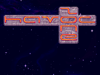 I'll add some organic stuff next. |
|
|
IP Logged |
|
|
Squirrelsquid
Commander
Joined: 18 July 2023 Online Status: Offline Posts: 259 |
Posted: 11 September 2007 at 11:46am |
|
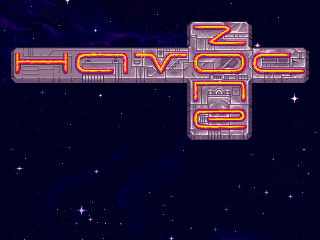
here's some more work on the title:
 gave the metal plate more thickness, and added some blueish metal shine. next up is a perspective drawing of the player ship, that will be placed beneath the title. oh, and some "press start" text. Edit: here's the next version. and I did a font! 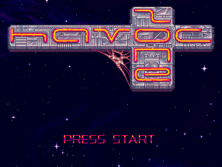 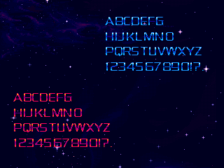 Edited by Squirrelsquid - 11 September 2007 at 2:32pm |
|
|
IP Logged |
|
|
jalonso
Admiral 
Joined: 29 November 2022 Online Status: Offline Posts: 13537 |
Posted: 11 September 2007 at 7:31pm |
|
I may be too late to join this convo. This last mockup looks fantastic with an exception. The letter V is all wrong. In typographical terms the Mspace is all wrong. Even if using artistic license the serifs are far too long for the down strokes. The 'whitespace' left between the A and O make the otherwise most important letter by virtue of it being center to the eye as a smaller to the brain 'read'.
Now in English, lol... The V sucks ass. Either raise it so that the 'wings' on it go over the A and O. Maybe even all the way over the H to the C. Ditch the wings otherwise and spread the V out. On another note. Being familiar with all the sprites in this project. May be more work. But if the 'glass' letters were somehow more organically blended INTO the metal. Like some metal bracing going over the reds here and there it would tie in better. As with all these things MORE GUEY GOO, pleeez :D |
|
|
|
|
|
IP Logged |
|
|
Squirrelsquid
Commander
Joined: 18 July 2023 Online Status: Offline Posts: 259 |
Posted: 12 September 2007 at 11:46am |
|
Thanks Jal, your comments gave me the impulse to ditch the current font, and try a more freestyle carved in letters.
They take forever to do, but look a lot better IMO. 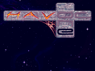 here's more progress: 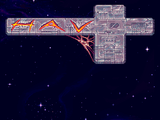 EDIT2: and even more progress 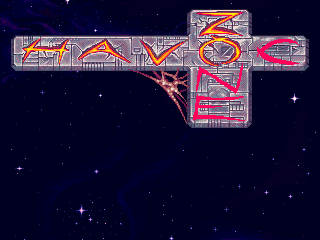 Edited by Squirrelsquid - 12 September 2007 at 3:05pm |
|
|
IP Logged |
|
|
Metaru
Commander
Joined: 28 December 2025 Online Status: Offline Posts: 3305 |
Posted: 12 September 2007 at 3:11pm |
|
Letter C should be one single Curved trace instead of two, like the rest of the letters.
|
|
|
I ate leel's babies
|
|
|
IP Logged |
|
|
jalonso
Admiral
Joined: 29 November 2022 Online Status: Offline Posts: 13537 |
Posted: 12 September 2007 at 4:32pm |
|
yup, I agree.
Letters look awesome. Maybe a tiny bit of oozing into the metal grooves following gravity (no gravity in space, I know, but still). |
|
|
|
|
|
IP Logged |
|
|
Larwick
Commander
Joined: 18 July 2024 Online Status: Offline Posts: 4015 |
Posted: 12 September 2007 at 4:52pm |
|
I quite like that the C is two slashes..
OMG THIS IS AN AMAZING UPDATE. Jesus it just looks fantastic. You need to get that web stuff to look more involved in the rest of the piece somehow. I think it may be the single hue that makes it not match the rest as much. KUTGW. |
|
|
|
|
|
IP Logged |
|
|
Aleiav
Commander
Joined: 08 April 2016 Online Status: Offline Posts: 2380 |
Posted: 12 September 2007 at 11:26pm |
|
WOW, some definite improvement! I love the new additions. You've changed my mind about the text. The spiderwebby thing really works.
|
|
|
IP Logged |
|
|
Metaru
Commander
Joined: 28 December 2025 Online Status: Offline Posts: 3305 |
Posted: 13 September 2007 at 9:41am |
|
You know what would look great below that? a concept art of the game's ship in a dynamic view... or a demo play of the game...
But well, just by seeing the title makes me think about giving the game a try. And that's great I believe.
|
|
|
I ate leel's babies
|
|
|
IP Logged |
|
|
Squirrelsquid
Commander
Joined: 18 July 2023 Online Status: Offline Posts: 259 |
Posted: 13 September 2007 at 12:17pm |
|
thank you all for the comments! I finished the letters:
 @ Jalonso: well I'm not sure about ooze in the letters, but I'm thinking of making the web drool, possibly animated. and maybe I'll add additional alien goo some where else. @Larwick: yea, you are kinda right about that. I'll see what I can do. @ Metaru: a big art for the ship is planed, as well as an own star-background. because the current is the one I use pretty much everywhere, and it's getting old ;) EDIT: did some test palette cycling... dunno if I should love it or hate it :/ 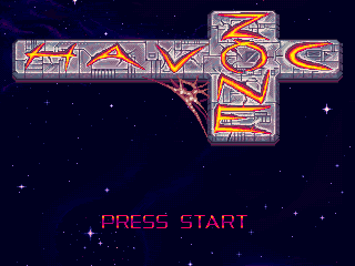 Edited by Squirrelsquid - 13 September 2007 at 12:27pm |
|
|
IP Logged |
|
|
Metaru
Commander
Joined: 28 December 2025 Online Status: Offline Posts: 3305 |
Posted: 13 September 2007 at 1:05pm |
|
NAH... instead of that, put the metal plate empty, then a big flash and so the carved letters appears, reducing their glowing to the first animation, but a bit slowered and more constant.
|
|
|
I ate leel's babies
|
|
|
IP Logged |
|
|
Squirrelsquid
Commander
Joined: 18 July 2023 Online Status: Offline Posts: 259 |
Posted: 17 September 2007 at 4:21pm |
|
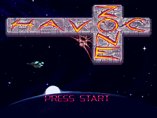
well here's some more progress... decided to put a planet at the lower
screen. The redstuff will look like burning lava, of sorts, when finished.
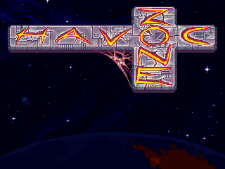 @ Metaru: I'll do such an animation when everything's finished :) Edited by Squirrelsquid - 17 September 2007 at 4:21pm |
|
|
IP Logged |
|
|
Souly
Commander
Joined: 13 December 2020 Online Status: Offline Posts: 2451 |
Posted: 17 September 2007 at 5:00pm |
|
I liked the slashed C better.
|
|

I am the jesus of PJ. |
|
|
IP Logged |
|
|
jalonso
Admiral
Joined: 29 November 2022 Online Status: Offline Posts: 13537 |
Posted: 17 September 2007 at 7:33pm |
|
Damm squir, that C is a mess! Do go back to slender crossed version.
*Its for your own good ;) |
|
|
|
|
|
IP Logged |
|
|
M.E.
Commander
Joined: 26 February 2007 Online Status: Offline Posts: 430 |
Posted: 19 September 2007 at 1:12am |
|
Hey Hello SquirrelSquid,
Looking great. How brave of you to work with different characters. The latest ones are much better readable! Here are my comments: - Yes: Slashed C - That planet doesn't really match with the nebula that comes behind it. If you want the planet, try removing the flare above it. (And the little hearts  ) )Looking forward to updates!!! Best regards from M.E. |
|
|
KunstStukken.nl M.E. Art
|
|
|
IP Logged |
|
|
Squirrelsquid
Commander
Joined: 18 July 2023 Online Status: Offline Posts: 259 |
Posted: 20 September 2007 at 4:37pm |
|
returned to the slashed C and I also worked on the planet some more
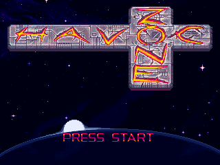 still far from finished but it's late and I need to go to bed :P @ M.E. the little "hearts" where just put there so I would not loose the 3 colors I had there. more work on the planet soon! |
|
|
IP Logged |
|
|
Larwick
Commander
Joined: 18 July 2024 Online Status: Offline Posts: 4015 |
Posted: 20 September 2007 at 5:50pm |
|
Truly wonderful updates. I imagine you'll be smoothening out the 'moon' glow thing later. Keeeep it up man.
|
|
|
|
|
|
IP Logged |
|
|
jalonso
Admiral
Joined: 29 November 2022 Online Status: Offline Posts: 13537 |
Posted: 20 September 2007 at 6:12pm |
|
Lovin that font on press start. I do think the planet's curvature is incorrect from the viewers perpective.
|
|
|
|
|
|
IP Logged |
|
|
jesusbot3000
Seaman 
Joined: 22 October 2005 Online Status: Offline Posts: 9 |
Posted: 20 September 2007 at 10:06pm |
|
The right side of the planet looks a bit too steep, methinks. Elsewise this is damn spiffy.
|
|
|
IP Logged |
|
|
Squirrelsquid
Commander
Joined: 18 July 2023 Online Status: Offline Posts: 259 |
Posted: 21 September 2007 at 3:07am |
|
Originally posted by jalonso Lovin that font on press start. I do think the planet's curvature is incorrect from the viewers perpective. the planet is a perfect circle... so, it should be correctly curved... but you are right, it kinda seems off. oh, and I kinda switched off the layer with the web... that will return, ofcourse! |
|
|
IP Logged |
|
|
jalonso
Admiral
Joined: 29 November 2022 Online Status: Offline Posts: 13537 |
Posted: 21 September 2007 at 6:58am |
|
Bingo! Planets are NOT perfect circles.
|
|
|
|
|
|
IP Logged |
|
|
Squirrelsquid
Commander
Joined: 18 July 2023 Online Status: Offline Posts: 259 |
Posted: 22 September 2007 at 7:20am |
|
Originally posted by jalonso Bingo! Planets are NOT perfect circles. well as I didn't want to fiddle with the planetshape itself, since I just wouldn't know how. So I changed the lighting a bit.  oh, and on the webthing is now an omnivore eyeball that opens up and looks around :D Edited by Squirrelsquid - 22 September 2007 at 7:21am |
|
|
IP Logged |
|
|
jalonso
Admiral
Joined: 29 November 2022 Online Status: Offline Posts: 13537 |
Posted: 22 September 2007 at 8:23am |
|
Oh, that is way awesome! The planet glare is great now*. Eyeball rules.
*AA a little the area right above the second S in 'press' its jaggy |
|
|
|
|
|
IP Logged |
|
|
Squirrelsquid
Commander
Joined: 18 July 2023 Online Status: Offline Posts: 259 |
Posted: 22 September 2007 at 1:22pm |
|
well, I built the player ship in Maya, and wanted to use it as
reference for the perspective shot of the ship, but I decided
against it because it looked to busy and just not good...
so here's the final result, I smoothed the glare like jal suggested 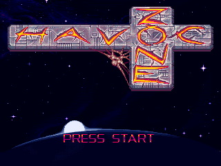 so now I'll get this in the gallery :) |
|
|
IP Logged |
|
|
jalonso
Admiral
Joined: 29 November 2022 Online Status: Offline Posts: 13537 |
Posted: 22 September 2007 at 6:03pm |
|
Now make the sky pink and the ship made out of wood and you're done.
 |
|
|
|
|
|
IP Logged |
|
|
Monkey 'o Doom
Commander
Joined: 24 September 2005 Online Status: Offline Posts: 2994 |
Posted: 22 September 2007 at 6:05pm |
|
The eye closes very quickly. Too quickly, maybe?
|
|
|
RPG is numberwang. |
|
|
IP Logged |
|
|
Squirrelsquid
Commander
Joined: 18 July 2023 Online Status: Offline Posts: 259 |
Posted: 22 September 2007 at 7:24pm |
|
well, I certainly won't make it barbie pink, but I could use the same
glowing colors as in the regular omnivore palette. also I decided to
display a ship again:
 currently there's just my reference dummy. the cool thing about this size and the perspective is, that I can also display the other ships that will be playable in later versions of the game. so, eventualy you'll have a fleet of 4 ships at some point :) Edited by Squirrelsquid - 22 September 2007 at 7:25pm |
|
|
IP Logged |
|
|
jalonso
Admiral
Joined: 29 November 2022 Online Status: Offline Posts: 13537 |
Posted: 22 September 2007 at 7:30pm |
|
I don't know man. Its been mentioned in the gallery but adding the ship 'in-scene' is amateur-ish. If you perhaps raised the planet with the glare and the 'press start' and placed some UI looking box in the lower part broken into four, for the 4 ships, then yes. Style and design do matter. Leave the ships for game play. Presummably the player would have just come from a more UI screen or options or something. Using a partial UI overlay here would make for a better layout. Frankly, the scale of the ship is too small. It competes with the logo and 'eyeball' detail. This update is a terrible idea for me : /
|
|
|
|
|
|
IP Logged |
|
|
Squirrelsquid
Commander
Joined: 18 July 2023 Online Status: Offline Posts: 259 |
Posted: 22 September 2007 at 7:52pm |
|
you are kinda right I guess. so I won't do it, because I also still wasn't realy sure
still one question remains: I'm also doing a new mainmenu, and I'm unsure if I should do that on another screen, or I should place it on the titlescreen, presenting it kinda in Streetfighter II style menu. Edited by Squirrelsquid - 22 September 2007 at 7:52pm |
|
|
IP Logged |
|
|
jalonso
Admiral
Joined: 29 November 2022 Online Status: Offline Posts: 13537 |
Posted: 22 September 2007 at 7:59pm |
|
That's sort of what I was referring to. Before this screen is this screen with UI overlays. Before that same screen with other overlays. Maybe as 2D UI panels or whatnots. By the time you get here its hit press then 'free space' action. Like layers being peeled off : /
|
|
|
|
|
|
IP Logged |
|
|
Squirrelsquid
Commander
Joined: 18 July 2023 Online Status: Offline Posts: 259 |
Posted: 19 October 2007 at 7:56pm |
|
RISE FROM THE GRAVE OH GREAT ZOMBIE TOPIC!
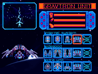
I don't know if the layer method is a good idea, since you'll go through variouse selections like Difficulty, Pilot, Ship and weapons. I need big fullscreen menus for that, but I will have a minimalistic main-menu :) here's the weapon select, the first selection type on the list. obviously missing quite a bit in the lower area... the upper left thingy will display the weapons fire range and so on. 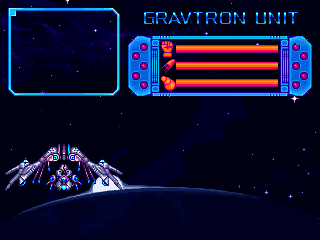 EDIT: more progress: 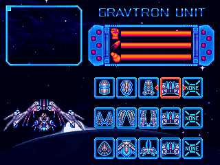 EDIT2:some slight changes: 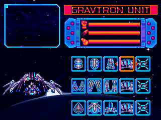 Edited by Squirrelsquid - 19 October 2007 at 8:59pm |
|
|
IP Logged |
|
|
Squirrelsquid
Commander
Joined: 18 July 2023 Online Status: Offline Posts: 259 |
Posted: 20 October 2007 at 7:39pm |
|
more progress...
 |
|
|
IP Logged |
|
|
Skull Master
Commander
Joined: 29 September 2007 Online Status: Offline Posts: 200 |
Posted: 20 October 2007 at 9:03pm |
|
It looks great! but, I wunder, why would there be a cobweb in space? :S
|
|

leel: "At least I'm not claiming to a master in anything." lol, oops. Xp |
|
|
IP Logged |
|
|
Squirrelsquid
Commander
Joined: 18 July 2023 Online Status: Offline Posts: 259 |
Posted: 21 October 2007 at 11:38am |
|
Originally posted by Skull Master It looks great! but, I wunder, why would there be a cobweb in space? :S that's not a cobweb, that's an omnivore-organism. the can appear in any shape, and in this case it looks like a cobweb. slight edit: 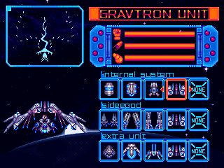 I removed the outline of the weapons for their own good |
|
|
IP Logged |
|
|
Skull Master
Commander
Joined: 29 September 2007 Online Status: Offline Posts: 200 |
Posted: 21 October 2007 at 12:08pm |
|
Well, that's good. I didn't want you to take it away anyways, it really adds to it.

|
|
|
leel: "At least I'm not claiming to a master in anything." lol, oops. Xp |
|
|
IP Logged |
|
|
Metaru
Commander
Joined: 28 December 2025 Online Status: Offline Posts: 3305 |
Posted: 22 October 2007 at 3:43pm |
|
kept up the good work squirrel |
|
|
I ate leel's babies
|
|
|
IP Logged |
|
| |
||
Forum Jump |
You cannot post new topics in this forum You cannot reply to topics in this forum You cannot delete your posts in this forum You cannot edit your posts in this forum You cannot create polls in this forum You cannot vote in polls in this forum |
|
