| Active TopicsSearchRegisterLogin |
| WIP (Work In Progress) | |
| |
  |
| Author | Message |
|
zi-double
Commander 
Joined: 05 October 2021 Online Status: Offline Posts: 277 |
  Topic: as always - ISO building Topic: as always - ISO buildingPosted: 04 December 2007 at 4:11am |
|
I'm not post here nothink from too much time heh and lose my pass and mail but now always is fine :)
Ok here are some building for one my project ... Post and two work files. The colors are take from there and aren't so good to repair them, but if need will do that ! Will be glad to hear if somebody have some corrections ... 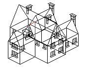 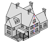 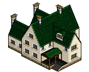 and 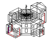 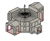 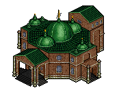 last edition after help last edition after help 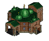 thanks in advance :) Edited by zi-double - 04 December 2007 at 5:28pm |
|
 IP Logged IP Logged |
|
|
jalonso
Admiral 
Joined: 29 November 2022 Online Status: Offline Posts: 13537 |
Posted: 04 December 2007 at 4:24am |
|
You are honestly one of the best isometric pixelartists ever, ever!!!
On the building with the domes. The way the columns on the front portico meet the green roof is very ugly. The much lighter color of the domes themselves makes them seem disconnected from the flat parts. |
|
|
|
|
|
IP Logged |
|
|
zi-double
Commander
Joined: 05 October 2021 Online Status: Offline Posts: 277 |
Posted: 04 December 2007 at 4:46am |
|
Thanks man, as always you are right :)
... and add a bit details which are in some height as in another entrance and make columns to view not so simple.  |
|
|
IP Logged |
|
|
jalonso
Admiral
Joined: 29 November 2022 Online Status: Offline Posts: 13537 |
Posted: 04 December 2007 at 4:59am |
|
Maybe, add one pixels to the roofs so that they break the boxes a little bit and appear more organic?
Also the column on the end appears disconnected. If you modify the roof on the visible one in a way so that that back one is tied in?  I also edited the front column to show what I meant Edited by jalonso - 04 December 2007 at 5:00am |
|
|
|
|
|
IP Logged |
|
|
jalonso
Admiral
Joined: 29 November 2022 Online Status: Offline Posts: 13537 |
Posted: 04 December 2007 at 5:11am |
|
One last thing before I go to work :(
 |
|
|
|
|
|
IP Logged |
|
|
zi-double
Commander
Joined: 05 October 2021 Online Status: Offline Posts: 277 |
Posted: 04 December 2007 at 5:34am |
|
hm back columb - I think for that maybe must hide 1 line ... else his place is there ... another what I think is to make 2 entrance parts biggest than will see and back roof and this columb will be not as implant.
Else thinking to add some konzole parts over the roof when are that 2 columbs - but must test first - will think and will see ! back steps think over 10 minutes how will look and make them before post here kekeke how stupid I'm :( Thanks man for big help and to loose time and wish you good working time :) Edited by zi-double - 04 December 2007 at 5:34am |
|
|
IP Logged |
|
|
zi-double
Commander
Joined: 05 October 2021 Online Status: Offline Posts: 277 |
Posted: 04 December 2007 at 3:24pm |
|
After interference of jalonso look better
 I'll think for more details ... |
|
|
IP Logged |
|
|
surt
Commander
Joined: 30 December 2015 Online Status: Offline Posts: 413 |
Posted: 04 December 2007 at 3:53pm |
|
This second building really needs a light source. Every plane seems to be equally illuminated. This has a flattening result. Not what you want for a 3d rendering such as iso.
The first building handled this much better with the south-east facing walls being lighter than the south-west facing. |
|
|
IP Logged |
|
|
zi-double
Commander
Joined: 05 October 2021 Online Status: Offline Posts: 277 |
Posted: 04 December 2007 at 5:26pm |
|
Thanks surt you are right :) but I always make light parts when the work is near to finish ... because else sometimes when make much changes or add some other parts they can throw shades and than make that work twice :(
ok I start to make that changes because I dont see much details which I can add and here is result untill now:
|
|
|
IP Logged |
|
|
zi-double
Commander
Joined: 05 October 2021 Online Status: Offline Posts: 277 |
Posted: 05 December 2007 at 4:19am |
|
... and another building on which working - hangar ... and one little plane - old plane :) Put them on the dark back because have too much dark areas and black outline
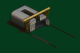 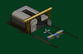 I'll put another little door on the big right wing of the hangar ! Edited by zi-double - 05 December 2007 at 4:20am |
|
|
IP Logged |
|
|
jalonso
Admiral
Joined: 29 November 2022 Online Status: Offline Posts: 13537 |
Posted: 05 December 2007 at 5:57am |
|
The hangar needs nothing, its AWESOME.
|
|
|
|
|
|
IP Logged |
|
|
zi-double
Commander
Joined: 05 October 2021 Online Status: Offline Posts: 277 |
Posted: 05 December 2007 at 8:07am |
 now I haven't more ideas for hangar :( only can try to make walk area over him to be large but ... many times that cranes have cabin on them but I think if I put will have some sort of disbalance ! ofcource will add some cables ets but when put in his place ! Edited by zi-double - 05 December 2007 at 8:09am |
|
|
IP Logged |
|
|
Dutrho
Commander
Joined: 04 July 2005 Location: Canada Online Status: Offline Posts: 237 |
Posted: 05 December 2007 at 9:13am |
|
if anything, either the hangar needs to be widened or make the plane smaller, it dosen't seem like it could fit.
|
|
|
Mmmm.. Thats good placebo!
|
|
|
IP Logged |
|
|
zi-double
Commander
Joined: 05 October 2021 Online Status: Offline Posts: 277 |
Posted: 06 December 2007 at 4:24pm |
|
durtho yep need maybe 2 or 4 pixels because now if the plane enter will havent free place but he is enough big in comparision with other building that maybe better is to stay in that size :(
hm in last days try to taste some colours, because maybe will need to change contrast and will need better palette ... until try ... make that building hah if that is building of course :) Just put here some details from my scene as horse climber ets for fun :) 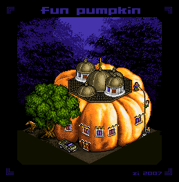 |
|
|
IP Logged |
|
|
jalonso
Admiral
Joined: 29 November 2022 Online Status: Offline Posts: 13537 |
Posted: 06 December 2007 at 6:21pm |
|
To me the windows and roof are ON the pumpkin not a part of it.
|
|
|
|
|
|
IP Logged |
|
|
zi-double
Commander
Joined: 05 October 2021 Online Status: Offline Posts: 277 |
Posted: 07 December 2007 at 2:18am |
|
a bit more ... If I put roof inside will be very strange where will go the water that is why try to find another variant ... of course background /leafs/ isn't good ... think to change quadratic windows ...
 jalonso if I work with you in one place I'll hate you, because always easy find mistakes and induse peoples to repair and to improve ! Just joking ;) Edited by zi-double - 07 December 2007 at 3:43am |
|
|
IP Logged |
|
|
jalonso
Admiral
Joined: 29 November 2022 Online Status: Offline Posts: 13537 |
Posted: 07 December 2007 at 7:11am |
|
You wouldn't hate me because I love your work and by extension you too :p
This is what I meant by integrating the man-made elements into the organic ones.  It may be that the tree's foliage is not around the pumpkin but collaged onto it. Making the foliage grow around the pumpkin is all that you need. The trunk is fine. e:typo Edited by jalonso - 07 December 2007 at 7:12am |
|
|
|
|
|
IP Logged |
|
|
zi-double
Commander
Joined: 05 October 2021 Online Status: Offline Posts: 277 |
Posted: 07 December 2007 at 11:35am |
|
hehehe jalonso you are as stimulant :) I think that today again will not sleep :(
just progress ... 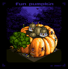 |
|
|
IP Logged |
|
|
pixelblink
Commander
Joined: 19 February 2023 Online Status: Offline Posts: 2865 |
Posted: 07 December 2007 at 11:38am |
|
it's a very dark scene but you have some very bright highlights that make it seem like it's glowing instead being reflected from somewhere.
On a plus note, the new edit looks better, especially the windows blending in. |
|
|
IP Logged |
|
|
zi-double
Commander
Joined: 05 October 2021 Online Status: Offline Posts: 277 |
Posted: 07 December 2007 at 11:54am |
|
agreed blink better will be if have some trees near, which envelop pumpkin and as somebody open grass ot leafs in front /my first idea was to make pumpkin with his leafs but start to work too large pumpkin :(/ ... I just use template of kenneth and that is why background is unneeded, but will think what I can do :)
Edited by zi-double - 07 December 2007 at 11:58am |
|
|
IP Logged |
|
|
zi-double
Commander
Joined: 05 October 2021 Online Status: Offline Posts: 277 |
Posted: 08 December 2007 at 11:40pm |
|
I think if put more details or elements on the pumpkin will be very overburdened ...
that is until now:  |
|
|
IP Logged |
|
|
zi-double
Commander
Joined: 05 October 2021 Online Status: Offline Posts: 277 |
Posted: 09 December 2007 at 9:22am |
|
hm back to the theme
this is some stuff as cars, horces, planes ets. If somebody see something too wrong will be glad to hear :) 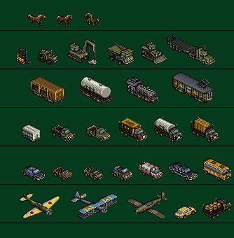 |
|
|
IP Logged |
|
|
jalonso
Admiral
Joined: 29 November 2022 Online Status: Offline Posts: 13537 |
Posted: 09 December 2007 at 1:15pm |
|
wow, what beauties!
Very wimpy looking propellars is all I see to crit. The window bubble on green plane #3 looks too flat, or missing glass dome? |
|
|
|
|
|
IP Logged |
|
|
Skaka
Commander
Joined: 31 October 2007 Online Status: Offline Posts: 183 |
Posted: 09 December 2007 at 3:27pm |
|
Zi I have no crits but I have to ask how long does it take you to pixel one of those iso vehicles? I did a tank from 4 perspectives once and it took me ~ a week, and here bam no problem you have load of them, and they look awesome too!
|
|
|
Ars longa, vita brevis.
|
|
|
IP Logged |
|
|
zi-double
Commander
Joined: 05 October 2021 Online Status: Offline Posts: 277 |
Posted: 10 December 2007 at 4:39am |
|
current work on the fire station
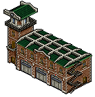 and thinking a bit and add some carriage ... maybe better will be with "pumpkin carriage", but carriage which try to make I'll use in another work :) 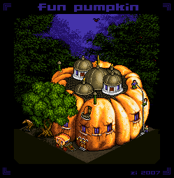 jalonso I want stuff to look old as before 30-40 years and that is why haven't glass, but /yellow plane/ make first and for me he isn't good and have some problems with the wings :( Skaka I make them until try to improve details of the building maybe for 2-3 hours but I watch them and sometimes repair some details which aren't good ... as example 1. take some picture to see some details 2. because scale is very little try to make some changes from original in train poor is that I haven't red in my works else better will be with red colour ... and remove part for colas because will be a bit misunderstanding for somebody ... if you watch chimney will see they aren't in proper place but if I put them in that scale on right place will be badly ets. in plane ... in first plane watch wings ... if you see lover wing is small but if I make him right with 1px small will be poor choice from red plane I watch how wings keep one to other ... 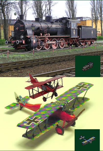 |
|
|
IP Logged |
|
|
zi-double
Commander
Joined: 05 October 2021 Online Status: Offline Posts: 277 |
Posted: 11 December 2007 at 6:02am |
|
some elements which maybe are ready or maybe not ... I'm not shure, but maybe need more work on the grass with statue and maybe bus-stop must be 1 or 2px high ... he is enough high but because have too big roof and only little parts from columb are visible and that makes him to look poky ... if I put concrete part of the end will be better else now he can fall out on the ground !
 |
|
|
IP Logged |
|
|
jamcob
Seaman 
Joined: 14 December 2017 Online Status: Offline Posts: 29 |
Posted: 11 December 2007 at 9:47am |
|
So are you going to make an isco-town with all this because if you're not then you should really consider it!
|
|
|
IP Logged |
|
|
jalonso
Admiral
Joined: 29 November 2022 Online Status: Offline Posts: 13537 |
Posted: 11 December 2007 at 10:29am |
|
the moped/motorcycles are mind-blowing in detail legibility
 Black lineart in statue is weak. |
|
|
|
|
|
IP Logged |
|
|
zi-double
Commander
Joined: 05 October 2021 Online Status: Offline Posts: 277 |
Posted: 11 December 2007 at 3:59pm |
|
listen to advice jal :)
here is repairs  and some trees on which working now ...  jamcob yep will make one "retro green village", but if I post work until now then will be very hard somebody to repair my mistakes and faults ... I think better is to add separately current works ... |
|
|
IP Logged |
|
|
Fuzzyleaves
Commander
Joined: 23 June 2007 Online Status: Offline Posts: 147 |
Posted: 12 December 2007 at 8:35am |
|
holy crap is this going to be a game?
|
|
|
IP Logged |
|
|
jamcob
Seaman
Joined: 14 December 2017 Online Status: Offline Posts: 29 |
Posted: 12 December 2007 at 12:29pm |
|
Yer your right, then people can see each buidling/object as a seperate piece and feel their able to comment on it withought sounding picky.
So i can't wait for this town now, you're truly amazing =)
|
|
|
IP Logged |
|
|
Club Beuker
Commander
Joined: 29 January 2007 Online Status: Offline Posts: 513 |
Posted: 13 December 2007 at 4:50am |
|
Originally posted by zi-double hm back to the theme this is some stuff as cars, horces, planes ets. If somebody see something too wrong will be glad to hear :) The only crit I can see here is that the "nose" of the locomotive seems a bit out of perspective (according to the back). That's it! For the rest, keep up the good work, I really like your style here. |
|
|
Without me, it's just aweso
|
|
|
IP Logged |
|
|
Pixel_Outlaw
Commander
Joined: 01 September 2005 Online Status: Offline Posts: 3829 |
Posted: 13 December 2007 at 1:54pm |
|
Excellent work!My only complaint is that the spire on the middle dome of your buildings appears to be off center. It seems to come out of the back side of the dome rather than the top. Try bringing the spire's base down a few pixels.
Perhaps this will help. Your dome is similar to the spheres here.
 Edited by Pixel_Outlaw - 13 December 2007 at 2:01pm |
|

|
|
|
IP Logged |
|
|
zi-double
Commander
Joined: 05 October 2021 Online Status: Offline Posts: 277 |
Posted: 14 December 2007 at 5:04am |
|
Club Beuker
will be repaired ...
Pixel_Outlaw Yep you are right will repair will add more details and will try to make better background and then will post again for crit Where I'm with my work - to nowhere ... 1. have too much unfinished parts and work in all areas :( 2. add 2 colours which I don't need because work on separately files. I'll remove them when going to finish, because want to keep 64 colours but think to add more red colours. 3. dislike colours and need more contrast :( here is the piece and will be glad for all comments ofcourse :)  Cheers for now, because finish scene with coffin heh Hm too poor, when the size going over 1024 the piece was smashed now I don't know what to do with outside border :( PS the shadows from the fire station aren't correctly tennis court haven't door the scool is like without light source and I think that his roof is very scantly ets ... Edited by zi-double - 14 December 2007 at 6:08am |
|
|
IP Logged |
|
|
klav
Commander
Joined: 01 December 2006 Online Status: Offline Posts: 128 |
Posted: 14 December 2007 at 9:35am |
|
Jesus Christ! i almost fell out of my chair when i saw the full image. The scale of the image is fantastic. This is inspiring.
 Im not sure if your finished, but the upper right corner doesnt run off the page like all the other sides. as far as composition goes, it needs one more building or some trees... |
|
|
IP Logged |
|
|
FireMedic
Seaman
Joined: 06 November 2006 Online Status: Offline Posts: 35 |
Posted: 16 December 2007 at 12:27pm |
|
The only thing that popped at me righta way was the steam locomotive, but that's because I'm a train buff. :)
The drivers on it need to be larger. They *should* be more visible then say, the trucks of the boxcar or tank car following it. Also, they probably wouldn't run loco-first into a siding, especially in the days of steam. ;) |
|
|
IP Logged |
|
|
jalonso
Admiral
Joined: 29 November 2022 Online Status: Offline Posts: 13537 |
Posted: 16 December 2007 at 1:15pm |
|
As I said in the beginning of this thread. You are one of the best at iso making. You have always been a source of insipiration.

|
|
|
|
|
|
IP Logged |
|
|
zi-double
Commander
Joined: 05 October 2021 Online Status: Offline Posts: 277 |
Posted: 18 December 2007 at 1:31am |
|
Klav I'm going and going with bigger size that is why some corners aren't finished ... Just want to make one petrol stantion and one canal in east part ...
Fire Medic I can try to make detail scene with the locomotive, than you will see more ;) I run shortly from the little size :) here is some detail scenes from the map ... ofcourse must back and repair some parts as rocks near to the scene with the miner or hair of the man with the dog, seat on the tennis court ets ... I keep some colours from the grass and from the soil from map and add more contrast colours for the sprites ! one global question to keep light outline or to make sprites with their current outline but with more dark colours As note: Some elements and sprites haven't shadows ! ofcourse if you see some problems will be apreciated because I have problem with the horse... Edited by zi-double - 18 December 2007 at 1:37am |
|
|
IP Logged |
|
|
zi-double
Commander
Joined: 05 October 2021 Online Status: Offline Posts: 277 |
Posted: 27 December 2007 at 7:08pm |
|
finish upper right corner and add some more details, shadows ets ...
In the last version when finish all details will repair some colours but I want to know first or second varian is better ... for me is second ! I'm not shure because watch so long time that works and :(   PS shadows of the trees are incorect in some areas, but will repair them when finish arrangement of all trees ! Edited by zi-double - 27 December 2007 at 7:10pm |
|
|
IP Logged |
|
|
jalonso
Admiral
Joined: 29 November 2022 Online Status: Offline Posts: 13537 |
Posted: 27 December 2007 at 7:32pm |
|
Maybe you have a reason to do so but the red on the firetruck and the horse carriage seem very saturated for such a green scene. I think the reds in such a scene would lean towards the purple side of red. Maybe even just greyed down a bit.
On the other hand the yellows and ligth blues are very saturated too but look fantastic : / The horses are all fantastic. Edited by jalonso - 27 December 2007 at 7:32pm |
|
|
|
|
|
IP Logged |
|
|
zi-double
Commander
Joined: 05 October 2021 Online Status: Offline Posts: 277 |
Posted: 27 December 2007 at 8:02pm |
|
yep, right will change the red ... until now I use only for clothes and some other very small objects as barriers, but now with that fire cars I need and add 4th colour of red ... big red elements look at very poor and will change that colours !
In the end think to repair a bit contrast between grey colours ... blue look at good maybe because he is cold colour as green. Yellow is in the gamma of the brown, but many big elements are in brown as streets ... that is why red with that saturation look at disgusting :) I make mistake untill make last 2 building as always in different files and now I have two brown colours which are near one to another and will replace them :) Thanks for suggestion Jal and here is edition of red 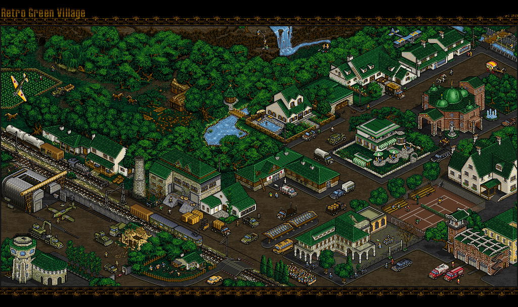 Edited by zi-double - 27 December 2007 at 8:30pm |
|
|
IP Logged |
|
|
jalonso
Admiral
Joined: 29 November 2022 Online Status: Offline Posts: 13537 |
Posted: 27 December 2007 at 8:33pm |
|
waaaaaaaaay better.
|
|
|
|
|
|
IP Logged |
|
|
surt
Commander
Joined: 30 December 2015 Online Status: Offline Posts: 413 |
Posted: 28 December 2007 at 12:13am |
|
Looking good.
One thing's bugging me though. The Green old-school car just right of image centre look out of scale in the direction of bigness. |
|

|
|
|
IP Logged |
|
|
Feron
Midshipman 
Joined: 17 September 2006 Online Status: Offline Posts: 99 |
Posted: 28 December 2007 at 4:09pm |
|
f**k off this is awesome...
with all the foliage though makes me wonder whether you should make all the roofs blue or purple... some seem to get lost in the trees. |
|
|
hmmmm.
|
|
|
IP Logged |
|
|
Acherhar
Commander
Joined: 13 September 2021 Location: United States Online Status: Offline Posts: 179 |
Posted: 28 December 2007 at 4:13pm |
|
*cough* Green Village *cough*
Anyway, it does indeed look spectacular. I LOVE tiny pieces like this, it's amazing how much detail you put in your work.
|
|
|
IP Logged |
|
|
5L1V3R
Seaman
Joined: 29 December 2007 Online Status: Offline Posts: 31 |
Posted: 04 January 2008 at 1:24pm |
|
it all looks excellent, except for the plane in the upper left corner...its angle just looks awkward to me
|
|
|
IP Logged |
|
|
Saint Minor
Midshipman
Joined: 02 December 2006 Online Status: Offline Posts: 95 |
Posted: 04 January 2008 at 1:46pm |
|
Planes of that era changed direction with the plane tilted to that angle. Watch an old war film and you will know what i mean. |
|
|
IP Logged |
|
|
jalonso
Admiral
Joined: 29 November 2022 Online Status: Offline Posts: 13537 |
Posted: 04 January 2008 at 2:26pm |
|
c'mon guys it's called green village it's green, as much green as possible. c+c other things.
|
|
|
|
|
|
IP Logged |
|
|
zi-double
Commander
Joined: 05 October 2021 Online Status: Offline Posts: 277 |
Posted: 05 January 2008 at 2:28am |
|
Surt yep - repair it ... I watch old type of cars they are black and they are too long but now look better :)
Feron I want many colours to be in green and brown gamma and just add 4 blue colours for water, 3 colours for some metal elements and 2 yellow + 2 red colours for some elements ... but when I want to make fire cars I add + 2 ekstra red :( Else I try how will look with red and grey roofs but 1st my favourite colour is green 2nd I think green carry some specific atmosphere 3rd I want to keep colours below 64. Acherhar details isn't enough - if you look in one street will understand how much details and scenes have there :) 5L1V3R plane isn't in the best direction, but I put him there because want left upper corner to have something like corner direction and in that corner I don't see much scenes which I can make ... maybe only fire in the fields :) Yep agreed jal "as much green as possible" everywhere hehehe ... why - because I watch too much ISO works as streets and towns and they are without enough trees and vegetation, but if somebody look will see that in real world have too much green :) I want all elements and details to be vissible that is why I try do not cross visible areas with vegetation :( Also I try every small character to have some employment in some small scene :) Also I try don't repeat elements more than twice, of cource some elements as telegraph pole try to put in different right points but to be vissible different parts ! else here is some update where I repair too much details and add more ... and try to repair some colours and to repair contrast ! ... I think that I'm near to finish that size ! 
Edited by zi-double - 05 January 2008 at 2:48am |
|
|
IP Logged |
|
|
hiddddde
Midshipman
Joined: 26 March 2007 Location: Netherlands Online Status: Offline Posts: 68 |
Posted: 05 January 2008 at 8:27am |
|
Maybe let the plane fire. So it looks it's crashing down :P
Sorry for bad enlgish *Hidde |
|
|
IP Logged |
|
| |
||
Forum Jump |
You cannot post new topics in this forum You cannot reply to topics in this forum You cannot delete your posts in this forum You cannot edit your posts in this forum You cannot create polls in this forum You cannot vote in polls in this forum |
|
