| Active TopicsSearchRegisterLogin |
| WIP (Work In Progress) | |
| |
  |
| Author | Message |
|
Sabata
Commander 
Joined: 08 July 2007 Online Status: Offline Posts: 128 |
  Topic: ISO stuff (building material, movement anim) Topic: ISO stuff (building material, movement anim)Posted: 11 June 2008 at 11:15am |
|
Well yea... started a pice whit a big fancy house to find out that I never did them... so I decided to make something small first.
Made some wall texture, a door and then combined them, the idea is to make parts like roof, window and then go to harder shapes like round roofs...  This grid is actually whit problems...need to fix that... so yea I want to learn making buildings as fast as possible.  Oh and look what a super grass tile!!! I can do those in 2 min...and that is the best I can do whit grass  Edited by Sabata - 15 June 2008 at 10:21am |
|
|
We fall to rise again.
|
|
 IP Logged IP Logged |
|
|
zi-double
Commander
Joined: 05 October 2021 Online Status: Offline Posts: 277 |
Posted: 11 June 2008 at 1:49pm |
|
colours are in need ... as colour and as contrast ... and for wall and for wood ... also think how will look building with colours of that type - maybe like Eboy. Also door have frame ? I don't see here and now door is like outside the wall.
|
|
|
IP Logged |
|
|
Sabata
Commander
Joined: 08 July 2007 Online Status: Offline Posts: 128 |
Posted: 11 June 2008 at 5:59pm |
|
Originally posted by zi-double colours are in need ... as colour and as contrast ... and for wall and for wood ... also think how will look building with colours of that type - maybe like Eboy. Also door have frame ? I don't see here and now door is like outside the wall. Eboy is not the style I want  Will try to make it good, but about colors this is from where I got them...good old orange brick, maybe I picked the color wrong? Also did a hard contrast shift.  |
|
|
We fall to rise again.
|
|
|
IP Logged |
|
|
BlackDragon
Commander
Joined: 13 May 2014 Location: United States Online Status: Offline Posts: 729 |
Posted: 11 June 2008 at 6:29pm |

Well I dunno what to do about the door but I suggest looking at Zi-Double's work for reference.
The bricks, on the other hand, I have ideas about. The highlight color should not follow the whole inner outline of the brick, but rather a stronger highlight in the corner and then fade when it spreads. The colors were good but I advise you to create your own. The left side of the brick wall needed a shade between the light and shade. And to complete it, some variation was added in the brick colors like in your reference.
|
|
|
IP Logged |
|
|
Sabata
Commander
Joined: 08 July 2007 Online Status: Offline Posts: 128 |
Posted: 15 June 2008 at 10:20am |
|
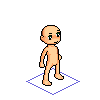
Thank you all for the input. Still trying something whit buildings, learning here and there...nothing to show actually.
Meanwhile a little iso walking animation, its a doll that will have clothes applied so I am trying to make less movement and most possible quality...head still don't work well, any ideas?  |
|
|
We fall to rise again.
|
|
|
IP Logged |
|
|
Garrett
Commander
Joined: 04 May 2008 Online Status: Offline Posts: 147 |
Posted: 15 June 2008 at 11:46am |
|
Regarding the animation, I think the whole body should follow the legs movement, so the head shouldn't move like a pidgeon but make his torso, and with that everything that is joined to, up and down.
|
|
|
You'll hear your steps making no noise
|
|
|
IP Logged |
|
|
Sabata
Commander
Joined: 08 July 2007 Online Status: Offline Posts: 128 |
Posted: 16 June 2008 at 2:01pm |
|
Originally posted by Garrett Regarding the animation, I think the whole body should follow the legs movement, so the head shouldn't move like a pidgeon but make his torso, and with that everything that is joined to, up and down.  pidgeon.... pidgeon....Try on body turn...just head up and down  body and head   
|
|
|
We fall to rise again.
|
|
|
IP Logged |
|
|
BlackDragon
Commander
Joined: 13 May 2014 Location: United States Online Status: Offline Posts: 729 |
Posted: 16 June 2008 at 3:15pm |
|
Cool base! I love the walk animation.
The head bob is too exagerated IMO.
|
|
|
IP Logged |
|
|
Metaru
Commander
Joined: 28 December 2025 Online Status: Offline Posts: 3305 |
Posted: 16 June 2008 at 11:16pm |
|
the legs looks promising, but the head and torso should move together, 1 or 2px max.
and you should ditch that head movement, imo. looks like he had a coil for a neck. |
|
|
I ate leel's babies
|
|
|
IP Logged |
|
|
Omegavolt
Commander
Joined: 03 March 2005 Location: United States Online Status: Offline Posts: 227 |
Posted: 18 June 2008 at 11:04pm |
|
The head bob youre giving him is actually representative of the movement in the upper body caused by the legs coming together and spreading apart while walking. What that means is the torso should be 'bobbing' the same distance up and down as the head as it walks.
Also, you've drawn everything isometric, except the shoulders and mouth. :(
|
|
|
IP Logged |
|
|
Silence
Seaman 
Joined: 29 March 2008 Location: Australia Online Status: Offline Posts: 7 |
Posted: 19 June 2008 at 12:54am |
|
I don't really have any crits but I think what's happening so far looks great : ) I can't wait to see how this turns out.
|
|
|
IP Logged |
|
|
Sabata
Commander
Joined: 08 July 2007 Online Status: Offline Posts: 128 |
Posted: 24 June 2008 at 9:12am |
|
I can finally see what do you mean by head and body movement
 Omegavolt mouth is changeable, can place different there..as for shoulders I kinnda thought its nice and made it so, maybe not everyone will like it  Well time for north side....any help on this?  PS:Fixed head size. |
|
|
We fall to rise again.
|
|
|
IP Logged |
|
|
Metaru
Commander
Joined: 28 December 2025 Online Status: Offline Posts: 3305 |
Posted: 24 June 2008 at 7:03pm |
|
mouth is fine, since the mouth is suposed to be somwhow... 'happy' -or expresive-. a broke iso line there would look somehow... broke.
I know that doesnt make much sense. but it does. |
|
|
I ate leel's babies
|
|
|
IP Logged |
|
|
Sabata
Commander
Joined: 08 July 2007 Online Status: Offline Posts: 128 |
Posted: 28 June 2008 at 2:47pm |
|
Originally posted by Metaru mouth is fine, since the mouth is suposed to be somwhow... 'happy' -or expresive-. a broke iso line there would look somehow... broke. I know that doesnt make much sense. but it does. You know, I actually understand what you mean. Now ne/nw is much more harder took me whole day of revising to reach m likeness.... Any crits? on this one?  Edited by Sabata - 28 June 2008 at 2:47pm |
|
|
We fall to rise again.
|
|
|
IP Logged |
|
|
Sabata
Commander
Joined: 08 July 2007 Online Status: Offline Posts: 128 |
Posted: 07 August 2008 at 9:21am |
|
Here is something I've been working on... there is clearly some non pixel art, like backgrounds... but post of it is pixel made.
Its a user interface... some things are missing (like page count on upper window...just got tiered of placing same thing...) Well give you comments. 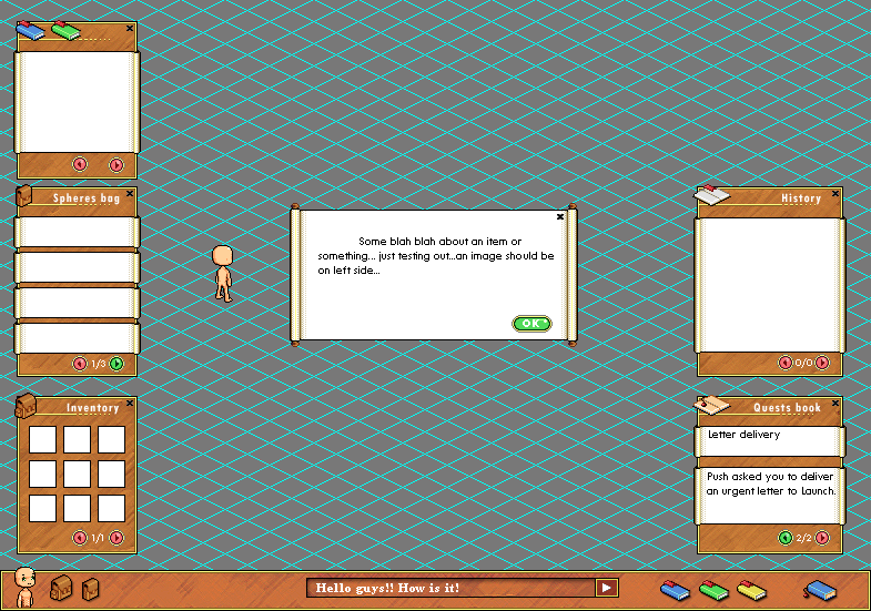 PS: Image not to be shared. |
|
|
We fall to rise again.
|
|
|
IP Logged |
|
|
jalonso
Admiral 
Joined: 29 November 2022 Online Status: Offline Posts: 13537 |
Posted: 09 August 2008 at 7:11pm |
|
I will offer a word of wisdom for you about iso work.
When you make stuff that has to be combined with other stuff the corners MUST always be a 2-2 line in the edge/corners. I see you have used 3-1 and even 4-1. This can be trouble ;) |
|
|
|
|
|
IP Logged |
|
|
Sabata
Commander
Joined: 08 July 2007 Online Status: Offline Posts: 128 |
Posted: 11 August 2008 at 10:02am |
|
Originally posted by jalonso I will offer a word of wisdom for you about iso work. When you make stuff that has to be combined with other stuff the corners MUST always be a 2-2 line in the edge/corners. I see you have used 3-1 and even 4-1. This can be trouble ;) To what exactly are you referring? Lately I am having problems on deciding how to start all iso... should I start whit 3 pixels on middle and continue 2:1 rate... or should I follow all in 2:1 rate... don't know if get the idea... By starting whit 3 pixels middle line would look better but this would make me change my whole tiles grid....  Further advice? |
|
|
We fall to rise again.
|
|
|
IP Logged |
|
|
jalonso
Admiral
Joined: 29 November 2022 Online Status: Offline Posts: 13537 |
Posted: 11 August 2008 at 11:43am |
|
Well, I say its always best to use 2:1 corners whenever there is the slightest chance that you will need to combine stuff. The 3:1 is, to me, only for isolated iso work never to be used with other items.
On your layout piece with the light blue grid you have 2:1 corners so by making 3:1 corners you'll never match. Its just a safe thing to do for the most part. I understand that 3:1 corners seem like the better choice but if you look at my iso stuff I never use 3:1 and it doesn't make things off, I find. I will within items alter to 3:1 for centered towers and other details but I remain with overall 2:1. The other benefit to 2:1 is that in future iso work you can reuse item already made with modifications to create new stuff. This makes the work faster. I actually save everything as lineart in library files for later reuse. Anyhoo, just advice you are going good. |
|
|
|
|
|
IP Logged |
|
|
Sabata
Commander
Joined: 08 July 2007 Online Status: Offline Posts: 128 |
Posted: 27 August 2008 at 7:58am |
|
Let me start by thanking Jalonso for the advice...
And now, I've been working on remaking the face of my avatar and came up whit a thing "I" consider better... the only thing I totally dislike the walking animation... actually its almost the same, only change is face, but still I don't like it...is it the ears, eyes or my head spinning from working on it so much?  |
|
|
We fall to rise again.
|
|
|
IP Logged |
|
|
Sabata
Commander
Joined: 08 July 2007 Online Status: Offline Posts: 128 |
Posted: 11 October 2008 at 6:01am |
|
And so I am back...
Finally fixed my walking animation but something still was wrong whit base.... I guess I wanted something more "perfect" in my point of view, so I've made changes on lightning, now its supposed to be up front this way when mirroring highlights should be always ok... an changed body form too, thats where I need advice, do you think that new hands disposition is better? Top row: Eyes are aligned by 2 pix tall difference. Bottom row: Eyes are aligned by 1 pix difference. This is another problem of mine, it looks like all body has 2 pix difference soo eyes should too no?? But I am not sure I like it that way. 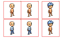 And for those wondering my little guys evolution...from first to last. 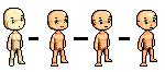 |
|
|
We fall to rise again.
|
|
|
IP Logged |
|
|
Fatalis67
Midshipman 
Joined: 08 August 2008 Online Status: Offline Posts: 80 |
Posted: 12 October 2008 at 10:37am |
|
This guy looks too much like a baby imo
|
|
|
IP Logged |
|
|
Souly
Commander
Joined: 13 December 2020 Online Status: Offline Posts: 2451 |
Posted: 12 October 2008 at 11:00am |
|
I already messaged you about this.
May as well crit it. Alright, head is WAY too huge in comparison to body. Neck is tiny. I actually think the lines aren't too bad, his left arm is f**ked though. Wtf, is going on with his stomach and crotch? They seems to fuze. Edited by Souly - 12 October 2008 at 10:59am |
|

I am the jesus of PJ. |
|
|
IP Logged |
|
|
Sabata
Commander
Joined: 08 July 2007 Online Status: Offline Posts: 128 |
Posted: 13 October 2008 at 11:42am |
|
So umm, I want a chibi look whit my base, so here what I got so far...
 C&C plz Thanks for your help Souly |
|
|
We fall to rise again.
|
|
|
IP Logged |
|
| |
||
Forum Jump |
You cannot post new topics in this forum You cannot reply to topics in this forum You cannot delete your posts in this forum You cannot edit your posts in this forum You cannot create polls in this forum You cannot vote in polls in this forum |
|
