| Active TopicsSearchRegisterLogin |
| Resources and Support | |
| |
  |
| Author | Message |
|
Indrik
Seaman 
Joined: 03 March 2011 Online Status: Offline Posts: 24 |
  Topic: Palette Color Selection Topic: Palette Color SelectionPosted: 24 April 2011 at 1:22pm |
|
Is there any rhyme or reason to the distances between values that are chosen in a palette? Or do most people just go with what looks good? I ask because when observing some palettes in images, the colors in the color ramp have a very mechanical, seemingly automatic distance from one color to another when I see their locations in the color field. I'm not really certain how to calculate those value differences, so I always try to eyeball an equal decrease in SB info, but it sometimes results in a lower-quality palette than those images which seem to have computer-calculated info. Is it just a matter of decreasing the S & B % an equal amount while keeping the Hue the same if I want a cohesive decrease? |
|
 IP Logged IP Logged |
|
|
tanuki
Commander 
Joined: 01 April 2014 Online Status: Offline Posts: 333 |
Posted: 24 April 2011 at 4:39pm |
|
There's a lot of different ways of doing it. Sometimes I'll manually select each color in a ramp, but more often I do something like this-

I manually selected the yellow and the blue by typing in the RGB values for them. That blue is actually one of my favorites, RGB-(128, 128, 255). I colored the left square yellow and all the rest of it blue. I then changed my brush opacity to 75% with the yellow active and colored over the 2nd from the left square. I then went to 50% for the middle one and 25% for the 4th square. It's now an even blend, or close enough. I would then use this palette to make whatever pixel art I'm making. At the end I might decide to manually adjust some of the colors. Take my current avatar for example. I don't think there's a single color on it that I didn't manually adjust at the end. Sometimes these adjustments take the form of selecting all pixels with a certain color, making a new layer, and filling that layer with a new color. Then I'll adjust the layer opacity so it mixes that new color with whatever was there before, until I find a good balance. There's a ton of other ways of doing all of this though. Also, the HSB color model is great in some ways but a little messed up in others. Really, saturation shouldn't affect value, but in HSB it does. Here's something I made not long ago- 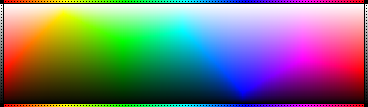
Notice that jagged line going from left to right? That shouldn't be there. In HSB it is, because of how color is calculated. Above that line value, "B", is 100% and saturation decreases as you go up. Below that line saturation is a near constant 99% and value decreases as you go down. Now it's not impossible that I didn't make it exactly right, so I'll check it later to make sure. I don't have time for it right now though. Actually I'm fairly sure that it's not completely perfect. I'll try to get a better version made later. Edited by tanuki - 24 April 2011 at 4:54pm |
|
|
IP Logged |
|
|
Indrik
Seaman
Joined: 03 March 2011 Online Status: Offline Posts: 24 |
Posted: 24 April 2011 at 7:02pm |
|
Thanks Tanuki. I've been doing that as a shortcut for a long time now, but was wondering if there was a better way.
I most frequently have only three values to worry about, and sometimes when I need a 4th or 5th, I have to tack something on to the end. That's when I usually need to eyeball it. I can also splash black/white on the color at a certain opacity, but I don't always know what % is best. I feel like HSB is hard to understand well. I can't figure out how to manipulate the numbers in a simple way. Even between your Ramp, it goes from top-right in the field, to further down-left, then again, then reverses as you go back to the blue shades. I don't understand WHY it behaves like that. It looks erratic. Averaging percentages doesn't work though. At all. I'd imagine that means the jagged line is accurate, since averaging percentages in HSB variables would intuitively work if the color field used a straight line. |
|
|
IP Logged |
|
|
tanuki
Commander
Joined: 01 April 2014 Online Status: Offline Posts: 333 |
Posted: 24 April 2011 at 7:34pm |
|
Recently I was playing with adobe illustrator's "blend" feature that makes blended averages between two things by a chosen number of steps. Here's one of the palettes I made-
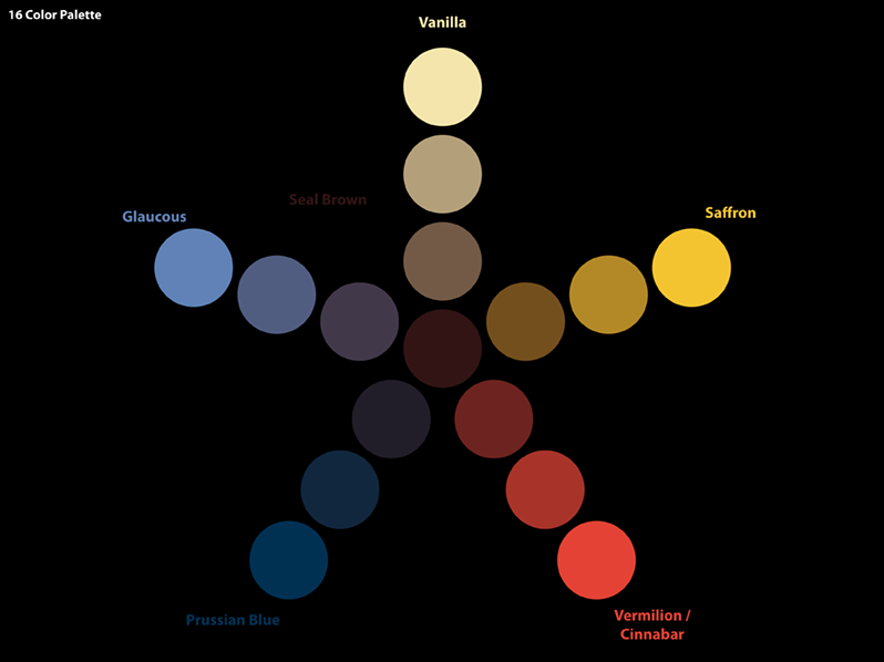
All of the named colors, the middle one and the ones at the ends of each branch, were chosen from this list of colors. I liked this because with 6 main colors I could make 10 ramps that were all related. |
|
|
IP Logged |
|
|
neota
Commander
Joined: 27 November 2018 Online Status: Offline Posts: 158 |
Posted: 28 April 2011 at 6:11am |
|
Originally posted by Indrik Thanks Tanuki. I've been doing that as a shortcut for a long time now, but was wondering if there was a better way. Something like gpick includes 'color mixer' which can make those blends for you. Dedicated pixel art progs have the facility to quickly make those blends, too. I most frequently have only three values to worry about, and sometimes when I need a 4th or 5th, I have to tack something on to the end. That's when I usually need to eyeball it. I can also splash black/white on the color at a certain opacity, but I don't always know what % is best. I feel like HSB is hard to understand well. I can't figure out how to manipulate the numbers in a simple way. Even between your Ramp, it goes from top-right in the field, to further down-left, then again, then reverses as you go back to the blue shades. I don't understand WHY it behaves like that. It looks erratic. Averaging percentages doesn't work though. At all. HSB, HSV, HSL and friends are write-offs, as far as any kind of image adjustment, IMO. see the discussion at http://en.wikipedia.org/wiki/HSV_color_space, culminating in HSB and HLS were developed to specify numerical Hue, Saturation and Brightness (or Hue, Lightness and Saturation) in an age when users had to specify colors numerically. The usual formulations of HSB and HLS are flawed with respect to the properties of color vision. Now that users can choose colors visually, or choose colors related to other media (such as PANTONE), or use perceptually-based systems like L*u*v* and L*a*b*, HSB and HLS should be abandoned LAB or LCH are generally much more reliable bets. Your recoloring thing should be able to apply color readily by multiplying the greymap L with the color L, then setting the greymap A and B to the same values as the color A and B. Edited by neota - 28 April 2011 at 6:14am |
|
|
absolutely.
|
|
|
IP Logged |
|
|
yrizoud
Commander
Joined: 03 May 2021 Location: France Online Status: Offline Posts: 343 |
Posted: 28 April 2011 at 7:15am |
|
tanuki: If you used a program that works in indexed colors, it would be much more user-friendly, with Palette changes applied on the image in real-time.
|
|
|
IP Logged |
|
|
Indrik
Seaman
Joined: 03 March 2011 Online Status: Offline Posts: 24 |
Posted: 28 April 2011 at 9:38am |
|
Can you index color associations? As in, If I have an object with three values for shading, could I index its bright blue primary color in the menu, and have the remaining two items switch to a complementary shade of my choosing?
I know regular indexed colors handle colors one at a time, but I was wondering if there's a way to code it to say, if <color> changes, change <color 2> & <color 3> to these colors. |
|
|
IP Logged |
|
|
neota
Commander
Joined: 27 November 2018 Online Status: Offline Posts: 158 |
Posted: 28 April 2011 at 9:19pm |
|
It sounds like your ideas about what indexed colour is are a bit vague. I suggest investigating the wikipedia 'indexed color' article.
I'm also getting the impression that you have the idea that it's possible to invade other people's software with your code and alter the behaviour. If that is the case: generally, that is not the situation. Although if you were using GIMP, it would be pretty straightforward to make a plugin which does the adjustments you want .. as for associating different color indices, you could do that by laying out your palette in a specific way. Like this, for example: the first 8 colors for one group (this could include unused slots, which would be black), the second 8 colors for the next group, and so on. Then your program would just adjust the L,A,B values of the whole set of 8 at once. |
|
|
absolutely.
|
|
|
IP Logged |
|
|
Indrik
Seaman
Joined: 03 March 2011 Online Status: Offline Posts: 24 |
Posted: 28 April 2011 at 9:29pm |
|
No, I understand it. I've played with tile programs before.
I'm not trying to modify a program, I'm thinking of alternatives to accomplish a goal if I try to code something myself. So, you couldn't make a box with an arbitrary color as a visual cue for the user, but code it so that clicking it performs 3 different indice changes that are simply invisible? It'd be like having 3 indices laid on top of each other in a stack, but only seeing one when you press it. |
|
|
IP Logged |
|
|
neota
Commander
Joined: 27 November 2018 Online Status: Offline Posts: 158 |
Posted: 28 April 2011 at 9:47pm |
|
Originally posted by Indrik No, I understand it. I've played with tile programs before. I'm not trying to modify a program, I'm thinking of alternatives to accomplish a goal if I try to code something myself. So, you couldn't make a box with an arbitrary color as a visual cue for the user, but code it so that clicking it performs 3 different indice changes that are simply invisible? It'd be like having 3 indices laid on top of each other in a stack, but only seeing one when you press it. You could (the limit of what you can program is exactly 'any deterministic process', which resolves to 'any process at all' -- Turing and others provided scientific proof of this. With the further constraint 'anything you can actually conceptualize in full'). I suspect you don't mean 'arbitrary' as an arbitrary color wouldn't be a visual cue at all. I suspect you want to calculate a representative color based off of the colors in the set, and then normalize your color values relative to that before performing any color adjustment. Your ability to actually code that is primarily dependent on your own ability to conceptualize it in detail. |
|
|
absolutely.
|
|
|
IP Logged |
|
|
DawnBringer
Commander
Joined: 11 August 2024 Online Status: Offline Posts: 568 |
Posted: 29 April 2011 at 6:10am |
|
Not quite sure what it is you ppl want here, but it got me thinking about color-ramps again. Figured I could write a Grafx2 script that would create a color-ramp between two colors in the palette that's a Bezier-curve along a third hypothetical color. (and some other curves and options later).
Here my interactive 3D-palette script displays a ramp generated between Red & Blue along White.  Edited by DawnBringer - 29 April 2011 at 7:35am |
|
|
IP Logged |
|
|
Indrik
Seaman
Joined: 03 March 2011 Online Status: Offline Posts: 24 |
Posted: 29 April 2011 at 10:28am |
|
Neat. How'd you manage that?
And neota, yes, I did mean representative. |
|
|
IP Logged |
|
|
DawnBringer
Commander
Joined: 11 August 2024 Online Status: Offline Posts: 568 |
Posted: 03 May 2011 at 2:37am |
|
Well, worked some more on the script. Had to hammer out some logic and maths about splines & curves. Also adjusted things so colors are evenly spaced over the entire curve.
 So, are curved ramps superior to simple straight lines...not sure yet, but don't they look sexy? :D |
|
|
IP Logged |
|
|
neota
Commander
Joined: 27 November 2018 Online Status: Offline Posts: 158 |
Posted: 03 May 2011 at 3:31am |
|
I think a straight line, but in LAB colorspace, is better
(just easier to think about, and more consistent/uniformly nice looking) Implementing LAB support is possible but non-trivial in Lua (the non-trivial part being matrix application) |
|
|
absolutely.
|
|
|
IP Logged |
|
|
DawnBringer
Commander
Joined: 11 August 2024 Online Status: Offline Posts: 568 |
Posted: 03 May 2011 at 4:06am |
|
Well, if dealing with a 3-point dataset why would two straight lines be better than a curve in computer-gfx/art when it's not in most aspects of maths, logic & nature? After 30 years of ugly straight-ramping in computer-gfx I thought it could be nice to try something new!
I can, and usually do, adjust for true perceptual colordistances but kept everything at uniform RGB for easy evaluation, so far. |
|
|
IP Logged |
|
|
neota
Commander
Joined: 27 November 2018 Online Status: Offline Posts: 158 |
Posted: 03 May 2011 at 4:30am |
|
Oh, that's what you meant. I confess I've only tried splines for larger gradients, like say 16 slots with 5 colors filled in + cubic splines (I think you are doing conic splines here). It works great there, although, I was never able to overcome the issues near the edges of the curve to my satisfaction.
Eventually I concluded that, with a linear LAB gradient as a base, it was just easier to tweak the colors. So from my PoV, how useful this is gonna be depends on how easy it is to use. It has to be REALLY EASY to beat the simplicity of plain gradient+tweak, especially for works with a small palette. |
|
|
absolutely.
|
|
|
IP Logged |
|
| |
||
Forum Jump |
You cannot post new topics in this forum You cannot reply to topics in this forum You cannot delete your posts in this forum You cannot edit your posts in this forum You cannot create polls in this forum You cannot vote in polls in this forum |
|
