| Active TopicsSearchRegisterLogin |
| WIP (Work In Progress) | |
| |
  |
| Author | Message |
|
drfractal
Seaman 
Joined: 16 December 2011 Online Status: Offline Posts: 3 |
  Topic: [WIP] my guy feels wrong please help Topic: [WIP] my guy feels wrong please helpPosted: 16 December 2011 at 2:57pm |
|
Hello everybody, I am quite new to the fantastic site of PJ (less than 2 months that i started to visit it regularly) and as well new for pixel art.
I am mainly a Program Designer and lately (about 2 years ;) i started few times some exercises on making a game out of ideas i got. Ah the most hard part for me is the little time i got to develop them to at least an alpha stage and of course my lack on graphic skills. Not that i dont like to draw my own stuff but really sometimes i get stuck on my work and i ask myself how i can improve this or that.... So here it is my little guy that i want to put in my last attempt to make a flash (2d sidescrolling) game: 
It is just a sketch and also one of my first real attempts to make a pixelled character. 
The static position it is not very relevant cause i will take arms, legs and head out and make some different sprites for the various positions i will need ( am i wrong for this as well?). But i feel that even the shape of my character is not that armonious, please keep in mind that i dont want a perfect proportioned real human body, i really like the modern style of characters that have big heads and a childish overall look. Please any one can give some suggestion, critics or anything else to help me improve? Thanks a lot. I am sorry if my english is not that good, i am italian and i live in Paris (France). Happy christmas  to all to all
|
|
 IP Logged IP Logged |
|
|
saji82NO
Seaman
Joined: 12 December 2011 Online Status: Offline Posts: 13 |
Posted: 16 December 2011 at 10:11pm |
|
Ah dang too bad I only speak a little Spanish. Your English is better than most Americans.
Anyways, I'm new to pixeling too (excluding the time when I was a kid and all we had available was MS Paint). I'll avoid any pixeling advice and stick to getting the character looking less... awkward? What I see is an adult trapped in a childs body. I think for such a caricature the detail is too "realistic" if you catch my drift? He has exaggerated proportions but pseudo lifelike features; eyes, nose, mouth, ears, and feet. Ultimately those things combined are probably whats making him look "wrong". Never mind the fact that he has no eyebrows which are big time indicators of emotion and state of mind. I say try and redraw some of the facial features from a more minimalistic approach. suggest the mouth, imply the ears, round out the eyes, etc. 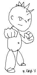 Try those proportions. Try those proportions.Edited by saji82NO - 16 December 2011 at 10:22pm |
|
|
IP Logged |
|
|
drfractal
Seaman
Joined: 16 December 2011 Online Status: Offline Posts: 3 |
Posted: 17 December 2011 at 2:18am |
|
Tnx for the advice, i will try as you suggested:
And for the eyebrows you're right i didn't draw them at all cause i wanted to make those as well a moving part based on character actions, still maybe a basic one is better to put on just to have a better feeling on the whole thing, thanks again. |
|
|
IP Logged |
|
|
tanuki
Commander 
Joined: 01 April 2014 Online Status: Offline Posts: 333 |
Posted: 17 December 2011 at 6:04pm |
|
Consider making this character much smaller. Many people new to pixel art start drawing things very large, but one of the strengths of pixel art is to make things small but still be detailed and understandable.
In pixel art each individual pixel is important and is given attention by the artist, but the larger something is then the less important each pixel is and the harder it is to give enough thought and care for each one. I think a good size would be if the top of his head was the same height as where the top of his shorts currently are. Edited by tanuki - 17 December 2011 at 6:04pm |
|
|
IP Logged |
|
|
drfractal
Seaman
Joined: 16 December 2011 Online Status: Offline Posts: 3 |
Posted: 18 December 2011 at 9:31am |
|
Ok i am starting to get where i am failing, fisrst the pose it was too static and then i am still far to be able to render in pixels a shape in the good form... so WIP WIP WIP for a bit more just to get better in rendering at this small resolution....
Some sketches to see if i get to the right point... 
I would have made the guy double this size but for now i keep the suggestion from tanuki, it will help me to make an effort to think in very small proportion and shades. Once again, comments please? Edited by drfractal - 18 December 2011 at 9:33am |
|
|
IP Logged |
|
| |
||
Forum Jump |
You cannot post new topics in this forum You cannot reply to topics in this forum You cannot delete your posts in this forum You cannot edit your posts in this forum You cannot create polls in this forum You cannot vote in polls in this forum |
|
