| Active TopicsSearchRegisterLogin |
| WIP (Work In Progress) | |
| |
  |
| Author | Message |
|
xxmantisxx
Commander 
Joined: 03 August 2019 Online Status: Offline Posts: 191 |
  Topic: Ninja - Work in Progress Topic: Ninja - Work in ProgressPosted: 14 August 2012 at 5:45pm |
|
Why do people always name their titles "work in progress"? What ELSE would you put into this section of the forum?

So, I've never really had to shade anything with so many folds and creases. Advice? |
|
 IP Logged IP Logged |
|
|
H|F
Commander
Joined: 14 March 2020 Online Status: Offline Posts: 363 |
Posted: 14 August 2012 at 7:06pm |
|
I believe the pants would look more ninja is they were tight after the knee. Also tight around the forearm like a gauntlets length.
|
|
|
IP Logged |
|
|
xxmantisxx
Commander
Joined: 03 August 2019 Online Status: Offline Posts: 191 |
Posted: 15 August 2012 at 5:09pm |
|
Ah, thank you kindly.

Is this any better? |
|
|
IP Logged |
|
|
H|F
Commander
Joined: 14 March 2020 Online Status: Offline Posts: 363 |
Posted: 16 August 2012 at 6:04am |
|
Maybe to make it more action looking, try to have the katana.... Or sword (know he isn't samurai) pointing more downward/straight rather then up.
|
|
|
IP Logged |
|
|
Yuran
Commander
Joined: 10 November 2024 Online Status: Offline Posts: 329 |
Posted: 16 August 2012 at 6:44am |
|
I can not understand where the light source
|
|
|
IP Logged |
|
|
jalonso
Admiral 
Joined: 29 November 2022 Online Status: Offline Posts: 13537 |
Posted: 16 August 2012 at 6:49am |
|
Originally posted by xxmantisxx Why do people always name their titles "work in progress"? What ELSE would you put into this section of the forum? NPA  Originally posted by xxmantisxx
So, I've never really had to shade anything with so many folds and creases. Advice? I would go with strong contrast/lighting with a piece this small to convey the texture of folds and creases. |
|
|
|
|
|
IP Logged |
|
|
-
Commander
Joined: 12 May 2025 Online Status: Offline Posts: 120 |
Posted: 16 August 2012 at 10:14am |
|
Is that a flare on the top of the sword? Cause I think it needs to be longer with sharp edges like this one.

|
|
|
IP Logged |
|
|
Yuran
Commander
Joined: 10 November 2024 Online Status: Offline Posts: 329 |
Posted: 16 August 2012 at 12:36pm |
|
|
|
IP Logged |
|
|
H|F
Commander
Joined: 14 March 2020 Online Status: Offline Posts: 363 |
Posted: 16 August 2012 at 3:09pm |
|
I agree with Jal about the contrast.
I feel like his legs could use some length.... I just feel like he should be more spidery (is that a word?) and thin.
|
|
|
IP Logged |
|
|
xxmantisxx
Commander
Joined: 03 August 2019 Online Status: Offline Posts: 191 |
Posted: 16 August 2012 at 5:19pm |

@Jalonso: Non-pixel art WORK IN PROGRESSES! HAH! @H|F: I'm actually following a reference, and the sword is at that very angle. However, I agree on the "spidery" point and gave my best to fix it. @Artwark: Yeah, it's supposed to be a flare. Though honestly, I'd only added that at the last minute. I've now removed it ;) @Jalonso again: I see what you mean! However, I'm still not sure about how to light them to seem like they're actually folds. I gave it a try Yuran: First note, before posting, you should probably finish your sentence. Secondly, I tried to correct that mistake. |
|
|
IP Logged |
|
|
Night
Commander
Joined: 29 January 2024 Online Status: Offline Posts: 168 |
Posted: 17 August 2012 at 2:44am |
|
I would suggest working a bit more on his clothing, making them more like the traditional ninja clothing perhaps.
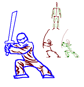
Another thing I think that you might want to move a little is his shoulder, the one visible to us, slightly more to the right. I also think that it wouldn't hurt if you would make his right hand visible, from the bottom. Here's an edit 
I added him also a shadow and made his sword somewhat curved(if it's a katana). Ah, and if you're going to keep this background colour, adding AA wouldn't hurt at all. :P edit* Oh, and as for the folds and creases, well, they wouldn't be very visible in this size, although, you can add some lines here and there to mark a fold or crease that you think would make it look better. Edited by Night - 17 August 2012 at 2:50am |
|
|
IP Logged |
|
|
Yuran
Commander
Joined: 10 November 2024 Online Status: Offline Posts: 329 |
Posted: 17 August 2012 at 3:12am |
|
Cool, but he was heavy, it is more appropriate to hand battle-ax
Edited by Yuran - 17 August 2012 at 3:13am |
|
|
IP Logged |
|
|
H|F
Commander
Joined: 14 March 2020 Online Status: Offline Posts: 363 |
Posted: 17 August 2012 at 4:54pm |
|
I agree with Night, very good edit!
Once you get everything down this will be a very cool ninja Mantis.
|
|
|
IP Logged |
|
|
xxmantisxx
Commander
Joined: 03 August 2019 Online Status: Offline Posts: 191 |
Posted: 22 August 2012 at 7:52pm |

I tried not to make it a carbon copy 
After looking at a few references, I'd realized that there was no way to make the belt noticable unless it was a bright color (just as yours is). However, I'm highly curious as why the belt is shaded the way it is (with the two colors, placed so strangely) and why I couldn't seem to make it look nice any other way. The sword. My god, the sword. Thank you, you saved me with that one, Night. And, making the folds, I think I now understand it thanks to you guys. Also, Night, the right arm WAS visible. Apparently not enough, so I've now fixed that. I've no idea why I didn't use and Selective-Outlining. That's something that I've ALWAYS used, and in this one I had left it alone 
|
|
|
IP Logged |
|
|
H|F
Commander
Joined: 14 March 2020 Online Status: Offline Posts: 363 |
Posted: 22 August 2012 at 9:07pm |
|
Only thing is that night had the knee (left) turned in, and imo that looked nice.
|
|
|
IP Logged |
|
|
xxmantisxx
Commander
Joined: 03 August 2019 Online Status: Offline Posts: 191 |
Posted: 22 August 2012 at 10:15pm |
|
Indeed. Night DID have the left knee turned in. And it did look very nice. However, I don't really see a reason to flip it, do you? I'd sorta like for it to stay like this, with the knee outward.
|
|
|
IP Logged |
|
|
Noburo
Commander
Joined: 10 June 2014 Location: United States Online Status: Offline Posts: 279 |
Posted: 23 August 2012 at 2:06pm |
|
Try standing crouched in the same position as the ninja. You'll find that your center of gravity doesn't allow you to hold as strong of a balance in that position. While you can technically stand in that pose without falling, it's a bit nonsensical for a Ninja to be intentionally standing in a weaker pose while fighting.
-Edited grammatical error. Edited by Noburo - 23 August 2012 at 2:07pm |
|
|
IP Logged |
|
|
xxmantisxx
Commander
Joined: 03 August 2019 Online Status: Offline Posts: 191 |
Posted: 23 August 2012 at 4:07pm |
|
Touche, Noburo...

You win this round... |
|
|
IP Logged |
|
|
Friend
Commander
Joined: 01 April 2015 Online Status: Offline Posts: 710 |
Posted: 24 August 2012 at 6:39am |
|
the sword looks a bit too long so that it is goofy looking.
|
|
|
IP Logged |
|
|
xxmantisxx
Commander
Joined: 03 August 2019 Online Status: Offline Posts: 191 |
Posted: 25 August 2012 at 9:45am |

Yeah, that was a good point. Better now? |
|
|
IP Logged |
|
|
Friend
Commander
Joined: 01 April 2015 Online Status: Offline Posts: 710 |
Posted: 25 August 2012 at 11:23am |
|
Yus, I think the last step is to just clean up the clusters, maybe add
more contrast and maybe work on separating certain sections with more
contrast or darker outlines like so

|
|
|
IP Logged |
|
|
xxmantisxx
Commander
Joined: 03 August 2019 Online Status: Offline Posts: 191 |
Posted: 02 September 2012 at 6:37pm |
|
I think that I'm going to post it now. Thanks everyone!
|
|
|
IP Logged |
|
| |
||
Forum Jump |
You cannot post new topics in this forum You cannot reply to topics in this forum You cannot delete your posts in this forum You cannot edit your posts in this forum You cannot create polls in this forum You cannot vote in polls in this forum |
|
