| Active TopicsSearchRegisterLogin |
| WIP (Work In Progress) | |
| |
  |
| Author | Message |
|
FauxShadow
Seaman 
Joined: 21 January 2021 Online Status: Offline Posts: 36 |
  Topic: RPG Character Topic: RPG CharacterPosted: 20 August 2013 at 7:21pm |
|
Been working on multiple pixel projects for a big project I'm working towards. This is a character I started up, I think I'm going in the right direction, I just can't figure out how to make it look much better, without really adding too much more to the palette. I'm still figuring out shading and texturing and such.
Current (3/4 standing): Edited by FauxShadow - 23 February 2014 at 5:11pm |
|
 IP Logged IP Logged |
|
|
Oriena
Midshipman 
Joined: 30 June 2013 Online Status: Offline Posts: 79 |
Posted: 20 August 2013 at 7:51pm |
|
Well, adding more colors to the palette really isn't that bad. You just don't want to make it look un-pixelly. I personally think you could use a lot more, mostly for shading purposes and smoothing out your outlines.
But anyways! I think you should round the top of the head out a bit more, it looks pretty flat at the moment. The top of the hair might be a bit too low. And again, you should add some more shading and lighting to it but it looks like the shading on your shirt is too lightly colored. Try darkening it a bit and make it less gray. And for the pants, it seems like the shading is almost a bit too harsh. Just as a start. Edited by Oriena - 20 August 2013 at 7:51pm |
|
|
IP Logged |
|
|
coolsarahkry
Midshipman
Joined: 23 June 2020 Online Status: Offline Posts: 90 |
Posted: 21 August 2013 at 8:36am |
|
You definitely need to make the outline smoother. You have a lot of jaggies. Check out this guide: http://www.pixeljoint.com/forum/forum_posts.asp?TID=11299
|
|
|
IP Logged |
|
|
FauxShadow
Seaman
Joined: 21 January 2021 Online Status: Offline Posts: 36 |
Posted: 21 August 2013 at 6:33pm |
|
I tried taking your guy's advice, and I tried shading the shirt a little better, added one more shade and changed the hue of the shades for it a bit. Also lifted the hair a little and more or less fixed some of the jaggies (I think)
 |
|
|
IP Logged |
|
|
coolsarahkry
Midshipman
Joined: 23 June 2020 Online Status: Offline Posts: 90 |
Posted: 21 August 2013 at 6:49pm |
|
Also, note that the human arm+hand goes down to about halfway down the thigh.
|
|
|
IP Logged |
|
|
FauxShadow
Seaman
Joined: 21 January 2021 Online Status: Offline Posts: 36 |
Posted: 21 August 2013 at 8:19pm |
|
Ahh yes, I tried that but at first it looked weird, I will try again though.
|
|
|
IP Logged |
|
|
FauxShadow
Seaman
Joined: 21 January 2021 Online Status: Offline Posts: 36 |
Posted: 22 August 2013 at 4:16pm |
|
Alright, changed the arms a little, lengthened them and kind of angled them a little. Also changed the shading on his shirt and neck a little. It's starting to look better I think.
 |
|
|
IP Logged |
|
|
coolsarahkry
Midshipman
Joined: 23 June 2020 Online Status: Offline Posts: 90 |
Posted: 23 August 2013 at 6:55am |
|
The arms are looking better.
It still looks messy.The outlines are jagged. You should pay attention to where your pixels make the lines look jagged and try to fix that. Try to fix the outline.Also it's weird how the boots don't have an outline on the bottom. The legs are too short also, legs should be about the same size us the entire upper body, including the head. I took a closer look at your pixel and...you shouldn't have the outline of the shirt just stop midway. Either have it or don't. The shirt is...uneven. Both sides should reach the neck at the same point and the shirt should end at the same point. The arm seems to be going through the shirt into the characters upper back. The pixels of outline by the shirt sleeves should line up with the shirt, not go under it. Where is your light source? The shirt seems to be going in a pillow shading way that I don't like. See pillow shading here:here Here is an example: 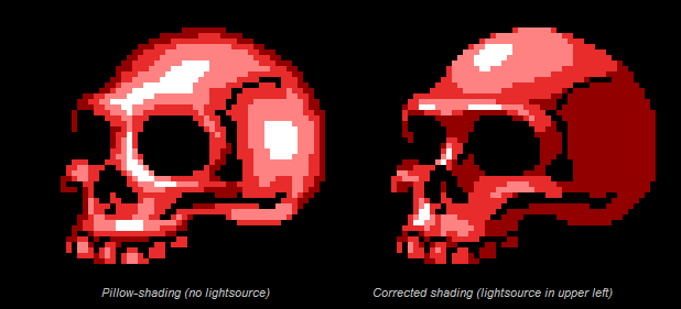
You need to choose a lightsource when you begin shading your piece and stick with it for each part. The shading for the pants is too dark and looks like a separate object. In order to fix the 'jaggies' I would delete the outline and create a new outline that is smoother, and then fill in the colors where you expanded the outline. |
|
|
IP Logged |
|
|
FauxShadow
Seaman
Joined: 21 January 2021 Online Status: Offline Posts: 36 |
Posted: 24 August 2013 at 7:31pm |
|
Okay, I took your advice about the jaggies in the outline and looked at what you meant by the shading. I went and re-did my entire outline, got rid of a lot of the shading and tried to centralized the light source, after which I will focus on shading from that. I do know the coloring on the pants is a bit odd, but I'll fix that later, right now I'm more focusing on the upper body before I do the lower body. The pants also aren't as long as the shirt because I was trying to make it so the shirt hangs down quite a bit into the legs. And the reason the shirt is uneven at the bottom is just the style of the shirt he is wearing, I wanted it to be uneven.
 |
|
|
IP Logged |
|
|
serrival
Seaman
Joined: 30 May 2025 Online Status: Offline Posts: 31 |
Posted: 25 August 2013 at 6:19am |
|
You might want to consider raising the crotch line of the pants. The legs are looking stumpy at the moment because of the way they're so small in comparison to the arms and torso, which have good proportions. If you don't want to increase the sprite size to give the legs more room, I suggest raising the line of the pants to make the legs look longer (and to help make it seem like the shirt is just long instead making it look like the entire torso is big in comparison to the legs).
|
|
|
IP Logged |
|
|
FauxShadow
Seaman
Joined: 21 January 2021 Online Status: Offline Posts: 36 |
Posted: 25 August 2013 at 11:58am |
|
Okay, I raised his crotch line a bit to make the legs longer, and also worked on shading a little more. The hair I'm still working on so I know it looks weird, having a hard time figuring out how to shade it well. I think I've established a pretty good light source though, if not please feel free to tell me.
 |
|
|
IP Logged |
|
|
Night
Commander 
Joined: 29 January 2024 Online Status: Offline Posts: 168 |
Posted: 25 August 2013 at 3:27pm |
|
The first thing you should take care of is the perspective, as of now it looks like you're looking at him directly from the front, whilst what I assume you wanted to achieve is a 3/4 perspective.
As for the lighting source, you've still got a problem, well, not necessarily a problem, but it could hurt the overall aesthetics of the graphics, or just make your work harder 
The problem being is that the light source is coming from a diagonal angle, from the side, the problem with that is if you made a profile image of the character (let's say even the walking animation from the side) the light source would move to the other end of the spectrum if you flipped it, which, would require you too make another sprite just so that the light source would fit with everything. Fixing this would be very easy though, simply by making the light source from the top. On a lesser note, the what I am going to assume is a pauldron (or whatever its called), needs to be attached to something, currently it looks as if it's just laying on his shoulder and could fall in any second. Furthermore, the scabbard on his back should be attached to a sword belt; it looks like it's either flying, or attached to his shirt right now. Edited by Night - 25 August 2013 at 3:30pm |
|
|
IP Logged |
|
|
FauxShadow
Seaman
Joined: 21 January 2021 Online Status: Offline Posts: 36 |
Posted: 25 August 2013 at 3:32pm |
|
Actually, this is a profile look at him. I will be making 3/4 perspectives later. I want to make profile views of every character though. It's extra work but I have a plan for all of it. I do plan on adding those finer details you pointed out.
Thank you for the tips and I will take into consideration what you said. |
|
|
IP Logged |
|
|
Night
Commander
Joined: 29 January 2024 Online Status: Offline Posts: 168 |
Posted: 25 August 2013 at 3:34pm |
|
By "profile" I meant side view.
And sure, no problem. :) |
|
|
IP Logged |
|
|
FauxShadow
Seaman
Joined: 21 January 2021 Online Status: Offline Posts: 36 |
Posted: 25 August 2013 at 7:43pm |
|
Okay, not a lot of major work done, but I did sort of add another piece to the pauldron which I am trying to work into making it sort of latched onto the shirt, having a hard time figuring it out though. I also added a basic belt which in the back is attached to the sword to hold it in place. Also touched up on shading a bit more and I'm starting to like how it looks.
 |
|
|
IP Logged |
|
|
Night
Commander
Joined: 29 January 2024 Online Status: Offline Posts: 168 |
Posted: 25 August 2013 at 11:42pm |
|
I think that the belt would work better if it were to go from the shoulder to the waist, sort of like a seat belt (considering that the scabbard is on his back and not on the side of his waist).
You should also make his legs more straight, they look jagged right now and thus unnatural. At this level, "pixel level" if you will, you don't have much room to focus on every muscle and give it its own individual pixel, the same goes for all those finer details on the cloth, hair, etc.; so you have to make it the best of your space. |
|
|
IP Logged |
|
|
FauxShadow
Seaman
Joined: 21 January 2021 Online Status: Offline Posts: 36 |
Posted: 26 August 2013 at 1:34pm |
|
I fixed up the belt so it's from shoulder to hip/side, forgot to fix up the legs but that won't take long to do so I can get to it later. The pauldron is attached to the belt which also latches around the back and holds the sword in place. I think this character is starting to look like something now.
 |
|
|
IP Logged |
|
|
Night
Commander
Joined: 29 January 2024 Online Status: Offline Posts: 168 |
Posted: 27 August 2013 at 7:58am |
|
I would suggest to lower the belt down to around the hips.
|
|
|
IP Logged |
|
|
coolsarahkry
Midshipman
Joined: 23 June 2020 Online Status: Offline Posts: 90 |
Posted: 27 August 2013 at 8:07am |
|
Nice job, the outline is greatly improved.
|
|
|
IP Logged |
|
|
FauxShadow
Seaman
Joined: 21 January 2021 Online Status: Offline Posts: 36 |
Posted: 27 August 2013 at 5:27pm |
|
I will work on lowering the belt, any other tips? I think he's just about finished so I want to hear any other ideas or tips people might have before I finish him off.
|
|
|
IP Logged |
|
|
serrival
Seaman
Joined: 30 May 2025 Online Status: Offline Posts: 31 |
Posted: 27 August 2013 at 7:48pm |
|
Good job on the improvements, Faux! He's looking better.
The black lines have been bothering me a bit. Maybe consider changing the mouth to one of the browns, like the darker tan color of his skin. Same for the dots on his hands. For the detail lines in the armor and in the boots, you can also consider replacing the black with a darker grey so that the lines aren't as harsh. |
|
|
IP Logged |
|
|
FauxShadow
Seaman
Joined: 21 January 2021 Online Status: Offline Posts: 36 |
Posted: 27 August 2013 at 8:17pm |
|
Originally posted by serrival Good job on the improvements, Faux! He's looking better. The black lines have been bothering me a bit. Maybe consider changing the mouth to one of the browns, like the darker tan color of his skin. Same for the dots on his hands. For the detail lines in the armor and in the boots, you can also consider replacing the black with a darker grey so that the lines aren't as harsh. Thank you :) I adjusted the belt so it hands lower, and changed the black detail lines and mouth into more agreeable colors. I think it looks good. I'm going to say he is done, unless anyone has any ideas on how to add more to him, or improve him just a little. 
|
|
|
IP Logged |
|
|
FauxShadow
Seaman
Joined: 21 January 2021 Online Status: Offline Posts: 36 |
Posted: 28 August 2013 at 8:10pm |
|
Okay, I realized I never went and fixed up his legs so they aren't bent in a weird way. So I just went and straightened them completely, also did minor changes on the pauldron and the boots, added some extra color to them, just to make them more unique. I used colors I already had, didn't see a reason to add another color for such a minor thing. Also made the boots smaller as they seemed kind of weird looking when I straightened legs, but I think it looks good.
 |
|
|
IP Logged |
|
|
serrival
Seaman
Joined: 30 May 2025 Online Status: Offline Posts: 31 |
Posted: 28 August 2013 at 9:52pm |
|
Good choice of edits! He's looking rather confident now.
|
|
|
IP Logged |
|
|
Crudus
Seaman
Joined: 25 August 2013 Online Status: Offline Posts: 9 |
Posted: 29 August 2013 at 2:50am |
|
First off, this has really improved since you started! The only thing that still looks a bit strange to me are the eyes. I might try moving them down a pixel and see how that looks. Also, the pure white just seems a bit too bright... especially against the shadow of the hair.
|
|
|
IP Logged |
|
|
FauxShadow
Seaman
Joined: 21 January 2021 Online Status: Offline Posts: 36 |
Posted: 30 August 2013 at 10:19pm |
|
I changed the color of the eyes slightly, so the white is a little bit darker, but not too much where it doesn't look white. Also lowered them but I don't know if I like it or not, and now I'm wanting to make a 3/4 perspective version of him, but I'm not sure how to start it.
 |
|
|
IP Logged |
|
|
FauxShadow
Seaman
Joined: 21 January 2021 Online Status: Offline Posts: 36 |
Posted: 31 August 2013 at 6:28pm |
|
Well I attempted a more 3/4 look, I don't know if it's going in the right direction or not. The arms are more or less copied, I will tweak them, just trying to get the perspective right first.
 |
|
|
IP Logged |
|
|
FauxShadow
Seaman
Joined: 21 January 2021 Online Status: Offline Posts: 36 |
Posted: 01 September 2013 at 4:04pm |
|
Yeah I'm stuck from here. I just don't know how to make it look better while keeping it from being a front view of him.
|
|
|
IP Logged |
|
|
FauxShadow
Seaman
Joined: 21 January 2021 Online Status: Offline Posts: 36 |
Posted: 01 September 2013 at 8:22pm |
|
Tried to make it a little better, added his sword!! Changed the shading slightly, it looks a little 3/4 but I'm trying to make it more accurate and realistic.
 |
|
|
IP Logged |
|
|
Samiboula
Seaman
Joined: 22 May 2013 Online Status: Offline Posts: 9 |
Posted: 02 September 2013 at 1:22pm |
|
You're definitely heading in the right direction! The arms seem wrong, they stick out too much. They should be a lot straighter to look more natural. The hands are also off, if you look at someone's hands when they're stood straight they're more of a side view than the front view that you have now. The legs seem bent as if he's squatting, although I think the shading is to blame for this. Try and make the lighter shade not stretch so far down his legs. Good luck!
|
|
|
IP Logged |
|
|
FauxShadow
Seaman
Joined: 21 January 2021 Online Status: Offline Posts: 36 |
Posted: 02 September 2013 at 3:04pm |
|
I was worried it wasn't looking right, well I know the arms are off, those are just copied from my front-view just to place the rest of the body. I know they need worked on which isn't a problem, I'm just trying to get the overall body looking right, then I'll tweak the minor things. Thank you so much though.
|
|
|
IP Logged |
|
|
Oriena
Midshipman
Joined: 30 June 2013 Online Status: Offline Posts: 79 |
Posted: 02 September 2013 at 7:38pm |
|
Hmm the shoulders look too broad.
|
|
|
IP Logged |
|
|
FauxShadow
Seaman
Joined: 21 January 2021 Online Status: Offline Posts: 36 |
Posted: 03 September 2013 at 7:51pm |
|
Thank you for the tips, I adjusted the arms, brought them in a bit and also adjusted the shoulder's a little, hopefully they aren't as broad, also did edits to the shadows a bit to make it look more real. Better or worse?
 |
|
|
IP Logged |
|
|
serrival
Seaman
Joined: 30 May 2025 Online Status: Offline Posts: 31 |
Posted: 03 September 2013 at 9:22pm |
|
I see you're working hard! The new shadows do look nice, in my opinion. Here are some suggestions, though they might not work out. It's up to you if you want to use them.
Maybe move the head a few pixels down and also add more shading to the bottom of the arms, like how you did the legs. That will give more of a sense that you're looking down at him from above (which is what I think you're trying to do?). Also, make the hair more voluminous by adding tufts of hair sticking out at the sides and at the top, like the hair in the front sprite. It will add more character than his current hairstyle, which sticks to the head base. Those are all the suggestions I have for now. Good work! You're improving very well. |
|
|
IP Logged |
|
|
Neonman
Seaman
Joined: 03 September 2013 Online Status: Offline Posts: 34 |
Posted: 04 September 2013 at 7:06am |
|
Hi FauxShadow!
My first reaction to your character is its suffering from being too symetrical and that's visually flattening him. You need to 'strike a pose' with him. A good tip if you are struggling with this is to type in the pose you want into Google images and see what pops up, I bet you'll find something that would inspire you in this area :) Or maybe watch a film and gets some poses from that, OR even other videogames! hope this helps! Neonman. |
|
|
IP Logged |
|
|
FauxShadow
Seaman
Joined: 21 January 2021 Online Status: Offline Posts: 36 |
Posted: 04 September 2013 at 1:11pm |
|
Originally posted by Neonman Hi FauxShadow! My first reaction to your character is its suffering from being too symetrical and that's visually flattening him. You need to 'strike a pose' with him. A good tip if you are struggling with this is to type in the pose you want into Google images and see what pops up, I bet you'll find something that would inspire you in this area :) Or maybe watch a film and gets some poses from that, OR even other videogames! hope this helps! Neonman. Thank you for the tip, but I actually do not plan to pose him, as he is hopefully going to be a character in a game and I need an idle standing pose. Thank you for the advice though. I will make a pose for the characters I make after I do everything else involved with making them. Originally posted by serrival
I see you're working hard! The new shadows do look nice, in my opinion. Here are some suggestions, though they might not work out. It's up to you if you want to use them. Maybe move the head a few pixels down and also add more shading to the bottom of the arms, like how you did the legs. That will give more of a sense that you're looking down at him from above (which is what I think you're trying to do?). Also, make the hair more voluminous by adding tufts of hair sticking out at the sides and at the top, like the hair in the front sprite. It will add more character than his current hairstyle, which sticks to the head base. Those are all the suggestions I have for now. Good work! You're improving very well. I will definitely try those and see what happens, I was definitely going to mess with the hair, was trying to get the perspective right first. I think I have done so now I can go into finer details. Thank you very much. |
|
|
IP Logged |
|
|
Siskan
Midshipman
Joined: 07 April 2021 Online Status: Offline Posts: 31 |
Posted: 04 September 2013 at 1:22pm |
|
Originally posted by FauxShadow
but I actually do not plan to pose him, as he is hopefully going to be a character in a game and I need an idle standing pose. It's not very natural to stand like that though, unless you're going to measure yourself. |
|
|
IP Logged |
|
|
Neonman
Seaman
Joined: 03 September 2013 Online Status: Offline Posts: 34 |
Posted: 05 September 2013 at 10:43am |
|
I think even if this is a standing pose it needs to be stronger. At the moment the arms pushed forward at the shoulders, which looks a bit odd. You need to push them back and push his chest forward. Try and break the asymetry too, that's a real no-no when drawing a character pose :)
|
|
|
IP Logged |
|
|
FauxShadow
Seaman
Joined: 21 January 2021 Online Status: Offline Posts: 36 |
Posted: 08 September 2013 at 6:19pm |
|
Lowered his head a couple pixels, also shortened his arms in an attempt to make it a more higher up angle. I don't exactly know how else I can make his arms seem more in the back than his chest. Also shaded his arms more, like the pants.
 |
|
|
IP Logged |
|
|
imnumberfour
Midshipman
Joined: 24 June 2021 Online Status: Offline Posts: 63 |
Posted: 10 September 2013 at 8:58am |
|
I made a very (VERY) sloppy edit to show how you could possibly tweak the design.
 So far I thought everything looked "forced" and unnatural. I tried to remedy this a bit |
|
|
IP Logged |
|
|
FauxShadow
Seaman
Joined: 21 January 2021 Online Status: Offline Posts: 36 |
Posted: 27 January 2014 at 7:11pm |
|
Thank you again for all the feedback guys, I decided to go a little smaller on the sprite, make it seem more "old-school". I think it looks good, but how can I make it look any better, if at all?
|
|
|
IP Logged |
|
|
FauxShadow
Seaman
Joined: 21 January 2021 Online Status: Offline Posts: 36 |
Posted: 23 February 2014 at 5:10pm |
|
Finally got around to doing more work on it. I'm liking how it's coming, only unhappy with the hair, not really sure how to detail it without making it look bad. Moved the legs a bit to make it look more natural, will also make it easier to animate when I get to it. Does anyone have any other ideas on what I could add to it (besides how I can improve the hair, I really am stuck there) before I move on to animating it.
|
|
|
IP Logged |
|
| |
||
Forum Jump |
You cannot post new topics in this forum You cannot reply to topics in this forum You cannot delete your posts in this forum You cannot edit your posts in this forum You cannot create polls in this forum You cannot vote in polls in this forum |
|
