| Active TopicsSearchRegisterLogin |
| WIP (Work In Progress) | |
| |
  |
| Author | Message |
|
AshCrimson
Commander 
Joined: 24 April 2020 Online Status: Offline Posts: 606 |
  Topic: Wooden structures, Items and Palettes. Topic: Wooden structures, Items and Palettes.Posted: 16 March 2014 at 12:56pm |
|
Hello, I've recently been experimenting with some different colours for wood and i was just wondering what the consensus would be on for what colour i should settle with, or wether i should keep on mixing them and trying out new ones.
Here's a pixel dump with three different individual palettes for wood:  [Tower's removed] Towers were inspired by Masna's Style in his piece "Church On the Sea" which you can view here: http://www.pixeljoint.com/pixelart/84625.htm Edited by AshCrimson - 27 March 2014 at 12:50am |
|
 IP Logged IP Logged |
|
|
Jacob123
Seaman 
Joined: 11 February 2014 Online Status: Offline Posts: 14 |
Posted: 16 March 2014 at 3:15pm |
|
I really like the third palette for the wood. Makes it look more like wood in my opinion.
|
|
|
IP Logged |
|
|
AshCrimson
Commander
Joined: 24 April 2020 Online Status: Offline Posts: 606 |
Posted: 18 March 2014 at 4:10am |
|
Ah cool! I just wanted to make sure i had enough colours that looked wooden enough, without them being stock or generic.
|
|
|
IP Logged |
|
|
Mr.Fahrenheit
Commander
Joined: 01 April 2015 Online Status: Offline Posts: 238 |
Posted: 18 March 2014 at 2:15pm |
|
I actually like 4 the best because I feel like this style doesnt call for super high contrast.
|
|
|
IP Logged |
|
|
CELS
Commander
Joined: 23 September 2022 Online Status: Offline Posts: 758 |
Posted: 18 March 2014 at 2:38pm |
|
I agree with Mr. Fahrenheit.
|
|
|
IP Logged |
|
|
AshCrimson
Commander
Joined: 24 April 2020 Online Status: Offline Posts: 606 |
Posted: 19 March 2014 at 12:14pm |
|
Thanks for the comments guys. Here's the tower plus another building with the 4th tower's palette.
 There's two versions, one with bricks put in and one with just a flat surface. Was wondering if the bricks take away, rather than add to the piece. |
|
|
IP Logged |
|
|
r1k
Commander
Joined: 01 April 2014 Online Status: Offline Posts: 336 |
Posted: 19 March 2014 at 2:19pm |
|
I think the shadow of the white part of the tower should be a little darker, given the contrast between the light and shadow on the roof. Also I think you can try just suggesting a brick texture rather than rendering every brick. I think showing all the bricks detracts from the simple style
 |
|
|
IP Logged |
|
|
jalonso
Admiral 
Joined: 29 November 2022 Online Status: Offline Posts: 13537 |
Posted: 19 March 2014 at 4:06pm |
|
Originally posted by r1k Exactly! Pixel the least you possibly can and let the viewer fill it in by suggestion. |
|
|
|
|
|
IP Logged |
|
|
AshCrimson
Commander
Joined: 24 April 2020 Online Status: Offline Posts: 606 |
Posted: 20 March 2014 at 12:45am |
|
Thanks for the advice, I'll give that a go and post the results later!
Edit:  Three ones, blank one for comparison, 2nd one with the advice in mind and 3rd one with darker shadow's. Edited by AshCrimson - 20 March 2014 at 1:25am |
|
|
IP Logged |
|
|
SuperTurnip
Commander
Joined: 29 March 2014 Online Status: Offline Posts: 301 |
Posted: 20 March 2014 at 12:07pm |
|
I like where this is going. Remember that wood, and basically all materials, are context-sensitive. There is no general "best" color to use for every time you draw wood! It all depends on where the wood is, how it's being lit, etc.
But regardless of that, your current colors are great and the piece is looking very good. Your second edit might be the best one to use, in my opinion. Keep on pixelling! |
|
|
IP Logged |
|
|
AshCrimson
Commander
Joined: 24 April 2020 Online Status: Offline Posts: 606 |
Posted: 21 March 2014 at 2:45pm |
|
A further update, I'm trying to, although i am not sure if i'll ever submit it however, create a piece showing a village or town etc (probably more a village)
Here:  I'm a bit iffy on the buildings (other than the tower's) roofs. Clouds will probably change as well, think of them as placeholders for the moment. Edited by AshCrimson - 21 March 2014 at 3:27pm |
|
|
IP Logged |
|
|
jalonso
Admiral
Joined: 29 November 2022 Online Status: Offline Posts: 13537 |
Posted: 21 March 2014 at 7:57pm |
|
Clouds are ok but far too many...remember that 'less' from before.
The building's problem seems to be that its not matching the scale of the tower as any drunk in that bar is just as high in the window as the tower. If the tower is supposed to be farther back in the horizon then it can't have the same level of detail as the bar up front. Scale, proportion, and colors are crucial in this type of perspective if they are to real well. |
|
|
|
|
|
IP Logged |
|
|
AshCrimson
Commander
Joined: 24 April 2020 Online Status: Offline Posts: 606 |
Posted: 22 March 2014 at 1:27am |
|
I tried to take your advice and i made this edit:
 Apologies if it's not what you meant! |
|
|
IP Logged |
|
|
CELS
Commander
Joined: 23 September 2022 Online Status: Offline Posts: 758 |
Posted: 22 March 2014 at 4:51am |
|
Aside from all the technical stuff, I have to ask: are these buildings to be used in a fantasy setting, with all your shields and armour and swords?
Because right now, the style looks more like American civil war / wild west than anything else, at least to me. |
|
|
IP Logged |
|
|
AshCrimson
Commander
Joined: 24 April 2020 Online Status: Offline Posts: 606 |
Posted: 22 March 2014 at 5:13am |
|
Eh, it's more of a practice than anything else, just wanted to see if i could do a decent village set. I guess i kind of wanted a medieval sort of village, but i can see how it could be interpreted otherwise.
I didn't really think of linking it to my other pieces, it's just that the medieval period is my favourite time in history. |
|
|
IP Logged |
|
|
AshCrimson
Commander
Joined: 24 April 2020 Online Status: Offline Posts: 606 |
Posted: 22 March 2014 at 12:21pm |
|
Another change, tried to make it look more fantasy medieval.
 Tried also adding people, made certain buildings smaller, etc. Apologies if im posting too much! |
|
|
IP Logged |
|
|
r1k
Commander
Joined: 01 April 2014 Online Status: Offline Posts: 336 |
Posted: 23 March 2014 at 1:32pm |
|
Im getting kind of an old west vibe myself. Maybe its partly the colors. Heres a drawing of a medieval town, maybe try incorporating some of the archetural elements here
http://historymad.stmaryscollegehull.co.uk/TempPages/MedievalLife/town.jpg |
|
|
IP Logged |
|
|
AshCrimson
Commander
Joined: 24 April 2020 Online Status: Offline Posts: 606 |
Posted: 24 March 2014 at 7:00am |
|
Thanks for the illustration R1k, here's my attempt at introducing some of those elements to the buildings:
 I'll probably try more buildings at somepoint. Thanks everyone for bearing and putting up with me so far. |
|
|
IP Logged |
|
|
CELS
Commander
Joined: 23 September 2022 Online Status: Offline Posts: 758 |
Posted: 24 March 2014 at 12:42pm |
|
It's a step in the right direction, but there's a few issues remaining.
- Half-timbering (the style of constructing buildings as seen in the drawing r1k provided) doesn't have a wooden frame outside the bricks and concrete-like material being used. It's all flush, on the same surface. It's basically like filling in the gaps. So there should be no shadows below or on the sides of the wooden framework. - Some diagonal wooden beams would help solidify the european medieval timber framing look. - Medieval / fantasy architecture tends to have small windows, presumably because large windows lose a lot of heat. I imagine few people would have glass windows, but instead had open windows, with doors and hatches to be closed during the night and / or winter. - A modern style of nicely hanging curtains in the windows makes it look very modern and 1950's. Not medieval / fantasy. - Other PJ members will have to confirm or contradict this, but I would generally expect more contrast on the bright sides of the buildings, and less contrast on the dark sides. You seem to have the opposite, at least for the brick structure. |
|
|
IP Logged |
|
|
AshCrimson
Commander
Joined: 24 April 2020 Online Status: Offline Posts: 606 |
Posted: 24 March 2014 at 2:16pm |
|
Thanks for the advice again CELS, will make an edit with your words in mind. Sorry for making so many mistakes
|
|
|
IP Logged |
|
|
CELS
Commander
Joined: 23 September 2022 Online Status: Offline Posts: 758 |
Posted: 24 March 2014 at 2:35pm |
|
Glad to help. No need to apologize, unless you did all those things as an act of aggression towards me personally. In which case you're clearly a bastard :)
And those are just my opinions anyway. Others may disagree with me, so it's a bit early to say that you've made mistakes. :) |
|
|
IP Logged |
|
|
AshCrimson
Commander
Joined: 24 April 2020 Online Status: Offline Posts: 606 |
Posted: 24 March 2014 at 3:03pm |
|
I only did one building with the diagonal wooden beams, only just to see what input i get in regards to them, so i can change them if need be.
I also took into account the contrast, windows, size of windows and the shadows. (Although i left the shadows on the beams because without them they seemed flat to me at least).  |
|
|
IP Logged |
|
|
r1k
Commander
Joined: 01 April 2014 Online Status: Offline Posts: 336 |
Posted: 24 March 2014 at 3:12pm |
|
thats starting to look good now. I think some background elements will help establish the setting as well. The people dont look very medieval though. I would think like, brown tunics for peasants and colorful clothes for upper class people, though peasants could have colorful clothes too. Heres some more references
http://static.tvtropes.org/pmwiki/pub/images/Medieval_Morons.jpg http://theloveforhistory.com/wp-content/uploads/2011/08/meal.jpg http://media.web.britannica.com/eb-media/18/125118-004-B164E787.jpg the darker bricks on the prison are making it look a little too noisy/busy now. You could also try having little window things on the roof area (not sure how to describe them, but like in this picture: ) http://www.warrencottage.com/graphics/cottage3.jpg |
|
|
IP Logged |
|
|
AshCrimson
Commander
Joined: 24 April 2020 Online Status: Offline Posts: 606 |
Posted: 24 March 2014 at 3:20pm |
|
Not sure how to increase the contrast of the bricks, without making them look noisy. Might possibly go back to the previous shade if it's an issue
|
|
|
IP Logged |
|
|
r1k
Commander
Joined: 01 April 2014 Online Status: Offline Posts: 336 |
Posted: 24 March 2014 at 3:51pm |
|
ya thats what I meant, I think it looked fine before.
|
|
|
IP Logged |
|
|
CELS
Commander
Joined: 23 September 2022 Online Status: Offline Posts: 758 |
Posted: 25 March 2014 at 2:24am |
|
One reason why it looks noisy now is because the darkest parts on the bright side of the building are exactly as bright as the darkest parts on the dark side of the building (lum 109), which makes no sense. They also have the same hue, which makes them look warmer on the dark side, because they're contrasting a colder colour. (Grey looks cold next to yellow, but warm next to blue)
I agree that it looks noisy now, but I think you've gone too far in the other direction by having such an extreme contrast on very thin lines. For me, another thing that gives this a "wild west" feeling is the very bright wood. Bright wood is usually wood without any kind of treatment (varnish, tar, etc). You'll notice that the half timbered houses in old europe (and in the picture provided by r1k) have very dark wood, because it's covered with tar to stop it from rotting. Quite often, the wood is black, not brown. 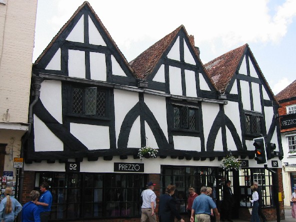
You can ignore all this, if you want. But realism isn't just a goal in itself, it's also about helping the viewer understand what you're trying to draw. If you draw a soldier from the Roman empire without looking at proper references, then it might end up looking like a Greek hoplite, for example. To me, the prison reads more like a Spanish / Arab structure, because of the flat roof and tiny teeth (battlements) on the edge of the roof. I don't recall seeing small, medieval European buildings with a feature like that. It looks like something you'd see on a mosque. Maybe I'm wrong. If we're REALLY going to nitpick, you should also note how windows in medieval European half-timbered houses were just openings created by the wooden framework already in place. Basically, they just left some of the holes in the wooden frames unfilled by bricks, etc. So they didn't actually construct windows separately, with window frames that break the framework of the surrounding wall, like in your piece, and like in modern houses. The edges of the window should follow the lines of the entire framework on that wall. 
Quick and sloppy edit. I'll just leave it at this. I would argue that more realism is better, but I totally understand if that is not your goal. Edited by CELS - 25 March 2014 at 2:31am |
|
|
IP Logged |
|
|
AshCrimson
Commander
Joined: 24 April 2020 Online Status: Offline Posts: 606 |
Posted: 25 March 2014 at 3:32am |
|
Thanks for that post CELS, I'll probably darken the wood. I'm also interested in the thatched Roof for the bar, so i will definitely give that a go. I also liked what you did with the side of the roofs, so i'll also try that. It looks so much better than just leaving them blank!
Also thanks for the information about the wood and it's colouring, i wasn't away that tar was used to preserve wood in the medieval ages! In regards to realism, it wasn't really something i put much thought into, if you know what i mean? Thanks so much again, as usual! I'll try again and incorporate some of the things you mentioned. Sorry if this thread seems to keep going on, i just want to make sure im okay with the piece before i decided to submit it. I might possibly remove the people, depending on whether they takeaway from the finished piece. |
|
|
IP Logged |
|
|
MrHai
Commander
Joined: 12 January 2014 Location: Norway Online Status: Offline Posts: 119 |
Posted: 25 March 2014 at 5:42am |
|
Just wanted top pop in here to give you some praise for your excellent attitude and hard work. The way you approach learning and taking critique is truly commendable.
Also, I'd like to argue for the merits of stylization. Seems that the general attitude in this thread has been to push for more and more realism. That's completely valid, and if realism is your goal you have received some tremendous advice. However, I'd just like to say that my favorite of all your iterations is actually your towers in the first post. It's a strong and bold style that stands out. It give me an exotic vibe and intrigues me more than the more standard looking later versions. I'd have loved to see a game or simply a scene done in that style. Finally, make sure you keep your lighting consistent - now that you've flipped your tower, the shadow's on the wrong side (unless its temporary and you plan to flip it back). |
|
|
"Work is more fun than fun"
-John Cale |
|
|
IP Logged |
|
|
CELS
Commander
Joined: 23 September 2022 Online Status: Offline Posts: 758 |
Posted: 25 March 2014 at 8:18am |
|
Ditto to what MrHai said. I should point out that I didn't originally push for a specific design. My point was simply that if you're going to imitate something, then it should at least be somewhat accurate.
I thought the initial, stylistic approach was rather cool too. It's more... abstract. Not specific to any culture or time. |
|
|
IP Logged |
|
|
AshCrimson
Commander
Joined: 24 April 2020 Online Status: Offline Posts: 606 |
Posted: 25 March 2014 at 8:39am |
|
Thank's MrHai,
The main reason im so keen to hear other people's opinions is because i personally find them very important and useful in learning what i've done wrong, what i could do to improve. Sometimes i feel like i'm done with a piece, but i make sure to post it on the WIP for critique just in case i missed something or if i need to improve or redo certain sections. With CELS words in mind, i have done two versions, one without the shadows beside and underneath the beams and one with. Im my opinion the one without the shadows makes it look sort of flat, I am sure if that is a good or bad thing. Here's both for a comparison: No Shadow's on the beams:  With Shadows:  |
|
|
IP Logged |
|
|
SuperTurnip
Commander
Joined: 29 March 2014 Online Status: Offline Posts: 301 |
Posted: 25 March 2014 at 9:40am |
|
I'd say the version with the shadows is more dimensional, and I feel it works better in this case. It's very, very subtle, which is great. I'd stick with it! By the way-- this is looking great! Keep up the good work!
|
|
|
IP Logged |
|
|
AshCrimson
Commander
Joined: 24 April 2020 Online Status: Offline Posts: 606 |
Posted: 26 March 2014 at 10:09am |
|
Possibly my last update:
 Made a few changes, most notably with the roofs. I wanted them all to be roughly the same. Wasn't sure i should go for the sort of thatched roof CELS depicted. I intend for them to look like thatch, not sure if it comes across that way. I'll await further critique before i decide to post this. |
|
|
IP Logged |
|
|
jalonso
Admiral
Joined: 29 November 2022 Online Status: Offline Posts: 13537 |
Posted: 26 March 2014 at 10:56am |
|
This edit does not show what I would do but what I think would be better choices in the way you are showing you wish to go.
*Overall your colors are too cheery for medieval. *More contrast on the shaded side will make everything pop. * Break edges of roofs for 'thatch' look. *Change the very little used shade on the bricks to a highlight color for thatch roof highlights. * Building is good but destroying is awesome...add cracks and imperfections her and there. * Bring clouds into the 'world' they seem afraid to get too close. * I accept your sky but skies are darker on the bottom and will balance the grass as you've chosen too so that its more of a blend than a pattern. 
|
|
|
|
|
|
IP Logged |
|
|
AshCrimson
Commander
Joined: 24 April 2020 Online Status: Offline Posts: 606 |
Posted: 26 March 2014 at 11:38am |
|
Hello Jalonso,
I gave it another go with your words in mind, haven't fully completed the thatch, not sure if it looks "thatchy". I've increased the contrast on the shaded areas, moved the clouds closer, made the sky darker at the bottom and added a highlight to the thatch.  Personally im a bit dubious of the thatch, i tried to emulate your edit's suggestion but i can't seem to get it down. Thanks for the advice and suggestions btw, I always appreciate it. Edit: Finished the thatching for the buildings, might leave the tower with a wooden roof. Edited by AshCrimson - 26 March 2014 at 11:56am |
|
|
IP Logged |
|
|
SuperTurnip
Commander
Joined: 29 March 2014 Online Status: Offline Posts: 301 |
Posted: 26 March 2014 at 6:37pm |
|
@jalonso Woah woah woah, I agree with you in plenty of ways, but too cheery to be medival? Maybe I need clarification on what you mean there. Gritty scenes can be technicolor. Feudal Japan can be neon. Colors are never "wrong", although they can fall outside of a gamut or palette inappropriately. Nothing of that sort happens here. But I'll step back from saying you're wrong, as it is a matter of opinion, not an objective truth.
But to constructively critique the actual piece, Ashcrimson, your thatch looks excellent. Don't worry about it, you've done well there. For the wooden roof, how is it constructed? It might need a tiny bit of implied construction, because right now I don't know how it's built, and what it's built out of! Other than that you're pretty golden. I might suggest bringing little tufts of grass to the base of the buildings, just to connect them to the ground. The darker blue sky actually looks like ground extending to the horizon to me, with atmospheric perspective, so you could utilize that if little tufts don't work. |
|
|
IP Logged |
|
|
r1k
Commander
Joined: 01 April 2014 Online Status: Offline Posts: 336 |
Posted: 26 March 2014 at 6:59pm |
|
you can certaintly have bright or rich colors in a medieval setting. Check out some medieval artwork
http://karenswhimsy.com/public-domain-images/medieval-art/images/medieval-art-7.jpg http://25.media.tumblr.com/tumblr_mavihtcbWC1qejjo9o1_1280.jpg http://24.media.tumblr.com/7729dc04cc60b4571158409f35bd6193/tumblr_miunycWu481qd4ufdo1_500.jpg http://my.firedoglake.com/peasantparty/files/2010/12/TheRightHandOfGod_JeanFouquet-MetMuseum.jpg |
|
|
IP Logged |
|
|
CELS
Commander
Joined: 23 September 2022 Online Status: Offline Posts: 758 |
Posted: 26 March 2014 at 11:14pm |
|
Btw, I think jalonso's edit looks great due to the fact that the dark side of the buildings are significantly darker than the bright side of the buildings. It creates a lot of depth, makes the buildings look more real and interesting.
Re: The sky is always darker on the bottom. Is it? http://wallpoper.com/images/00/31/96/44/horizon-trees_00319644.jpg http://www.mlewallpapers.com/image/4x3-Standard-Screen-2/view/St-Lucia-Horizon-321.jpg http://www.rayskinner.info/uploads/1/0/9/6/10967492/1469373_orig.jpg http://northernblogosphere.files.wordpress.com/2011/08/panorama20110801-full.jpg |
|
|
IP Logged |
|
|
AshCrimson
Commander
Joined: 24 April 2020 Online Status: Offline Posts: 606 |
Posted: 27 March 2014 at 12:41am |
|
Thanks for all the comments guys!
Here's my edit based upon your suggestions:  CELS: I've increased the contrast of the darker side of the buildings again. Superturnip: Tried tufts of grass at the bottom. Also implied that the top of the tower's roof is made out of planks. R1k: In regards to colours, here's my palette if you and CELS are interested:  Thanks again for all the comments. I really appreciate them, even just looking a at the beginning of the thread to the edit just now, I feel like i've perhaps improved. I feel a tad silly for making so many edits, but i feel like i've really learnt from the mistakes, critique, advice and suggestions. Unfortunately i had to delete some of my previous edits, as my account on IMGUR was full of them, unfortunately. Apologies for any inconveniance this causes. Edited by AshCrimson - 27 March 2014 at 12:49am |
|
|
IP Logged |
|
|
CELS
Commander
Joined: 23 September 2022 Online Status: Offline Posts: 758 |
Posted: 27 March 2014 at 4:01am |
|
Sorry, maybe I wasn't clear. I didn't want more contrast on the darker side of the buildings (if you recall, I originally argued that the contrast should be lower on the shadow side and higher on the sunny side)
I've tried to explain here.  Edited by CELS - 27 March 2014 at 4:03am |
|
|
IP Logged |
|
|
AshCrimson
Commander
Joined: 24 April 2020 Online Status: Offline Posts: 606 |
Posted: 27 March 2014 at 6:25am |
|
Apologies for misunderstanding!
Here's a quick edit, hopefully this is what you meant:  Maybe i should make the darker beams lighter or keep the current colours? |
|
|
IP Logged |
|
|
jalonso
Admiral
Joined: 29 November 2022 Online Status: Offline Posts: 13537 |
Posted: 27 March 2014 at 6:34am |
|
Yay! you have finally understood what all have been saying :)
Don't keep adding colors. Refine the palette as you go and only add when really needed. --- To those that had questions on my opinions note that I started with: 'edit does not show what I would do but what I think would be better choices in the way you are showing you wish to go" |
|
|
|
|
|
IP Logged |
|
|
AshCrimson
Commander
Joined: 24 April 2020 Online Status: Offline Posts: 606 |
Posted: 27 March 2014 at 11:25am |
|
Sorry if i seemed stubborn, Jalonso. I genuinely appreciate all advice and criticism.
I'm thinking of submitting it, barring any further need to edit it. Edited by AshCrimson - 27 March 2014 at 11:26am |
|
|
IP Logged |
|
|
jalonso
Admiral
Joined: 29 November 2022 Online Status: Offline Posts: 13537 |
Posted: 27 March 2014 at 1:37pm |
|
You've done great and hopefully learned a lot.
Finish it and add those great people you drew and make it extra nice ;) |
|
|
|
|
|
IP Logged |
|
|
AshCrimson
Commander
Joined: 24 April 2020 Online Status: Offline Posts: 606 |
Posted: 27 March 2014 at 2:56pm |
|
Here's my attempt with the people added in:
 Not sure if they are readable, if they aren't i'll most likely just submit it without them. |
|
|
IP Logged |
|
|
CELS
Commander
Joined: 23 September 2022 Online Status: Offline Posts: 758 |
Posted: 27 March 2014 at 3:39pm |
|
In my eyes, they do crash a bit with the horizon. And like I said above, I don't know why jalonso said that the horizon should be darker than the sky above. Either I am misunderstanding him or I have misunderstood something fundamental about drawing landscapes and horizons.
Originally posted by CELS
Re: The sky is always darker on the bottom. Is it? http://wallpoper.com/images/00/31/96/44/horizon-trees_00319644.jpg http://www.mlewallpapers.com/image/4x3-Standard-Screen-2/view/St-Lucia-Horizon-321.jpg http://www.rayskinner.info/uploads/1/0/9/6/10967492/1469373_orig.jpg http://northernblogosphere.files.wordpress.com/2011/08/panorama20110801-full.jpg 
Edit: Note the clouds on different levels, vertically, as in jalonso's edit. When clouds are evenly spread over an area, you will see more of them in the horizon than right above your head, due to your perspective. But this can be freely ignored, depending on your balance of style vs realism.  Edited by CELS - 27 March 2014 at 3:54pm |
|
|
IP Logged |
|
|
jalonso
Admiral
Joined: 29 November 2022 Online Status: Offline Posts: 13537 |
Posted: 29 March 2014 at 10:19am |
|
This has now been added to the gallery but I don't want any confusion.
I mistakenly said that skies get darker on the bottom and was not entirely what I meant to say. Of course the submitted sky I don't like anymore because I only suggested flipping vertically when the grass had the same shading 'pattern'. My thought was that by flipping so that both patterns met then because of its graphic nature it would both blend and create a horizon that fades front to back which seemed to match the simple graphic style that was being shown when I said that. I do know skies are darker on top, k. k. |
|
|
|
|
|
IP Logged |
|
|
CELS
Commander
Joined: 23 September 2022 Online Status: Offline Posts: 758 |
Posted: 29 March 2014 at 2:45pm |
|
Cool, was wondering about that. I see what you mean now.
|
|
|
IP Logged |
|
| |
||
Forum Jump |
You cannot post new topics in this forum You cannot reply to topics in this forum You cannot delete your posts in this forum You cannot edit your posts in this forum You cannot create polls in this forum You cannot vote in polls in this forum |
|
