| Active TopicsSearchRegisterLogin |
| WIP (Work In Progress) | |
| |
  |
| Author | Message |
|
Froste
Midshipman 
Joined: 15 August 2014 Online Status: Offline Posts: 41 |
  Topic: Ninja and more [C+C] Topic: Ninja and more [C+C]Posted: 15 August 2014 at 3:31pm |
|
First of all is my ninja, I hope you like it LOL.
 Next is an Ice Crystal I made for my avatar. I tried submitting it but didn't get a high enough score. Got one comment on it talking about staircase banding so I tried to fix it without changing the look to much.  And last is a weave I made while trying to practice warm and cool colors. |
|
 IP Logged IP Logged |
|
|
Froste
Midshipman
Joined: 15 August 2014 Online Status: Offline Posts: 41 |
Posted: 16 August 2014 at 6:06am |
|
On a side note, why am I not able to use the crystal for an avatar but I can use the weave. both are pending and both are 65x65 or smaller?
|
|
|
IP Logged |
|
|
Hapiel
Rear Admiral 
Joined: 30 June 2023 Online Status: Offline Posts: 3266 |
Posted: 16 August 2014 at 6:36am |
|
The crystal needs to be 64x64, not 65x65
I couldn't see your ninja, just a polar bear in the snow ;) As for why this did not get in, it is not about the staircase banding. That is a detail you shouldn't worry too much about. It's that ice crystals drawn out of random lines are boring to watch. The weave thing is more visually interesting but still the result of random luck and not of skill and thought. Why not look up examples of real (ice) crystals and try to draw those? Once you are able to draw realistic looking ice crystals you can simplify them again to a couple of lines and still impress people, but until then this is a boring subject... |
|
|
IP Logged |
|
|
Froste
Midshipman
Joined: 15 August 2014 Online Status: Offline Posts: 41 |
Posted: 16 August 2014 at 7:36am |
|
ok, i thought it said 65, i will have to fix that. Thing is, I don't want it to look like a "real" ice crystal. I want it to look just the way it is, so I guess it wont even be "good enough" for the site. if i can just get it as my avatar i will be happy because that was all i ever wanted.
|
|
|
IP Logged |
|
|
Friend
Commander 
Joined: 01 April 2015 Online Status: Offline Posts: 710 |
Posted: 16 August 2014 at 8:59am |
|
Froste, it is completely fine you dont want it to look like a real ice crystal. The problem comes in the fact that the piece of art you have created is just not at a standard the mods and people of PJ allow in the gallery. A big point of having a barrier of entry is that it forces you to improve as an artist. In fact, sometimes mods don't accept a piece into the gallery simply because they believe it is not up to that particular artist's abilities. I've had pieces rejected that were "better" than a lot of crude pieces that have been accepted.
Bottom line is why not seek to improve the ice crystal you have made, if not from a pixel technique standpoint than from a general art standpoint. The colors are very hastily chosen. The design is pretty cool, but again the banding and too many colors hinders its visual appeal. You may be perfectly content with it now, but is there not any way you think you could make yourself like it more? I made an edit which really didn't improve on any of the artistic fundamentals of your piece. (I didn't improve on the forms, and the shading done does not follow much any specific light source, but in turning up the lightness and switching some colors helped sort of imply more an ice crystal, even though it doesn't exactly look like one. It just feels more like one and doesn't feel like geometric blue lines.  |
|
|
IP Logged |
|
|
Froste
Midshipman
Joined: 15 August 2014 Online Status: Offline Posts: 41 |
Posted: 16 August 2014 at 9:29pm |
|
This personal symbol of mine has been in development for over a decade now. It might change in the future has I come up with ideas. I suppose calling it an Ice Crystal was a bad idea seeing how you don't know what is on my mind and the meaning behind the name, so I guess for here I will call it general personal symbol lol. (But trying to make it look more like ice is not a bad idea.)
I have other projects that I am practicing my skill and developing my talent with, but this is just not one of them. It is ok that it is not right for the gallery, it has just been the one I use for all forum avatars. |
|
|
IP Logged |
|
|
Friend
Commander
Joined: 01 April 2015 Online Status: Offline Posts: 710 |
Posted: 17 August 2014 at 11:32am |
|
That's fine froste, really. Again, it is fine in terms of design. (No one can tell you what to call it, and what you do won't change its ability to be in the gallery) BUT, in terms of the pixels, they are controlled poorly. Here's an edit: I'm sure the edited version would be accepted into the gallery, if in the description you explain how this piece is sentimental to you. The major thing preventing it from being accepted now is it is just not demonstrative of basic pixeling skills
 Edited by Friend - 17 August 2014 at 11:36am |
|
|
IP Logged |
|
|
Froste
Midshipman
Joined: 15 August 2014 Online Status: Offline Posts: 41 |
Posted: 17 August 2014 at 5:14pm |
|
wow, that looks amazing.
|
|
|
IP Logged |
|
|
Froste
Midshipman
Joined: 15 August 2014 Online Status: Offline Posts: 41 |
Posted: 17 August 2014 at 9:18pm |
|
First of all, thank you Friend for pushing me and giving me that great example. Here is what I did with it.
 In the top left if to your idea but used the shades on the side I wanted them to be. The top right is the same picture, but I gave it some more contrast to make the sides pop out more. After looking at that, I decides to rework it into the bottom left picture. This one has the same colors and the top right, but place differently. When I was done with that, I started thing about AA and tried to add some. That is what I did in the bottom right and I think it looks way better. What do you think? |
|
|
IP Logged |
|
|
Limes
Commander
Joined: 15 September 2021 Online Status: Offline Posts: 683 |
Posted: 17 August 2014 at 10:29pm |
|
You caught your jaggies error with the third picture, Fantastic. The fourth however looks too "fuzzy" mainly from over AAing it. It is really common for people to over AA when new to pixel art and I myself have done it as well. I do really like the third one though. Next I think you should work on it but with a different pallet and a bigger canvas maybe?
|
|
|
IP Logged |
|
|
Froste
Midshipman
Joined: 15 August 2014 Online Status: Offline Posts: 41 |
Posted: 18 August 2014 at 12:26am |
|
Haven't really figured out what a good amount of AA is, I don't like using it much but I figured I would give it a try.
I tried to find the best highlights and shadows for it, those seem to work better then the first set because they were easier to see. I could really only darken or lighten the colors because I want to keep it blue. Can't really do a bigger canvas because I need it no bigger then that size so I can use it as my avatar. Unless you are talking about using the current picture as a preview and use the preview as my avatar which I think I have seen some people do. Not sure if I would want to make it bigger because I have other projects I would like to spend my time on. |
|
|
IP Logged |
|
|
Froste
Midshipman
Joined: 15 August 2014 Online Status: Offline Posts: 41 |
Posted: 18 August 2014 at 12:48am |
    Here are also some sprite I am working on for an online game I am working on. I am trying to make them where they all of the same amount of shades on their main color ramp because each will also be colors using each other colors. |
|
|
IP Logged |
|
|
Friend
Commander
Joined: 01 April 2015 Online Status: Offline Posts: 710 |
Posted: 18 August 2014 at 6:23am |
|
I'll continue to do an edit or two, but in the meantime, your sprites are really weak in design. They look far from professional.
What you need to do if you are serious or at least interested in this as a hobby is to improve as an artist. A lot of people tell new pixel artists who can't draw well to put the pixel down and pick up pen and paper instead. Pixel art is impossible to do if you can't draw well, unless you are good at making really tiny 8x8 sprites or something develop your artistic eye. "what makes this piece so good and this one not?" Look at technique, colors, shading, everything. You won't be able to make anything good if you can't envision what good is Edited by Friend - 18 August 2014 at 6:24am |
|
|
IP Logged |
|
|
Limes
Commander
Joined: 15 September 2021 Online Status: Offline Posts: 683 |
Posted: 18 August 2014 at 2:32pm |
|
Here is a really bad example of how you could have made your fire dragon pop.

From this edit you can clearly see that my dragon may not be as clean looking but he sure does look less flat. I do this by not putting him at such a boring straight angle and rather a obscure side angle. Your dragon also lacks some design elements and character to him So I added mushrooms because I imagined him from an under ground cave of sorts and fungus grew on him, or something. Jut be creative right! EDIT: And just for fun I made a portrait of green dude.  Edited by Limes - 18 August 2014 at 2:43pm |
|
|
IP Logged |
|
|
PixelSnader
Commander
Not a troll! Joined: 05 June 2014 Online Status: Offline Posts: 3194 |
Posted: 18 August 2014 at 5:44pm |
|
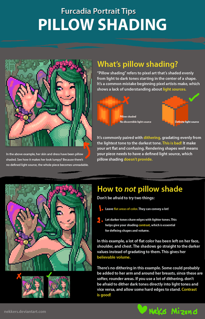
Your biggest issue right now is what's generally called "pillow shading". Here's a bit of an explanation but there are far more tutorials and such available via google:
|
|
|
▄▄█ ▄▄█ ▄█▄ ▄█▄ |
|
|
IP Logged |
|
|
Froste
Midshipman
Joined: 15 August 2014 Online Status: Offline Posts: 41 |
Posted: 19 August 2014 at 12:14am |
|
@Friend I know they are far from professional, that is way I am here. I am trying to learn how to make them better. If I go back to pen and paper, how will anyone be able to critique my work? A far as the whole what makes a good piece good, that is debatable. I have seen art that tons of people say is good, but I think looks like crap. Maybe I just don't have that artistic eye. @Limes Thanks for the prospective on the "dragon", that is one thing I have always had trouble with. I will have to study that pic and see if I can mimic it.@PixelSnader Didn't realize that was still considered pillow shading. Is it because the shadow goes almost around each part or because of the consistent gradual change in color?
|
|
|
IP Logged |
|
| |
||
Forum Jump |
You cannot post new topics in this forum You cannot reply to topics in this forum You cannot delete your posts in this forum You cannot edit your posts in this forum You cannot create polls in this forum You cannot vote in polls in this forum |
|
