| Active TopicsSearchRegisterLogin |
| WIP (Work In Progress) | |
| |
  |
| Author | Message |
|
Zeratanus
Commander 
Joined: 03 December 2020 Online Status: Offline Posts: 576 |
  Topic: Evashock Topic: EvashockPosted: 01 October 2014 at 9:06am |
|
Ooookay, it feels like forever since the last time I actually made any pixel art.Evangelion anime mixed with Bioshock, because why the hell not~Rei as a Big Sister with armor based on Eva 00, and Eva 02 as a Big Daddy 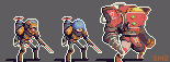
Based on drawings of the same things I did a while back:http://zeratanus.deviantart.com/art/Evashock-484969758 Been so long that making these was way harder than it should have been. I could feel the rust on my skills. I feel like these should look way better, but my brain's straining to work with these tiny shapes again.Done with DB's palette, cuz I hadn't used it before, but I don't think I'm using it as well as I could. The shapes are all a bit too muddied. Maybe if I animated them shapes would be more clear, but they should be able to stand on their own without that.Any tips at all are welcome, but I guess mainly if anyone has any advice on how to make them more readable, or on using DB's palette I'd love to hear them.Thanks folks! 2016 NECROBUUUUMP Heyya folks! I haven't pixeled in... far too long. Haven't visited for a bit longer! But I felt like kicking off some of the rust and getting back to this little project now that I'm on an Eva kick from watching Rebuild 3.33 and I've expanded the cast significantly in the past... oh goodness since 2014? yikes! Anyway, the 4 sprites on the right side are all new, and I'm unsure of how they're going. I really like Eva01, the big blue one... except for the fact that it's SUPPOSED to be purple! but DB's colors aren't exactly strong in that color range. If anyone has any tips on how I could rework the colors to be more purple on the giant roboface (though without heavy dithering I have my doubts) or any other tips in general, I'd be stoked to hear them :) A year or more out of the loop has me less confident than I normally am with this! 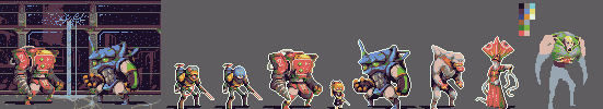
The first two are based off my art Here and the second two are from here (Edit: man, looking at it again the red dress monster lady really needs more contrast I compared to the rest of them~ erf. I'll work on that~) |
|
 IP Logged IP Logged |
|
|
Zeratanus
Commander
Joined: 03 December 2020 Online Status: Offline Posts: 576 |
Posted: 02 October 2014 at 9:24am |
|
Added in the dark green from the palette (yay, now using the whole set~). Think it looks a bit better, at least on the big red one. Not as sold with the orange but better than it was... i think... for the moment.
V1 -> V2  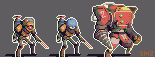 |
|
|
IP Logged |
|
|
jalonso
Admiral 
Joined: 29 November 2022 Online Status: Offline Posts: 13537 |
Posted: 02 October 2014 at 10:11am |
|
No crits. I likes :)
|
|
|
|
|
|
IP Logged |
|
|
Zeratanus
Commander
Joined: 03 December 2020 Online Status: Offline Posts: 576 |
Posted: 02 October 2014 at 9:15pm |
|
Haha, For some reason I feel like taking that as a challenge! If I'm not screwing up I'm obviously not trying hard enough!
 Added Little Sister Asuka and a background scene. Not exactly the ideal palette for the Bioshock feel (Probably would need one of almost all blue, green and brown for that, but those colors wouldn't be as fun~)  The characters on top of the background without outlines. Idealy they would all be animated along with the dripping water, so that parts of them are hard to read without the outline will hopefully be less of an issue.  Edited by Zeratanus - 02 October 2014 at 9:15pm |
|
|
IP Logged |
|
|
andrae
Midshipman 
Joined: 30 September 2017 Online Status: Offline Posts: 43 |
Posted: 03 October 2014 at 5:36am |
|
I like how you used db32 palette and still make it look unique. The sprites are already good. The single blue pixels in the background looks noisy and messy for me though.
|
|
|
IP Logged |
|
|
Zeratanus
Commander
Joined: 03 December 2020 Online Status: Offline Posts: 576 |
Posted: 03 October 2014 at 8:34am |
|
Thanks! And yeah I can see what you mean about the blue pixels. I'm trying to find some way to suggest that it's all underwater, so I was thinking "BUBBLES!" but yeah that's just turning out to be noise isn't it?
Just had an idea to use animation to give the background a kind of wavey sway to suggest distortion of light underwater, but I'm not really sure how that'd look either. Smash Bros comes out today so it might be Monday before I get back on this but I'll keep thinkin' about it (As usual though, if anyone has any advice I'm totally down for hearin' it!) |
|
|
IP Logged |
|
|
Zeratanus
Commander
Joined: 03 December 2020 Online Status: Offline Posts: 576 |
Posted: 07 October 2014 at 8:29am |
|
Haven't made much progress on the background, but here's my first pass at the Eva Daddy animation:

|
|
|
IP Logged |
|
|
Zeratanus
Commander
Joined: 03 December 2020 Online Status: Offline Posts: 576 |
Posted: 02 May 2016 at 1:30pm |
|
NECROBUUUUMP
Heyya folks! I haven't pixeled in... far too long. Haven't visited for a bit longer! But I felt like kicking off some of the rust and getting back to this little project now that I'm on an Eva kick from watching Rebuild 3.33 and I've expanded the cast significantly in the past... oh goodness since 2014? yikes! Anyway, the 4 sprites on the right side are all new, and I'm unsure of how they're going. I really like Eva01, the big blue one... except for the fact that it's SUPPOSED to be purple! but DB's colors aren't exactly strong in that color range. If anyone has any tips on how I could rework the colors to be more purple on the giant roboface (though without heavy dithering I have my doubts) or any other tips in general, I'd be stoked to hear them :) A year or more out of the loop has me less confident than I normally am with this!
The first two are based off my art Here and the second two are from here (Edit: man, looking at it again the red dress monster lady really needs more contrast I compared to the rest of them~ erf. I'll work on that~) Edit 2: found some time to work on that. Got the red dress monster some more contrast, messed with the one to its left just a tad, and blocked out the rest of the body on the green one. I'll prooobably hate how splotchy his colors are come next time I look at it, but at least it'll just be editing what is already there~ (also now with dark outlines instead, since I think it works better) 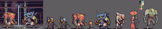
Edit 3! Two new characters and a lot of reworking and tweaking the existing ones, including redesigning a good chunk of Eva02 (the red robo) to better match my newer design for it. 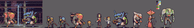
|
|
|
IP Logged |
|
|
Zeratanus
Commander
Joined: 03 December 2020 Online Status: Offline Posts: 576 |
Posted: 04 May 2016 at 9:33am |
|
Alllriightly, I've been chugging away on this regularly since Monday and I'm starting to burn out I think~ I'll take a (hopefully short) break from this become coming back to it and finishing the last three.
When those three are done that'll be every design I've made for Evashock thus far~ 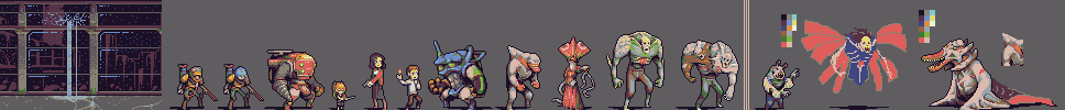
|
|
|
IP Logged |
|
|
MrHai
Commander
Joined: 12 January 2014 Location: Norway Online Status: Offline Posts: 119 |
Posted: 11 May 2016 at 5:25am |
|
Neat stuff!
I think the most successful sprites are the two "big daddies" (?). Mainly because their designs seem the clearest and least ambiguous. I also think they use contrast the best. Maybe you could be a bit bolder with the contrast, actually. The range from your darkest dark to your lightest light seems fine, it's in the contrast between some of the mid-range colors and where the darks are placed that I think there's still something to gain (ref the legs of #10, 11, 12 from the left). |
|
|
"Work is more fun than fun"
-John Cale |
|
|
IP Logged |
|
| |
||
Forum Jump |
You cannot post new topics in this forum You cannot reply to topics in this forum You cannot delete your posts in this forum You cannot edit your posts in this forum You cannot create polls in this forum You cannot vote in polls in this forum |
|
