| Active TopicsSearchRegisterLogin |
| WIP (Work In Progress) | |
| |
  |
| Page of 2 Next >> |
| Author | Message |
|
Lakelezz
Commander 
Joined: 28 January 2023 Online Status: Offline Posts: 172 |
  Topic: The squirrel and the nut Topic: The squirrel and the nutPosted: 23 November 2014 at 11:28am |
|
Hello dear pixel-artists!
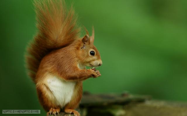
I am currently working on this piece:  The idea is to display a strong zoom on a squirrels eye which reflects his target which is an acorn nut! On this thread I will document my progress! Therefore I would be very thankful to hear your opinion and ideas :) However keep in mind that I am aware the piece being very sketchy at some points! This will be changed of course. Thanks for reading - I appreciate that! |
|
 IP Logged IP Logged |
|
|
DrTripwire
Commander
Joined: 29 October 2014 Online Status: Offline Posts: 174 |
Posted: 23 November 2014 at 12:24pm |
|
I'm an idiot and hit "clear form" instead of"post reply."
Awesome concept! I lvoe the blue monochrome-ish of the reflection. One thing is the shape of the acorn. If you hadn't said acorn, I'm not sure if I would've known. Also, the reflections on the eye look more like 3D bubbles instead of reflections. Reflections don't have that obvious reflections and shadows, yo. xD (I mean, I don't think so, at least.) |
|
|
IP Logged |
|
|
Lakelezz
Commander
Joined: 28 January 2023 Online Status: Offline Posts: 172 |
Posted: 23 November 2014 at 12:39pm |
|
Thanks!
I guess you are right. I will probably remove those "bubbles". They were meant to add some more roundish feeling of the eye. Probably the wrong style, too. This would rather be more like manga/anime/cartoon. Additionally I will try to improve the acorn's readability. However I need to keep the distorted roundish reflecting eye in mind, too. Edited by Lakelezz - 23 November 2014 at 12:40pm |
|
|
IP Logged |
|
|
Lakelezz
Commander
Joined: 28 January 2023 Online Status: Offline Posts: 172 |
Posted: 27 November 2014 at 8:25am |
|
Some edits:
-Changed the top of the acorn -General progressing changes (fur, eye, acorn) -Some experiments on the eye (reflections) - just sketched  Edited by Lakelezz - 27 November 2014 at 8:32am |
|
|
IP Logged |
|
|
DrTripwire
Commander
Joined: 29 October 2014 Online Status: Offline Posts: 174 |
Posted: 27 November 2014 at 9:02am |
|
I like the style of the new reflections! However, are you intending to have two light sources? I only see one lightsource on the acorn. ;)
|
|
|
IP Logged |
|
|
Lakelezz
Commander
Joined: 28 January 2023 Online Status: Offline Posts: 172 |
Posted: 13 December 2014 at 3:55pm |
|
I had to think about the whole piece and came to a conclusion:
Due the dark colours in the eye of a squirrel, the whole eye would mirror the spectated area. That is why I went for such a version. Here it is:  However I do not really like that. It somehow destroys the aesthetic appearance of the eye. So I downscaled it again - nothing more. If I want to stick to the following version, it would have to be cleaned up of course.  I would be happy to hear your feedback! Specially concerning this conflict between logic and art. Though I am aware that art - aesthetic - should be first. Edited by Lakelezz - 13 December 2014 at 3:57pm |
|
|
IP Logged |
|
|
RebeaLeion
Commander
Joined: 04 October 2017 Online Status: Offline Posts: 321 |
Posted: 13 December 2014 at 5:00pm |
|
a reflection is perfect :o) good job. I like it. For the light I am not expert in this... I just liked first version of lighting better.
Edited by RebeaLeion - 13 December 2014 at 5:01pm |
|
|
IP Logged |
|
|
eishiya
Commander
Joined: 04 August 2022 Online Status: Offline Posts: 1109 |
Posted: 13 December 2014 at 5:03pm |
|
I think the reflection should span the whole eye, but it should use the purplish, less shiny palette in the purple section, instead of extending the blue palette to it. I think that would feel more realistic and look more interesting. I also think you should have some areas near the edges of the eye where there's no reflection. Even if realistically it might be there, I think most people expect the eyelids to block most reflections near the edges, like they do in human eyes.
|
|
|
IP Logged |
|
|
Limes
Commander
Joined: 15 September 2021 Online Status: Offline Posts: 683 |
Posted: 13 December 2014 at 10:54pm |
|
I am still finding it hard to read.
|
|
|
IP Logged |
|
|
Lakelezz
Commander
Joined: 28 January 2023 Online Status: Offline Posts: 172 |
Posted: 19 December 2014 at 6:19pm |
|
I made some more changes according to the posted comments.
First of all, I returned to the old highlights. I am aware there would not be such highlights on a real zoom onto the eye. However I decided to do this for the sake of art and creativity. Next is the removal of the background to improve readability. Though the grass was not totally removed. Last but not least: I changed way of reflection on the nut. Keeping it more simple to make it better to be read.  I am still very thankful for every feedback and idea! |
|
|
IP Logged |
|
|
eishiya
Commander
Joined: 04 August 2022 Online Status: Offline Posts: 1109 |
Posted: 19 December 2014 at 6:26pm |
|
I think this step is a noticeable improvement!
The acorn cap texture doesn't appear to curve around the cap's form, I think that's the weakest part of the whole image so far. The cap also looks a bit flat, acorn caps typically stick out quite a bit beyond the rest of the acorn (if it's a ripe one). |
|
|
IP Logged |
|
|
Lakelezz
Commander
Joined: 28 January 2023 Online Status: Offline Posts: 172 |
Posted: 20 December 2014 at 4:04pm |
|
Thank you for your feedback, eishiya!
The shape of the acorn is based on the ones i regularly see here. 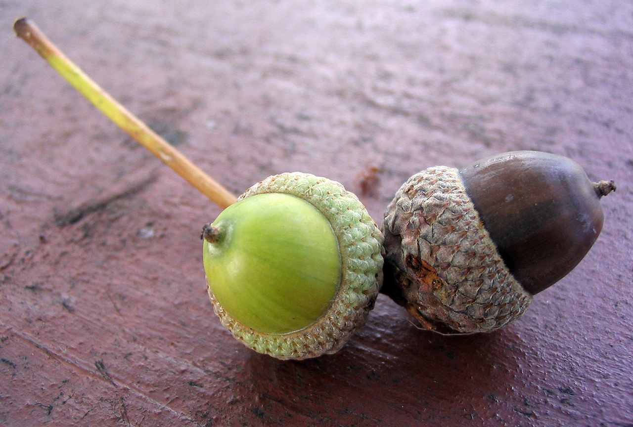 I made some changes:  -Lowered the power of the reflection on the acorn nut itself. -Changed the texture of the cap. -Some small changes on the grass. |
|
|
IP Logged |
|
|
eishiya
Commander
Joined: 04 August 2022 Online Status: Offline Posts: 1109 |
Posted: 20 December 2014 at 4:08pm |
|
In the photo you posted, the nut-cap ratio is quite different to what you drew. The cap is quite small in yours.
The texture looks a lot better, but I think it still feels a bit flat near the edges where it should be curving around the cap. Acorns are usually fairly dull, so I think you could "dull" the highlights on it even more. Try getting rid of the brightest two colours, perhaps? |
|
|
IP Logged |
|
|
Mr.Fahrenheit
Commander
Joined: 01 April 2015 Online Status: Offline Posts: 238 |
Posted: 21 December 2014 at 5:16pm |

Thats what I came up with. I dulled tryed to represent two different materials with the same colors. I've heard people call that using colors in different spreads. In essence its using the colors in different ratios for different materials to show make it look like they are differentiated. A quote from Illke: " I mean that all colors are used on all parts of the image disregarding their chromatic values. For instance i didn't use any green on the nearest teddy bear, although I could have placed it between purple and blue to make the transition smoother. In the same manner I didn't use purple on the other bear, and the final result is that it's obvious that the bears are colored differently. If you take a look at most of the other entries, you'll notice how everything is the same color. That's what I meant by saying 'single spread'." taken from this piece. |
|
|
IP Logged |
|
|
Lakelezz
Commander
Joined: 28 January 2023 Online Status: Offline Posts: 172 |
Posted: 21 December 2014 at 5:39pm |
|
I worked on another edit of my piece. However focused on eishiya's words since I just read what Mr.Fahrenheit wrote a few seconds ago, haha.
 I think Illke's way of thinking about colour spread can be neat but does not work on every style nor on every palette. Nonetheless I am pretty sure Illke is able to use the method quite well and does know when to use it. Despite that I like your turn on the cap and might gonna try it out. Additionally thinking about the nut itself gave me quite some hard time again. I made also a dull version but disliked it quite a lot. That is the reason for my mix of the rather white highlight and dull light. |
|
|
IP Logged |
|
|
Limes
Commander
Joined: 15 September 2021 Online Status: Offline Posts: 683 |
Posted: 23 December 2014 at 10:44am |
|
readable now :)
|
|
|
|
|
|
IP Logged |
|
|
Lakelezz
Commander
Joined: 28 January 2023 Online Status: Offline Posts: 172 |
Posted: 31 December 2014 at 9:01pm |
|
So, after a rather long pause due a lot of stress I finally came back to this piece.
First of all, thanks Limes for your feedback, it helped me! I made some new changes on the cap of the nut. The reason was to get more out of the area - making it interesting. However I feel like the bright upper part still needs some work - so please take that into account. Additionally I started to work on the rest of piece. Though the changes might not be that significant.  As always: I appreciate your feedback quite a lot since it is helping strongly. Oh, and a happy new year :) |
|
|
IP Logged |
|
|
Lakelezz
Commander
Joined: 28 January 2023 Online Status: Offline Posts: 172 |
Posted: 01 January 2015 at 5:56pm |
|
Some more changes:
-The eye got some fixes, specially the brown part. -Some minor changes in the fur and eye lid. -Also some attempts to fix the nut cap.  I am looking forward for your feedback :) |
|
|
IP Logged |
|
|
jalonso
Admiral 
Joined: 29 November 2022 Online Status: Offline Posts: 13537 |
Posted: 01 January 2015 at 7:14pm |
|
Pixelling is going well.
I would say at this point that the more realistic you go with the nut you'll have to match in the fur. If unbalanced it could all fail? |
|
|
|
|
|
IP Logged |
|
|
Lakelezz
Commander
Joined: 28 January 2023 Online Status: Offline Posts: 172 |
Posted: 01 January 2015 at 7:37pm |
|
Oh, I did not really think about the risk of breaking it. Thanks, jalonso :)
I am pretty happy with everything inside the eye but the nut cap. Some more tuning is needed and then I just let it as it is. |
|
|
IP Logged |
|
|
Lakelezz
Commander
Joined: 28 January 2023 Online Status: Offline Posts: 172 |
Posted: 02 January 2015 at 3:51pm |
|
I edited my piece again!
-The fur got updated on quite a lot places. -Minor changes on the light reflections.  Edited by Lakelezz - 02 January 2015 at 3:52pm |
|
|
IP Logged |
|
|
skittle
Commander
Joined: 20 July 2021 Online Status: Offline Posts: 350 |
Posted: 03 January 2015 at 8:14am |
|
I'm not sure how well the brown colours are working on the eye. The acorn looks great though!
|
|
|
IP Logged |
|
|
Lakelezz
Commander
Joined: 28 January 2023 Online Status: Offline Posts: 172 |
Posted: 03 January 2015 at 9:51am |
|
Thanks for your feedback, ADrawingMan!
You mean the brown colours of the dermis or how the fur's brown is relating to the eye? |
|
|
IP Logged |
|
|
skittle
Commander
Joined: 20 July 2021 Online Status: Offline Posts: 350 |
Posted: 04 January 2015 at 5:09am |
|
Oh, sorry, I meant the purple on the eye (they look a bit brownish to me). Where the bottom highlight is on the eye, I think it might look a bit better if you didn't hueshift so much to purple.
One other small thing, imho, the colours of the highlight should be spread out more, and if you add a darker colour near the middle of the eye it could give it a bit more depth (also, removing the highlights on the acorn might not make it stand out so much). I'm not sure if I'm explaining what I mean properly, so here's an edit to show what I mean. 
I'm not sure how beneficial this would be, but since you're working with pretty much just blues for the eye, it might be good to switch to greyscale for the moment -especially if you're not sure about your pallete (whatever works best for you though). Edited by ADrawingMan - 04 January 2015 at 5:47am |
|
|
IP Logged |
|
|
Lakelezz
Commander
Joined: 28 January 2023 Online Status: Offline Posts: 172 |
Posted: 04 January 2015 at 2:57pm |
|
I really enjoyed your idea of how to bring everything more into and giving the whole thing more depth.
My new update is focusing on exactly that. Additionally I took a look at your colours and came up with this.  It is still not done, there has to be some work done. Specially around the bottom reflection highlight. |
|
|
IP Logged |
|
|
DrTripwire
Commander
Joined: 29 October 2014 Online Status: Offline Posts: 174 |
Posted: 04 January 2015 at 7:56pm |
|
Loving the new highlights! Bringing the missing roundness to it.
|
|
|
IP Logged |
|
|
Lakelezz
Commander
Joined: 28 January 2023 Online Status: Offline Posts: 172 |
Posted: 08 January 2015 at 1:50pm |
|
Thank you for the feedback, DrTripwire - I totally agree with you!
I made some more edits, slowly fixing more and more edgy parts and adding more depth here and there.  -Changed the pattern and behavior of the dark shadow on the eyelid. -Multiple lines were fixed: Eyelid, reflection forms, [...] -Some more minor changes, adding more fur here and there, [...] Edited by Lakelezz - 08 January 2015 at 1:52pm |
|
|
IP Logged |
|
|
Lakelezz
Commander
Joined: 28 January 2023 Online Status: Offline Posts: 172 |
Posted: 09 January 2015 at 6:03pm |
|
Some more changes were done!
However mostly minor changes on the fur. -Removed some of the blue ground / corrected shadows -Shape corrections -Small fur changes  Since my previous update I added those little blackish shadows on the lid. Any opinions about that? Though I am not talking about the blackish areas next the corner were both lids connect but about those single lines everywhere around the lower lid. |
|
|
IP Logged |
|
|
eishiya
Commander
Joined: 04 August 2022 Online Status: Offline Posts: 1109 |
Posted: 09 January 2015 at 6:19pm |
|
What's the green bit in the upper left corner? If it's the background, then that means your squirrel's head is too small.
|
|
|
IP Logged |
|
|
Lakelezz
Commander
Joined: 28 January 2023 Online Status: Offline Posts: 172 |
Posted: 10 January 2015 at 10:18am |
|
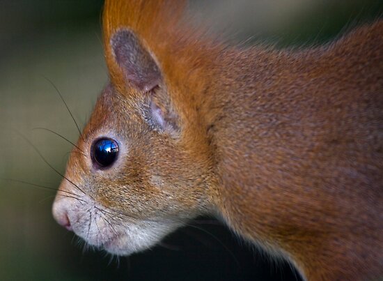
Oh, I looked at multiple squirrels:
  From those the only thing which would be wrong is the shape of the curve. However I filled in the corner now since I did not like using one colour for something so useless as the nothing saying green-background. It could imply that the squirrel is in a forest but is not the eye saying enough already? Additionally this updated focused on: -AAing / mostly around and on the eyelid -Shaping  Edited by Lakelezz - 10 January 2015 at 10:19am |
|
|
IP Logged |
|
|
Mr.Fahrenheit
Commander
Joined: 01 April 2015 Online Status: Offline Posts: 238 |
Posted: 10 January 2015 at 2:07pm |
|
I think the colors you are using for the fur are really oversaturated. Here's a quick edit:

|
|
|
IP Logged |
|
|
DrTripwire
Commander
Joined: 29 October 2014 Online Status: Offline Posts: 174 |
Posted: 10 January 2015 at 4:06pm |
|
If you're going for a natural fur colour, then the eye colour should probably be natural, too. I didn't mind the oversaturation because it was stylised color.
|
|
|
IP Logged |
|
|
Limes
Commander
Joined: 15 September 2021 Online Status: Offline Posts: 683 |
Posted: 10 January 2015 at 4:25pm |
|
idk the eye colour looks pretty natural to me? don't understand what your meaning.
|
|
|
|
|
|
IP Logged |
|
|
Lakelezz
Commander
Joined: 28 January 2023 Online Status: Offline Posts: 172 |
Posted: 10 January 2015 at 6:55pm |
|
Originally posted by Mr.Fahrenheit I think the colors you are using for the fur are really oversaturated. Here's a quick edit: Oversaturated in what kind of manner? This piece is not meant to be 1:1. Originally posted by DrTripwire
If you're going for a natural fur colour, then the eye colour should probably be natural, too. I didn't mind the oversaturation because it was stylised color. I guess you meant Mr.Fahrenheit? Originally posted by Limes
idk the eye colour looks pretty natural to me? don't understand what your meaning. Actually the original colours remain to a certain level. It is quite a complex process and would also have to work with some kind of transparency showing the iris and such since the reflection would not be completely opaque. If we would try to make this more naturalistic I would have to replace the highlight effect with the original source of light, too. That is one thing I tried for the sake of naturalism. I dislike it in the end. I prefer this stylized version :) Thank you all for your feedback! If there is an objection to be mentioned feel free to do so! Additionally, feedback is accepted in general of course. Edited by Lakelezz - 10 January 2015 at 6:58pm |
|
|
IP Logged |
|
|
Lakelezz
Commander
Joined: 28 January 2023 Online Status: Offline Posts: 172 |
Posted: 14 January 2015 at 1:40pm |
|
I made some more (rather little) changes:-Lower eye-reflection fixes-Some fur changes and some cleanups
 I am slowly tending to upload it to the gallery. However I would like to ask for your opinion on the piece :)Any suggestions left or problems I simply missed out? I am slowly tending to upload it to the gallery. However I would like to ask for your opinion on the piece :)Any suggestions left or problems I simply missed out?
Edited by Lakelezz - 14 January 2015 at 2:18pm |
|
|
IP Logged |
|
|
Limes
Commander
Joined: 15 September 2021 Online Status: Offline Posts: 683 |
Posted: 14 January 2015 at 8:35pm |
|
The red is too red it clashes with the blue hard.
|
|
|
|
|
|
IP Logged |
|
|
Lakelezz
Commander
Joined: 28 January 2023 Online Status: Offline Posts: 172 |
Posted: 15 January 2015 at 8:53am |
|
I do not think so, Limes.
However I am open for all kind of ideas and here is an example of how it would look with a lower saturation but the same colours.  Old: Edited by Lakelezz - 15 January 2015 at 8:57am |
|
|
IP Logged |
|
|
DrTripwire
Commander
Joined: 29 October 2014 Online Status: Offline Posts: 174 |
Posted: 15 January 2015 at 11:33am |
|
Wait a second, did we talk about the right corner of the eye? Er, the corner nearest to its ear. Perhaps that could be a little less sharp. You don't have to go totally true-to-life with a completely round eye, but I think the pinch could be brought a little closer to the eye itself.
As for the colours... hm. I like how it's browner, and not so harsh red, but I think it could be brightened up a bit. |
|
|
IP Logged |
|
|
Lakelezz
Commander
Joined: 28 January 2023 Online Status: Offline Posts: 172 |
Posted: 16 January 2015 at 8:24am |
|
Oh, I tried to fix that! I never really thought about it, haha. Thanks!
Additionally the colour has been tweaked again.  I simply let the fur get longer at that place where the sharp eye-lid corner used to be. However that might be removed later since I am not sure if either like it or not. Any thoughts? |
|
|
IP Logged |
|
|
Lakelezz
Commander
Joined: 28 January 2023 Online Status: Offline Posts: 172 |
Posted: 17 January 2015 at 3:37am |
|
New update on my squirrel!
 -I changed the fur on the right lid-corner. -Reworked the fur on the right top corner. -Additionally some small changes here and there. |
|
|
IP Logged |
|
|
Lakelezz
Commander
Joined: 28 January 2023 Online Status: Offline Posts: 172 |
Posted: 17 January 2015 at 6:13pm |
|
Some more tuning!
I reworked the fur again, which is a complex thing to handle but I am almost completely happy with it by now.  I want to finish it soon - any suggestions? Did I miss something critical? |
|
|
IP Logged |
|
|
eishiya
Commander
Joined: 04 August 2022 Online Status: Offline Posts: 1109 |
Posted: 17 January 2015 at 9:09pm |
|
I think the fur sticking out looks very unnatural and should be removed. The fur is quite long relative to the size of the eye, so to have these teeny hairs sticking out is weird.
I also think the eye still looks a bit too symmetrical, the "back" corner is still too big and pointy. I think if you keep both eyelids completely convex instead of letting them be concave and let them meet where they'd meet, it'd look good. |
|
|
IP Logged |
|
|
Lakelezz
Commander
Joined: 28 January 2023 Online Status: Offline Posts: 172 |
Posted: 18 January 2015 at 5:24am |
|
However with what to replace that sticking out fur? It is originally meant to represent the brighter area around the eye which actually even larger in relation to the eye.
I will try to tackle the "too symmetrical" part later, though I am not sure what to do with the fur around the eye for now. Thanks for your feedback, eishiya :) Any suggestions? |
|
|
IP Logged |
|
|
Iscalio
Commander
Joined: 29 March 2023 Online Status: Offline Posts: 225 |
Posted: 18 January 2015 at 7:06am |
Don't think I've seen someone focused this much on an acorn since Scrat. I fiddled with it in Photoshop with just some paintover stuff. Tried getting rid of all the hair sticking out around the eye and it felt like that was too much, so I stuck to just minimizing them. I looked at the reference and the only sort of object reflection I see is silhouette and the light source. I see no illuminated objects complete with light sources in these eye reflections. So I cut down on the amount of light hitting the acorn via a few % tone brushings. You've got a lovely light reflection, and by lessening the light on the acorn I think those show up more. I'm not sure how obvious vs subtle you want the acorn to be. I also noted the eye reflection of sky (blue) was very different from the eye reflection of ground (black). So I widened the color area at the top half of the eye. I also threw on some large eyebrow whiskers (upper left) for fun as I saw those in the reference.squirrels. Again this is just fiddling in Photoshop, it is not repixeled to any finished state. 


|
|
|
IP Logged |
|
|
Lakelezz
Commander
Joined: 28 January 2023 Online Status: Offline Posts: 172 |
Posted: 18 January 2015 at 1:10pm |
|
Thank you for your ideas, Iscalio!
First of all the references are not really references. The piece was made without them. Later on I started to study on human and animal eyes (especially ones similar to squirrels). Concerning the acorn: The acorn is meant to be in the focus :) Also the background of the acorn is not meant to be the sky. I can not think about many situations where the squirrel can actually see the sky behind the acorn. That would mean there are not many trees or it is near to some cliff. However this is just some ecological approach. The eye reflection is actually not a real one. As I said above: On this distance you will be able to see the light source and it wont be rendered roughly. This is what I did not do. The reflection is rather there to add depth to the eye and performs quite abstract. However I like your last edit specially when I ignore ecology, haha. On the other hand I cant see where you removed the sticking out fur around the eye, hmm. I must be blind, haha. Oh, also I guess adding the whiskers will make it rather harder to read. At least I feel like they are not that necessary but thanks to remind me of them - I totally forgot :P Overall I will take your ideas into account and think a little bit about it. On the other hand I still mainly worry about the "eyebrows", haha. |
|
|
IP Logged |
|
|
Lakelezz
Commander
Joined: 28 January 2023 Online Status: Offline Posts: 172 |
Posted: 20 January 2015 at 11:26am |
 Some changes about the eye shape. I simply removed the right corner. I am not quire sure how to handle the eyebrows, I might keep it since it is not bugging me nor occurring weird. Also squirrels always have some kind of brighter fur around their eyes. Edited by Lakelezz - 20 January 2015 at 11:28am |
|
|
IP Logged |
|
|
Iscalio
Commander
Joined: 29 March 2023 Online Status: Offline Posts: 225 |
Posted: 21 January 2015 at 9:06am |
|
If anything doesn't look as good to me it's the acorn itself, maybe because you're faking the light in the eye or maybe because you're making the shape an "acorn" shape instead of a real acorn.
Maybe it's just me, but I'd move on to the next thing. This looks pretty good and it seems like you're caught up in the polishing of something that's already quite well finished, but you're not really getting further big improvements for your efforts. |
|
|
IP Logged |
|
|
Lakelezz
Commander
Joined: 28 January 2023 Online Status: Offline Posts: 172 |
Posted: 22 January 2015 at 2:41pm |
|
Yes, I guess you are right - I should move onto the next piece.
Though I already started working to work new pieces some weeks ago. However there were some spots on the piece which I did not like that much. Only details though. Edited by Lakelezz - 22 January 2015 at 2:42pm |
|
|
IP Logged |
|
|
Yuelyan
Seaman 
Joined: 05 December 2014 Online Status: Offline Posts: 21 |
Posted: 22 January 2015 at 4:56pm |
|
I agree with Iscalio on the acorn's shape. The way you drew it is rather flat against a rounded, reflective surface. Even the grass adds to that. If you ever consider changing the acorn, I suggest photoshopping it or something to enlarge the mid-portion of the eye so it gives the optical view. Great job on your progress though!
|
|
|
IP Logged |
|
|
Lakelezz
Commander
Joined: 28 January 2023 Online Status: Offline Posts: 172 |
Posted: 25 January 2015 at 11:59am |
|
Thanks for your feedback, Yuelyan!
However I decided to finish my piece, fixed some more minor issues and published it. You can find it here: http://www.pixeljoint.com/pixelart/92117.htm Finally I want to thank you all for your ideas, suggestions, and commitment! :) Edited by Lakelezz - 25 January 2015 at 12:34pm |
|
|
IP Logged |
|
| Page of 2 Next >> |
| |
||
Forum Jump |
You cannot post new topics in this forum You cannot reply to topics in this forum You cannot delete your posts in this forum You cannot edit your posts in this forum You cannot create polls in this forum You cannot vote in polls in this forum |
|
