| Active TopicsSearchRegisterLogin |
| Resources and Support | |
 Topic: Converting photos to background pixel art... Topic: Converting photos to background pixel art... |
  |
| Author | Message |
|
Palocles
Midshipman 
Joined: 02 December 2013 Online Status: Offline Posts: 65 |
  Topic: Converting photos to background pixel art... Topic: Converting photos to background pixel art...Posted: 20 April 2015 at 12:57am |
|
I need to get a background for my barbarian platformer game and initially thought i could use photos i've taken of some 'nice' stone walls and modify them in GIMP.
I was going to reduce the images to a reasonable number of pixels, convert them to use the palette i created for the game characters and tweak contrast (etc) then make blocks that could be drawn to the screen to make up the levels. BUT the resized and colour converted walls look awful and flat. Has anyone actually done this successfully or should i just draw from scratch using the photos of the walls as references? Suggestions please. |
|
 IP Logged IP Logged |
|
|
Hapiel
Rear Admiral 
Joined: 30 June 2023 Online Status: Offline Posts: 3266 |
Posted: 20 April 2015 at 5:32am |
|
Small scale AND small palette doesn't really work for photos, which is why pixel art was invented ;).
Maybe enlarge either your palette or the block size? Though this method probably works best for a full screen background. Care to share your bg pic, palette, screen of your game etc? |
|
|
IP Logged |
|
|
yrizoud
Commander 
Joined: 03 May 2021 Location: France Online Status: Offline Posts: 343 |
Posted: 20 April 2015 at 7:14am |
|
Judging by your barbarian sprite, I think you could go for an "art direction" like Torvak the warrior.
|
|
|
IP Logged |
|
|
Palocles
Midshipman
Joined: 02 December 2013 Online Status: Offline Posts: 65 |
Posted: 22 April 2015 at 11:26pm |
|
Sorry for the delay...
Here are some pics of what i've tried so far. The source pic is huge though... 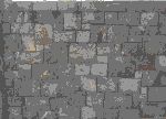 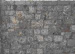
One of the above has been scaled first, then indexed and the other was indexed then scaled. I can't remember which is which. 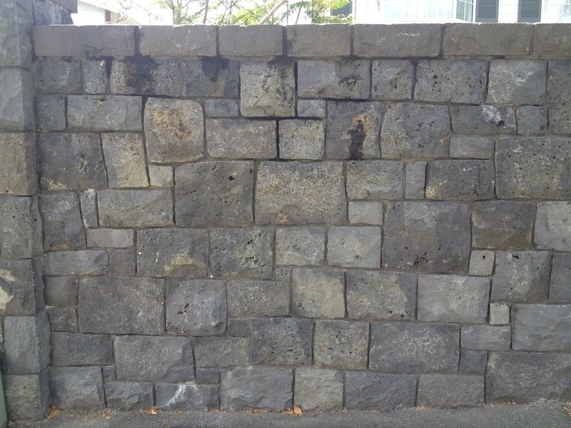
I thought with the relatively nice and even block shapes in this wall that things would work out. I was wrong. Below is a screen cap from Amiga Gods. I'm drawing a lot of inspiration from this game but hopefully i can make something that looks a bit better. Not that Gods looks bad but i will have larger sprites. 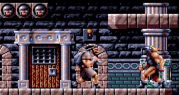
I also went and watched a long play of Torvak... yeah, it's the kind of thing i'm trying to do. The controls looked a bit awkward but there were some cool creatures in it. Hopefully i can do some better AI for my monsters too but i might be getting carried away. One level and a few monsters and traps will be a good start though. Anyway, i think i will go with something hand drawn and tiled with addition detail stuff added in places. Then i might be able to do a game mock up. |
|
|
IP Logged |
|
|
yrizoud
Commander
Joined: 03 May 2021 Location: France Online Status: Offline Posts: 343 |
Posted: 23 April 2015 at 1:07am |
|
Mark Coleman's unique style, it's an ambitious goal :) Not only it requires very precise pixelling, it also requires perfect understanding of how colors "mix". The Amiga works of Dan Malone show a similar ability, and more recently you should study the works of DawnBringer, especially his DB16 palette.
|
|
|
IP Logged |
|
|
Palocles
Midshipman
Joined: 02 December 2013 Online Status: Offline Posts: 65 |
Posted: 24 April 2015 at 2:01am |
|
So Mark Coleman did Gods? I though i read somewhere that a woman was the artist?
Gods seems to have a pretty big palette which probably helps it look so good. I want to go with something more limited to begin with to simplify things. This is the palette i've used for Bogan. I've already had to expand it a little as it needed some more earthy, subdued tones and more shades between black and white. I'm trying to find some time to do a block background but it's harder than i imagined to make it not perfectly aligned. |
|
|
IP Logged |
|
|
yrizoud
Commander
Joined: 03 May 2021 Location: France Online Status: Offline Posts: 343 |
Posted: 24 April 2015 at 4:17pm |
|
I just rechecked in multiple sources, he's the one credited for both Gods and Magic Pockets, which have identical style.
I said it's ambitious because "Gods" style is obtained by choosing a small number of colors and mixing them very intelligently. The sprites use 16 colors, and the scenery 16 more. This is why I referred to DawnBringer's "DB16" palette, here's an example he made with it: About tiles : Don't hesitate to draw 'large' tiling blocks (ie. 32x32). It's visually more interesting because there is less repetition, and it's easier to draw interesting shapes for you because the pixel size doesn't limit you so much. |
|
|
IP Logged |
|
|
Palocles
Midshipman
Joined: 02 December 2013 Online Status: Offline Posts: 65 |
Posted: 25 April 2015 at 1:15am |
|
I've chosen my palette to, hopefully, cover all of the character and background colours I will need. I think it might look a little cartoony in some instances though.
I might end up creating creatures on some levels by simply dropping the level of the R, G or B (or combinations of them). But that would technically give me more than the colours in my palette. Though I could still feel relatively happy that I made the original pieces with the limited palette. DBs icons look really good. Hopefully I can make something that good myself, at some point. As to my block tiles. I'm doing them in 100 by 100 so it should be big enough, haha. The latest, unfinished, version of Bogan is 60 pix high. I thought he should walk past a wall with a tile size bigger than him. Well, really it was because I thought it would be easier to build the map by making it out of a uniform tile size which could accommodate the character actions like jumping and attacking. Once I have a set of tile for each block type I need, ie. surface on top only, surface on two adjacent sides making a corner piece, platform adjacent to top only, etc. then I can make a level map from them as if they were Lego. |
|
|
IP Logged |
|
|
Hapiel
Rear Admiral
Joined: 30 June 2023 Online Status: Offline Posts: 3266 |
Posted: 25 April 2015 at 9:10am |
|
I first increased the contrast, so that the details (such as the cracks) pop out much more. Otherwise they would get lost when resizing.
I reduced the size with a smoothing algorythm, otherwise you would get some random details to pop out which would look like noise (your example nr 2) Still, some cracks got lost so I would then manually restore them... Or create a file with just the (darkened) cracks and resize this and overlay it on the resize you already have. The colors are obviously not as interesting as DB's things.. But it works kinda. 16  8 v1  8 v2  4  |
|
|
IP Logged |
|
|
Palocles
Midshipman
Joined: 02 December 2013 Online Status: Offline Posts: 65 |
Posted: 26 April 2015 at 8:30pm |
|
Thanks Hapiel, that's pretty cool. But i've gone with drawing the BG instead of trying to convert it from a picture.
After wasting some time this morning trying to make a palette using colour ramps i just jumped in with my existing palette, after tweaking the greys to make them a little darker. (I'll return to the ramps at some point though) I used a technique i saw in the Noobtorials thread (I think it was there) and lined in the blocks in the center diamond of a 100 x 100 pix canvas, then rotated the corners and filled the middle. I spent a while adjusting the blocks so it didn't band too badly and started colouring. I've ended up with this: 
Which looks pretty good tiled across a mock up and matches the style of the sprites i've done already. I first started it with a rougher surface and decided it would take too long but it might be a better result in the end so i will revisit that too. Here are a couple of level mock ups saved in MSPaint. I guess i could use the one saved as a GIF (which effects the flat colours strangely) as the BG and get free texturing? 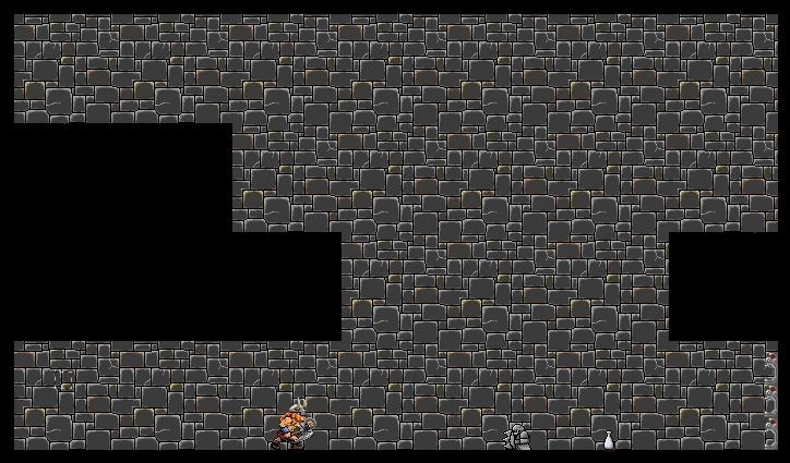
That's the current version of Bogan, he's going to become 60 pix tall in next incarnation. The little creature is a Shield Smurry and is 30 pix tall. The bottle isn't done using my current palette. It and a bunch of other items will have to be done for the game too. Blending into the background on the far right is a stack of three flame shooting traps that will also need a redesign, judging by how they look here. I'll make them 50 pix tall and 25 deep so i can stack them two high on a tile and they will have more presence. I'm going to try do some platforms and floor/wall/ceiling tiles now. These would be loaded over top of the BG and the code would refer to them for collision detection, etc. Lets see how much i can get done in the next few hours... |
|
|
IP Logged |
|
|
StoneStephenT
Commander
Joined: 08 April 2021 Online Status: Offline Posts: 252 |
Posted: 26 April 2015 at 8:56pm |
|
The colors on those background tiles seem way too bright; they actively draw attention away from the sprites.
|
|
|
IP Logged |
|
|
Palocles
Midshipman
Joined: 02 December 2013 Online Status: Offline Posts: 65 |
Posted: 26 April 2015 at 10:06pm |
|
Really? I thought the highlights were pretty minimal and the main colour was the darkest grey i'm using. I thought the sprites were showing up pretty good.
I haven't got time to tweak anything now but if you want to do that to show me what you think it should look like that would be cool. Also, i've made some floor tiles...:  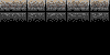
I did the grey first and like the look. Then i started on the ceiling and realised that the floor should probably have a bit of dirt on it, ie. brown, leaving clean grey for the ceiling that nothing walks on. (Except now i just got an idea for a roof crawling enemy...) Which do you think would look better? I'll need to use a different texture/colour to do the end on walls too. |
|
|
IP Logged |
|
|
Palocles
Midshipman
Joined: 02 December 2013 Online Status: Offline Posts: 65 |
Posted: 27 April 2015 at 3:09am |
|
Well, this will probably be my last update on this for some time. Today has been a bank holiday monday and the wife has let me do this all day. Tomorrow is back to work...
This is where i am up to: 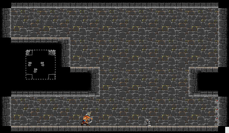
I'm working on things to go into the corners that are blank. That's what's in that floating selection box in the gap. Can you make out what they are? I could have gone with more plain block and if this doesn't work out i might still have to. But i thought some detail would look good. In hindsight i realise that i could have done the entire end on walls as something decorative. I'll see how it looks with them in place. I'm also thinking of doing some alternative BG tiles to break up the monotony. These will include tiles with torches burning on them, casting a glow around them (which unfortunately wont cast onto the sprites), tiles with faces or spouts leaking unpleasant looking liquids. Also maybe some columns or floor candelabras, maybe even tapestries. Still loads of things that will need to be made for the game too. Doors, portcullises, trap doors covering pits, spikes for the bottom of pits, treasure chests, treasure, potions, etc. This has turned into a WIP thread now, if a Mod sees and wants to move it, that would be great. Edited by Palocles - 27 April 2015 at 3:16am |
|
|
IP Logged |
|
|
yrizoud
Commander
Joined: 03 May 2021 Location: France Online Status: Offline Posts: 343 |
Posted: 27 April 2015 at 6:25am |
|
Progress is very good !
One critic is that you rely too much on single-pixel detail; When the screen will be filled with scenery and characters, everything will draw as much attention, and it may look messy. In these brick tiles, you should use 2- or 3-pixel wide lines every time there is a big boundary between two shapes. You can't possibly create a perfect multi-purpose tile set on your first try. Instead, start the actual level design as soon as possible, and add new tiles as you need them, in the context of the rooms where you'll need them. |
|
|
IP Logged |
|
|
Palocles
Midshipman
Joined: 02 December 2013 Online Status: Offline Posts: 65 |
Posted: 27 April 2015 at 11:40pm |
|
Thanks. :)
Do you mean i should use 2-3 pixels between blocks in the BG walls? The only other things that are really separate are the sprites form the BG but i don't think i could put a 2 pixel wide border around them. Personally i like the crispness of the single pixel lines in the blocks. And the outline on the little shield smurry gives it definition. I want to make the sprites more colourful than the background to make them stand out. Bogan looks pretty good in there and has a lot more colours than the creature. Now that i have a BG to put them against i can make them more visible. Oh yeah, i'm not going to try make a full on multi-purpose tile set straight off the bat. I'm just going to do the things that i'm planning to use in this level to start with. Eventually i'd like to have a whole dungeon full of stuff though. Things i need for this level: Portcullis (which slams down to close the entrance off) Door(behind which is treasure/potion, to show that doors are interactive things in the game) Trap door and pit with spikes Platforms(static and moving, but can look the same) A switch or button(to activate platforms) A treasure and a potion to go behind the door. A variant door (as a level exit) Everything that has only one or two states or steps of animation is way quicker the draw than things that need to be animated like enemies. BTW, can anyone tell what those objects are that i put center left of the last level mock up? I need to know if they are readable as something specific or if i need to redo them simpler. |
|
|
IP Logged |
|
|
yrizoud
Commander
Joined: 03 May 2021 Location: France Online Status: Offline Posts: 343 |
Posted: 28 April 2015 at 4:52am |
|
Originally posted by Palocles
Do you mean i should use 2-3 pixels between blocks in the BG walls? Oh no, rather at the "gameplay edges" of the solid walls, or at borders of cornerstones, so that they "pop" more. Originally posted by Palocles
can anyone tell what those objects are that i put center left of the last level mock up? I need to know if they are readable as something specific or if i need to redo them simpler. Looked like bat heads, and from they way you place them, corner stones carved as such. But you may have trouble placing them as actual corner stones if they don't fit a simple geometric shape. By the way, your image had 61 colors, though a good half is redundant. It may be difficult for you to keep up if you don't either : - stick to a color-indexed mode, - or keep a graphical view of your target palette somewhere, for easy eyedrop (like the following image) 
|
|
|
IP Logged |
|
|
Palocles
Midshipman
Joined: 02 December 2013 Online Status: Offline Posts: 65 |
Posted: 28 April 2015 at 10:25pm |
|
Hmmm. Not sure about that. I'm using a nearly solid lightest grey or beige as the collidable edges of the level which is more like what they have done on the Gods levels. I think I'd rather reduce the highlights on the BG blocks to increase contrast that way.
Colour count is under control but you had me wondering how you got that number. That little potion was drawn before I made my palette and uses semi transparent layers to get shades and highlights. That's probably where the extra colours are coming from. All of the objects that I will use in the final mockup and alpha test will be drawn with the palette I posted earlier. If you did the colour count thing on that single background tile 6 posts up you should get a more realistic colour count. It's a shame I hadn't read about colour ramps before I started this lot. I'd much rather be using colours chosen that way than the way I picked my palette. Glad those gargoyles are recognise able. The one on the top right needs fixing though. I think they should fit in the level ok though. Hopefully have time to finish them soon and see how they look. |
|
|
IP Logged |
|
| |
||
Forum Jump |
You cannot post new topics in this forum You cannot reply to topics in this forum You cannot delete your posts in this forum You cannot edit your posts in this forum You cannot create polls in this forum You cannot vote in polls in this forum |
|
