| Active TopicsSearchRegisterLogin |
| WIP (Work In Progress) | |
| |
  |
| Author | Message |
|
Gruthix
Midshipman 
Joined: 29 March 2022 Online Status: Offline Posts: 24 |
  Topic: [CC] Sky Chasers - iOS game Topic: [CC] Sky Chasers - iOS gamePosted: 28 October 2015 at 3:30am |
|
Hi, My name is Gruthix and I work at Lucky Kat Studios
After our debut game Nom Cat that currently has over 3m downloads we're creating something entirely different. In Sky Chasers, inspired by classics such as Moon lander and the "real world" wire loop game. You play as the young Max, desiring to become a true Sky Chaser, who is brave enough to build a ship out of a cardboard box and go on an epic adventure in a breathtaking magical world. Upgrade and tweak your ship, and test your flying skills against others. With intuitive two-touch controls and fun physics, players of all skill levels are set to feel like a true aeronaut. 


Please, tell us what you think! |
|
 IP Logged IP Logged |
|
|
eishiya
Commander 
Joined: 04 August 2022 Online Status: Offline Posts: 1109 |
Posted: 28 October 2015 at 8:23am |
|
The background (the trees) feels a bit unfinished compared to the foreground. It doesn't need more detail, just a little more refining of the shapes, and maybe a tad more AA on the non-transparent parts.
Are the buried bones gameplay elements or just little details? Their contrast suggests that they're important to the gameplay. If they're not, make them less bright. It took me a while to see that the player character is a human in a box, I thought it was an insect, thought the hat (?) was their real eyes+antennae, because the face is usually distorted beyond recognition because of the zoom-out and rotation. (Non-crit, totally personal opinion time: I love pixel art too much to play pixel art games with auto-zoom like this, since it distorts the art (and at 2x+, the distortion is very noticeable). I can deal with rotation a bit better, but I'd still much prefer to see several hand-rotated frames that get interpolated rather than have auto-generated rotations for every angle.) When money drops from you on death, I think the rotation animation should start on a random frame per coin, instead of all the coins being synchronised. It would look more natural and interesting. Having the coins that spawn with the level be synchronized is okay. I like the camera shake when you die. Simple, but very effective. The snapping flowers look good, but the way their stems seem to be hanging off a fixed point in mid-air looks weird. The ground they're attached to and the flower-head should be the only "fixed" points, there shouldn't be anything like that in the stem, I think. The water and the splashy interactions with it look great! Maybe a subtle gradient to make the water darker the deeper it gets might look more interesting? |
|
|
IP Logged |
|
|
Iscalio
Commander
Joined: 29 March 2023 Online Status: Offline Posts: 224 |
Posted: 28 October 2015 at 6:33pm |
|
Overall looks very nice to me. I love the insinuation that the kid found a box and then imagined doing all this stuff.
I do note that you've got a grass tile set and then you've put a stone tileset on top of it for some reason in your first shot? This looks wrong to me. Sometimes the stone even overlaps the grass awkwardly. I'd suggest grass and stone/dirt/etc be all a single, integrated tileset. I likeyour items, but the stars and coins at least seem to have different outline treatments? I kind of prefer the treatment on the stars, but maybe they are a bit too subtle for pick-up items? I don't know. Maybe they could have an animated shine or a rotation or something. I see you've got a darker green for background bushes, vines, etc. But in shot 3 their uniform shape makes them almost look like another platform (say in mario 3 they'd have platforms like this). Making the shapes of background bushes more varied might make them feel less like platforms assuming they aren't platforms. I agree with pretty much everything eishiya said, though I did immediately get that it was a kid in a box. I think for those flowers the curved U-shape bends look much more natural than the sharp V-shaped bends. The aboveground water animation looks fine to me, but I'd love to see a little something more occurring below the water line, whether it be bubbles rising from his impact or some white splashes into the water from his push down... |
|
|
IP Logged |
|
|
Gruthix
Midshipman
Joined: 29 March 2022 Online Status: Offline Posts: 24 |
Posted: 29 October 2015 at 8:01am |
|
Hello Eishiya,
Thanks a lot for the feedback! Really useful! We'll fix the bones and make a stem for the Piraha plants(We already planned this before.) We get the feedback about the character a lot, but we might make a intro animation where you see Max, the human jump into the box getting ready for lift off. This will clear up that it's a human and adds a little more character to the game :) We have chosen to make the ship rotate like this because we are going to make about 30+ ships that you can buy in the shop. It saves a lot of time. Ofcourse we'd prefer to hand draw them all, but we have tight deadlines to finish every week to ensure the release for Q1 2016. We have fixed the coins and made them non synchronised upon dead. 
We also wanted to make it clear that you 'cash in' your coins and gems when you land on a checkpoint. 
Please tell us what you think!( ͡^ ͜ʖ ͡^ ) |
|
|
IP Logged |
|
|
Gruthix
Midshipman
Joined: 29 March 2022 Online Status: Offline Posts: 24 |
Posted: 29 October 2015 at 8:25am |
|
Hello Iscalio,
Thanks a lot! The kid sure has a bright imagination ;) The first GIF was from a early build, I just wanted to showcase the awesome Piranha plants with it! We've made 'transition' tiles from grass to stone so we have a little bit of variation and transition to (secret!) caves. 
The stars in the gif were placeholders and we replaced them with coins. 
Please tell me what you think! The rest of your feedback will be applied as well, we're going to make more varied bush shapes and we're going to look into something more intresting for under water. We were thinking about a gradient to dark, this makes a lot of sense. Seaweed or other underwater plants and maybe small fish. (Since we already have small harmless birds) Thank you! :) |
|
|
IP Logged |
|
|
eishiya
Commander
Joined: 04 August 2022 Online Status: Offline Posts: 1109 |
Posted: 29 October 2015 at 11:37am |
|
The coins being cashed in looks great!
I realize it's probably not finished, but the checkpoint glow looks very bland now. Make it an off-white colour instead of white, and maybe add some sparkles rising up, not just a smooth gradient? I think people are used to rotation like this being a common time-saving technique and won't question it. Key-frames might make a nice later update though, if there's the time/budget to polish the game further. What size(s) of screen is the game meant to be played on? I only ask because the auto-zoom looks fine at 1x, but not so good at 2x+ where everything looks jittery. But again - this might just be me and my purism. The rock-grass transitions look good. I think the solid-looking grass border around the "black" looks a bit unpolished though, since it looks like we see a lot of the solid "black" areas. I think there should be additional transition tiles, so the edge is smoother and wider. It would require more work to place the tiles, but I think it would look much better, and draw less attention to the blockiness of the world. The piranha plants could use a little more animation while they're idle. Because the screen moves around so much, their slow, subtle movements don't really come across, so they look static. In addition to the procedural movement, it would be nice if the sepals (the green leaf-like parts) had some animation to them, especially when they're propelling forward (e.g. when the mouth is open). I know it seems like I'm full of nitpicks about the polish level of the game, but the little details you already have are great! I just don't want to waste time on what you probably already know. I love the little smoke puffs from the "ship", the "poof" effect on the coins being picked up, the camera shakes from all the different impacts, etc. The fact that what's already there is often quite good is what makes me want to push you further. Are the levels hand-made, or procedural? This seems like the sort of game people on sites like VGAtlas would love to map out, if the levels are hand-made. There would probably need to be a PC version for that though. |
|
|
IP Logged |
|
|
Gruthix
Midshipman
Joined: 29 March 2022 Online Status: Offline Posts: 24 |
Posted: 29 October 2015 at 12:14pm |
|
Thank you! We're still working on the full effect, we might want to do something more "juicy" for the gem(Gems are the 'premium' currency for the game) so we want to make this feel really good to cash in.
The rotation in the gifs look jittery, I agree. But I can assure it looks better on mobile devices :) You can sign up for the beta here if you want: Beta We're still working on it, but we want to make the beta a polished and fun experience! "The rock-grass transitions look good. I think the solid-looking grass border around the "black" looks a bit unpolished though, since it looks like we see a lot of the solid "black" areas. I think there should be additional transition tiles, so the edge is smoother and wider. It would require more work to place the tiles, but I think it would look much better, and draw less attention to the blockiness of the world." You have to enlighten me on this one! Do you mean This part? Do you think it needs a transition from the green to purple("Black")? 
For the piranha plant we'll animate the stem(the leafes on it) and the neck/rope might get leafes as well that animate with it, but this is part of future polish :) The level is hand-made and we'll be getting other areas in the future with different enemies and obstacles for variation in the gameplay. But we want to polish level 1 first! |
|
|
IP Logged |
|
|
Iscalio
Commander
Joined: 29 March 2023 Online Status: Offline Posts: 224 |
Posted: 29 October 2015 at 3:37pm |
|
I'm assuming eishiya means you're going directly from green grass to blackness? Instead of transitioning to a dirt or rock design, however subtle? As much as I like the grass texture that's there it is completely repetitive. Perhaps an alternate tileset of variation tiles (with different shapes, little flowers, or whatever) that are used only 20% of the time or so might break up the regularity of the ground cover?
I like the new coins. If you want to spice up the coin or gem turn-in it feels like you could have some particles coming from the kid as the coins burst out of him. And you could maybe give the crystal a more interesting flight path where it's spiraling around and giving off sparkles or something. *shrug* |
|
|
IP Logged |
|
|
eishiya
Commander
Joined: 04 August 2022 Online Status: Offline Posts: 1109 |
Posted: 29 October 2015 at 4:03pm |
|
Iscalio got it right - I meant the fact that you're going right from grass to purple-black without any dirt or any other sort of transition in-between. The rocks can transition well from rock into the purple-black because there's not a lot of contrast, but the grass contrasts a lot with the purple-black (and looks good being as thick as it is), so a wider transition would be good. Having a grass-dirt transition would be good. You could make the transition include some smaller tufts of grass in the dirt, there are lots of ways to go about it. If possible, there should be multiple transition tiles so that the green part has a variable thickness.
The sharp cut-off you currently have looks fine in small quantities, but in the actual level, it starts to just read as a bright green outline rather than a natural part of the environment. I wish I could help with the beta, but I don't have a suitable device. |
|
|
IP Logged |
|
|
Gruthix
Midshipman
Joined: 29 March 2022 Online Status: Offline Posts: 24 |
Posted: 09 November 2015 at 3:40am |
|
Hey, Sorry for the late reply!
We're going to look into this in the future. Currently we have made a slight transtion from the grass to purple. Right now we are revising the gameplay a bit. We're going to introduce more obstacles and enemies. I'll keep you guys updated! In the meantime, have this gif with new enemies and obstacles: 
And also, a teaser trailer :) Teaser Trailer |
|
|
IP Logged |
|
|
Gruthix
Midshipman
Joined: 29 March 2022 Online Status: Offline Posts: 24 |
Posted: 10 November 2015 at 7:48am |
|
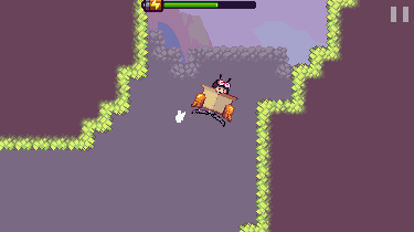
I'm working on editing the new flying enemies and I could really use your help. The one in the previous gif is not very readable so I edited the colors. I also didn't like the eyes so trying something different here. First one is the original.

|
|
|
IP Logged |
|
|
eishiya
Commander
Joined: 04 August 2022 Online Status: Offline Posts: 1109 |
Posted: 10 November 2015 at 9:43am |
|
The middle one reads the best to me.
Because of the auto-zoom, you should avoid any important features that are only 1px wide because they're at risk of disappearing, so the 2px eyes are the most likely to stay readable. It might still not read well against the background, because the background is full of midtones, and these enemies are also midtones. |
|
|
IP Logged |
|
|
Gruthix
Midshipman
Joined: 29 March 2022 Online Status: Offline Posts: 24 |
Posted: 11 November 2015 at 1:34am |
|
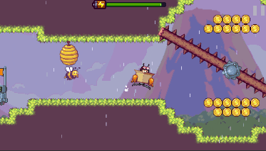
Agreed!
I implemented him in the game, gave him 1px line eyes though :) They wont disappear because of the zoom so that's alright. I guess they read against the background pretty well here: 
|
|
|
IP Logged |
|
|
eishiya
Commander
Joined: 04 August 2022 Online Status: Offline Posts: 1109 |
Posted: 11 November 2015 at 7:29am |
|
Definitely better!
Something about the game environment feels a little washed out overall. Maybe a tad more saturation in the foreground tiles, and a darker "black" in the dirt? I'm not even sure! Looking at the screenshots, they look good, but somehow "pale". The screenshot with the water looks great because there's that big bright, not-pastelly area of water, but the rest feel dull. Maybe it's not even the values, but the hues - the hues of the foreground are about the same as the background, instead of being shifted cooler/warmer. I'm sorry that I can't give more specific feedback this time. This isn't even necessarily a crit, just something I don't like the look of. It might be intentional and good in the context of the game, e.g. if you want a pastel world full of bright enemies. Something I forgot to mention last time: The energy/HP bar looks good! Reads well, and the blinking bolt is great, it's informative but not distracting. |
|
|
IP Logged |
|
|
MikePixel
Commander
Joined: 24 May 2018 Online Status: Offline Posts: 125 |
Posted: 11 November 2015 at 8:21pm |
|
I feel like the player isn't that readable but omg I love your games aesthetics. The tileset is really pretty to me! Do you think the background foliage is a bit unfinished compared to the foreground?
Losing money looks really awesome too. |
|
|
IP Logged |
|
|
Fusionnist
Commander
Joined: 01 April 2016 Online Status: Offline Posts: 119 |
Posted: 12 November 2015 at 10:46am |
|
I'm bad at crits, so here are suggestions: Simple game mechanics as pressure plates and gear-like doors, air vents and stuff are real nice in these games. I reccomend you play Nitrome's Hot air games, may be useful :)
Also please do bosses, everyone loves bosses (I guess?) I wish you lots of energy and courage for your development (and also for reading our endless flow of crits) ;) |
|
|
IP Logged |
|
|
Gruthix
Midshipman
Joined: 29 March 2022 Online Status: Offline Posts: 24 |
Posted: 12 November 2015 at 11:06am |
|
Originally posted by eishiya
Definitely better!Something about the game environment feels a little washed out overall. Maybe a tad more saturation in the foreground tiles, and a darker "black" in the dirt? I'm not even sure! Looking at the screenshots, they look good, but somehow "pale". The screenshot with the water looks great because there's that big bright, not-pastelly area of water, but the rest feel dull. Maybe it's not even the values, but the hues - the hues of the foreground are about the same as the background, instead of being shifted cooler/warmer.I'm sorry that I can't give more specific feedback this time. This isn't even necessarily a crit, just something I don't like the look of. It might be intentional and good in the context of the game, e.g. if you want a pastel world full of bright enemies.Something I forgot to mention last time: The energy/HP bar looks good! Reads well, and the blinking bolt is great, it's informative but not distracting. I think the purple dirt makes this effect. The background and things further away are also shifted to purple. I'll try to experiment with it but I'm not sure if we CAN change it, we're in pretty deep and a lot of colors are adapted to it and such! If we change that color we will probably have to make a lot of color changes :( |
|
|
IP Logged |
|
|
Gruthix
Midshipman
Joined: 29 March 2022 Online Status: Offline Posts: 24 |
Posted: 12 November 2015 at 11:11am |
|
Originally posted by Fusionnist
I'm bad at crits, so here are suggestions: Simple game mechanics as pressure plates and gear-like doors, air vents and stuff are real nice in these games. I reccomend you play Nitrome's Hot air games, may be useful :) Also please do bosses, everyone loves bosses (I guess?) I wish you lots of energy and courage for your development (and also for reading our endless flow of crits) ;) Got you covered! This crate can SHOOT and kill enemies, but you'll have to get rid of it to open up a pressure plate activated door ;) 
|
|
|
IP Logged |
|
|
Gruthix
Midshipman
Joined: 29 March 2022 Online Status: Offline Posts: 24 |
Posted: 12 November 2015 at 11:13am |
|
Originally posted by Conker534
I feel like the player isn't that readable but omg I love your games aesthetics. The tileset is really pretty to me! Do you think the background foliage is a bit unfinished compared to the foreground? Losing money looks really awesome too. On these 100% scaled gifs the rotation make the character less readable. But in the actual game all pixels get rescaled to 200% which makes Max more readable. You can see it here in our TEASER TRAILER |
|
|
IP Logged |
|
|
Gruthix
Midshipman
Joined: 29 March 2022 Online Status: Offline Posts: 24 |
Posted: 20 November 2015 at 8:07am |
|
We've made a new obstacle that quite literally.. gives a swing to your movement.
SORRY FOR 2X SCALE If it's 100% scale, the rotation wont look like it will in the final game. This looks better! 
|
|
|
IP Logged |
|
|
Gruthix
Midshipman
Joined: 29 March 2022 Online Status: Offline Posts: 24 |
Posted: 01 December 2015 at 6:36am |
|
Hey people!
We're working very hard to get this game done for the release! 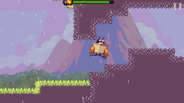
We changed the bee, it now chases you down to a certain point. Also added rain and wind effects and sharp rocky tiles that hurt you on touch. Let us know what you think, and contact me on twitter(@Gruthix) if you are interested in beta testing (android & iOS) |
|
|
IP Logged |
|
|
eishiya
Commander
Joined: 04 August 2022 Online Status: Offline Posts: 1109 |
Posted: 01 December 2015 at 7:10am |
|
What do the sharp rocks look like?
Does the wind affect your flight? In the second gif it looks like it should. In the third gif, it looks like the bee is being pushed but not hurt by the spiked log. Is that intentional? Feels unfair xP I like what I've seen of the level design so far. Do you use any sort of tool to help with the timing of enemies, or is it hand-tweaked? Or are they all designed to work on the same "beat", so it's just a matter of synchronizing their start positions? What are the system requirements for this game (CPU/RAM/storage)? |
|
|
IP Logged |
|
|
Gruthix
Midshipman
Joined: 29 March 2022 Online Status: Offline Posts: 24 |
Posted: 01 December 2015 at 11:51am |
|
The sharp rock tiles are in the first image! It's a spin to the normal gameplay and challenges you to be extra careful. This is World 2, and we wanted this to feel different to the first world immediatly. The wind does indeed affect your flight and is a big spin on what you usually encounter, the enemies and obstacles you have seen before need a whole different approach.
Our lead programmer Hernan takes care of the level design, inspired by old NES games(Donkey kong country, super mario, mr. gimmick, Kirby etc etc) he makes really cool levels. He is using tiled to create the levels and hand-tweaks every challenge that you encounter, so everything feels varied. So you don't feel like you're doing the same thing over and over. It's a mobile game, so I'm not sure if specs really matter. It's working on iPhone 4 with 30-60 fps, but we're still optimizing everything before the release in January. *btw the gifs were recorded while the level lay out was created, so no detail was added yet. We create the level lay out first before detailing it. I'll post more gifs with foliage, birds, and more details next time!* |
|
|
IP Logged |
|
|
eishiya
Commander
Joined: 04 August 2022 Online Status: Offline Posts: 1109 |
Posted: 01 December 2015 at 6:41pm |
|
The rocks don't read as "PAIN DO NOT TOUCH" to me, they're too similar to the harmless rocks in world 1. The only immediately obvious difference is these rocks are actually forming the gameplay boundary instead of being in otherwise solid non-playable areas.
I would have each spike be larger (2-3 spikes per tile instead of the bunch you have) and longer (taking up most of the tile in length) and more dangerous-coloured. Common spike themes are metal or ice spikes - both light-coloured, but anything that reads as being different from the usual rocks and looks sharp (shiny) would work. Not all smart phones are created equal xP Mine's old and creaky. But, it is comparable to the iPhone 4, so as long as I have the space, I should be able to play it. Space has been an issue with games in the past, which is why I asked about the storage requirements. |
|
|
IP Logged |
|
|
Gruthix
Midshipman
Joined: 29 March 2022 Online Status: Offline Posts: 24 |
Posted: 02 December 2015 at 12:55am |
|
Hey, thanks for the feedback.
These spikes were already version 2, had even thinner spikes before :P Anyways! I made new, much bigger spikes here, I'm pretty sure they are clear. We don't want them to be a different color because it kinda breaks the consistency of the purple/green boundries. 
sorry for the zoom effect, looks bad on this resolution :( |
|
|
IP Logged |
|
|
eishiya
Commander
Joined: 04 August 2022 Online Status: Offline Posts: 1109 |
Posted: 02 December 2015 at 6:56am |
|
The corner spikes look spikier, but could probably stand to be thinner - it looks like a sharp rock, but still a harmless rock because it doesn't look sharp enough to pierce/hurt. The other ones still look read as an overall flat (=safe) surface. Have the spikes vary in length, e.g. have one dominant spike that goes all the way across the tile, and the rest be shorter. You need the silhouette to read as spiked. At present, it just reads like slightly pointy rocks. If spikes look too even (same direction, or the same height, or the same width), they don't look "jagged" and thus don't look dangerous.
Edit: Here's an edit of two of your tiles. I don't know where exactly your tile boundaries are so these might not tile well with your other tiles, but hopefully you get the idea. (Also I flipped my corner tiles instead of rotating them, so the lighting is wrong.)  I made the spikes thinner, more varied in width and height, and they're not all pointing in perfect angles. I left a decent chunk of empty space between some of them to emphasize the jaggedness. I made the little ones on the bottom also a bit more varied, contributing to the "jagged" look. |
|
|
IP Logged |
|
|
Gruthix
Midshipman
Joined: 29 March 2022 Online Status: Offline Posts: 24 |
Posted: 18 December 2015 at 7:54am |
|
Hello people!
We have been very busy FINISHING THE GAME the last couple of weeks and we are happy to announce the release date in the launch trailer! You can see the launch trailer on our WEBSITE ps. I edited the spiketiles, never got back to reply to you though. Thanks everyone here for all the feedback and help! It has been very educational for me personally and as a studio :) |
|
|
IP Logged |
|
|
Fusionnist
Commander
Joined: 01 April 2016 Online Status: Offline Posts: 119 |
Posted: 19 December 2015 at 1:41pm |
|
Brilliant stuff in there!
|
|
|
IP Logged |
|
|
Gruthix
Midshipman
Joined: 29 March 2022 Online Status: Offline Posts: 24 |
Posted: 20 January 2016 at 3:00am |
|
Hey guys! Skychasers just released on iOS. Android will be released in a week :)
Check it out: https://itunes.apple.com/us/app/sky-chasers/id1038866266?ls=1&mt=8 |
|
|
IP Logged |
|
|
Caladium
Seaman 
Joined: 23 July 2016 Online Status: Offline Posts: 7 |
Posted: 20 January 2016 at 5:56pm |
|
game has an appealing style
|
|
|
IP Logged |
|
| |
||
Forum Jump |
You cannot post new topics in this forum You cannot reply to topics in this forum You cannot delete your posts in this forum You cannot edit your posts in this forum You cannot create polls in this forum You cannot vote in polls in this forum |
|
