| Active TopicsSearchRegisterLogin |
| WIP (Work In Progress) | |
| |
  |
| Author | Message |
|
Lindion45
Midshipman 
Joined: 03 June 2016 Online Status: Offline Posts: 35 |
  Topic: Adding snow to stuff Topic: Adding snow to stuffPosted: 10 November 2015 at 9:21am |
|
Here's a picture of a tree from my game.

I'm trying very hard to add snow to it, but I can't get it to look right. Any techniques to make it better? |
|
 IP Logged IP Logged |
|
|
eishiya
Commander 
Joined: 04 August 2022 Online Status: Offline Posts: 1109 |
Posted: 10 November 2015 at 9:46am |
|
Define the forms of the tree more clearly, and that will help you see where snow would be able to lie and where it would not. Your tree looks more like a textured cardboard cutout (2D shape) now, it has no 3D form.
|
|
|
IP Logged |
|
|
Lindion45
Midshipman
Joined: 03 June 2016 Online Status: Offline Posts: 35 |
Posted: 10 November 2015 at 9:57am |
|
Well it's meant to look like a cardboard cut out, to some degree, I guess.
I added some snow, but it looks wierd 
Is there enough tree showing? |
|
|
IP Logged |
|
|
eishiya
Commander
Joined: 04 August 2022 Online Status: Offline Posts: 1109 |
Posted: 10 November 2015 at 11:01am |
|
A cardboard cutout wouldn't have much snow on it (unless it's very sticky snow blowing at a proper angle xP).
I think you have enough snow showing. The forms don't look good, but that's just a result of the tree not having good forms. It definitely reads like a tree with snow on it, so you're successful there! I don't think you need the midtone on your snow. Snow is very bright. Depending on the lighting conditions, you might not even see shadows on it, it's just globs of white. There are definitely almost never discernible highlights on it though (aside from speculars from individual crystals), snow is too light in colour for that. I think having some shadows is fine in this case. I would keep all three snow-colours, but use the lighter colour for most of it, keep the shadow colour where it is, and use the middle colour only for AA. Depending on the type of tree this is meant to be, you might get it to look better by changing the shapes of your snow-globs. If this is something like cypress where it's effectively a solid mass of branches and leaves, then your current ones are fine. If it's something with distinctly visible branches, then you might want to have more horizontal ones, suggesting them lying on top of branches. By the way, you should have posted this in the WIP forum, that's the place to go to post your work for critique/feedback. You should ask a mod to move your thread (by PMing one or reporting the thread). |
|
|
IP Logged |
|
|
Lindion45
Midshipman
Joined: 03 June 2016 Online Status: Offline Posts: 35 |
Posted: 10 November 2015 at 12:18pm |
|
A cardboard cutout wouldn't have much snow on it
SHHH shh shh shhhhh shhh artistic license! 
It definitely reads like a tree with snow on it, so you're successful there!
Yay! I don't think you need the midtone on your snow. If you mean, the snow is too dark overall, it has to be because the ground is going to be close to white! Or, if you mean that the snow has 3 colours and the middle one is not necessary, I think it is. Not because it has highlights, but I feel it wouldn't just be a flat colour. I'm trying to mimic this: 
Maybe I need a bit more blue! Depending on the type of tree this is meant to be

By the way, you should have posted this in the WIP forum
Apologies!! I will report this now |
|
|
IP Logged |
|
|
eishiya
Commander
Joined: 04 August 2022 Online Status: Offline Posts: 1109 |
Posted: 10 November 2015 at 12:27pm |
|
The snow in the first image is ground-snow, and it looks like it has shadows cast on it from elsewhere, in addition to its form shadows. It still has no outright highlights. It just has a smooth transition from light to dark, which is what using your middle colour as AA would help achieve. As-is, your lightest colour reads as highlights rather than a main colour, because it's not dominant. In your example the snow is somewhat backlit so shadows dominate, but your tree looks like it's top/front-lit, so light dominates, which would imply that the lightest colour should dominate. I'm not sure whether that's your goal, though.
The tree in your second image is a fir tree, and it has distinct branches. Notice how in that image, the snow patches are mostly horizontal, because the branches are largely horizontal and the snow sits on top of them. Then, from those large horizontal areas, you get some smaller vertical ones from the smaller branches that come off the main ones. The tree's form determines how the snow lays on it. |
|
|
IP Logged |
|
|
Fusionnist
Commander
Joined: 01 April 2016 Online Status: Offline Posts: 119 |
Posted: 10 November 2015 at 12:46pm |
|
Is it ground snow? I'd call it a fat snow layer...
The way the snow is shaded could have a fix: the shading sticks too much to the outlines, instead of being uhh (I need the words to come out sorry, got no vocabulary still help me Eishi!) |
|
|
IP Logged |
|
|
Lindion45
Midshipman
Joined: 03 June 2016 Online Status: Offline Posts: 35 |
Posted: 10 November 2015 at 2:05pm |
|
the snow patches are mostly horizontal, because the branches are largely horizontal and the snow sits on top of them.
Here, how about this: 
The snow in the first image is ground-snow
It certainly is! I was just showing the transition effect I was going for! How it's even blue in the shadows! 
|
|
|
IP Logged |
|
|
Lindion45
Midshipman
Joined: 03 June 2016 Online Status: Offline Posts: 35 |
Posted: 10 November 2015 at 2:09pm |
|
The way the snow is shaded could have a fix: the shading sticks too much to the outlines, instead of being uhh
I know exactly what you mean 
|
|
|
IP Logged |
|
|
eishiya
Commander
Joined: 04 August 2022 Online Status: Offline Posts: 1109 |
Posted: 10 November 2015 at 3:29pm |
|
I think Fusionnist might have been talking about how your shadows follow the shape of your... shapes, without creating any forms of their own. So, more like this, perhaps?
 Your example is essentially a flat gradient with only a slight suggestion of form. This clump of snow has a clear form, with its own hills and valleys. Most of your snow clumps don't need to be this complex, but they shouldn't look flat. Even a simple round shape shouldn't just have a flat gradient, the shadows should follow the form. |
|
|
IP Logged |
|
|
Lindion45
Midshipman
Joined: 03 June 2016 Online Status: Offline Posts: 35 |
Posted: 10 November 2015 at 3:42pm |
|
Your example is essentially a flat gradient with only a slight suggestion of form
Well I did try to add a little thing in there, I didn't mean it to be just a gradient! I'll see what I can do tomorrow |
|
|
IP Logged |
|
|
Fusionnist
Commander
Joined: 01 April 2016 Online Status: Offline Posts: 119 |
Posted: 10 November 2015 at 11:27pm |
|
Yeah I meant that :)
|
|
|
IP Logged |
|
|
Lindion45
Midshipman
Joined: 03 June 2016 Online Status: Offline Posts: 35 |
Posted: 11 November 2015 at 4:53am |


There, how about that? I tried very hard to give the snow some "form" that wasn't just following the edges! Also, there appears to be a line down the middle. Should I look into removing that? :D |
|
|
IP Logged |
|
|
eishiya
Commander
Joined: 04 August 2022 Online Status: Offline Posts: 1109 |
Posted: 11 November 2015 at 7:22am |
|
I think it's an improvement. I feel like a lot of your shadow work just ends up lost though, because the contrast is so low, and the image is so small that you can't see much.
You should definitely get rid of the line down the middle. Not only is it bad for the composition, but it also makes your tree look like we're looking at a cross section. There should be some branches coming towards us, which would also have snow on them. Depending on the angle we're seeing this tree from, these snow clumps could be anything from squat square-ish shapes to long vertical rectangles. I'm guessing the squares are more likely. By the way, the forums have a zoom feature so you don't need to post pre-zoomed versions. Click to zoom in, ctrl+click to zoom out. |
|
|
IP Logged |
|
|
Lindion45
Midshipman
Joined: 03 June 2016 Online Status: Offline Posts: 35 |
Posted: 12 November 2015 at 4:45pm |
|
I feel like a lot of your shadow work just ends up lost though, because the contrast is so low
You should definitely get rid of the line down the middle.
Alright, how about this? I've completely refurbished the palette, and deleted the horrible line! 
the image is so small that you can't see much.
It will be rendered at 3x ingame! By the way, the forums have a zoom feature  Oops, completely missed that! They should add some hover-over GUI to showcase that! Oops, completely missed that! They should add some hover-over GUI to showcase that!
|
|
|
IP Logged |
|
|
eishiya
Commander
Joined: 04 August 2022 Online Status: Offline Posts: 1109 |
Posted: 12 November 2015 at 5:37pm |
|
I think the newest version looks good! Definitely reads like a snow-covered spruce, and the raised contrast helps (even at 1x, and definitely looks better at 3x).
Speaking of contrast, because the dark greens contrast so much with the snow, they all read as the same colour. You could easily reduce them all to one or two colours without any noticeable difference, even at 3x. The dark greens only become discernible around 5x or so. Depending on how the rest of your game looks, maybe you could make the snow shadows more blue? Blue shadows will lend your game a sunny day feeling (blue shadows are the result of a clear sky creating a sky-blue ambience). If your game has falling snow or is otherwise meant to have an overcast feel, then these greyer shadows are better. Also, just in case this becomes relevant as you make more snow objects/tiles: don't be too afraid of letting the snow on your trees blend into the ground-snow a little. That's quite normal IRL, and you have enough of the tree structure visible that it'll still read as "snowy tree against snowy background". |
|
|
IP Logged |
|
|
Fusionnist
Commander
Joined: 01 April 2016 Online Status: Offline Posts: 119 |
Posted: 13 November 2015 at 8:07am |
|
Only one thing, that branch going out a bit too much for me ;)
|
|
|
IP Logged |
|
|
Lindion45
Midshipman
Joined: 03 June 2016 Online Status: Offline Posts: 35 |
Posted: 14 November 2015 at 9:10am |
|
I fixed the over-sized branch!
the newest version looks good!
Glad to hear it!! Speaking of contrast, because the dark greens contrast so much with the snow, they all read as the same colour. You could easily reduce them all to one or two colours without any noticeable difference
Alright, I merged some colours, and pushed the lighter colours up. Depending on how the rest of your game looks, maybe you could make the snow shadows more blue? Absolutely! They already are, that's just a mockup shadow I painted. The shadows are handled with code :3

What happened to the rest of your post? You had loads of great ideas of other trees to add! I'm sorry for long replies, I'm super busy, and today my computer wouldn't even start up without some severe issue like no sound or programs not opening... 
I do read your replies basically within the half hour they're posted. But building up a reply with all your improvements has to fit in with an already overfilled schedule! I'm not ignoring you, and I'm endlessly grateful for the effort you're putting in to help! |
|
|
IP Logged |
|
|
eishiya
Commander
Joined: 04 August 2022 Online Status: Offline Posts: 1109 |
Posted: 14 November 2015 at 9:28am |
|
I meant the shadows on the snow on the tree, not the cast shadows.
It looks weird to me that the shadows and trees have different resolutions, but I'm a bit of purist when it comes to that thing. My personal preference is to zoom after all of the game rendering. Ironically, that tends to draw less attention to the blockiness than mixing resolutions does. I got rid of the tree suggestions because I felt it was premature, since you hadn't expressed any indication that you'd be making more trees. But I'm glad you liked it. Typing it up gave me some ideas for something I'm working on too. Need to figure out how to add downed trees to my game xP I don't feel you're ignoring me, don't worry xP My goal is just to give you some ideas on making your work better, replies don't figure into it. Plus, you're faster at responding than I am in my own thread! |
|
|
IP Logged |
|
|
Lindion45
Midshipman
Joined: 03 June 2016 Online Status: Offline Posts: 35 |
Posted: 14 November 2015 at 9:41am |
|
I'm just surprised you didn't say anything about the shadow direction contradicting massively with light source xD
|
|
|
IP Logged |
|
|
eishiya
Commander
Joined: 04 August 2022 Online Status: Offline Posts: 1109 |
Posted: 14 November 2015 at 10:29am |
|
If I'm going to point that out, I should also point out that with the kind of lighting you have on the tree, there shouldn't even be such a distinct cast shadow xP
(I was distracted by the blockiness and by correcting the misunderstanding.) |
|
|
IP Logged |
|
|
Fusionnist
Commander
Joined: 01 April 2016 Online Status: Offline Posts: 119 |
Posted: 14 November 2015 at 1:17pm |
|
Looks nice now :)
|
|
|
IP Logged |
|
|
Lindion45
Midshipman
Joined: 03 June 2016 Online Status: Offline Posts: 35 |
Posted: 14 November 2015 at 3:01pm |
|
Looks nice now
Thanks!!! :D It looks weird to me that the shadows and trees have different resolutions
Yeah, I think it's gonna strain any true pixel artist's eyes! However, I'm a huge fan of the hyper realistic pixel art. Where they replace what should be a HD texture, with a carefully coloured pixelated texture. 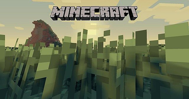


I got rid of the tree suggestions because I felt it was premature, since you hadn't expressed any indication that you'd be making more trees.
Aww! No! Put 'em back! There will be loaaads of art, and I've been harassing my community to give me more ideas! Every single asset I add has like 10 different variations as well, so I can make the world look as natural as possible, in a pixelly way! 
Typing it up gave me some ideas for something I'm working on too. Need to figure out how to add downed trees to my game xP
PUT EM BACK!!! Give me more xD Seriously though, if you could donate some more ideas, I'd be super appreciative of it!
|
|
|
IP Logged |
|
|
eishiya
Commander
Joined: 04 August 2022 Online Status: Offline Posts: 1109 |
Posted: 14 November 2015 at 4:50pm |
|
I think we have very different definitions of what "hyper realistic" means in the context of pixel art xP But no matter.
You should post a mock-up with your current assets in context. It would be much easier to give good suggestions then. Moreover, depending on the context, the critique for your existing stuff could change. For example, your tree is drawn as a side view, but the shadow suggests that it's meant to be more of a 3/4 RPG view (assuming the ground is meant to be flat), so you might have a mismatch there. I don't remember all the suggestions I posted, so I might be missing some, but I added a few more to make up for it: - Different heights and widths - Different shapes. Have some trees that are wider at the bottom, have some that are top-heavy. - Some trees tilt. That might be hard to show in the scale you're using, but it's something to consider. When the tilt is due to wind, magic explosions, etc, the trees will tend to lean in the same direction. When the tilt is due to unstable ground, the tilt will be random. - In areas that get frequent strong winds from a consistent direction, trees will often have fewer (or no!) branches on the windward side (example). - Some trees, especially ones in denser/darker forests, lose their bottom branches because light doesn't reach them. The leaves/needles and thinner branches fall off, but the thicker parts stay. - Some trees have bare branches on top because of frosts and harsh winds. Even cold-tolerant species will sometimes have dead tops. - Dead trees! Sometimes trees die (disease, root damage, etc) but stay standing until the wind or some other force topples them. Dead trees often lose their bark (both because it falls off and because animals eat it), so they'll often be the colour of aged wood (usually various warm greys, but that depends on the tree species). The bark is lost gradually over time, so you should have some trees with more/less bark remaining. - Dead trees that have fallen! These are especially common in old, wild forests where they have not been burned away by forest fires or taken by humans. - Fallen dead trees often serve as habitats for younger trees, as well as moss. It's rare to find a bare fallen tree, unless it fell recently. - When wind fells a tree, it could tear it out with the roots, so some of your fallen trees could have roots still attached and visible. Some might break because the trunk is weaker than the roots, in which case you should have a visible jagged stump nearby. - If humans cut trees down in the area, have some stumps that reflect that . When a tree is chopped down it leaves a pointed stump (common for thinner trees), and when a tree is sawed, it leaves a flat stump. With your scale, pointed stumps might be hard to distinguish from jagged stumps, so if you want to make it clear that some stumps are the result of human work, stick to a jagged-flat contrast. - This applies to all assets, not just trees: Detail variation isn't very noticeable. If the overall size, shape and colours look similar, the variation is likely to go unnoticed. Focus on making lots of very different versions first, then create subtly differing ones if you have areas where the repetition remains an issue. |
|
|
IP Logged |
|
|
Lindion45
Midshipman
Joined: 03 June 2016 Online Status: Offline Posts: 35 |
Posted: 16 November 2015 at 9:23am |
|
we have very different definitions of what "hyper realistic" means in the context of pixel art
No no no xD I don't mean that the pixel art itself is realistic, I mean the context of the pixel art is realistic. For instance look at those HD blurred shadows on the art: 
post a mock-up with your current assets in context.
Sure! 


Just a few, sorry for the messiness of the last one, that's a really old version! the shadow suggests that it's meant to be more of a 3/4 RPG view (assuming the ground is meant to be flat), so you might have a mismatch there.
Yeah, the camera angle is very superficial! But I think it looks cool so I won't be changing it! Different heights and widths
Different shapes. Have some trees that are wider at the bottom, have some that are top-heavy. There is quite a bit of variation between each sprite, as much as I can! Some trees tilt.
I did actually do some messing around with this xD 
But to be honest, I probably won't use it. When the tilt is due to wind, magic explosions, etc, the trees will tend to lean in the same direction. When the tilt is due to unstable ground, the tilt will be random.
Actually that's a really good idea! Maybe trees will wobble when nearby explosions go off, maybe even topple! - Dead trees! Sometimes trees die (disease, root damage, etc) but stay standing until the wind or some other force topples them. Dead trees often lose their bark (both because it falls off and because animals eat it), so they'll often be the colour of aged wood (usually various warm greys, but that depends on the tree species). The bark is lost gradually over time, so you should have some trees with more/less bark remaining.
- Dead trees that have fallen! These are especially common in old, wild forests where they have not been burned away by forest fires or taken by humans. - Fallen dead trees often serve as habitats for younger trees, as well as moss. It's rare to find a bare fallen tree, unless it fell recently. - When wind fells a tree, it could tear it out with the roots, so some of your fallen trees could have roots still attached and visible. Some might break because the trunk is weaker than the roots, in which case you should have a visible jagged stump nearby. Those are AMAZING ideas!! I'll make sure to include them!! 
If humans cut trees down in the area, have some stumps that reflect that . When a tree is chopped down it leaves a pointed stump (common for thinner trees), and when a tree is sawed, it leaves a flat stump. With your scale, pointed stumps might be hard to distinguish from jagged stumps, so if you want to make it clear that some stumps are the result of human work, stick to a jagged-flat contrast.
- This applies to all assets, not just trees: Detail variation isn't very noticeable. If the overall size, shape and colours look similar, the variation is likely to go unnoticed. Focus on making lots of very different versions first, then create subtly differing ones if you have areas where the repetition remains an issue. Well, currently, the really subtle detail works amazingly in my opinion. It's kind of like one of those things where you appreciate something, and you're not sure why. And I know this is true because at one point, there was a bug in my code that stopped the variations of the sprites from showing, and I noticed instantly. Thank you so much for this wave of ideas! Also, if you have ideas not related necessarily to trees, just stuff I could put in the environment, that would be muchly appreciated as well!! |
|
|
IP Logged |
|
|
eishiya
Commander
Joined: 04 August 2022 Online Status: Offline Posts: 1109 |
Posted: 16 November 2015 at 10:41am |
|
Automatically tilting the trees doesn't look good because when trees tilt, their branches still grow upwards, and the tree is still rooted normally What you have doesn't look natural because the whole tree is tilted rather than just the trunk (also most are tilted too far than you normally get). If you want tilting trees, you'd need new assets for them. I don't think this game needs that though.
I'm not a fan of the style you're going for, so I won't comment on things relating to that, but I will comment on your assets: I think the grass could use a little texture. The trees, grass, etc are very detailed, so the grass looks like you forgot to texture it. Plus, a little texture will help your blocky duckling stand out even more, since it'll be the only untextured thing on the screen. Just keep the texture subtle. Maybe add some dirt patches and areas of different types of grass, moss, etc? Forests seldom have a consistent ground cover, it varies a lot based on the microclimates. You mentioned you wanted the trees to look flat like cardboat cutouts, but to me they just look like they're unintentionally bad. Either give them form but then treat them as very pretty cardboard cutouts (as far as the geometry and shadowcasting does), or make them obviously cartoony. Whatever you do should look intentional. The subtle variation works well and is important, I'm just saying that overall things still feel "samey" because the shapes, colours, etc have very little variation. It's better to have a tree species in 5 different sizes with 3 subtly different versions each than to have it in 3 sizes with 5 versions of each, even though the number of overall versions is the same. |
|
|
IP Logged |
|
|
Lindion45
Midshipman
Joined: 03 June 2016 Online Status: Offline Posts: 35 |
Posted: 16 November 2015 at 11:05am |
|
Automatically tilting the trees doesn't look good because when trees tilt, their branches still grow upwards, and the tree is still rooted normally What you have doesn't look natural because the whole tree is tilted rather than just the trunk (also most are tilted too far than you normally get). If you want tilting trees, you'd need new assets for them. I don't think this game needs that though.
Alrighty. Agreed. I think the grass could use a little texture. The trees, grass, etc are very detailed, so the grass looks like you forgot to texture it.
Alright, will do. they just look like they're unintentionally bad.
lmao thanks. I'll see what I can do. I'm going for the more realistic side of pixel art, but not so realistic it's bland (eg Dayz). Photoenhanced realistic. As if someone had taken a picture, and slapped it on some cardboard. But the picture would have been taken in such a way that the cardboard cut out looked realistic at that angle. The subtle variation works well and is important, I'm just saying that overall things still feel "samey" because the shapes, colours, etc have very little variation. It's better to have a tree species in 5 different sizes with 3 subtly different versions each than to have it in 3 sizes with 5 versions of each, even though the number of overall versions is the same.
Hmmm. Well the end goal is to have many different assets with lots of subtle changes to each one! |
|
|
IP Logged |
|
|
Lindion45
Midshipman
Joined: 03 June 2016 Online Status: Offline Posts: 35 |
Posted: 19 November 2015 at 6:32am |
|
Old tree:

New ideas and experiments:     
I hope it looks a little less unintentionally bad now :3 EDIT: That's weird, the shadow seems to be the same...? I'll have to look into that |
|
|
IP Logged |
|
|
eishiya
Commander
Joined: 04 August 2022 Online Status: Offline Posts: 1109 |
Posted: 19 November 2015 at 6:59am |
|
It definitely looks more intentional now. I think the last image has the best sense of form, the rest feel flat because the shadows on them, though expressing detail/subforms, still amount fo a flat gradient on the overall shape.
If you want to have a tree with a texture like the second tree, you should give it an appropriate silhouette with branches sticking out. The tree's outline is very smooth, so the expectation is of a fairly smooth texture (like on trees 1, 4, and 5). |
|
|
IP Logged |
|
|
AJ1
Seaman 
Joined: 31 December 2015 Online Status: Offline Posts: 1 |
Posted: 30 December 2015 at 8:12am |
|
Since you're going for that realistic feel mixed with pixel graphics, I suggest blurring the cast shadows, so that they're smooth, like in that Minecraft picture you posted.
|
|
|
IP Logged |
|
| |
||
Forum Jump |
You cannot post new topics in this forum You cannot reply to topics in this forum You cannot delete your posts in this forum You cannot edit your posts in this forum You cannot create polls in this forum You cannot vote in polls in this forum |
|
