| Active TopicsSearchRegisterLogin |
| WIP (Work In Progress) | |
| |
  |
| Author | Message |
|
Pixel_Outlaw
Commander 
Joined: 01 September 2005 Online Status: Offline Posts: 3829 |
  Topic: Puzzle Game Pieces Topic: Puzzle Game PiecesPosted: 10 June 2016 at 2:47pm |
|
Hello all!
I'm an ancient Pixel Joint fan who has not posted for like 10 years... *ahem* I've released a game I wrote to Steam. I've got some comments saying it looked old and too 90's. (Which is kind of when I started doing pixel art). I don't think it looks terrible personally, but I'd like to get some old fashioned critiques and comments from the community. Anyway I've had a hard time making the pieces look very different color wise but also match the background nicely. Orange is especially difficult as it needs to read differently from yellow and red. I think part of my problem might be my linear shading from color -> white highlight. Probably need to get a hue shift or two in there. Here is my sprite sheet: 
Here is a screenshot so you can see the elements on screen. 
|
|

|
|
 IP Logged IP Logged |
|
|
jalonso
Admiral 
Joined: 29 November 2022 Online Status: Offline Posts: 13537 |
Posted: 10 June 2016 at 2:50pm |
|
Omg its popo! A blast from the past >.<
|
|
|
|
|
|
IP Logged |
|
|
Hapiel
Rear Admiral 
Joined: 30 June 2023 Online Status: Offline Posts: 3266 |
Posted: 10 June 2016 at 3:22pm |
|
Welcome back!
Very 90s indeed, why the saturated background? And why the extreme highlights on the otherwise flat spheres? Good luck with the project :) |
|
|
IP Logged |
|
|
Pixel_Outlaw
Commander
Joined: 01 September 2005 Online Status: Offline Posts: 3829 |
Posted: 10 June 2016 at 3:39pm |
|
Well I've kind of taken a cue from puzzle games I've played that have round pieces. Puzzle Bobble might be on par visually.
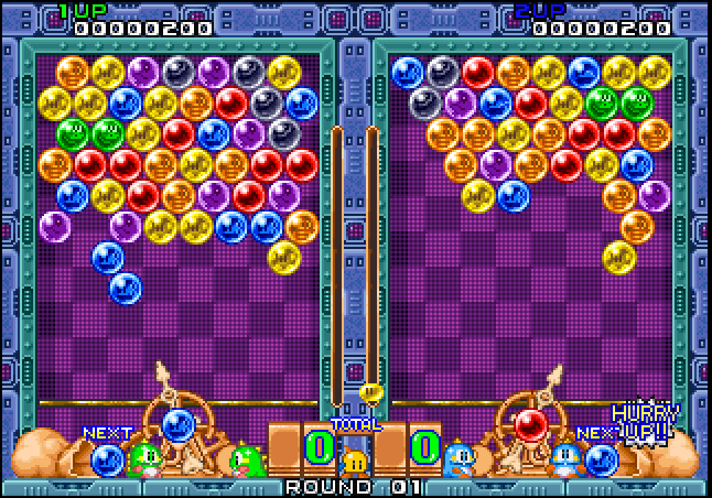 Most of the reference pictures I looked at for glass spheres had high specularity so that kind of found it's way in. If anyone wants to take a crack at that tile set as far as colors go It'd be welcome. Fresh set of eyes is always good... Well I took another crack at it... Used slightly different shading and reduced the saturation a bit. Still hard to see those colors differently at a glance. I guess the symbols help a bit...  |
|
|
|
|
|
IP Logged |
|
|
MrHai
Commander
Joined: 12 January 2014 Location: Norway Online Status: Offline Posts: 119 |
Posted: 11 June 2016 at 3:45am |
|
The red background outside the game board commands a lot of attention with its strong red. Would consider muting it a bit so it's easier to focus on the actual game pieces.
|
|
|
"Work is more fun than fun"
-John Cale |
|
|
IP Logged |
|
|
GameBoy
Midshipman 
Joined: 31 May 2016 Online Status: Offline Posts: 35 |
Posted: 11 June 2016 at 7:06am |
|
I would also use a cold colour (like blue) instead of warm red in background.
|
|
|
IP Logged |
|
|
Pixel_Outlaw
Commander
Joined: 01 September 2005 Online Status: Offline Posts: 3829 |
Posted: 12 June 2016 at 6:04am |
|
Thanks for the feedback. I'll see what I can do!
 |
|
|
|
|
|
IP Logged |
|
|
r1k
Commander
Joined: 01 April 2014 Online Status: Offline Posts: 336 |
Posted: 12 June 2016 at 10:57am |
|
Heres an edit I did of the color:
 The border around the image draws a lot of attention, so making it darker, cooler, and with less contrast helps take focus off of it and put it back onto the play area. The pattern behind the balls, inside the grid, isn't necessary at all I think, it just makes it look noisy. The dividers between the cells of the grid don't need to be that pronounced either. After removing the noise from the background, you can see the grid pretty well, even without any dividing lines, so I made those darker too. I made the border around the play field a little redder, so that it looks nice with the purple background, and stands out just enough as a border, while still not drawing much attention away from the play area. I made the orbs a little more saturated and used some subtle hue shifting. The biggest problems when not using hue shifting are that orange tends to look brownish when made darker, and yellow tends to get greenish when made darker. By shifting the dark oranges towards red a little, and the dark yellows towards orange, it keeps them looking bright, and its subtle enough that their local color identities stay as what they should be. Shifting the light blues towards cyan a bit is also an easy way to make the blue orbs really look bright and shiny. Hope this is helpful |
|
|
IP Logged |
|
|
Pixel_Outlaw
Commander
Joined: 01 September 2005 Online Status: Offline Posts: 3829 |
Posted: 12 June 2016 at 12:21pm |
|
You've really got those colors looking bright r1k!
I need to revise a bit now I think. :) The triangles on the borders are what you click with the mouse to shift columns and rows. I might keep them a bit brighter in my edit. Here is the link to my Greenlight project if anyone cares to toss a "yes" vote my way. :D Also I'm adding an option for people to user their own sprite sheets which other artist might enjoy. So you'll get a skinnable puzzle game if it gets approved. Vote for Shufflet here Also I decided to go with purple. After playing around more. Think I'm pretty happy with the results. Thanks for the help and edits! 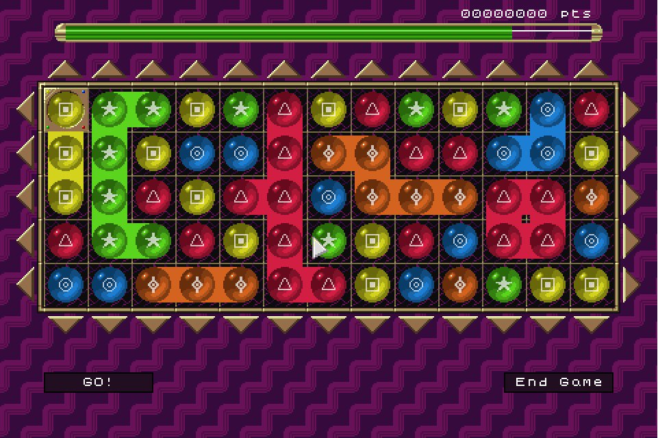 |
|
|
|
|
|
IP Logged |
|
|
saulc12
Midshipman
Joined: 04 August 2025 Online Status: Offline Posts: 18 |
Posted: 15 June 2016 at 8:10am |
|
The internal reflection on your crystals curves the wrong way really as this would be the incoming light magnified and diffused through the volume of the crystal. You could also do with more depth of shading to really bring out the effect of the light (maybe not relying on using so many shades though) for example:
Just a rough idea, but much more solid looking I think... |
|
|
IP Logged |
|
| |
||
Forum Jump |
You cannot post new topics in this forum You cannot reply to topics in this forum You cannot delete your posts in this forum You cannot edit your posts in this forum You cannot create polls in this forum You cannot vote in polls in this forum |
|
