| Active TopicsSearchRegisterLogin |
| WIP (Work In Progress) | |
| |
  |
| Author | Message |
|
Bacrylic
Midshipman 
Joined: 30 July 2017 Online Status: Offline Posts: 19 |
  Topic: 1st Game - Style (WIP) Topic: 1st Game - Style (WIP)Posted: 31 July 2017 at 2:59pm |
|
Critiques and suggestions are welcome.
Hi I'm Bacrylic and aslo the acting art director for Squaretale. 
------------------------------------------------------ Updated I've since been working on my character's animation. Found some contract work so my efforts have been split, but I'm back at it for the moment. Here's some stuff I haven't posted here yet.  


|
|
 IP Logged IP Logged |
|
|
eishiya
Commander 
Joined: 04 August 2022 Online Status: Offline Posts: 1109 |
Posted: 31 July 2017 at 4:51pm |
|
So the JPG artefacts are from the screengrabs? Try using GifCam or a similar program to record gifs of the game. It's really hard to judge pixel art when it's full of artefacts.
|
|
|
IP Logged |
|
|
Bacrylic
Midshipman
Joined: 30 July 2017 Online Status: Offline Posts: 19 |
Posted: 31 July 2017 at 5:16pm |
|
Thanks for the recommendation. I was using gyazo, but it still seems to be showing some artifacting on a smaller scale. I'll keep working on that, but its cleaner than what it was.
|
|
|
IP Logged |
|
|
Bacrylic
Midshipman
Joined: 30 July 2017 Online Status: Offline Posts: 19 |
Posted: 31 July 2017 at 5:22pm |
|
GifCam actually seems to be causing the artifacting on record. I'm not sure why. It doesn't appear to be artifacting on screen until I save out the recorded gif.
|
|
|
IP Logged |
|
|
eishiya
Commander
Joined: 04 August 2022 Online Status: Offline Posts: 1109 |
Posted: 31 July 2017 at 5:47pm |
|
Did you replace the image? The artefacting is different now. This is much better and clearer than before.
This type of artefacting is inevitable in an animated gif since your game has more than 256 colours, but GIF palettes only go to 256. You could post a second, non-animated screenshot to give a better sense of the actual look of the game. Save it as PNG to avoid compression artefacts. |
|
|
IP Logged |
|
|
Bacrylic
Midshipman
Joined: 30 July 2017 Online Status: Offline Posts: 19 |
Posted: 31 July 2017 at 6:10pm |
|
Thanks for the tips.
Here's a still. But it is still getting some artifacting....  I don't know how to fix at the moment, but as long as I can convey the mood and atmosphere, I'm not gonna get hung up on the mini issues unless necessary. I don't know how to fix at the moment, but as long as I can convey the mood and atmosphere, I'm not gonna get hung up on the mini issues unless necessary.

|
|
|
IP Logged |
|
|
eishiya
Commander
Joined: 04 August 2022 Online Status: Offline Posts: 1109 |
Posted: 31 July 2017 at 6:21pm |
|
Stop saving it as a gif, save as PNG xP PNG allows for 24bit colour.
|
|
|
IP Logged |
|
|
Bacrylic
Midshipman
Joined: 30 July 2017 Online Status: Offline Posts: 19 |
Posted: 31 July 2017 at 8:44pm |
|
Hah, my bad......

|
|
|
IP Logged |
|
|
Bacrylic
Midshipman
Joined: 30 July 2017 Online Status: Offline Posts: 19 |
Posted: 04 August 2017 at 9:31pm |
|
Feedback seems to be scarce
|
|
|
IP Logged |
|
|
eishiya
Commander
Joined: 04 August 2022 Online Status: Offline Posts: 1109 |
Posted: 05 August 2017 at 5:13am |
|
It's probably because you're asking a broad, vague question without providing any information to narrow it down. You're asking for feedback on the style, but what does that mean exactly? You also haven't said what sort of game this is, what mood you're trying to evoke, etc.
I personally think it's a bit hard to read, it would be nice if the character stood out a bit more. It might be less realistic, but I personally prefer clarity to realism. The environment feels very flat, there is no feeling of volume/3Dness to anything. That's understandable on the flat, man-made objects like the wall (which, ironically, you've shaded too much given the weather), but the trees are large and textured enough that they should have some shadows. Instead, you've given every single leaf shadows and highlights, making it all look flat. This is more of a personal taste thing probably, but I really don't like how noisy things are. There's so much single-pixel noise in your shadows and textures! I prefer a cleaner approach to pixel art, and prefer to see noisy, grungy aesthetics in non-pixel art, where I find it less jarring. |
|
|
IP Logged |
|
|
Bacrylic
Midshipman
Joined: 30 July 2017 Online Status: Offline Posts: 19 |
Posted: 05 August 2017 at 11:13am |

Good stuff all around. I'll answer in order. As far as what I mean by style, I mean my personal take and approach to design through the pixel art medium. You kind of answered that yourself with the 'taste thing' comment. I've amended some details about the game. Up top. This area scene is supposed to feel reminiscent of the scene from the Pagemaster where the kid is riding his bike in the rain.(Environmentally anyways, our guy isn't gonna ride a bike) I see what you mean by it being hard to read, and making the character stand out. In game, the camera will be pulled in closer to focus on the character. The background elements are there for any camera pull-outs to try and give a sense of scale. Trying to make him look small. Which I think needs some work. Closing in on the character may bring him more readable, but I kind of want to have that same effect from this far back. Which is why I posted from this angle. When we see the environment I want the player's eye to catch everything, but still feel drawn to the character. Still thinking of solutions for that. 
Clarity over realism is good. Though I guess my aim is to find a balance over both. The realism factor changes over the next few scenes, but the current area is intended to feel like a dull, urban city. Intentionally. I agree about the flatness. I'll see what I can do about the volume of things. I have options but sense every thing is pieced together and not a whole image, I only have a few work arounds for that. Shadows over casting objects from the trees for example, may not be an option....  So much agreement on the leaves thing. Thats something I'll work on. Not sure what you mean about over shading on the wall.?.? I'd guess you meant maybe its too bright considering the weather. In that case I'd agree. Overall it should be a darker scene. So much agreement on the leaves thing. Thats something I'll work on. Not sure what you mean about over shading on the wall.?.? I'd guess you meant maybe its too bright considering the weather. In that case I'd agree. Overall it should be a darker scene.
Back to the taste thing. Yeah, it looks like the grungy pixel noise is more or less building into my style, sorry. The cleaner approach may not be in the books for me, but I could clean it up on some elements to make the composition as a whole not feel so noisy. That might help bring focus to areas that have more focus. Thanks for the feedback! 
|
|
|
IP Logged |
|
|
Bacrylic
Midshipman
Joined: 30 July 2017 Online Status: Offline Posts: 19 |
Posted: 05 August 2017 at 2:44pm |
|
More Stuff for the game.
Here is my go at our main character's run cycle. I was going for a very exaggerated/animated run that would fit the type of character I wanted to show. I imagine there will be a toggle for this kind of sprint. 
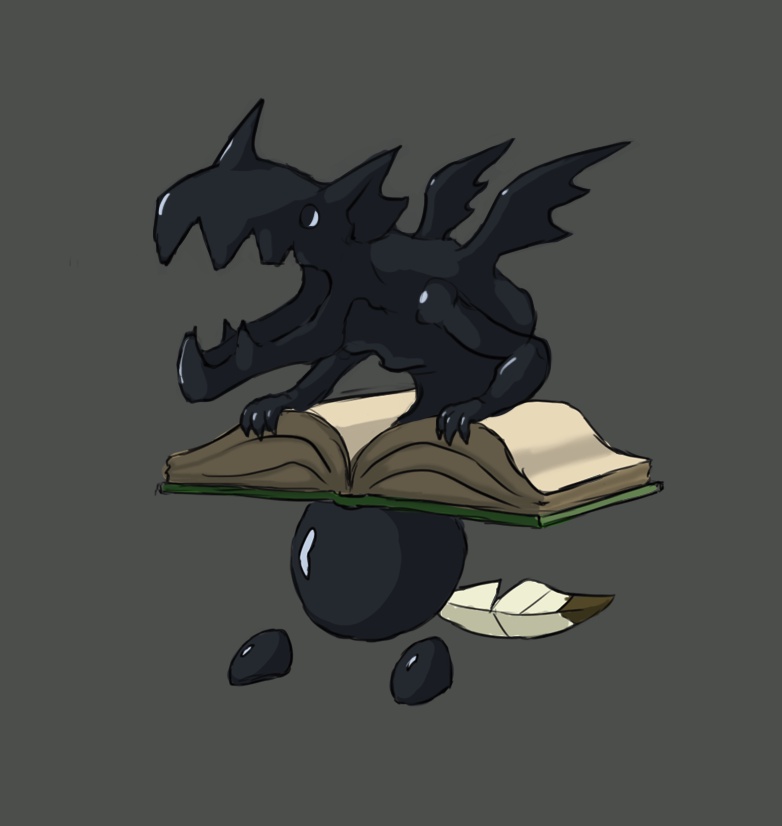
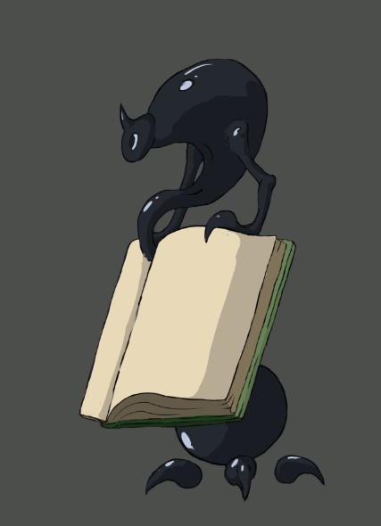
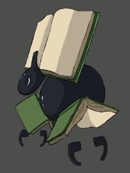
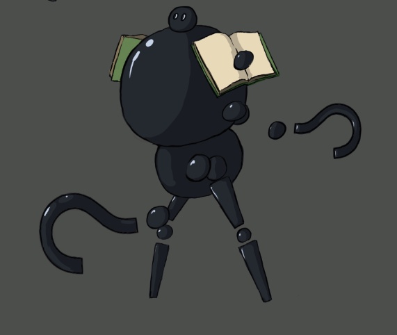
And here are a few enemy characters we will be seeing. Essentially, these will be our game's 'heartless'. We're not calling them that, but they will come in many different shapes and sizes. 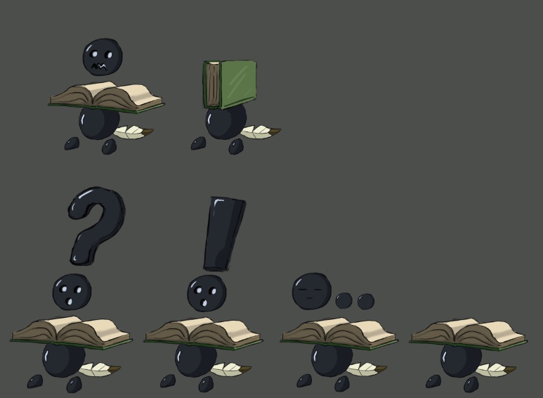


|
|
|
IP Logged |
|
|
eishiya
Commander
Joined: 04 August 2022 Online Status: Offline Posts: 1109 |
Posted: 05 August 2017 at 3:03pm |
|
With the walls, I meant that you have rather distinct directional shadows and highlights, whereas in this kind of weather, the only shadows you'd get on relatively flat objects like walls are ambient occlusion shadows (e.g. cracks, tight corners, anything that'll keep the ambient light from getting in).
With the leaves, I think the problem is just that you're not leaving any part of the tree in shadow. Here is a very rough edit that just gets rid of your highlights in some parts of the tree:  I think that adds some volume, without adding enough contrast to look like there's strong lighting. (I would've made it a link instead of embedding but the forum refuses to cooperate.) Re: "heartless" sprites You had a nice cel-shading look in the big art, but then made the book shadows noisy in the pixel art? Any reason for that? They looked quite nice with sharp shadows. There's no texture in the books to warrant that kind of noise, the pages are just paper. What are these sprites going to be, exactly? They look like (rather rough) pixel renditions of the concept art, and don't look very optimized for being sprites in-game - the colours don't read very well at the smaller size, the highlights are too prominent and placed in a way that flattens the forms rather than giving them volume, and they all seem to have differing light sources - in a game, you want something consistent. |
|
|
IP Logged |
|
|
Bacrylic
Midshipman
Joined: 30 July 2017 Online Status: Offline Posts: 19 |
Posted: 05 August 2017 at 9:20pm |

Ahh, I see. The shadow pass on the wall was more or less an experiment on my end. It was to test how well I could overlay a faded tile to try and create a shadow, so I can control it separately in game. I do find that the trees look better that way. For the not 'heartless', 'rough pixel renditions of the concept art' are pretty much what they are for now. It was my first pass at making the pixel versions, and to see how small I could make them. Size-wise to be relative to the character I wanted to make sure they were readable, though I may opt to make them bigger. The noise thing again was just when I started. It felt and looked right to me at the time. I'll be giving these guys another go over later. |
|
|
IP Logged |
|
|
Bacrylic
Midshipman
Joined: 30 July 2017 Online Status: Offline Posts: 19 |
Posted: 12 September 2017 at 10:50pm |
|
Currently working on making a tileset for our forest scene in the demo. The trailer is gonna be put on hold for now.


|
|
|
IP Logged |
|
|
Bacrylic
Midshipman
Joined: 30 July 2017 Online Status: Offline Posts: 19 |
Posted: 14 September 2017 at 2:27am |
|
I'm not satisfied with my current tileset, but for all sake and purposes it gives my partner something to work with in the meantime. So to make sure we have what we need for the game I'm jumping back to working on our basic enemy character, the Inkling Pawn and concepting out it's close range attack. My partner says projectile attacks could have a lot more bugs to fix, so we're not gonna show the fireball just yet.
Here is a test for the Pawn's idle anim. 
And here is the concept for close range. 
Something is wrong with my link for this one. Idk why its so big. Let me know what you think. I kind of like the arcing slam down hit for my taste (#1). |
|
|
IP Logged |
|
|
Bacrylic
Midshipman
Joined: 30 July 2017 Online Status: Offline Posts: 19 |
Posted: 16 September 2017 at 8:49pm |
|
Did some work on my inkling during comiccon. Not the best work station, so it still needs some work but people seemed to dig it.

Starting the gauntlet attack. 
|
|
|
IP Logged |
|
|
Bacrylic
Midshipman
Joined: 30 July 2017 Online Status: Offline Posts: 19 |
Posted: 08 January 2018 at 2:17pm |
|
After a work hiatus 'The Book of Alex' is going back in developement. Here is a promo piece I was working on for the occasion. Squaretale is back at it again.

|
|
|
IP Logged |
|
|
administrative
Midshipman
Joined: 27 August 2015 Online Status: Offline Posts: 45 |
Posted: 11 January 2018 at 4:36am |
|
Your game looks great! I like the details and lighting on the grass. The rain effect is majestic! I love it!
|
|
|
IP Logged |
|
|
Bacrylic
Midshipman
Joined: 30 July 2017 Online Status: Offline Posts: 19 |
Posted: 19 January 2018 at 10:11pm |
|
@adminstrative. Thank you. I'm working on a different scene since getting back into development, but I do want to jump on that one at some point.
Alex's attack combo, still kind of a WIP. 
Oh, and this guy i was working on back when.... 
|
|
|
IP Logged |
|
|
Bacrylic
Midshipman
Joined: 30 July 2017 Online Status: Offline Posts: 19 |
Posted: 24 January 2018 at 3:14am |
|
Really trying to nail the whole tileset thing for this forest level. Was having trouble with making different tiers of grass, so on one of my tests I did this ground and stone look. I like it the most out of what I tried. Maybe its because it flattens the area that the player will walk on. Idk.

I intend to try and add more grass, and some alpha decoratives to make things more green. Suggestions are welcome. |
|
|
IP Logged |
|
|
Bacrylic
Midshipman
Joined: 30 July 2017 Online Status: Offline Posts: 19 |
Posted: 29 June 2018 at 2:41pm |
|
Some Inkling Pawn animations I've been working on


|
|
|
IP Logged |
|
|
Bacrylic
Midshipman
Joined: 30 July 2017 Online Status: Offline Posts: 19 |
Posted: 29 June 2018 at 2:42pm |

|
|
|
IP Logged |
|
|
Bacrylic
Midshipman
Joined: 30 July 2017 Online Status: Offline Posts: 19 |
Posted: 10 January 2020 at 10:28pm |
|
Progress Update
I've been pretty busy and haven't had a lot of free time to dev. I usually forget to update the forums as I'm more active on twitter or discord groups. I want to change that a bit so here's what has changed or been happening lately. 


|
|
|
IP Logged |
|
|
Greycloak
Midshipman
Joined: 12 May 2025 Online Status: Offline Posts: 59 |
Posted: 11 January 2020 at 3:07pm |
|
I hate to offer character design critique this far along in your project, but I feel like your player character looks very...uninspired? It looks like a design that would be used for a side character NPC instead of a main character. If I was looking for a game to play, it doesn't look like a main character that I would enjoy playing as. Of course this is a rather subjective point, but I think it is worth consideration.
I do see that there seems to be a transition into a more fantasy type world. If there was some sort of character transformation and you spiced up the character design after that transition into the fantasy world, I think it could help the aesthetic of the game...since it's also a bit jarring to have someone in modern casual clothes using a stone sword in some sort of enchanted forest. As for specific animation critique, the only particular thing that really bothers me is the idle stance for the sword: 
With this stance, the sword is completely off his center of balance, and this would make anyone fall backwards (unless the sword weighs nothing). I would recommend changing the pose to either have the blade resting against his shoulder (though the blade may actually be too large to do this), or holding the sword at the ready. I do, however, quite enjoy the monster designs for the "book monsters." They are quite imaginative and I think that if the same creativity was applied to the main character it could make a huge difference in the overall feel. |
|
|
IP Logged |
|
|
Bacrylic
Midshipman
Joined: 30 July 2017 Online Status: Offline Posts: 19 |
Posted: 19 January 2020 at 1:08pm |
|
Well noted. This isn't the only comment I've gotten like this.
Though its unlikely we'll change the character's concept design, but I probably will go back over his pixel form. It was my first pixel character which we went with, but as I'm improving and updating our game's look I could take a crack at that. It may seem jarring to some to have a modern character in a fantasy theme world, but there is an adequate reason for that. Being that it is relevant to the story. As for the animation, I am going back over things and will be taking that into consideration. Though just a note, if not noticeable from the promo art, the sword isn't made of stone but rather is an origami blade that folds out of a book. Physics wise, I don't think it would be that heavy but I intend to give him a more appealing equipped idle animation anyway. Thanks for the feedback, much appreciated. |
|
|
IP Logged |
|
|
2blackbar
Midshipman
Joined: 28 January 2013 Online Status: Offline Posts: 28 |
Posted: 14 February 2020 at 1:38pm |
|
IMO


|
|
|
IP Logged |
|
|
aeveis
Midshipman
Joined: 07 April 2021 Online Status: Offline Posts: 82 |
Posted: 15 February 2020 at 10:11pm |
|
Some thoughts on the book enemies:
- Are there different types of the book enemy or is that just different attacks? If there are different types, I would like some more differences then just the form on the top of the book, like maybe the book is bigger or more weathered, maybe it has gold plating, etc. There are lots of different kinds of books and book covers to draw from in terms of reference. - In terms of the enemy design itself - I think personally I would like the design to be more focused - what is the most important thing in the design, and make other details smaller. For example, if the book is always going to be the same, it doesn't need to be as large and you can have more space for the enemy that is coming out of it. Same for the body, which is just a sphere. Other thoughts - Not sure where the running animation is from in the post above, but I prefer the first animation there? I also like that wip blocked out running animation above from further back more. - In the pose where he's holding the paper sword, I think the arm is just at an awkward angle where it's too withdrawn - the fist looks like it's right at the shoulder, which is usually a difficult place to put your hand (at least for me I can only touch my shoulder with my fingers, let alone put my whole hand there). - Just a note for animation - even if the sword is light, I think animating it heavy at certain points can help sell the impact of the move. I think that's sort of happening already in the wip sword combo animation above. |
|
|
IP Logged |
|
| |
||
Forum Jump |
You cannot post new topics in this forum You cannot reply to topics in this forum You cannot delete your posts in this forum You cannot edit your posts in this forum You cannot create polls in this forum You cannot vote in polls in this forum |
|
