| Active TopicsSearchRegisterLogin |
| WIP (Work In Progress) | |
| |
  |
| Author | Message |
|
VictorianSolution
Midshipman 
Joined: 14 July 2019 Online Status: Offline Posts: 23 |
  Topic: Trouble with Character Design and facial features Topic: Trouble with Character Design and facial featuresPosted: 15 July 2019 at 5:10pm |
|
Hey everyone, I'm a newby artist and a new to PixelArt, quite the unfortunate combo. My understanding of artistic principles are basic and my skills very rough, and I've taken a liking to PixelArt not just because of its inherent charm, but also because finding mistakes and fixing them, and throwing ideas at a wall and seeing what sticks is rather straight-forward when you're working on a pixel-by-pixel basis. With that out of the way, I got the idea of using DAZ3D to pose figures (because for me that's the hardest part when working out a character) and I really heavily on that, because as I said, my skills and understanding are very basic. The first attempt at that turned out rather alright, so I actually built up some measure of confidence, and began working on the second character. And I'm already encountering problems while trying to diverge from my previous success.  This is what I got so far. My idea was for her to be pale and a have a blueish purple light source, but I just can't get her facial features, the eyes in particular, to look pretty. And I'm completely stumped on the eyebrows. If you got anything to say about the hue-shifting and shading while we're at it, go ahead. I would really appreciate it if you guys could help me out of this mental mud I'm stuck in and give me some pointers what I can fix. If there's one thing I've learned in the last week since I started obsessing over this, it#s that sometimes it's just a few pixels that are wrong, that make the whole thing look weird. Maybe that's the case here too, and I shouldn't CTRL-X This thing just yet. Anyway, looking forward for what you can tell me. |
|
 IP Logged IP Logged |
|
|
Greycloak
Midshipman
Joined: 12 May 2025 Online Status: Offline Posts: 59 |
Posted: 16 July 2019 at 8:12am |
|
For a "newbie" artist, I think you're off to a good start. Don't worry about making mistakes, as it's all just part of the learning process. I'd first recommend smoothing out some of the harsh edges, particularly the ones around the jawline. I'm mostly talking about those parts with 2 pixels that are jutting out, as they detract from the smoothness of the face (they are called "jaggies" in pixel art, and can be caused by sudden changes in curvature). The dark purple border around the jaw also seems too strong, as there appears to be a brighter white light to her left that is drowning out most of the purple light. If you just use the purple light for the shadows then it should look a bit more natural. For the eyebrows I would recommend raising them a bit and adding more anti-aliasing to them--also I would probably try to make the eyebrow on the left (her right eyebrow) a little smaller to show some perspective. e.g.  (reference by ohodavi at https://www.nexusmods.com/stardewvalley/mods/1839?tab=images) And then mostly I would just recommend finding references for the style that you're going for (if it's a realistic style, which it seems to be, then pixel art anime faces might not help much). Analyze what is different between your picture and your reference and that should give you some insight as to how to improve. Here's a picture that has a more similar style to yours, though keep in mind that it is at a higher resolution: (reference by Jaeden at http://pixeljoint.com/pixelart/4328.htm)
|
|
|
IP Logged |
|
|
MicmasH
Midshipman
Joined: 09 September 2019 Online Status: Offline Posts: 32 |
Posted: 17 July 2019 at 8:20pm |
|
Hold your horses Greycloak! I know you don't mean to but if I saw that amazing picture I would lose to demotivation. But of course great advice nonetheless. VictorianSolution, your an amazing newbie artist and if you stick with it, you'll find nothing to be impossible. Doing pretty good already. Greycloak made a good point about jaggies. Banding seems to be present as well ; banding is where the pixel lines stack directly on each other in layers, it's only present in the left jaw area. And I know what you mean about mental mud. It's tough. But I wrote a looooong post (as I am in the habit of doing) in the "Can you draw?" thread (under diversions) about how I deal with it. Some of it may help you. I can tell you a whole lot more but I will have to stop listening to Noriki Dream Cruise and wake up in the morning before I can give you some sensible advice. Keep it going, Seaman! my post some example of how to think about these things  |
|
|
IP Logged |
|
|
VictorianSolution
Midshipman
Joined: 14 July 2019 Online Status: Offline Posts: 23 |
Posted: 18 July 2019 at 5:50am |
|
Thanks for the advice, I worked on it a bit more.  What do you think? |
|
|
IP Logged |
|
|
MicmasH
Midshipman
Joined: 09 September 2019 Online Status: Offline Posts: 32 |
Posted: 18 July 2019 at 8:33am |
|
I'm liking the shadows on the left side of the face. However, although you fixed the banding quite well, the right jaw line has that dark stripe on it, even with the light source shining on that side of the face. The highlight is amazing though. The eyes were pretty good in the first post, but now they seem a little too dark. Also, the pallette is a little too bright. You have probably heard about values already but it may help to work in a black/white/grays pallette to figure the values out first, and then just replace them with colors when your done. One last thing: It may help if you post as a .png or .gif, right now it's jpeg and jpeg takes information out of your art, which is bad for pixelart. It also blew your color count into 1148 different colors!
|
|
|
IP Logged |
|
|
VictorianSolution
Midshipman
Joined: 14 July 2019 Online Status: Offline Posts: 23 |
Posted: 18 July 2019 at 8:47am |
|
Originally posted by MicmasH One last thing: It may help if you post as a .png or .gif, right now it's jpeg and jpeg takes information out of your art, which is bad for pixelart. That's weird, I'm saving them as PNGs and uploading them to Imgur. Anyway, I'll go see if I can make the transition on the jaw a little softer. GraphicsGale has the Adjust Colour feature so I can also muck about with the values a bit. Thanks for the feedback.
|
|
|
IP Logged |
|
|
Greycloak
Midshipman
Joined: 12 May 2025 Online Status: Offline Posts: 59 |
Posted: 18 July 2019 at 1:40pm |
|
Originally posted by MicmasH Hold your horses Greycloak! I know you don't mean to but if I saw that amazing picture I would lose to demotivation. But of course great advice nonetheless. It was intended to inspire, but it's true that it could also have the opposite effect. I'll be more cognizant of that in the future. @VictorianSolution It's improving. I do have some things to suggest though.
There are also some other things but I don't want to bombard you with too much at once. Here's a reference photo which might help:  |
|
|
IP Logged |
|
|
MicmasH
Midshipman
Joined: 09 September 2019 Online Status: Offline Posts: 32 |
Posted: 18 July 2019 at 4:14pm |
|
I would also like to suggest squinting, if you don't already know about it. Basically you squint until all the irrelevant features of the reference are gone and all you can see is the light and dark areas. I bet it's Imgur's fault that its compressed.
|
|
|
IP Logged |
|
|
VictorianSolution
Midshipman
Joined: 14 July 2019 Online Status: Offline Posts: 23 |
Posted: 20 July 2019 at 7:18pm |
|
Thanks for all your help so far, but before I can fine-tune the shading I obviously need to add some hair and I am greatly struggling with that. You got any general advise or resources for me? In particular I'm trying to go for a curly look, but I don't know the ideas between working on the hair as a single entity or working on individual strands and putting them together.
|
|
|
IP Logged |
|
|
Greycloak
Midshipman
Joined: 12 May 2025 Online Status: Offline Posts: 59 |
Posted: 20 July 2019 at 7:38pm |
|
I would not suggest making individual strands, since at your resolution they would likely be too blocky...besides the fact that making individual strands is a very tedious process.
You can group strands together to make large strands, and this is also usually how hair is portrayed in anime. You start with the general shape of the hairstyle in a midtone, and then add depth with highlights and shadows. Here's one example in pixel art that you might want to try emulating: 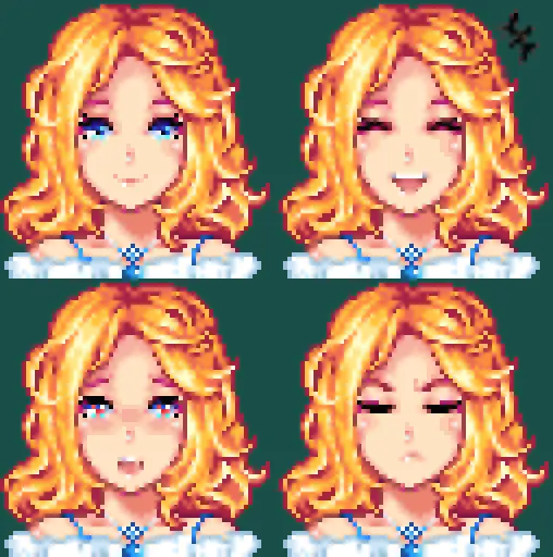 That hair is more wavy than curly, but if you're looking to make curlier hair then I might be able to find more suitable references. Here's a picture tutorial I found that clearly shows the process:  |
|
|
IP Logged |
|
|
VictorianSolution
Midshipman
Joined: 14 July 2019 Online Status: Offline Posts: 23 |
Posted: 21 July 2019 at 9:38am |
|
Originally posted by Greycloak Here's a picture tutorial I found that clearly shows the process: Thanks, having the steps in the process clearly outlined helps a lot. I have no experience drawing hair, so after 5 or so attempts at different hairstyles I think I finally found something that, with liberal use of reference (some might even say copying) I could represent. I have drawn it very roughly, just trying to figure out the shape and flow, but I thought before I proceed to bust my balls on the details, I'd let you guys have a look and knock some things out that don't look right. Should probably talk about colours as well, since I have really no idea what I'm doing and just randomly pulling sliders around until it looks acceptable.  |
|
|
IP Logged |
|
|
MicmasH
Midshipman
Joined: 09 September 2019 Online Status: Offline Posts: 32 |
Posted: 21 July 2019 at 10:55am |
|
Nice! Actually, that's kind of what your supposed to do with colors, just make sure that you don't use too many. A good thing to do would be to get the general color of the hair that you want, get a highlight color and a shadow color, and use one or two more colors and that's all you need. Right now you've got 5 darks and a light, I would recommend replacing some of those darks with mid-tones (in between the dark and the light, think the normal color) right now those darks blend together a little too much. This hand is pointing at a midtone. Notice how the value pallette on the right has been reduced to all the tones that clearly stick out. The ones that blend together and are hard to see have been cut out.  |
|
|
IP Logged |
|
|
VictorianSolution
Midshipman
Joined: 14 July 2019 Online Status: Offline Posts: 23 |
Posted: 22 July 2019 at 7:12am |
|
Alright, how's this?  |
|
|
IP Logged |
|
|
Greycloak
Midshipman
Joined: 12 May 2025 Online Status: Offline Posts: 59 |
Posted: 22 July 2019 at 8:15am |
|
I think the color you had before for the highlight was better. All the colors for the hair look too saturated now, so I would lower their saturation a tad to get a more natural-looking hair color. I believe what MicmasH intended was for you to just change the brightness values of your shadows to create a smoother transition from your darkest shadow to your brightest highlight. i.e. Every shade should have a roughly equal amount of difference in brightness from the previous shade and the next shade. If you have a shade that only has a slight difference in brightness than the previous shade, then it does not add very much to the palette. I would try to avoid using only one-pixel width highlights, if you do use them then do so very sparingly. One-pixel lines really stick out and mostly only work whenever you use anti-aliasing to make them smoother. (This is the 6th step in the picture tutorial.) Otherwise I would try to make highlights as clusters of pixels, which you did a bit of with the previous shades. Also, if you are using a reference for this hairstyle (one that hasn't been posted here already), it might be helpful if we can see what it is so that we know what you're going for.
|
|
|
IP Logged |
|
|
VictorianSolution
Midshipman
Joined: 14 July 2019 Online Status: Offline Posts: 23 |
Posted: 22 July 2019 at 10:02am |
|
I tried it, but I found that that colour was way too harsh, but maybe I just didn't have the transitions right, so I can give it another try. I'm still in the experimentation and figuring things out phase. In regards to the general hair colour, I can always turn the saturation down later since I have the hair on an individual layer, and I have no concept for how everything will look when it comes together (It's a full model) due to lack of experience with this sort of thing. Also, I actually kinda like the unnatural purple colour of the hair, because it fits what I have in mind for the character. Basically, it's a sprite for a Renpy Visual-Novel type game, one for a side-character that'll probably appear once, so I'm using her as a lab rat to try all the things that I'm reading and that you're teaching me. She'll appear in a scene with the following background:  So, along with the light colour I have chosen for the hue-shifting on the skin, I think it'd create the atmosphere and appearance for her that I want. At least that's the plan, I dunno if it'll actually work, I'm treading on uncharted ground here, I never got this far. I'll work more on the transitions, I got a case of mild insecurity about the shades I went for due to not knowing when I should and shouldn't hue-shift, and just moving sliders around at random. I'll add some AA to the highlights as well, or try to make them wider, see what looks better. Thanks for the advise here, it resonates with what I was already thinking after looking at it a couple of times, but I'm never certain about these things, or what to do about it. The reference I am using is from this work I found on DeviantArt, since I found it hard looking at real-life reference and trying to simplify it. I'm simply not that good yet.  Top Row, 3rd model from the left. The curls are much nicer on that than what I did, I think I'll have to put more effort into those as well. Thanks for your input so far, don't think I would've gotten this far, it's one thing seeing what is wrong, and another knowing how to fix it. |
|
|
IP Logged |
|
|
VictorianSolution
Midshipman
Joined: 14 July 2019 Online Status: Offline Posts: 23 |
Posted: 23 July 2019 at 7:11am |
|
Alright, worked a bit more on it and figured I should post the full model so you guys know exactly what I'm trying to do.  So, it desperately needs AA on the inner outlines of the body parts, but I'm not sure how to do AA when you're also trying to do an outline to make the piece stand out from the background. Some input here would be nice, for when I get there. I'm also gonna start work on the dress, that'll be an adventure. For now I just roughly sketched the general shape, and I'll have to refine that a lot, too. Any input here is always appreciated. I'm trying to go for something close to this:  Although here in the source, the mantle looks very much satin-esque because of the shine. I don't know if I'm able to make that look so convincing here. Any tips for starting out are appreciated.
|
|
|
IP Logged |
|
|
Greycloak
Midshipman
Joined: 12 May 2025 Online Status: Offline Posts: 59 |
Posted: 23 July 2019 at 8:26am |
|
Originally posted by VictorianSolution So, it desperately needs AA on the inner outlines of the body parts, but I'm not sure how to do AA when you're also trying to do an outline to make the piece stand out from the background. Some input here would be nice, for when I get there. I'm not entirely certain what you mean by this, AA shouldn't affect the outline of the character very much unless you're using selective outlining. (You can read more about this here) Typically people use the darkest shade for a 1 pixel-width outline of the character to help them stand out from the environment. As for the dress, the best picture tutorial I could find on the subject was this one:  (from https://www.deviantart.com/bluexcanary/art/High-to-Low-Skirt-Clothes-on-Bases-Process-614389582)
|
|
|
IP Logged |
|
|
VictorianSolution
Midshipman
Joined: 14 July 2019 Online Status: Offline Posts: 23 |
Posted: 23 July 2019 at 8:43am |
|
Originally posted by Greycloak I'm not entirely certain what you mean by this, AA shouldn't affect the outline of the character very much unless you're using selective outlining. Oh, well that's good to know, the entire time I thought I'd need to AA the outline too. I've read about selective, inlines and outlines etc. and was under the impression that for a black/dark outline I'd need to AA that too. Good to know that I don't, that actually makes it a lot easier. Thanks for the picture tutorial, you're really good at digging those up. I'll give this a try and post results.
|
|
|
IP Logged |
|
|
VictorianSolution
Midshipman
Joined: 14 July 2019 Online Status: Offline Posts: 23 |
Posted: 25 July 2019 at 6:42am |
|
Alright, with the help of your picture tutorial, I managed to get this:  Now this is still very rough-looking, and I absolutely hate the jaggedy, blurry mess that the mantle brooch is, but I'll definitely need some help in figuring out how to fix these things, because else I bite my teeth out on this. |
|
|
IP Logged |
|
|
Greycloak
Midshipman
Joined: 12 May 2025 Online Status: Offline Posts: 59 |
Posted: 25 July 2019 at 7:54am |
|
Not bad at all, it's starting to shape up. I like the dithering that you used for shading the robe and shadow on the neck. I don't think the brooch looks too bad, if you smooth out the shading a bit then it might help. The thing I notice most overall is the lack of shadows being cast upon objects. E.g.
Also, I should have noticed this earlier, but her robe is way too long for normal human proportions. The soles of her feet would be about where the purple part of the robe ends, so the robe shouldn't be any longer than that. You could also probably get rid of the protruding thumb on her left hand (or move it further back and show more of it), as if you try making that pose yourself you can see that it would be an awkward place to have your thumb at. |
|
|
IP Logged |
|
|
VictorianSolution
Midshipman
Joined: 14 July 2019 Online Status: Offline Posts: 23 |
Posted: 25 July 2019 at 8:28am |
|
Well, about the proportions, since I'm pretty bad at art and my understanding of anatomy is basic, but I do so much enjoy making character art, I took a model I posed in DAZ3D and traced it in an attempt to compensate for my lack of skill, and maybe even help me practice. Maybe I did something wrong during the resizing and cropping, but I had a similar issue with an earlier attempt at another character, where the model looked fine but the head seemed just that little bit too small compared to the rest of the body. Here's the pose I made and what I used to draw over:  |
|
|
IP Logged |
|
|
Greycloak
Midshipman
Joined: 12 May 2025 Online Status: Offline Posts: 59 |
Posted: 25 July 2019 at 8:50am |
|
Okay, I compared your picture against the reference pose and it does seem to check out. I think maybe just the fact that there's no visible end to the robe might be giving the illusion of really long legs, so maybe you can try adding a hem to the bottom of the robe or making it fold upon the ground. (Or just cut it off earlier since Visual Novels typically don't show the entire character anyway) 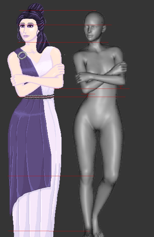 |
|
|
IP Logged |
|
|
VictorianSolution
Midshipman
Joined: 14 July 2019 Online Status: Offline Posts: 23 |
Posted: 25 July 2019 at 9:11am |
|
Originally posted by Greycloak (Or just cut it off earlier since Visual Novels typically don't show the entire character anyway) Yup, that was the idea, I guess I didn't cut off enough. I suppose it could also be that due to a lack of fine detail in guiding the eyes along the form of the robe and body and giving landmarks for the body parts that are hiding under, which I simply omit due to not being able to do it well, it kinda does not look right the longer you look at it, because your eyes can't latch onto any physiology. Maybe? I dunno.
|
|
|
IP Logged |
|
|
MicmasH
Midshipman
Joined: 09 September 2019 Online Status: Offline Posts: 32 |
Posted: 26 July 2019 at 8:04pm |
|
Is that your pose? If so your dang good at it.
|
|
|
IP Logged |
|
|
VictorianSolution
Midshipman
Joined: 14 July 2019 Online Status: Offline Posts: 23 |
Posted: 27 July 2019 at 9:48am |
|
Originally posted by MicmasH Is that your pose? If so your dang good at it. Yeah I do the poses myself, it helps a lot in understanding and visualizing how body parts interact and where they are positioned in a pose, and how it looks from different perspectives. Although it isn't particularly difficult, DAZ3D has a variety of sliders to individually move body parts, as well as locking those you don't want to move in place, so it's very easy. I also usually take a look at some stock poses(of which there are tons) and decide which already has a somewhat similar line of action and movement going on that I'm looking for, and then I work from there, rather than starting with a T-Pose. It's proven to be incredibly useful and I'd honestly recommend it to anyone wanting to improve their anatomy skills, it's like having a live model except you can make it do whatever you want. It's free, too.
|
|
|
IP Logged |
|
|
MicmasH
Midshipman
Joined: 09 September 2019 Online Status: Offline Posts: 32 |
Posted: 27 July 2019 at 9:12pm |
|
Neato! Your not as much of a noob as you make yourself out to be :)
|
|
|
IP Logged |
|
|
VictorianSolution
Midshipman
Joined: 14 July 2019 Online Status: Offline Posts: 23 |
Posted: 28 July 2019 at 2:20am |
|
Well, you say that but I can't spend 5 minutes in front of a piece without already stretching the limits of my understanding.  For example I tried my hand at AA but I just can't seem to get the right colours to AA with, or how I should AA the outward facing parts when I also want to add a black outline. And I have no clue how to fix the Brooch. I desperately need some help with this. |
|
|
IP Logged |
|
|
VictorianSolution
Midshipman
Joined: 14 July 2019 Online Status: Offline Posts: 23 |
Posted: 28 July 2019 at 5:48am |
|
Also, if you got resources on facial expressions, maybe a nice collection of them that I can study, I'd be much obliged. Having difficulties conveying what I want with such few pixels.
|
|
|
IP Logged |
|
|
MicmasH
Midshipman
Joined: 09 September 2019 Online Status: Offline Posts: 32 |
Posted: 28 July 2019 at 9:55pm |
|
Ok, have you seen RankarchVoid lately? they've been doing similar to what you're doing. I don't think you need to AA the outline of the dress like you've done. Umm, dude I just googled "facial expressions" or a keyword that I was looking for. I'd get on my tablet (an Ipad 1st gen) and proceed to save and save and save photos in the Images tab of the browser. Basically, I'd see something that would teach it to me visually, or I'd find a face that I liked (or an arm, or leg or whatever lol) and I'd save it. I would do many variations on a keyword (example: expressions, facial emotions, facial expressions, emotion, faces,facial reference, expressions drawing tutorial) and I'd spend lot's of time just gathering reference for everything you think you'd need. I'd love to put together a guide. I have a sort of "motivational story" in the  | "Can you draw?" thread ; I'm the bottom post. I'm sorry, that's not super helpful but I'm going to bed now _ | "Can you draw?" thread ; I'm the bottom post. I'm sorry, that's not super helpful but I'm going to bed now _ _ _It's really just combining keywords, like "face" and "tutorial" and then variations on similar words that mean the same thing. using descriptive words (i.e. Good, vibrant, positive) can really bring up some posts as well. That's just how browsers work. |
|
|
IP Logged |
|
|
VictorianSolution
Midshipman
Joined: 14 July 2019 Online Status: Offline Posts: 23 |
Posted: 29 July 2019 at 8:47am |
|
Right, I finally figured out how the Make Gradiation tool works on Gale, so I used that to make colours to AA with. I don't know if I made it better or worse though.  I'm particularly unhappy with the underside of her right forearm, it looks extremely jagged, probably also because of all the jaggies that I cannot for the life of me fix while still preserving the shape and position of the arm.
|
|
|
IP Logged |
|
|
Greycloak
Midshipman
Joined: 12 May 2025 Online Status: Offline Posts: 59 |
Posted: 29 July 2019 at 1:27pm |
|
Does Graphicsgale not have an outline function? It looks like that outline was manually pixelled...I guess I'm a bit spoiled with Aseprite. Anyway, that outline should also go around the single strands of hair. Right now it doesn't go on the outside and inside of the single strands of hair and it's a bit distracting. About the jaggies, they can somewhat be smoothed out by using AA. The jaggies are made when pixels go from 2-1-2-1 etc during a line. In this case I don't think you can completely solve that without changing the angle of the arm, but I'll show you my attempt at fixing it using AA. It could probably be smoothed out further, but would likely require more transitional shades. |
|
|
IP Logged |
|
|
VictorianSolution
Midshipman
Joined: 14 July 2019 Online Status: Offline Posts: 23 |
Posted: 29 July 2019 at 1:59pm |
|
I don't know if it does, but I didn't really think about using it, I just went and did it myself. I was unsure about doing single strands of hair as well because I thought they'd draw too much attention, but if you say I should, I'll do it. I'll try adding more shades to the AA on the lower arm then.
|
|
|
IP Logged |
|
|
VictorianSolution
Midshipman
Joined: 14 July 2019 Online Status: Offline Posts: 23 |
Posted: 02 August 2019 at 8:49am |
|
Alright guys, next step. I think the AA is alright, I played around with the colours a little and ended up turning the saturation up as I found against the background she looked too much like a ghost, and I am actually, dare I say it... happy, I guess? with the way she turned out. Now we get to facial expressions. Boy oh boy, another thing I have never done before. I found a reasonably helpful guide online, but that's for general drawing and not pixelart, so I take whatever I can from that and the result is a bit underwhelming but at least I'm getting there. Here's a few I tried:  Now, as you can see, the expressions are not very... expressive. It's really fine detail in the eyebrows and moving the corners of the mouth, mainly because I am afraid to do anything with the jaw and mouth. I tried, but everytime I did it looked like she had the gaping maw of the void sucking in every atom in existence, and when I tried to give her teeth it looked like I accidentally erased some pixels. So if you got any tips to help push me along, do provide them, I'd be much obliged. |
|
|
IP Logged |
|
|
Greycloak
Midshipman
Joined: 12 May 2025 Online Status: Offline Posts: 59 |
Posted: 03 August 2019 at 5:05am |
|
The shape and angle of the eyebrows conveys a lot of information. If the brow is raised at the middle and lowered at the ends then it helps convey sadness. If the brow is lowered in the middle and raised at the ends it conveys anger. If the brow is lowered overall then it conveys seriousness or concentration. If the brows are slightly raised while the eyes are squinting it conveys happiness. Here's another example image from an author I previously referenced:  Hope it helps.
|
|
|
IP Logged |
|
|
MicmasH
Midshipman
Joined: 09 September 2019 Online Status: Offline Posts: 32 |
Posted: 06 August 2019 at 7:02pm |
|
Hey! Here is an image of the underlying skull to help you out with that. 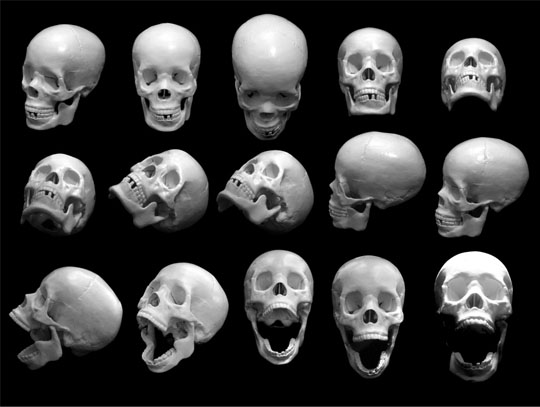 |
|
|
IP Logged |
|
|
MicmasH
Midshipman
Joined: 09 September 2019 Online Status: Offline Posts: 32 |
Posted: 06 August 2019 at 7:40pm |
|
|
|
|
IP Logged |
|
|
Iscalio
Commander 
Joined: 29 March 2023 Online Status: Offline Posts: 224 |
Posted: 07 August 2019 at 12:36pm |
|
Don't be afraid to go too far with your facial expressions and then dial it back. Feels like you are a bit afraid to stray too far outside the bounds you've build. Be flexible.
Eyebrows don't need to be a single line, don't be afraid to put full color on the thickest areas and trail off at the edges into inbetween tones. Note the eyebrows in the above example of the orange lady are an absolute gradation of tone. This might mean you need to add a color or balance your colors so there's a more even ramp from lightest to darkest so these blending moments are less difficult or harsh. |
|
|
IP Logged |
|
|
MicmasH
Midshipman
Joined: 09 September 2019 Online Status: Offline Posts: 32 |
Posted: 24 August 2019 at 9:24pm |
|
I hate to bumb this, but how'd it go?
|
|
|
IP Logged |
|
| |
||
Forum Jump |
You cannot post new topics in this forum You cannot reply to topics in this forum You cannot delete your posts in this forum You cannot edit your posts in this forum You cannot create polls in this forum You cannot vote in polls in this forum |
|
