| Active TopicsSearchRegisterLogin |
| WIP (Work In Progress) | |
| |
  |
| Author | Message |
|
JackBauer24
Commander 
Joined: 23 March 2017 Online Status: Offline Posts: 113 |
  Topic: WIP German officers Topic: WIP German officersPosted: 01 February 2007 at 6:00am |
|
Hey guys, I decided to take a break from the train and thought that I would show what I worked on awhile back. I was given the suggestion of starting smaller and this is something I might be willing to enhance and correct. Feel free to C+C it. Thanks alot!
Here it is:  Jack Edited by JackBauer24 - 01 February 2007 at 10:30am |
|
 IP Logged IP Logged |
|
|
Aleiav
Commander
Joined: 08 April 2016 Online Status: Offline Posts: 2380 |
Posted: 01 February 2007 at 8:49pm |
|
Shading?
The feet are too small. |
|
|
IP Logged |
|
|
JackBauer24
Commander
Joined: 23 March 2017 Online Status: Offline Posts: 113 |
Posted: 01 February 2007 at 11:15pm |
|
Here is an update for you...Where do you recommend shading? Thanks! I think its starting to look a little better. But keep me humble. *see bottom of page* Jack Edited by JackBauer24 - 03 February 2007 at 5:00am |
|
|
IP Logged |
|
|
Shoba
Seaman 
Joined: 20 July 2005 Online Status: Offline Posts: 20 |
Posted: 02 February 2007 at 3:05am |
|
Hmm... how about shading ... anywhere? You know ... you choose a light source, then drop some shadows, then add some highlights... stuff like that. Currently he looks totally flat.
And his hands need some updates. Currently they look like he has ... one Giant finger on each arm. The way the arms are connected to the body seems kinda strange as well. |
|
|
IP Logged |
|
|
JackBauer24
Commander
Joined: 23 March 2017 Online Status: Offline Posts: 113 |
Posted: 02 February 2007 at 3:16am |
|
Thanks for the advise. I have tried to update the hands. At present the black thing is supposed to be hands wearing gloves. Not sure how to make him look less flat,seeing as its a front view of the guy. Thanks again!
|
|
|
IP Logged |
|
|
Bifur
Commander
Joined: 15 April 2006 Location: Brazil Online Status: Offline Posts: 194 |
Posted: 02 February 2007 at 7:14am |
|
he looks like a doll... i'd rethink the whole piece
|
|

I know! Leafs shouldn't make shadow... |
|
|
IP Logged |
|
|
JackBauer24
Commander
Joined: 23 March 2017 Online Status: Offline Posts: 113 |
Posted: 02 February 2007 at 5:47pm |
|
Alright, what can I do to not make him look like a doll? He is supposed to be standing inspecting unseen troops. Thanks!
|
|
|
IP Logged |
|
|
pixelblink
Commander
Joined: 19 February 2023 Online Status: Offline Posts: 2865 |
Posted: 02 February 2007 at 6:29pm |
|
|
|
IP Logged |
|
|
JackBauer24
Commander
Joined: 23 March 2017 Online Status: Offline Posts: 113 |
Posted: 02 February 2007 at 8:33pm |
|
Ok last thing before I work steady on this project, Ive looked through the tutorials and have no idea which ones really apply to this. If you can point me in the right direction, I would appreciate it.
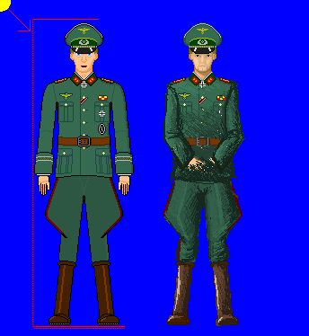
Also an update The new one is on the right:  http://www.diggerhistory.info/pages-uniforms/germany.htm#private Here is the reference Edited by JackBauer24 - 03 February 2007 at 5:01am |
|
|
IP Logged |
|
|
leel
Commander
Joined: 29 June 2005 Online Status: Offline Posts: 3001 |
Posted: 03 February 2007 at 5:19am |
|
wasnt the rigit stance supposed to be feet together and arms straight at your side? right now it looks more like he's speading them for police to pat him down.
and you NEED some shading. try to break up the man into simpler shapes. some examples could be found here: http://www4.ncsu.edu/~twbuie/id318/handouts/id318handouts.html look where it says box shading, sphere, cone etc. and use a consistent light source and at least try adding some volume to this guy, he would really like to be a real boy! :P
|
|
|
IP Logged |
|
|
JackBauer24
Commander
Joined: 23 March 2017 Online Status: Offline Posts: 113 |
Posted: 03 February 2007 at 7:21am |
|
I changed it because it sounded like the guy was too stiff looking. I know what I should do but Im not use to dealing with shading. Can you give some examples of areas that need shading? To be honest with you I never was any good with paper and pencil, I got better results(for me) by drawing on the comp. Thanks again and I will try to do as suggested.
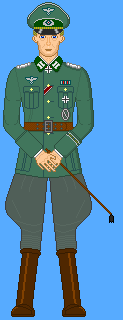
Here is my first few attempts at shading and having a set light source so bare with me: 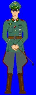 Jack Edited by JackBauer24 - 03 February 2007 at 7:38am |
|
|
IP Logged |
|
|
Ensellitis
Commander
Joined: 19 June 2005 Online Status: Offline Posts: 10099 |
Posted: 03 February 2007 at 8:05am |
|
that shading is far to subtle. i had to zoom in just to see where you did shade.
i think the main problem with this is how bland it is... and the size is going to hurt you too. his arms would never hang like that. he would either be stading at attention, then his hands would be flat against his sides and fingers rolled up. or he would be standing at ease, with his arms hanging, slight bend at the elbows, and his hands to the side. i cant think of any occasion when your hands would be like that unless you were showing off your new manicure. add some wrinkles. his pants are far too flat. the bunches at the legs have many wrinkles since all they are is extra fabric and they dont fold over the knee like you have:  here are a few other refs for you:   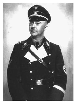 my advice to you is to cut the size down 50%, and push your limits... dont be afraid to go 3d instead of this 2d. make it more dynamic. right now it looks like a paper doll, make him look real |
|
|
There's a pubic hair on my keyboard. What the f**k?? I "mow the lawn" so it's not mine. Gross. |
|
|
IP Logged |
|
|
JackBauer24
Commander
Joined: 23 March 2017 Online Status: Offline Posts: 113 |
Posted: 03 February 2007 at 3:01pm |
|
Ok, I decided to focus on the form for now then I will work on the shading or the lack thereof... Here is an update....
See bottom post Edited by JackBauer24 - 07 February 2007 at 11:07am |
|
|
IP Logged |
|
|
leel
Commander
Joined: 29 June 2005 Online Status: Offline Posts: 3001 |
Posted: 03 February 2007 at 5:26pm |
|
very quick edit, and also very messy, but hopefully you'll get some ideas.
I also felt like giving him a very queer goatee :) love it!
 |
|
|
IP Logged |
|
|
Pixel_Outlaw
Commander
Joined: 01 September 2005 Online Status: Offline Posts: 3829 |
Posted: 03 February 2007 at 7:51pm |
|
LOL no german would sport a goatee. Nice edit though!
Did they have a reason for such hideous trousers? Edited by Pixel_Outlaw - 03 February 2007 at 7:51pm |
|

|
|
|
IP Logged |
|
|
JackBauer24
Commander
Joined: 23 March 2017 Online Status: Offline Posts: 113 |
Posted: 04 February 2007 at 1:00pm |
|
They were worn in tradition harking to the time that the officer rode a horse while the regular soldier walked. Thanks again and keep up the comments.
Jack Edited by JackBauer24 - 04 February 2007 at 1:00pm |
|
|
IP Logged |
|
|
Aleiav
Commander
Joined: 08 April 2016 Online Status: Offline Posts: 2380 |
Posted: 04 February 2007 at 2:28pm |
|
aww, cute german pants...
sorry... had to say that. XD |
|
|
IP Logged |
|
|
JackBauer24
Commander
Joined: 23 March 2017 Online Status: Offline Posts: 113 |
Posted: 04 February 2007 at 2:34pm |
|
Heh, come to think of it, they aren't the only ones who wore the breeches. Alot of armies in that era and before the war wore those. On a serious note, does anyone know where I can find tutorials concerning how to shade clothing, skin, etc? If so that would be great. Talk to you all later. Thanks again!
Jack |
|
|
IP Logged |
|
|
leel
Commander
Joined: 29 June 2005 Online Status: Offline Posts: 3001 |
Posted: 04 February 2007 at 3:10pm |
|
I think for now you should focus on on just the general where-light-hits ideas, and think about textures later. Just take it one step at a time, especially if you say that you don't really have the basics down yet.
I'd love to see an update. Edited by leel - 04 February 2007 at 3:10pm |
|
|
IP Logged |
|
|
JackBauer24
Commander
Joined: 23 March 2017 Online Status: Offline Posts: 113 |
Posted: 07 February 2007 at 11:07am |
|
Hey guys, heres a little update. One problem I am having is being able to figure out how to make realistic folds in the fabric. If anyone can point me to something that explains that, I would love that. Also, I have tried but for some reason, the boots do not look right, help! Anyhow, heres an update. I also have included my reference for the tunic.
 Edited by JackBauer24 - 10 February 2007 at 12:23am |
|
|
IP Logged |
|
|
leel
Commander
Joined: 29 June 2005 Online Status: Offline Posts: 3001 |
Posted: 09 February 2007 at 7:18pm |
|
just look at the photo above of the guy in the orange suit. The material is very thick, so it doesnt have many random folds, just where your body bends/changes shape - elbows, knees, where it's tightened by the belt, etc. Maybe you're overthinking this, don't worry about every pixel just yet, just sketch out the basic tones first if you're so not sure. I don't really know what else to say. Perhaps find some more reference photos, or get someone else to do an edit if the ones so far weren't helpful, but I think I'm starting to repeat myself.
Also btw, the guy needs to be shorter too. His head seems pretty small the more i look at it. Edited by leel - 09 February 2007 at 7:19pm |
|
|
IP Logged |
|
|
JackBauer24
Commander
Joined: 23 March 2017 Online Status: Offline Posts: 113 |
Posted: 23 June 2007 at 5:33am |
|
Hey guys, Jack here again. Ive been trying to enhance the German officer I had been working on for awhile. I need help with general layouts of the human body in relation to the officer. Thanks!
 |
|
|
IP Logged |
|
|
Metaru
Commander
Joined: 20 November 2025 Online Status: Offline Posts: 3305 |
Posted: 23 June 2007 at 12:02pm |
|
those hands need to be a bit more natural and less plastic. also, this officer has two left hands.
those legs seems a bit longer than needed too. and the knees needs more definition. actualy, her clothings looks as it was made of a solid material. even though it's an uniform, it needs some folds here and there. specially in the joints.
|
|
|
I ate leel's babies
|
|
|
IP Logged |
|
|
JackBauer24
Commander
Joined: 23 March 2017 Online Status: Offline Posts: 113 |
Posted: 23 June 2007 at 4:39pm |
|
There we go, thats the kind of advise I needed. I knew there were something wrong but I couldnt place it. Thanks alot mate! Though I just tried to reenact the hand clasp I have him in and I dont see where the two left hands come into play...Perhaps Im not seeing this right lol. Thanks again.
Jack Edited by JackBauer24 - 23 June 2007 at 4:41pm |
|
|
IP Logged |
|
|
Metaru
Commander
Joined: 20 November 2025 Online Status: Offline Posts: 3305 |
Posted: 23 June 2007 at 8:37pm |
|
you made the left hand, copied it, mirroed it, and pasted it where the rigth hand is supposed to be.
|
|
|
I ate leel's babies
|
|
|
IP Logged |
|
|
JackBauer24
Commander
Joined: 23 March 2017 Online Status: Offline Posts: 113 |
Posted: 23 June 2007 at 9:05pm |
|
Hmmm, yeah now that you mention it I did, but it seemed the only workable way at the time. What to do to fix it...THanks.
Jack |
|
|
IP Logged |
|
|
Aleiav
Commander
Joined: 08 April 2016 Online Status: Offline Posts: 2380 |
Posted: 24 June 2007 at 8:27am |
|
Sometimes mirroring can save time, but it does atrocious things to your art. Because as much as we'd like to be, we're not symmetrical. What you CAN do, is mirror it and then edit it so it looks slightly different or change the arm so it's in a pocket or something. That way you have a baseline of an arm to go with and it's not so weird looking.
|
|
|
IP Logged |
|
|
JackBauer24
Commander
Joined: 23 March 2017 Online Status: Offline Posts: 113 |
Posted: 24 June 2007 at 9:30pm |
|
Ok I think I get what you saying. Is there some tell-tale item on the hands that really indicate this? I want this thing to work out right. Thanks again for the advice.
Jack |
|
|
IP Logged |
|
|
Metaru
Commander
Joined: 20 November 2025 Online Status: Offline Posts: 3305 |
Posted: 25 June 2007 at 10:32am |
|
look at your own rigth hand, please. |
|
|
I ate leel's babies
|
|
|
IP Logged |
|
|
JackBauer24
Commander
Joined: 23 March 2017 Online Status: Offline Posts: 113 |
Posted: 25 June 2007 at 1:10pm |
|
Ok, so what youre saying is that the pinky screwed up and that it needs to be bigger? And whats the other red mark? Thanks again.
Jack |
|
|
IP Logged |
|
|
Monkey 'o Doom
Commander
Joined: 24 September 2005 Online Status: Offline Posts: 2994 |
Posted: 25 June 2007 at 1:56pm |
|
One thing that would help the hands is to eliminate the outlines by replacing them with the skin color (or a color close to it) in most places. Currently the fingers look like pencil-thin sticks, so if they were wider they'd be more believable.
|
|

RPG is numberwang. |
|
|
IP Logged |
|
| |
||
Forum Jump |
You cannot post new topics in this forum You cannot reply to topics in this forum You cannot delete your posts in this forum You cannot edit your posts in this forum You cannot create polls in this forum You cannot vote in polls in this forum |
|

