| Active TopicsSearchRegisterLogin |
| WIP (Work In Progress) | |
| |
  |
| Author | Message |
|
Hapiel
Rear Admiral 
Joined: 30 June 2023 Online Status: Offline Posts: 3266 |
  Topic: My Skateboard Topic: My SkateboardPosted: 22 March 2007 at 10:30am |
|
Ok what do you guys think of this, and what color should his face be??
This is just a rough sketch with tablet... :)  Refined lines  Edited by Lollige - 22 March 2007 at 12:05pm |
|
 IP Logged IP Logged |
|
|
Snowman11
Seaman 
Joined: 18 March 2007 Online Status: Offline Posts: 5 |
Posted: 22 March 2007 at 12:14pm |
|
Nice i like it
|
|
|
IP Logged |
|
|
Snowman11
Seaman
Joined: 18 March 2007 Online Status: Offline Posts: 5 |
Posted: 22 March 2007 at 12:15pm |
|
what do u thinkg of my avatar i made it but no one is approving it
|
|
|
IP Logged |
|
|
Hapiel
Rear Admiral
Joined: 30 June 2023 Online Status: Offline Posts: 3266 |
Posted: 22 March 2007 at 12:28pm |
|
Originally posted by Snowman11 what do u thinkg of my avatar i made it but no one is approving it ???? However.. Here are some colors.... tell me what you like the most, or suggest another :)       |
|
|
IP Logged |
|
|
Hapiel
Rear Admiral
Joined: 30 June 2023 Online Status: Offline Posts: 3266 |
Posted: 22 March 2007 at 1:24pm |
|
here is a new version.. had alot of trouble with those eyebrowns
 |
|
|
IP Logged |
|
|
Squirrelsquid
Commander 
Joined: 18 July 2023 Online Status: Offline Posts: 259 |
Posted: 22 March 2007 at 1:39pm |
|
Originally posted by Snowman11 what do u thinkg of my avatar i made it but no one is approving it yea right... and cows can fly... 7even did that character/Animation. (http://www.pixeljoint.com/p/4584.htm) back to topic: I think the shading is ok, you might want to AA the "nose-holes" though. Also be careful not to make the shading to "thick" as this might ruin the skateboard/flat-surface feel. nice start though. |
|
|
IP Logged |
|
|
Hapiel
Rear Admiral
Joined: 30 June 2023 Online Status: Offline Posts: 3266 |
Posted: 22 March 2007 at 2:14pm |
|
i didnt do anything yet with those nose holes.. Its pretty hard for me to keep it flat :p
|
|
|
IP Logged |
|
|
Hapiel
Rear Admiral
Joined: 30 June 2023 Online Status: Offline Posts: 3266 |
Posted: 23 March 2007 at 3:40pm |
|
What do you guys think of this?
 |
|
|
IP Logged |
|
|
Cliffo
Seaman
Joined: 21 March 2007 Online Status: Offline Posts: 7 |
Posted: 23 March 2007 at 4:51pm |
|
Being a skateboarder (nothing fancy only to get from a-b) I like your
design! Looks great. I like your avatar too, did you do that?
|
|
|
IP Logged |
|
|
Hapiel
Rear Admiral
Joined: 30 June 2023 Online Status: Offline Posts: 3266 |
Posted: 23 March 2007 at 4:58pm |
|
Thank you! Glad you like it! Yeah I made that pizza too :)
|
|
|
IP Logged |
|
|
klav
Commander
Joined: 01 December 2006 Online Status: Offline Posts: 128 |
Posted: 23 March 2007 at 7:42pm |
|
reminds me of a skateboard from the mid 80's....
rob roscopp was the skateboarder and santa cruz made his decks... the noses on the skateboards were tiny. here is a photo. enjoy: 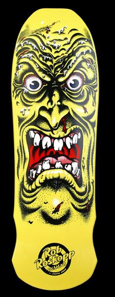 http://i82.photobucket.com/albums/j268/marysell1/roskopp_face.jpg |
|
|
IP Logged |
|
|
Metaru
Commander
Joined: 28 December 2025 Online Status: Offline Posts: 3305 |
Posted: 23 March 2007 at 8:14pm |
|
you could add ears to it, and you'll get a Shrek Skate...
xD... turn it yellow and add some frickles, and you get Bob Squarepants Skate xD... i'll suggest you to use the same color of the face in the rest of the deck. |
|
|
I ate leel's babies
|
|
|
IP Logged |
|
|
Hapiel
Rear Admiral
Joined: 30 June 2023 Online Status: Offline Posts: 3266 |
Posted: 24 March 2007 at 2:08am |
|
Originally posted by klav reminds me of a skateboard from the mid 80's.... rob roscopp was the skateboarder and santa cruz made his decks... the noses on the skateboards were tiny. here is a photo. enjoy: http://i82.photobucket.com/albums/j268/marysell1/roskopp_face.jpg lol I had googled for SkateDeck for some inspiration, and this was the most inspirating one :p... didnt know it was famous :p Metaru: ill keep the colors this way I think.. I allready tried to add ears, but there was not enaugh room for them :( |
|
|
IP Logged |
|
|
pixelblink
Commander
Joined: 19 February 2023 Online Status: Offline Posts: 2865 |
Posted: 24 March 2007 at 2:42am |
|
I think you should extend the head into the rest of the skateboard like your reference shows it. Your design has a lot of potential. Play around with it and don't be frightened to try something out of the box.
I spent 10 minutes or so on it:  just to show you what could be done |
|
|
IP Logged |
|
|
Hapiel
Rear Admiral
Joined: 30 June 2023 Online Status: Offline Posts: 3266 |
Posted: 24 March 2007 at 3:37am |
|
Originally posted by pixelblink I think you should extend the head into the rest of the skateboard like your reference shows it. Your design has a lot of potential. Play around with it and don't be frightened to try something out of the box. I spent 10 minutes or so on it: just to show you what could be done wow ur awesome pixelblink!!!! Im going to try that to!! EDIT: Omg this is so hard... Now im trrying to make mine as good as yours... but its so hard to do that without copying all your idea's...... :(:( (like the pallete, the idea to make the eyes smaller etc. etc..) Edited by Lollige - 24 March 2007 at 3:48am |
|
|
IP Logged |
|
|
Hapiel
Rear Admiral
Joined: 30 June 2023 Online Status: Offline Posts: 3266 |
Posted: 24 March 2007 at 4:21am |
|
ok its far from being as good as yours but ill show what I did..
 |
|
|
IP Logged |
|
|
Metaru
Commander
Joined: 28 December 2025 Online Status: Offline Posts: 3305 |
Posted: 24 March 2007 at 4:36am |
|
Add your signature in the bottom of the deck Lollige n_-
|
|
|
I ate leel's babies
|
|
|
IP Logged |
|
|
Hapiel
Rear Admiral
Joined: 30 June 2023 Online Status: Offline Posts: 3266 |
Posted: 24 March 2007 at 4:46am |
|
Originally posted by Metaru Add your signature in the bottom of the deck Lollige n_- ey ofcourse... but only when its (allmost) finished :) |
|
|
IP Logged |
|
|
pixelblink
Commander
Joined: 19 February 2023 Online Status: Offline Posts: 2865 |
Posted: 24 March 2007 at 11:42am |
|
you're more than welcome to use any ideas I presented in my edit dude.
I'd strongly suggest getting rid of any black lines on his face altogether. Choose some darker (and hue shifted) colours for the red and greens to make it pop Lookin good btw! Edited by pixelblink - 24 March 2007 at 11:42am |
|
|
IP Logged |
|
|
Metaru
Commander
Joined: 28 December 2025 Online Status: Offline Posts: 3305 |
Posted: 24 March 2007 at 11:08pm |
|
and, by the way, why don't you change the shape of the deck? like the rob rosomething's table.
|
|
|
I ate leel's babies
|
|
|
IP Logged |
|
|
AwesomePossum
Commander
Joined: 04 November 2006 Online Status: Offline Posts: 125 |
Posted: 24 March 2007 at 11:09pm |
|
I like your new version much more!
|
|
|
damned advertising... |
|
|
IP Logged |
|
|
Hapiel
Rear Admiral
Joined: 30 June 2023 Online Status: Offline Posts: 3266 |
Posted: 25 March 2007 at 1:20am |
|
Originally posted by Metaru and, by the way, why don't you change the shape of the deck? like the rob rosomething's table. nah ill just keep the shape from the template... like (allmost) every1 does :) |
|
|
IP Logged |
|
|
Hapiel
Rear Admiral
Joined: 30 June 2023 Online Status: Offline Posts: 3266 |
Posted: 01 April 2007 at 1:30pm |
|
Update:
 |
|
|
IP Logged |
|
|
Hapiel
Rear Admiral
Joined: 30 June 2023 Online Status: Offline Posts: 3266 |
Posted: 02 April 2007 at 9:18am |
|
Number 8:
 Number 9:  |
|
|
IP Logged |
|
|
Hapiel
Rear Admiral
Joined: 30 June 2023 Online Status: Offline Posts: 3266 |
Posted: 02 April 2007 at 11:47am |
|
Number 12 (yeah you guys missed 10 and 11 :p)
 |
|
|
IP Logged |
|
|
PixelSnader
Commander
Not a troll! Joined: 21 May 2026 Online Status: Offline Posts: 3194 |
Posted: 03 April 2007 at 4:18am |
|
i think the teeth could do with defined shapes
|
|
|
IP Logged |
|
|
Hapiel
Rear Admiral
Joined: 30 June 2023 Online Status: Offline Posts: 3266 |
Posted: 03 April 2007 at 12:49pm |
|
Originally posted by snader i think the teeth could do with defined shapes what do you mean with defined?? |
|
|
IP Logged |
|
|
Dragen
Seaman
Joined: 23 April 2006 Online Status: Offline Posts: 20 |
Posted: 03 April 2007 at 3:44pm |
|
I think me means outline each tooth, instead of just shade where a new tooth begins.
|
|
|
IP Logged |
|
|
Hapiel
Rear Admiral
Joined: 30 June 2023 Online Status: Offline Posts: 3266 |
Posted: 04 April 2007 at 7:30am |
|
Originally posted by Dragen I think me means outline each tooth, instead of just shade where a new tooth begins. Still dont really get it.. but he means that the lines between the teeth should be alot darker? |
|
|
IP Logged |
|
|
Hapiel
Rear Admiral
Joined: 30 June 2023 Online Status: Offline Posts: 3266 |
Posted: 04 April 2007 at 9:53am |
|
Number 15...
 Oops why red?? Omg.. Edit 17  Sadly I had to add 5 colors now :( Edited by Lollige - 04 April 2007 at 12:12pm |
|
|
IP Logged |
|
|
Monkey 'o Doom
Commander
Joined: 24 September 2005 Online Status: Offline Posts: 2994 |
Posted: 04 April 2007 at 12:52pm |
|
By upping the contrast and making that REAL metal I bet you could take that down by at least one color, maybe two.
Why does the eye of the guy make the shadow disappear? You have colors you can use there to make it more realistic and emphasize the flatness of the illustration. The top and bottom might look better if they're solid colors--filling shapes with dither tands to look grainy and bad. The whites of the eyes are a bit odd where they meet the green, and in general the piece needs some more work with the palette. Draw out your ramps and find where you're not using colors to smoothen it where you should be. Also, your ramp for red has a saturated and less saturated red of almost identical brightness, as seen of the near face of the wheels. Change one or both of those. In general, you have multiple levels of saturation in your ramps, but not smooth transitions of saturation. Work on that.
I like the concept, but you definitely have room to improve. Good luck, and keep updating this.
|
|

RPG is numberwang. |
|
|
IP Logged |
|
|
Hapiel
Rear Admiral
Joined: 30 June 2023 Online Status: Offline Posts: 3266 |
Posted: 04 April 2007 at 1:01pm |
|
Lol and I thought it was allready finished :p Ok lets see.. Using less colours should be possible... Im not shure what ramps are, but I think you mean the color differences?? Those colors from the wheels are stolen from the mouth.. and yes those 2 colors are allmost the same, but I cant do them Really the same because that didnt look good in the mouth... Also Id love to try to change the pallette, but since I work with paint that isnt that easy... I want to learn to work with photoshop soon... is there an easy way to change colors in paint, or do I have to pick another color every time and recolour everything (with the erase tool)? I also allready tried to do top and bottom solid colors but I didnt like that... I dont really understand what you mean with the eyes.. Could you show an example? Thanks for your advice :) EDIT: allready removed 1 color, still looking ok EDIT2: Long Lives Graphicsgale!!  Edited by Lollige - 04 April 2007 at 1:16pm |
|
|
IP Logged |
|
|
Monkey 'o Doom
Commander
Joined: 24 September 2005 Online Status: Offline Posts: 2994 |
Posted: 04 April 2007 at 6:52pm |
|
Okay, here's the edit per your request.
 I changed the more saturated red to a more intermediate one and changed the eyes to be more similar and fixed their antialiasing, a skill I think you need to work on a bit. I showed what I meant by making the greys into a nice silver metallic color and I also illustrated my approach to the solid ends on the top one. Zoom, my friend, and analyze.
Hmm, it wouldn't let me use the image button. "Only members with sufficient permission can access this page." Anyone know what that's all about?
BTW: A ramp is the set of palette entries you use for a certain visual color, such as olive green, or red. I put a few of 'em on the side for comparison and reference. Edited by Monkey 'o Doom - 04 April 2007 at 6:53pm |
|
|
RPG is numberwang. |
|
|
IP Logged |
|
|
Hapiel
Rear Admiral
Joined: 30 June 2023 Online Status: Offline Posts: 3266 |
Posted: 04 April 2007 at 11:54pm |
|
Wow thanks monkey!
I do not see much difference on the red  ..... Sorry... ..... Sorry...The silver is strange, but not bad! I will try if I can do the same... (but I think it will look alot like copying..) and about the eyes: they look alot bether now.. Ty for showing... and the top is better now indeed now that part is solid.. When I tried a solid top I filled the whole top  I am at school now, but ill make my own edit ASAP :) |
|
|
IP Logged |
|
|
Hapiel
Rear Admiral
Joined: 30 June 2023 Online Status: Offline Posts: 3266 |
Posted: 05 April 2007 at 8:10am |
   Number 22 Is that bether? Edited by Lollige - 05 April 2007 at 11:28am |
|
|
IP Logged |
|
|
Xion Night
Midshipman 
Joined: 10 July 2005 Location: United States Online Status: Offline Posts: 67 |
Posted: 05 April 2007 at 7:43pm |
|
I preferred the previous version, actually. The eyes had more "pop" and the colors were darker/more easy on (my) eyes. Note how monkey did the metal; He didn't just lighten it, he made the difference between the lights and darks larger and more defined.
I find it odd how the nose is just two nostrils without a...middle part. What's the word for it...Oh, tip. Yeah, you're missing the tip of the nose. What's up with that oval shape below the big eye? It looks weird...like he's holding some gum or something beneath his lip. I also think the eyebrows themselves could be darker ...hmm... What's with the right side of the board, next to the mouth. It looks wierd, like maybe a remnant of a previous version? The teeth still seem like they aren't separate. I don't think you need to darken the outline all the way around each individual tooth, just maybe halfway up so you can tell the difference between the separation of teeth and the...um...cavities[?] at a glance. This has come a really long way. A little further and it'll be awesome. Good onya. |
|
|
Kizzah!

|
|
|
IP Logged |
|
|
Hapiel
Rear Admiral
Joined: 30 June 2023 Online Status: Offline Posts: 3266 |
Posted: 06 April 2007 at 9:05am |
|
Thanks :)
eye's: dunno... it looks better no this screan Metal: It was darker first, but I did light it up with graphics gale... This did look better.. but now im not shure any more... hmm.. I think ill make those dark colors a bit more dark... The oval shape? It doesnt feel like hes holding gum to me.. just like he is pullin his wang up... Whats wrong with the right side? the teeth, I did darken the lines half first, but that was very messy and ugly.. I really think this is the best... Eyebrowns: I see what I can do. Thanks :) |
|
|
IP Logged |
|
| |
||
Forum Jump |
You cannot post new topics in this forum You cannot reply to topics in this forum You cannot delete your posts in this forum You cannot edit your posts in this forum You cannot create polls in this forum You cannot vote in polls in this forum |
|
