| Active TopicsSearchRegisterLogin |
| WIP (Work In Progress) | |
| |
  |
| Author | Message |
|
Hatch
Admiral 
Joined: 05 August 2015 Online Status: Offline Posts: 1387 |
  Topic: Signs of Improvement? Topic: Signs of Improvement?Posted: 25 June 2007 at 3:12pm |
|
I made this a while back, before I started posting WIPs here:

And here's after, using what I've learned: 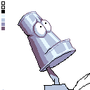 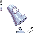  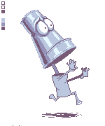 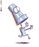
Used a much more interesting, contrasty palette, cleaned up some of the glaring anatomy and perspective issues, got rid of my pointless dither, etc. So I'm posting this to not only get help improving this piece further, but to say thanks to everyone who has helped me improve as much I have already, after only 2 pieces. So... Thanks! And... Help! Edited by Hatch - 27 June 2007 at 9:26pm |
|
 IP Logged IP Logged |
|
|
Aleiav
Commander 
Joined: 08 April 2016 Online Status: Offline Posts: 2380 |
Posted: 25 June 2007 at 3:29pm |
|
Wow, you've DEFINITELY improved. :) Excellent work. It's always nice to see people take in what people have suggested.
Are you going to continue to shade the rest like this? |
|
|
IP Logged |
|
|
Hatch
Admiral
Joined: 05 August 2015 Online Status: Offline Posts: 1387 |
Posted: 25 June 2007 at 3:36pm |
|
Originally posted by Aleiav
Wow, you've DEFINITELY improved. :) Excellent work. It's always nice to see people take in what people have suggested. Thanks 
You've been a great help. Originally posted by Aleiav
Are you going to continue to shade the rest like this? I plan to do the part of the robot that you can sort of see here--the neck, the top of the chest, some arms poking into the frame--I probably won't do the whole thing. But who knows? If I have a lot of fun with it I may get ambitious. |
|
|
IP Logged |
|
|
Rodder
Commander
infinite cool points Joined: 15 December 2005 Online Status: Offline Posts: 162 |
Posted: 25 June 2007 at 4:58pm |
|
That definitely looks like an improvement. If you want to take it further, try adding some backlighting (cause he's so reflective). You could either use your midtone color or add another to the palette, maybe a yellow/orange or another blue?
|
|
|
IP Logged |
|
|
eckered
Midshipman 
Joined: 16 October 2006 Online Status: Offline Posts: 61 |
Posted: 25 June 2007 at 6:13pm |
|
neon green is good too ;) great improvement so far, looking forward to seeing the rest of this shaded :)
|
|
|
IP Logged |
|
|
Hatch
Admiral
Joined: 05 August 2015 Online Status: Offline Posts: 1387 |
Posted: 25 June 2007 at 7:03pm |
|
Is this what you meant by backlighting? I don't really know what I'm doing 
|
|
|
IP Logged |
|
|
Aleiav
Commander
Joined: 08 April 2016 Online Status: Offline Posts: 2380 |
Posted: 26 June 2007 at 10:05am |
|
Yeah, sort of. Usually it's not the same shade as the image. Look at this for example. The light is purple, not grey.
|
|
|
IP Logged |
|
|
Hatch
Admiral
Joined: 05 August 2015 Online Status: Offline Posts: 1387 |
Posted: 26 June 2007 at 10:08am |
|
Right, but I don't really want to add more colors. I was asking more about where the light is hitting.
|
|
|
IP Logged |
|
|
Aleiav
Commander
Joined: 08 April 2016 Online Status: Offline Posts: 2380 |
Posted: 26 June 2007 at 10:10am |
|
I definitely think that it's an improvement from the original and it's probably backlighting. What I'm referring to is more ambient than backlighting. So no worries. :D
|
|
|
IP Logged |
|
|
Hatch
Admiral
Joined: 05 August 2015 Online Status: Offline Posts: 1387 |
Posted: 26 June 2007 at 10:26am |
|
Originally posted by Aleiav
no worries. :D Never 
|
|
|
IP Logged |
|
|
Hatch
Admiral
Joined: 05 August 2015 Online Status: Offline Posts: 1387 |
Posted: 27 June 2007 at 3:30pm |
|
Decided to do a quick sketch of the whole body. I like the tin can torso, not so sure about the limbs, especially the legs. |
|
|
IP Logged |
|
|
Aleiav
Commander
Joined: 08 April 2016 Online Status: Offline Posts: 2380 |
Posted: 27 June 2007 at 3:51pm |
|
haha!I love the body. Maybe the legs/arms/neck could be pipes?
|
|
|
IP Logged |
|
|
Hatch
Admiral
Joined: 05 August 2015 Online Status: Offline Posts: 1387 |
Posted: 27 June 2007 at 3:54pm |
|
That's the plan. I'm just not sure about the pose. I'm really miserable at anatomy.

|
|
|
IP Logged |
|
|
Aleiav
Commander
Joined: 08 April 2016 Online Status: Offline Posts: 2380 |
Posted: 27 June 2007 at 4:20pm |
|
The pose looks fine to me.
|
|
|
IP Logged |
|
|
Christopher
Commander
Joined: 09 February 2007 Online Status: Offline Posts: 110 |
Posted: 27 June 2007 at 5:52pm |
|
I actually really like the pose right now.
|
|
|
IP Logged |
|
|
Hatch
Admiral
Joined: 05 August 2015 Online Status: Offline Posts: 1387 |
Posted: 27 June 2007 at 8:03pm |
|
Made a little progress with the line art |
|
|
IP Logged |
|
|
Hatch
Admiral
Joined: 05 August 2015 Online Status: Offline Posts: 1387 |
Posted: 27 June 2007 at 9:21pm |
|
Started shading. Got rid of black, added orange. He kind of looks like he could be a mascot for a muffler shop 
Going to bed. |
|
|
IP Logged |
|
|
Rodder
Commander
infinite cool points Joined: 15 December 2005 Online Status: Offline Posts: 162 |
Posted: 28 June 2007 at 12:10am |
|
Reeeeally nice. Such a cool character. And yeah that's what I meant by backlighting. It's perfectly fine to use the same color for it, it's just a different color adds more interest. The pale orange looks good imo.
|
|
|
IP Logged |
|
|
Hatch
Admiral
Joined: 05 August 2015 Online Status: Offline Posts: 1387 |
Posted: 28 June 2007 at 11:54am |
|
Thanks Rodder
I'm not sure how to shade the underside of his jaw. I know it should be partially lit by the backlight, but everything I've tried so far looks... Odd. But of course, just having the flat color is dreadfully boring. I'll give it another go and post my attempts when I get home, but in the meantime, any pointers? |
|
|
IP Logged |
|
|
Aleiav
Commander
Joined: 08 April 2016 Online Status: Offline Posts: 2380 |
Posted: 28 June 2007 at 1:11pm |
|
Maybe some darklights around the crease between the neck and jaw?
|
|
|
IP Logged |
|
|
Rodder
Commander
infinite cool points Joined: 15 December 2005 Online Status: Offline Posts: 162 |
Posted: 28 June 2007 at 3:30pm |
|
Originally posted by Hatch
underside of his jaw. I know it should be partially lit by the backlight, but everything I've tried so far looks... Odd Well due to it's front-facing (downward) angle, it really would be lit by bouncing light off the floor & his body. Unless either one of those were colored, in which the color would bleed, i'd leave it as one of the metal colors you have now. Maybe just a simple gradient ramp? or you could highlight the edge depending on how reflective you want it to be. I'd just be careful not to make it contrast too much so it doesn't distract from the rest of him. Here's one of the best references around. Maybe it might be of some help: http://www.itchy-animation.co.uk/light.htm |
|
|
IP Logged |
|
|
Hatch
Admiral
Joined: 05 August 2015 Online Status: Offline Posts: 1387 |
Posted: 28 June 2007 at 6:58pm |
|
I see what you're saying. I'll have another go. Thanks again for the help.
Awesome link, BTW. Instant bookmark. |
|
|
IP Logged |
|
|
K.s
Seaman 
Joined: 29 June 2007 Online Status: Offline Posts: 34 |
Posted: 29 June 2007 at 2:54pm |
|
wow that looks awesome, nice job
 
|
|
|
IP Logged |
|
|
Hatch
Admiral
Joined: 05 August 2015 Online Status: Offline Posts: 1387 |
Posted: 29 June 2007 at 4:48pm |
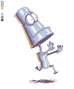
Slow shading progress. Avoiding the hands like the plague 
Also, I realize that it's unfinshed, but does this look like something that would be gallery-worthy when it's done? I kind of feel like it is, but I can't say in good faith that I'm completely objective
|
|
|
IP Logged |
|
|
leel
Commander
Joined: 29 June 2005 Online Status: Offline Posts: 3001 |
Posted: 29 June 2007 at 4:56pm |
|
I'd say it is.
|
|
|
IP Logged |
|
|
Rodder
Commander
infinite cool points Joined: 15 December 2005 Online Status: Offline Posts: 162 |
Posted: 29 June 2007 at 5:09pm |
|
Originally posted by Hatch
but does this look like something that would be gallery-worthy when it's done? Is that a joke? Seriously. This is good stuff. |
|
|
IP Logged |
|
|
mathiusman
Seaman
Joined: 29 June 2007 Online Status: Offline Posts: 2 |
Posted: 29 June 2007 at 7:14pm |
|
I like it!
|
|
|
IP Logged |
|
|
Hatch
Admiral
Joined: 05 August 2015 Online Status: Offline Posts: 1387 |
Posted: 29 June 2007 at 10:31pm |
|
The damn hands are killing me. Here's my best attempt so far:
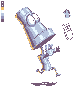
I can't tell if the perspective or the foreshortening of the near arm works at all. Help! |
|
|
IP Logged |
|
|
ceddo
Commander
Joined: 01 June 2020 Online Status: Offline Posts: 466 |
Posted: 30 June 2007 at 4:50am |
|
I think the hand you've already done looks great. But in case you were planning on keeping the other hand dark purple, it still looks very WIP-ish.
I think the shadow on the ground would also work better if it was a simple ellipse :) |
|
|
IP Logged |
|
|
Hatch
Admiral
Joined: 05 August 2015 Online Status: Offline Posts: 1387 |
Posted: 30 June 2007 at 9:26am |
|
Originally posted by ceddo
I think the hand you've already done looks great. Thanks Ceddo 
I'd been staring at it so long I couldn't even see it anymore, if you take my meaning. Looking at it now, after a good night's sleep, I think it might just work. Originally posted by ceddo
But in case you were planning on keeping the other hand dark purple, it still looks very WIP-ish. I think the shadow on the ground would also work better if it was a simple ellipse :) Yes, those are both unfinished. Back to work I go! |
|
|
IP Logged |
|
|
jalonso
Admiral
Joined: 29 November 2022 Online Status: Offline Posts: 13537 |
Posted: 01 July 2007 at 9:58am |
|
This character/pixel is awesome! why had I never seen it :/
...and made on a mac too... I shall go and punish myself now. |
|
|
|
|
|
IP Logged |
|
|
Hatch
Admiral
Joined: 05 August 2015 Online Status: Offline Posts: 1387 |
Posted: 01 July 2007 at 10:33am |
|
Originally posted by jalonso
This character/pixel is awesome! why had I never seen it :/ :O Thank you jalonso! I've admired your pixels for a long time, so that's a great compliment coming from you...
...and made on a mac too... I shall go and punish myself now.
Potentially dumb question: how did you know I made this on a Mac? I don't recall having mentioned it. Edited by Hatch - 01 July 2007 at 10:33am |
|
|
IP Logged |
|
|
jalonso
Admiral
Joined: 29 November 2022 Online Status: Offline Posts: 13537 |
Posted: 01 July 2007 at 10:40am |
|
I can see your IP and system (mod).
btw, safari is not as good as firefox for PJ/pixel viewing ;) |
|
|
|
|
|
IP Logged |
|
|
Hatch
Admiral
Joined: 05 August 2015 Online Status: Offline Posts: 1387 |
Posted: 01 July 2007 at 10:42am |
|
Oh, duh, I knew that was a dumb question.
Firefox is sloooooow on Mac, unfortunately. I'd prefer to use it, I'm just too impatient
|
|
|
IP Logged |
|
|
MashPotato
Commander
Joined: 05 February 2007 Online Status: Offline Posts: 237 |
Posted: 01 July 2007 at 4:05pm |
|
Firefox keeps crashing on my Mac at work
I would go back to Safari, but the smilies here don't work in that for some reason... you can see the bind I'm in Anyhoo, I really like this, great job! I think the left shine on his jaw could be a little less aligned with the shine on the top portion of his face, to show the jutting of his jaw more. (Maybe. I'm really bad at metallic highlights...) Me being super-nitpicky: perhaps lighten the darkest pixels on the bottom left edge of his body can (where his butt would be )Looking forward to the finished piece! |
|
|
IP Logged |
|
|
Hatch
Admiral
Joined: 05 August 2015 Online Status: Offline Posts: 1387 |
Posted: 01 July 2007 at 6:59pm |
|
Thanks for the comments! I'll reevaluate his jaw. You do have a point. It's offset a little, but perhaps not enough.
And yes, the pixels you mentioned do look a little odd. I'll fix them. I love super-nitpicky crits, so keep them coming
And hmm, smilies work fine on my Safari. :shrug: |
|
|
IP Logged |
|
|
Hatch
Admiral
Joined: 05 August 2015 Online Status: Offline Posts: 1387 |
Posted: 04 July 2007 at 6:44pm |
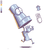
The far hand is giving me fits. It's too small for me to be able to put any detail into without it looking like a messy smear of pixels. Help! |
|
|
IP Logged |
|
|
PippySaid
Seaman
Joined: 15 July 2006 Online Status: Offline Posts: 20 |
Posted: 04 July 2007 at 6:54pm |
|
I think before when the hand was just a silhotte(sp?) it looked better.
|
|
|
IP Logged |
|
|
jalonso
Admiral
Joined: 29 November 2022 Online Status: Offline Posts: 13537 |
Posted: 04 July 2007 at 7:13pm |
|
I have to agree
|
|
|
|
|
|
IP Logged |
|
|
Hatch
Admiral
Joined: 05 August 2015 Online Status: Offline Posts: 1387 |
Posted: 04 July 2007 at 7:15pm |
|
I agree as well. That's why I was complaining about it being a messy smear of pixels and asking for help.
|
|
|
IP Logged |
|
|
jalonso
Admiral
Joined: 29 November 2022 Online Status: Offline Posts: 13537 |
Posted: 04 July 2007 at 7:26pm |
|
...in the meantime I finally remembered what this reminds me off in 'look and feel' THIS
|
|
|
|
|
|
IP Logged |
|
|
Hatch
Admiral
Joined: 05 August 2015 Online Status: Offline Posts: 1387 |
Posted: 04 July 2007 at 7:32pm |
|
Ooooh, that's awesome! I don't really feel the same vibe as my piece, though. Very cool regardless.
|
|
|
IP Logged |
|
|
Hatch
Admiral
Joined: 05 August 2015 Online Status: Offline Posts: 1387 |
Posted: 04 July 2007 at 7:41pm |
|
Anyhow, you don't think it would be a cop out to just go with the silhouette? Would it still be gallery-worthy?
(Sorry for the double post) EDIT: Typo. Edited by Hatch - 04 July 2007 at 7:41pm |
|
|
IP Logged |
|
|
PippySaid
Seaman
Joined: 15 July 2006 Online Status: Offline Posts: 20 |
Posted: 04 July 2007 at 7:43pm |
|
I say make the background transparent keep the sill. and gallery it :)
|
|
|
IP Logged |
|
|
jalonso
Admiral
Joined: 29 November 2022 Online Status: Offline Posts: 13537 |
Posted: 04 July 2007 at 8:04pm |
|
No the sil is great it adds depth.
|
|
|
|
|
|
IP Logged |
|
|
Hatch
Admiral
Joined: 05 August 2015 Online Status: Offline Posts: 1387 |
Posted: 04 July 2007 at 8:56pm |
|
If you say so, Mr. Jalonso
Finally submitted it: http://www.pixeljoint.com/pixelart/22483.htm Thanks everyone for your help! I really learned a lot from this piece and I can't wait to start on a new one. |
|
|
IP Logged |
|
|
CamLit
Seaman
Joined: 30 June 2007 Online Status: Offline Posts: 8 |
Posted: 07 July 2007 at 4:28pm |
|
You could sell that guy as a logo for any metal-ish or auto company I bet for a ton of money. Definitely awesome.
|
|
|
IP Logged |
|
| |
||
Forum Jump |
You cannot post new topics in this forum You cannot reply to topics in this forum You cannot delete your posts in this forum You cannot edit your posts in this forum You cannot create polls in this forum You cannot vote in polls in this forum |
|
