| Active TopicsSearchRegisterLogin |
| WIP (Work In Progress) | |
| |
  |
| Author | Message |
|
Hatch
Admiral 
Joined: 05 August 2015 Online Status: Offline Posts: 1387 |
  Topic: The Fat Man And His Fabulous Friends Topic: The Fat Man And His Fabulous FriendsPosted: 11 July 2007 at 10:00pm |
|
Just a fat, fat man. Trying to practice faces:
Initial, current:  
His double chin (the extra roll of fat under his chin) seems kind of odd to me and I'm sure there are a hundred other problems. EDIT: I was once again working in the wrong color space, so the colors aren't right. I'll fix them. EDIT: Fixed. But they still seem a little weak 
EDIT: Shortened the face, messed with the eyes a little. EDIT: One more before I go to bed. Changed the palette, amongst other things. Edited by Hatch - 18 July 2007 at 5:45pm |
|
 IP Logged IP Logged |
|
|
M.E.
Commander 
Joined: 26 February 2007 Online Status: Offline Posts: 430 |
Posted: 12 July 2007 at 1:08am |
|
Hello Hatch,
I liked your first head better regarding the general shape. The last ones are a bit too round. Regarding the chin I made a small edit which hopefully gives you something to work with:  You had another color (the white-eye) which I included in the cheeks. They are mirrored which can be improved on. The left eyebrow (his right) is lifted a bit. The rest of the face tends to flow a little bit upwards. Maybe you can attempt to shift some pixels there. For the chin I made a bump on to the right (his left). Also the chin on your examples was a bit too similar. I'm not a star with colors and attempted to make the face look a little less yellow:  Probably you could be hue-shifting a little bit more. Probably you could be hue-shifting a little bit more.Maybe even do a color change on the darkest color to have it more to the cobalt blue. Hope this is of help to you. Best regards from M.E. Edited by M.E. - 12 July 2007 at 1:08am |
|
|
KunstStukken.nl M.E. Art
|
|
|
IP Logged |
|
|
Hatch
Admiral
Joined: 05 August 2015 Online Status: Offline Posts: 1387 |
Posted: 12 July 2007 at 7:06am |
|
Hey M.E., thanks very much for the critiques and edits.
Originally posted by M.E. Well, I was trying to exaggerate the roundness of his face to make him look heavier. Perhaps I overdid it.
I liked your first head better regarding the general shape. The last ones are a bit too round. Originally posted by M.E. Ooh, I like the extra shine on his cheeks. I'll include that in my next edit.
Regarding the chin I made a small edit which hopefully gives you something to work with:
You had another color (the white-eye) which I included in thecheeks. They are mirrored which can be improved on.The left eyebrow (his right) is lifted a bit. The rest of the facetends to flow a little bit upwards. Maybe you can attemptto shift some pixels there.For the chin I made a bump on to the right (his left).Also the chin on your examples was a bit too similar The eyebrow is intentional; it's part of his expression. As for everything being shifted upward, you're right. I was sort of going for a perspective from slighlty underneath and, again, trying to exaggerate his weight, but I don't think it worked (the perspective at least). I have to be honest, I don't understand the blob you added on his chin. It seems to be arbitrarily adding asymmetry just for the sake of it. I may be missing something, but it just looks odd to me. Originally posted by M.E. Yes, I really struggle with palette choice, especially skin tones. I'll have another go at it with your advice.
I'm not a star with colors and attempted to make the facelook a little less yellow:
Probably you could be hue-shifting a little bit more.Maybe even do a color change on the darkest color to have itmore to the cobalt blue.Hope this is of help to you.Best regards fromM.E. Again, thank you very much for taking the time. It's a great help. Edited by Hatch - 12 July 2007 at 8:36am |
|
|
IP Logged |
|
|
leel
Commander
Joined: 29 June 2005 Online Status: Offline Posts: 3001 |
Posted: 12 July 2007 at 9:42am |
|
I think the highlight on his second chin is too strong.
This might be taking it too far, but if you want to exaggerate the fatness of his cheeks, you could add the ( ) lines from his nose to mouth on either side. Just some thoughts... |
|
|
IP Logged |
|
|
Hatch
Admiral
Joined: 05 August 2015 Online Status: Offline Posts: 1387 |
Posted: 12 July 2007 at 9:43am |
|
Thanks leel, good points. I'll take another stab at it.
|
|
|
IP Logged |
|
|
Hatch
Admiral
Joined: 05 August 2015 Online Status: Offline Posts: 1387 |
Posted: 12 July 2007 at 10:32am |
|
Quickie lunch break edit:
 
I think his fattyfattyfat chin looks better, and I think (hope) the palette does as well. |
|
|
IP Logged |
|
|
leel
Commander
Joined: 29 June 2005 Online Status: Offline Posts: 3001 |
Posted: 12 July 2007 at 12:27pm |
|
I really like this. I wanted to do an edit for you just cause I couldn't think of anything to really CC, so I wanted to play and see if you can add any details and stuff like that just to make into more than just a practice piece. I think he could use some skin imperfections.. but I couldn't get anything subtle enough with this palette...
Anyway, I just played around, see if it inspires you at all:  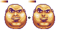 I tried to smooth some things out.. and he ended up a little more sinister hehe.  
|
|
|
IP Logged |
|
|
Hatch
Admiral
Joined: 05 August 2015 Online Status: Offline Posts: 1387 |
Posted: 12 July 2007 at 4:07pm |
|
Great edit, leel, thanks again.
His upper lip was the next thing I planned to do. All those little details you put in, the things that really make a portrait come to life--that's what I need to practice. By the way, I only see one image and three question marks. It looks like you linked to some files on your hard disk, which doesn't work too well for the rest of us 
EDIT: Well, I made some bold palette swaps and tried some zany dithering to suggest stubble and skin imperfections, as you say: 
I'm sure it's a mess now. Good thing I have lots of saves ^^ Edited by Hatch - 12 July 2007 at 4:57pm |
|
|
IP Logged |
|
|
leel
Commander
Joined: 29 June 2005 Online Status: Offline Posts: 3001 |
Posted: 12 July 2007 at 5:36pm |
|
no no I love it!
And I only posted one image from photobucket, not sure what question marks you're talking about, I don't see any.. Anyways, wow great job :) The one thing I can think to suggest is to get rid of the gray pixels separating the two circles on the chin. I think the separate highlights would be enough, but connecting the shadows is a wee bit much. You should try and see what it looks like without - it might help.  |
|
|
IP Logged |
|
|
Hatch
Admiral
Joined: 05 August 2015 Online Status: Offline Posts: 1387 |
Posted: 12 July 2007 at 5:47pm |
|
Thanks

It could still use some more AA and general touching up, but I think I'm going to toss this one on the "done" pile. Thanks again for your help; I learned a lot. Oh, and as for the broken images, this is what I see: 
And the ?'s link to C:\Documents\...\moz-screenshot.jpg *shrug* Edited by Hatch - 12 July 2007 at 5:47pm |
|
|
IP Logged |
|
|
leel
Commander
Joined: 29 June 2005 Online Status: Offline Posts: 3001 |
Posted: 12 July 2007 at 5:56pm |
|
dunno where that's coming from, I don't even have that file >_>
 |
|
|
IP Logged |
|
|
Hatch
Admiral
Joined: 05 August 2015 Online Status: Offline Posts: 1387 |
Posted: 12 July 2007 at 6:13pm |
|
It's aliens shootin' laser beams into mah internets!
Oh well. EDIT: Decided to submit it! Edited by Hatch - 12 July 2007 at 6:40pm |
|
|
IP Logged |
|
|
leel
Commander
Joined: 29 June 2005 Online Status: Offline Posts: 3001 |
Posted: 12 July 2007 at 6:49pm |
|
Good job.
|
|
|
IP Logged |
|
|
M.E.
Commander
Joined: 26 February 2007 Online Status: Offline Posts: 430 |
Posted: 13 July 2007 at 9:16am |
|
Hello Hatch,
Well Done. The rough beard is something that isn't working for me. I thought the face had character enough without it. Best regards from M.E. |
|
|
KunstStukken.nl M.E. Art
|
|
|
IP Logged |
|
|
Hatch
Admiral
Joined: 05 August 2015 Online Status: Offline Posts: 1387 |
Posted: 16 July 2007 at 5:51pm |
|
More face practice. This time--what else?-- The Thin Man:
Initial, current  
Not sure how well it reads at 1x. It's quite a challenge cramming detail into a piece this size. Hopefully it's not too big a mess :/ Obviously I haven't done much with the brow or forehead yet. Brutal criticism welcomed and encouraged! EDIT: Yes, his eyebrow is cocked as well because I'm extremely unimaginative Edited by Hatch - 18 July 2007 at 5:47pm |
|
|
IP Logged |
|
|
soda
Commander
Joined: 19 May 2007 Online Status: Offline Posts: 224 |
Posted: 16 July 2007 at 5:55pm |
|
Are you making them the size of avatars?
Looks pretty nice, just the forehead needs more shading, but I'm guessing your not done. Good job. |
|

|
|
|
IP Logged |
|
|
Hatch
Admiral
Joined: 05 August 2015 Online Status: Offline Posts: 1387 |
Posted: 16 July 2007 at 5:57pm |
|
Originally posted by Hatch
Obviously I haven't done much with the brow or forehead yet.
And yeah, so far they've both been on a 64x64 canvas, though in neither case have I come close to using all of it. EDIT: i r dum Edited by Hatch - 16 July 2007 at 6:11pm |
|
|
IP Logged |
|
|
soda
Commander
Joined: 19 May 2007 Online Status: Offline Posts: 224 |
Posted: 16 July 2007 at 6:06pm |
|
Woops, didn't catch that, sorry!
|
|
|
|
|
|
IP Logged |
|
|
Hatch
Admiral
Joined: 05 August 2015 Online Status: Offline Posts: 1387 |
Posted: 16 July 2007 at 6:55pm |
|
Quick update, mostly for the new and (hopefully) improved palette:

|
|
|
IP Logged |
|
|
Kfuchoin
Commander
Joined: 11 March 2007 Online Status: Offline Posts: 740 |
Posted: 16 July 2007 at 7:01pm |
|
yeah this new pallete is way better ^^
lokking for further progress btw some hair would be cool..
|
|
|
may the pixels be with you..
~Kfuchoin eMo looking for people for an RPG info: http://www.pixeljoint.com/forum/forum_posts.asp?TID=4903 |
|
|
IP Logged |
|
|
soda
Commander
Joined: 19 May 2007 Online Status: Offline Posts: 224 |
Posted: 16 July 2007 at 7:04pm |
|
Much improved palette. Like the forehead too.
|
|
|
|
|
|
IP Logged |
|
|
leel
Commander
Joined: 29 June 2005 Online Status: Offline Posts: 3001 |
Posted: 16 July 2007 at 7:31pm |
|
You should try making his forehead (and back of head) larger, regular size even, just to emphasize the skinniness of him. Cause skinny people still have skulls. Cause at the moment he just looks really squished..
This might be a bad idea, maybe too much like a caricature, but hopefully it'll make it more realistic. Maybe you could try outlining the skull first and then just kinda adding skin but keeping the same kinda creepy shape you know? And a note about anatomy - the cheekbones sit on the same line as the nose cavity, so they're a wee high on the face right now. Anyway, looking forward to seeing more. I like the sickly palette, but don't worry about the colors too much until you've got the shape and shading perfect. |
|
|
IP Logged |
|
|
Hatch
Admiral
Joined: 05 August 2015 Online Status: Offline Posts: 1387 |
Posted: 16 July 2007 at 7:51pm |
|
Thanks for the comments, leel. Good points as always.
I had already fattened up his cranium by the time I had read this
As for his cheekbones, I intentionally made them too high and too prominent. I was intending for this to be a bit caricature-y. It's a bold experiment indeed, but I just wanted to try something different. Again, thanks very much for the advice. It's always appreciated. Hopefully I'll have one more update before bedtime. |
|
|
IP Logged |
|
|
Hatch
Admiral
Joined: 05 August 2015 Online Status: Offline Posts: 1387 |
Posted: 16 July 2007 at 8:21pm |

Sigh... It's all wrong. |
|
|
IP Logged |
|
|
soda
Commander
Joined: 19 May 2007 Online Status: Offline Posts: 224 |
Posted: 16 July 2007 at 8:23pm |
|
Wow, that's much better, the contrast is wonderful too, has the same feel as "Fat Man".
|
|
|
|
|
|
IP Logged |
|
|
Hatch
Admiral
Joined: 05 August 2015 Online Status: Offline Posts: 1387 |
Posted: 16 July 2007 at 10:02pm |
|
Aw, thanks soda

One more for the night:  
Tried to make his expression more ghoulish and less menacing. The hair refuses to cooperate. EDIT: I just noticed this is beginning to look a little like Ilkke's avatar. EDIT: One more update. Edited by Hatch - 16 July 2007 at 10:17pm |
|
|
IP Logged |
|
|
M.E.
Commander
Joined: 26 February 2007 Online Status: Offline Posts: 430 |
Posted: 16 July 2007 at 11:21pm |
|
Hello Hatch,
First of all I have to say Great Work! Where can I send my picture to so that you can do M.E.?  He is looking so sad, maybe that is because he has really small ears?! (usually they run to the tip of the nose) Personally I find it a bit too dark. But I love how you popped out those eyes. Much clearer than your first itteration. Your Fat Man had nice irregular = non-mirrored features. This thin man is pretty mirrored. It is OK but it might be more interesting to see it slightly off in one half of the face. Looking forward to see more of this carricature-pixelling! Best regards from M.E. |
|
|
KunstStukken.nl M.E. Art
|
|
|
IP Logged |
|
|
Hatch
Admiral
Joined: 05 August 2015 Online Status: Offline Posts: 1387 |
Posted: 17 July 2007 at 7:44am |
|
Hey M.E., thanks for the comments.
Originally posted by M.E.
He is looking so sad, maybe that is because he hasreally small ears?! (usually they run to the tip of the nose) Heh, well, the idea is that you're only able to see the tops of his ears. When I had the entire length of them in, he looked like a very cadaverous monkey
But yes, I concede that they don't read well. Originally posted by M.E.
Personally I find it a bit too dark. But I love how you poppedout those eyes. Much clearer than your first itteration. Yes, I made the darks in this piece much darker than I normally would. I thought it would impart a bit of a spooky atmosphere. It's possible I overdid it. I'm constantly playing around with my palette, so I may rethink the colors. Originally posted by M.E.
Your Fat Man had nice irregular = non-mirrored features.This thin man is pretty mirrored. It is OK but it mightbe more interesting to see it slightly off in one half of the face. Ah! I new someone was going to call me on the mirroring
Yes, it's just laziness and I should fix it. I have no excuse. Originally posted by M.E.
Looking forward to see more of this carricature-pixelling!Best regards fromM.E. Thanks
I've got to say, though, I'm not really liking this piece. Maybe it's just the character I find somewhat drab. I dunno. Oh well, it's fine for practice I suppose. I'm learning quite a lot. Edited by Hatch - 17 July 2007 at 7:45am |
|
|
IP Logged |
|
|
soda
Commander
Joined: 19 May 2007 Online Status: Offline Posts: 224 |
Posted: 17 July 2007 at 9:11am |
|
The hair was a very nice touch, but like M.E. said, it's a little to dark compared to 'Fat Man'. Oh, and I like the real bony face, but I guess that would make since for a skinny man. Keep it up.
|
|
|
|
|
|
IP Logged |
|
|
Hatch
Admiral
Joined: 05 August 2015 Online Status: Offline Posts: 1387 |
Posted: 18 July 2007 at 5:25pm |
|
Update:
 
Played around with some different hair styles. I may try a few more, but I'm pretty happy with him at this point. EDIT: And yeah, I still haven't introduced any asymmetry, aside from the hair experiments. Everything I've tried that isn't so trivial as to be unnoticeable looks forced. *shrug* Edited by Hatch - 18 July 2007 at 6:59pm |
|
|
IP Logged |
|
|
soda
Commander
Joined: 19 May 2007 Online Status: Offline Posts: 224 |
Posted: 18 July 2007 at 5:33pm |
|
I like the first and second hair styles. More or less the 1st one, it looks good for a skinny man.
|
|
|
|
|
|
IP Logged |
|
|
M.E.
Commander
Joined: 26 February 2007 Online Status: Offline Posts: 430 |
Posted: 18 July 2007 at 10:02pm |
|
Hi Hatch,
Congratulations on your experiments. Usually there is a tendency to go for one style and don't play around. It gives you much more freedom. I like all three because they are all believable, but the second is my favorite. Best regards from M.E. |
|
|
KunstStukken.nl M.E. Art
|
|
|
IP Logged |
|
|
Hatch
Admiral
Joined: 05 August 2015 Online Status: Offline Posts: 1387 |
Posted: 19 July 2007 at 11:03pm |
|
Thank you M.E, soda.
I wasn't sure if I should start a new thread for this, because it's a much different style, but I figure it's all just face practice, which is what I started the for: Initial, Current: 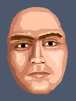 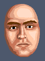
It's not very interesting from an artistic standpoint, but I wanted to try a plain realistic portrait. No ref, I made the face up as I went. I've mainly just blocked in the shading, and tweaked the eyes with a bit more detail. The forehead is obviously not entirely shaded. I'd like to know if there are any anatomy or proportion or lighting problems before I take it any further. Edited by Hatch - 20 July 2007 at 7:34pm |
|
|
IP Logged |
|
|
M.E.
Commander
Joined: 26 February 2007 Online Status: Offline Posts: 430 |
Posted: 19 July 2007 at 11:56pm |
|
Hi Hatch,
The palette is much better!
Face anatomy: With a frontal face the eyes are on the half of the skull.
You should probably add some skull.
The width of an eye is between the eyes. The points of the mouth
are aligned with the center of the eye.
I'm missing ears :)
Looking forward to your faces, as always!
Best regards from
M.E.
|
|
|
KunstStukken.nl M.E. Art
|
|
|
IP Logged |
|
|
leel
Commander
Joined: 29 June 2005 Online Status: Offline Posts: 3001 |
Posted: 20 July 2007 at 5:22am |
|
quick note: the nose seems perfectly vertical but the eyes are tilted
|
|
|
IP Logged |
|
|
soda
Commander
Joined: 19 May 2007 Online Status: Offline Posts: 224 |
Posted: 20 July 2007 at 9:16am |
|
It would look nice if you had a slight tilt, so rotate the nose a little bit like leel said. Awesome job btw, Hatch.
|
|
|
|
|
|
IP Logged |
|
|
Hatch
Admiral
Joined: 05 August 2015 Online Status: Offline Posts: 1387 |
Posted: 20 July 2007 at 7:34pm |
|
Update:
Thank you all for the crits. I tried to address everything you pointed out. Still needs a lot of work, but I'm very pleased how it's coming together. I've never done anything quite so ambitious.
Sorry, no ears yet, M.E
|
|
|
IP Logged |
|
|
M.E.
Commander
Joined: 26 February 2007 Online Status: Offline Posts: 430 |
Posted: 20 July 2007 at 10:38pm |
|
Hi Hatch,
Well making the eyes smaller helped a little bit. There will be a problem in fixing only one thing as everything relates to eachother. The height of the nose is approximately one width of an eye. Also the basic skull remained the same. There should be much more head on top. Even on bald people! Introducing the tilt is nicer from an artistic point of view, but it will increase the difficulty aligning everything. Like leel mentioned the nose is too straight when you tilt the eyes. And for the ears, oh well they will grow sooner or later. Best regards from M.E. |
|
|
KunstStukken.nl M.E. Art
|
|
|
IP Logged |
|
| |
||
Forum Jump |
You cannot post new topics in this forum You cannot reply to topics in this forum You cannot delete your posts in this forum You cannot edit your posts in this forum You cannot create polls in this forum You cannot vote in polls in this forum |
|
