| Active TopicsSearchRegisterLogin |
| WIP (Work In Progress) | |
| |
  |
| Author | Message |
|
locust
Seaman 
Joined: 27 July 2007 Location: Sweden Online Status: Offline Posts: 10 |
  Topic: [WIP]troll, with gun... Topic: [WIP]troll, with gun...Posted: 27 July 2007 at 9:32pm |
|
---------------------------[WARNING SPRITE IS APPROACING]----------------------- pay attention to backwards initial linework....  latest update: 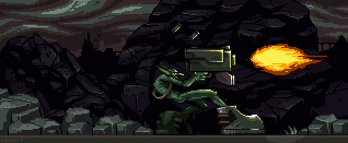 got some tips on the other pixel forum that i applyed...a more correct lightsources shading applied...new flame, darker colors...
a little rivercityransom lookalikes :) sylvester stallone and john merric on yer far right. template hovering in top corner, no ghost  __ ___ _____ _____ ____ _______ / /_ / _ \/ ___// / /_\ _//_ ___/ \____\___/_____/____/)_____\ \__\ [42C112C3N31MM0RT4L] Edited by locust - 03 August 2007 at 1:20pm |
|
|
|
|
 IP Logged IP Logged |
|
|
M.E.
Commander 
Joined: 26 February 2007 Online Status: Offline Posts: 430 |
Posted: 27 July 2007 at 11:05pm |
|
Hello Locust,
Welcome to PJ. You probably know that the background needs work. Several planes of trees/rocks and stuff would be nice. The physics of shooting is that there is an even amount of backforce as there is on the force going forward. The guns would probably rip his head off :) Suggestion would be to at least straighten the hands so that there is more strength behind the shot. The picture looks a bit hard to read. When zoomed in I discovered he had some LARGE boots on. But in normal view they are not visible. Make the upper arm thicker than the lower arm. That would be it for now .. Looking forward to the updates! Best regards from M.E. |
|
|
KunstStukken.nl M.E. Art
|
|
|
IP Logged |
|
|
theguy
Commander
Joined: 03 November 2023 Online Status: Offline Posts: 417 |
Posted: 28 July 2007 at 1:40am |
|
the boots bit is because this is WIP and he hasnt colored them
Edited by theguy - 28 July 2007 at 1:40am |
|
|
IP Logged |
|
|
AdrianJensen
Commander
Joined: 18 January 2007 Online Status: Offline Posts: 238 |
Posted: 28 July 2007 at 2:08am |
|
I love it. The boots are awesome.
|
|
|
My gallery lives here:
http://www.pixeljoint.com/p/8355.htm?pg=1&sec=icons |
|
|
IP Logged |
|
|
Metaru
Commander
Joined: 03 February 2020 Online Status: Offline Posts: 3305 |
Posted: 28 July 2007 at 2:18am |
|
JPEG, please.
|
|
|
I ate leel's babies
|
|
|
IP Logged |
|
|
locust
Seaman
Joined: 27 July 2007 Location: Sweden Online Status: Offline Posts: 10 |
Posted: 28 July 2007 at 6:29am |
|
png it is...
*UPDATE*  just made the arm a bit thicker, started coloring boots and "leatherbelt" just to let you know its active :) gonna work more later this night... thanks for the tips! Edited by locust - 28 July 2007 at 6:30am |
|
|
IP Logged |
|
|
locust
Seaman
Joined: 27 July 2007 Location: Sweden Online Status: Offline Posts: 10 |
Posted: 28 July 2007 at 11:24am |
|
The b00ts got shaded and platform background added. Decided to go with a more moonlit colortheme
the hand and gun is probably gonna get redone, again...uzi? AAing and shading on the ground background needed and so on... 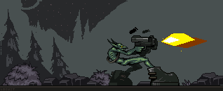 ___________________________________________________________ |
|
|
IP Logged |
|
|
locust
Seaman
Joined: 27 July 2007 Location: Sweden Online Status: Offline Posts: 10 |
Posted: 28 July 2007 at 3:46pm |
|
semi finished AAing on the foreground
tried a bit more pre historic style on the gun...thinking about tracker style clothing...or sub machineguns i really suck at backgrounds and i dont really know what to make of his other arm, mabey making him hold thegun with 2 hands... 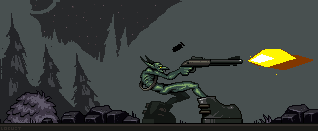 i think it looks kooler with the fatter gun? Edited by locust - 28 July 2007 at 3:49pm |
|
|
IP Logged |
|
|
soda
Commander
Joined: 19 May 2007 Online Status: Offline Posts: 224 |
Posted: 28 July 2007 at 4:56pm |
|
Better with the fat gun, for sure.
|
|

|
|
|
IP Logged |
|
|
Larwick
Commander
Joined: 18 July 2024 Online Status: Offline Posts: 4015 |
Posted: 28 July 2007 at 5:03pm |
|
Yeah, the recoil from the shotgun would swing it up (in my vast [sarc] knowledge of gunz) therefore it kinda looks odd. Phat gun looks hot. They're both really nice though.
Just thought i'd come and say that and that i really like this. Design, concept, pixelz. All good. Keep it up. Ooooh and with his other arm, you could just have it hanging down behind him, all "i'm too coo' fo' skl" styli. That's how i'd imagine it anyway. Edited by Larwick - 28 July 2007 at 5:04pm |
|
 
|
|
|
IP Logged |
|
|
M.E.
Commander
Joined: 26 February 2007 Online Status: Offline Posts: 430 |
Posted: 29 July 2007 at 12:28am |
|
Hi Locust,
Ah .. much better!! The fat gun works for me as well. I would give the boots a little bit more light if it is possible with your color-set. The arm suggestion from Larwick is very good, but I did like the two-gun effect you had before as well. Maybe try to enlarge his upperarm by giving him more muscles there?!? I really like the color-change of the background. The troll really comes to live on it! Looking forward to updates!!! Best regards from M.E. |
|
|
KunstStukken.nl M.E. Art
|
|
|
IP Logged |
|
|
locust
Seaman
Joined: 27 July 2007 Location: Sweden Online Status: Offline Posts: 10 |
Posted: 29 July 2007 at 8:25am |
|
im moving towards a rock background....
UZI 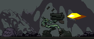 damn it looks dark, on my computer i turned the colors up so that there would be more nuanses of dark colors... i vote fore the recignation of the bush |
|
|
|
|
|
IP Logged |
|
|
locust
Seaman
Joined: 27 July 2007 Location: Sweden Online Status: Offline Posts: 10 |
Posted: 29 July 2007 at 2:55pm |
|
DAYTIME
 < heh forgot to hue... < heh forgot to hue...nighttime.... 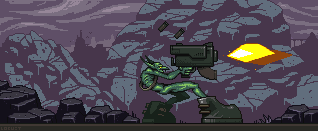 its the first time i do mountains but i think i pulled it off pretty ok...? mabey make a more doomish sky on the nocturnal one? Edited by locust - 29 July 2007 at 3:08pm |
|
|
|
|
|
IP Logged |
|
|
M.E.
Commander
Joined: 26 February 2007 Online Status: Offline Posts: 430 |
Posted: 29 July 2007 at 10:49pm |
|
Hello Locust,
Personally I liked the tree background better. This background adds a bit of noise to the scene. In case you want to work on the mountains a bit I would suggest to add another dark to the structure. As for the general form it actually looks like a pile of rocks instead of one large rock. But maybe you are after that effect  Are you making mockups with different backgrounds and guns? Because that sounds really great! Maybe you can make the blast a little more dynamic and interesting? Best regards from M.E. |
|
|
KunstStukken.nl M.E. Art
|
|
|
IP Logged |
|
|
locust
Seaman
Joined: 27 July 2007 Location: Sweden Online Status: Offline Posts: 10 |
Posted: 30 July 2007 at 9:11am |
|
Contrasted bg and changed the blast
 |
|
|
|
|
|
IP Logged |
|
|
M.E.
Commander
Joined: 26 February 2007 Online Status: Offline Posts: 430 |
Posted: 30 July 2007 at 9:44am |
|
Hi Locust,
MUCH better background! The blast can maybe done with a little AA to avoid such a hard line. Is there a touch of Red in the pallete? Else you might use the redish from the belt to give the blast more blast ?!? Great Job! Best regards from M.E. |
|
|
KunstStukken.nl M.E. Art
|
|
|
IP Logged |
|
|
AdrianJensen
Commander
Joined: 18 January 2007 Online Status: Offline Posts: 238 |
Posted: 30 July 2007 at 10:10am |
|
Maybe add some light from the blast to the boots?
It'll make them look shiny  |
|
|
My gallery lives here:
http://www.pixeljoint.com/p/8355.htm?pg=1&sec=icons |
|
|
IP Logged |
|
|
locust
Seaman
Joined: 27 July 2007 Location: Sweden Online Status: Offline Posts: 10 |
Posted: 31 July 2007 at 11:01am |
|
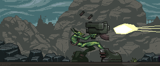
^UPDATE
|
|
|
|
|
|
IP Logged |
|
|
tuaarita
Commander
Joined: 04 December 2015 Online Status: Offline Posts: 1049 |
Posted: 02 August 2007 at 3:54am |
|
loving it all, just play around with the blast, look at pics in google etc for different kinds of blasts.
imo you should also give him some clothing, lol. |
|
|
I'm running in the desert,
running in to the sun, running out of blood and I'm going numb. |
|
|
IP Logged |
|
|
locust
Seaman
Joined: 27 July 2007 Location: Sweden Online Status: Offline Posts: 10 |
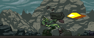
Posted: 03 August 2007 at 1:21pm |
|
shameless updatebump |
|
|
|
|
|
IP Logged |
|
|
M.E.
Commander
Joined: 26 February 2007 Online Status: Offline Posts: 430 |
Posted: 03 August 2007 at 11:12pm |
|
Hello Locust,
WOW, that is a nice blast! I dig the lightsource adjustments! Cool. The only thing I would do is a itsy bitsy light in the background. Dark is OK, but I think it is a bit too dark. (Could be just my monitor settings, so wait what others think!) Great progress you have shown! Impressive! Best regards from M.E. |
|
|
KunstStukken.nl M.E. Art
|
|
|
IP Logged |
|
|
Luca
Midshipman 
Joined: 24 February 2025 Location: United Kingdom Online Status: Offline Posts: 52 |
Posted: 04 August 2007 at 4:06am |
|
awsome thing locust!the background is awsome too.Great style
|
|
|
IP Logged |
|
|
Jumpei
Seaman
Joined: 08 January 2023 Online Status: Offline Posts: 2 |
Posted: 17 August 2007 at 5:59am |
|
Awesome stuff man, the latest update is uberninja!!!
|
|
|
IP Logged |
|
| |
||
Forum Jump |
You cannot post new topics in this forum You cannot reply to topics in this forum You cannot delete your posts in this forum You cannot edit your posts in this forum You cannot create polls in this forum You cannot vote in polls in this forum |
|
