| Active TopicsSearchRegisterLogin |
| WIP (Work In Progress) | |
| |
  |
| Author | Message |
|
Olie
Seaman 
Joined: 18 April 2006 Location: United Kingdom Online Status: Offline Posts: 11 |
  Topic: 2 WIP Topic: 2 WIPPosted: 24 September 2007 at 4:00am |
|
General suggestions, comments etc. would be appreciated.
For the old guy, any advice as to his limbs? I'm not happy with them them yet and perhaps they look too static or rigid, especially his right arm (that's his right, screen left).
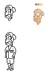  Backgrounds will be transparent probably.
|
|
 IP Logged IP Logged |
|
|
darokin
Seaman
Joined: 22 September 2007 Online Status: Offline Posts: 4 |
Posted: 25 September 2007 at 2:15pm |
|
Only one thing to say : Finish your grandpa, it gonna rock... Seriously, It's a good lineart and you seem good coloring (head)... That would give a really great sprite I think...
Keep on great work... |
|
|
IP Logged |
|
|
jalonso
Admiral 
Joined: 29 November 2022 Online Status: Offline Posts: 13537 |
Posted: 25 September 2007 at 7:31pm |
|
Yup, grandpa is great looking color that.
*probably transparent?...probably? EDIT:*note to self* we got a potential troublemaker here Edited by jalonso - 25 September 2007 at 7:36pm |
|
|
|
|
|
IP Logged |
|
|
Olie
Seaman
Joined: 18 April 2006 Location: United Kingdom Online Status: Offline Posts: 11 |
Posted: 27 September 2007 at 9:02am |
|
Thankyou, both of you, I'll update when when there's been progress worth updating for.
Oh, and Jalonso, I meant "probably transparent", as opposed to a particular background which I drew. I don't want no trouble. Edited by Olie - 07 October 2007 at 7:01am |
|
|
IP Logged |
|
|
Olie
Seaman
Joined: 18 April 2006 Location: United Kingdom Online Status: Offline Posts: 11 |
Posted: 07 October 2007 at 7:02am |
|
Update: Thoughts?
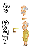 It's meant to be a safari-style outift, considering changing the shirt to something more interesting, an aloha shirt etc.
|
|
|
IP Logged |
|
|
Monkey 'o Doom
Commander 
Joined: 24 September 2005 Online Status: Offline Posts: 2994 |
Posted: 07 October 2007 at 8:35am |
|
Increase the contrast by making the darks darker. Right now your pixelling isn't too bad but the darker colors are too close to the light ones, making it hard to tell what's what or discern details.
|
|

RPG is numberwang. |
|
|
IP Logged |
|
|
Olie
Seaman
Joined: 18 April 2006 Location: United Kingdom Online Status: Offline Posts: 11 |
Posted: 13 October 2007 at 9:23am |
|
Monkey 'o Doom - thanks for the input, I haven't got around to adjusting the contrast yet but will do. In the meantime, I tried a dithered version which, I think is an improvement.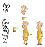 And here's a ukulele, thoughts appreciated.
 Perhaps it's a bit too dark.
|
|
|
IP Logged |
|
|
pixelblink
Commander
Joined: 19 February 2023 Online Status: Offline Posts: 2865 |
Posted: 13 October 2007 at 9:57am |
|
your ramp of 6 yellows aren't completely distinguishable. I say make the darkest one darker and then change the hues and light a bit on some of the others. Right now I can really see the details of his shirt too clearly as it is because of this.
|
|
|
IP Logged |
|
| |
||
Forum Jump |
You cannot post new topics in this forum You cannot reply to topics in this forum You cannot delete your posts in this forum You cannot edit your posts in this forum You cannot create polls in this forum You cannot vote in polls in this forum |
|
