| Active TopicsSearchRegisterLogin |
| WIP (Work In Progress) | |
| |
  |
| Author | Message |
|
ShinyOne
Seaman 
Joined: 04 October 2007 Location: United States Online Status: Offline Posts: 7 |
  Topic: Sharky Suggestions? Topic: Sharky Suggestions?Posted: 25 October 2007 at 5:43pm |
|
Alright, so I've tried to submit my shark-lighter pixel twice (revised the second time, not just an identical re-submit), but it kept getting returned, saying that it didn't get a high enough score. So I'm going to try fixing it up for re-submitting, but ...I'm just not really sure what needs work, exactly.
 First one is original!Sharky, the first version I made. Second is the updated version I re-submitted. Source Image I was actually going for a rough, "brushed metal" sort of look when I started, but I like the second version better now that I did it... I just don't know what else to fix to get it accepted. :) So, yah, any-and-all suggestions appreciated, and I'll give almost anything (well, anything logical ;]) a shot! <3 |
|
 IP Logged IP Logged |
|
|
Monkey 'o Doom
Commander 
Joined: 24 September 2005 Online Status: Offline Posts: 2994 |
Posted: 25 October 2007 at 7:16pm |
|
Your problem is that you lack the 3D shape of a lighter but still try to illuminate it like it was 3D. (And a pillow-shaped 3D object at that.) [Note: Not pillow shaded, pillow-shaped. Okay, maybe a little pillow shaded. More of an off-center pillow shading I guess. Ignore this rambling bit.] I suggest rotating the thing a bit in your head and drawing it from an angle. Isometric pixel art is quite good for this sort of thing, but you might want to also try your own angle and get a fresher start on things than isometric; I notice a lot of iso PA is very blocky because it's so clean and defined. Go for a view with some perspective shown, I say. Then shade the sides like the brushed metal/etc. you have here, paying attention to their orientation relative to the lightsource. I quite like the texture on the second one for a very matte metal but I think you would do better for a more high-contrast color scheme here, after you get the shape and the like down. Good luck with your art!
EDIT: Ramble disclaimer. :P Edited by Monkey 'o Doom - 25 October 2007 at 7:17pm |
|

RPG is numberwang. |
|
|
IP Logged |
|
|
ShinyOne
Seaman
Joined: 04 October 2007 Location: United States Online Status: Offline Posts: 7 |
Posted: 25 October 2007 at 11:27pm |
|
No worries on the ramble, and thanks for the quicklike reply. XD
I see what you mean, makes sense that flat shaded as 3D wouldn't look right... Played a little with outlines to see what I could come up with... 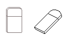 Are either of the outlines anything like what you meant? I'm not entirely sure how to go about making it have more dimension (since I pretty much always do the flat-look, as per Sharky there), so, yeah, that was what happened. :) |
|
|
IP Logged |
|
|
Monkey 'o Doom
Commander
Joined: 24 September 2005 Online Status: Offline Posts: 2994 |
Posted: 26 October 2007 at 1:00pm |
|
Either way works, though you really don't have too much space on the edges to work with on the left one and the right seems a bit thin and overly curved compared to the reference and zippo(e?)s I've seen. All your WIP images here so far seem just a bit out of proportion in that they're a bit compressed horizontally. Give them a few pixels more width.
|
|
|
RPG is numberwang. |
|
|
IP Logged |
|
| |
||
Forum Jump |
You cannot post new topics in this forum You cannot reply to topics in this forum You cannot delete your posts in this forum You cannot edit your posts in this forum You cannot create polls in this forum You cannot vote in polls in this forum |
|
