| Active TopicsSearchRegisterLogin |
| WIP (Work In Progress) | |
 Topic: She came from mars Topic: She came from mars |
  |
| Page of 2 Next >> |
| Author | Message |
|
GeorgiePie
Midshipman 
Joined: 07 November 2007 Location: United States Online Status: Offline Posts: 89 |
  Topic: She came from mars Topic: She came from marsPosted: 08 November 2007 at 9:23am |
|
There are a few things bothering me, her right hand (so small!) I like the posing of it though. Also, I'm not sure what else, can't put my finger on it. 
|
|
 IP Logged IP Logged |
|
|
Squirrelsquid
Commander 
Joined: 18 July 2023 Online Status: Offline Posts: 259 |
Posted: 08 November 2007 at 10:54am |
|
that's solid! me like!
for crits: one additional darker color for each ramp would be neat. with that you could add some additional shadows to define the bodyshapes more precisly. still, very sexy though. |
|
|
IP Logged |
|
|
Hapiel
Rear Admiral 
Joined: 30 June 2023 Online Status: Offline Posts: 3266 |
Posted: 08 November 2007 at 11:04am |
|
Is everything going to be as detailed as the lips?

|
|
|
IP Logged |
|
|
greenraven
Commander
Joined: 08 September 2016 Online Status: Offline Posts: 2598 |
Posted: 08 November 2007 at 11:11am |
|
The ear seems a bit off, but then again she's an alien.
 So far so good.  |
|
 "pwnage comes with patience, practice and planning." ~ Jalonso "pwnage comes with patience, practice and planning." ~ Jalonso 
|
|
|
IP Logged |
|
|
Metaru
Commander
Joined: 28 December 2025 Online Status: Offline Posts: 3305 |
Posted: 08 November 2007 at 12:00pm |
|
the far leg should be raised, so it would match the near one, because it actually appears that its not connected to the hips. its just a very, very rough edit
|
|
|
I ate leel's babies
|
|
|
IP Logged |
|
|
Doomcreator0
Commander
Joined: 12 March 2017 Online Status: Offline Posts: 187 |
Posted: 08 November 2007 at 1:08pm |
|
Even for a WIP, the shine effect is great.
As for CC, The arms and hands seem small/thin or is that done on purpose?
|
|
|
IP Logged |
|
|
Larwick
Commander
Joined: 18 July 2024 Online Status: Offline Posts: 4015 |
Posted: 08 November 2007 at 2:23pm |
|
Originally posted by Metaru the far leg should be raised, so it would match the near one, because it actually appears that its not connected to the hips. its just a very, very rough edit Although that improves the thigh-hip placement it ruins the composition and makes her look really awkward - like her foot is placed upon her right thigh, IMO. However yeah, i agree it needs to be fixed, just wouldn't execute it quite like that. :P |
|
 
|
|
|
IP Logged |
|
|
GeorgiePie
Midshipman
Joined: 07 November 2007 Location: United States Online Status: Offline Posts: 89 |
Posted: 08 November 2007 at 8:39pm |
|
Alright, I fixed her leg a bit, not sure what y'all think. Also, her ear was a bit off, fixed that.
 (ignore the foot!)
About those lips, what happend was I made them because... well I had nothing else to do and I wanted to pixel, so I did, then kept going, pixeled some eyes... turned into this.
Detail, yes I plan on trying it out, seeing which I like best, simple cartoon style, or detailed. We'll see.
The arms/hands... I love the way her left arm and hand look, but her right is so bad it's not even funny. I'll fix that I swear XD
Oh, by the way, don't pay no mind to those ugly green eyes... I don't know what I was thinking
(Ramp???)
Edited by GeorgiePie - 08 November 2007 at 8:42pm |
|
|
IP Logged |
|
|
Skaka
Commander
Joined: 31 October 2007 Online Status: Offline Posts: 183 |
Posted: 09 November 2007 at 7:54am |
|
Hey dude,
I like the piece in general but the leg is still too low. I don't pretend to be much of a pixel artist but I know anatomy well enough so I've super-imposed what would be the bones onto you're piece to show you what's wrong with the leg: 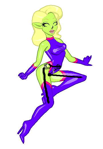 As you can see it looks like her left leg is out of it's socket :P Also on her chest there's sort of a dip between her left breast and her rib cage, which doesn't look right. I'd suggest filling the gap with the purple so it's stretches over :) Fix those and I think this is gonna look awesome. Good luck man :) *Edit just read the post about the leg fix messing up the composition, so I'd suggest changing the her stance a little bit so as to stick her foreleg out a little bit. Edited by Skaka - 09 November 2007 at 7:57am |
|
|
Ars longa, vita brevis.
|
|
|
IP Logged |
|
|
GeorgiePie
Midshipman
Joined: 07 November 2007 Location: United States Online Status: Offline Posts: 89 |
Posted: 09 November 2007 at 1:16pm |
|
Alright, I fixed the leg once again, by the way, her bottom half is to the side.
Also, that "bump" that sticks out is called fat XD It isn't her hip bone.
I'm no dude, I'm a dudette! Oh! almost forgot
need some crits on this AV for my friend
 Edited by GeorgiePie - 09 November 2007 at 1:16pm |
|
|
IP Logged |
|
|
Skaka
Commander
Joined: 31 October 2007 Online Status: Offline Posts: 183 |
Posted: 09 November 2007 at 1:46pm |
|
Duddette then :P Anyways that looks awesome now. You shut me up good ;]
Can't really crit on the av as I'm a nub at pixels :p |
|
|
Ars longa, vita brevis.
|
|
|
IP Logged |
|
|
Fuzzyleaves
Commander
Joined: 23 June 2007 Online Status: Offline Posts: 147 |
Posted: 09 November 2007 at 9:59pm |
|
She seems slimy with the that big reflection on her skin, it makes her skin looky slimy just as slimy as her clothing.. does that makes sense? OH btw the major problem.. she's wearing clothing, lol jk, i don't like the outline
|
|
|
IP Logged |
|
|
Hatch
Admiral 
Joined: 05 August 2015 Online Status: Offline Posts: 1387 |
Posted: 09 November 2007 at 10:21pm |
|
I think Maya needs to have the bridge of her nose blend a bit more smoothly with here face. Her chin seems pretty big, too, judging from the reference pic. I did an edit just 'cause:

I didn't really do much more than adhere a bit more closely to the ref pic (even stole some colors!) Good work on everything so far! |
|
|
IP Logged |
|
|
GeorgiePie
Midshipman
Joined: 07 November 2007 Location: United States Online Status: Offline Posts: 89 |
Posted: 09 November 2007 at 11:52pm |
|
Morgan Cook, thats really not helping me in any way by calling my art slimy and saying that you don't like the outline... mainly your post is pointless. Anyway, Skaka I'm glad you made your comment before because I would have made that wireframe for her, thus I wouldn't have edited it and made it look less wonky. I really didn't want to shut you up, just jokin' around a bit ^ 3^ Heres the edit (with fixed lips finally!)... with the worst eyes ever! Please give crits on those =)
Also, I still need to fix her right hand, maybe some posing suggestions?
 Hatch that edit is so awesome T 3T It looks just like the pic XD Maybe I could give it to her? Full credit to you since you edited it so much XD She would link back.
Edited by GeorgiePie - 09 November 2007 at 11:53pm |
|
|
IP Logged |
|
|
Skaka
Commander
Joined: 31 October 2007 Online Status: Offline Posts: 183 |
Posted: 10 November 2007 at 4:34am |
|
Looks awesome :D
I can't really see anything wrong with her eyes. Hmmm I think I know what Morgan was getting at. See how or her legs the shading highlight crosses straight over from her skin onto the latex? I guess that makes it look a little like they have the same texture. Oh and you may wanna anti alias her outline against here skin :P Looking great so far can't wait to see her finished. |
|
|
Ars longa, vita brevis.
|
|
|
IP Logged |
|
|
Larwick
Commander
Joined: 18 July 2024 Online Status: Offline Posts: 4015 |
Posted: 10 November 2007 at 5:15am |
|
Originally posted by GeorgiePie
You seem to have placed the black lines in a position where it would work, but they don't relate to how the leg is actually drawn, in my opinion. If the black line follows the bone, the left side of her thigh is just meat, whereas the right side is just skin, with the bone between.  I may be wrong. It still kinda works i guess, but i'm not anatomy expert. KUTGW. PS. Morgan Crook's post was not pointless atall. He's simply noted that he dislikes the way you've done the outline and thinks the way you've highlighted it makes her skin look slimy. Surely you want other people's opinions on you art? He's basically warning you that other people may think the same, which is a valid point i think, that you could address. So please try not to shoot people down so easily - they're only trying to help afterall. Edited by Larwick - 10 November 2007 at 5:27am |
|
|
|
|
|
IP Logged |
|
|
Hatch
Admiral
Joined: 05 August 2015 Online Status: Offline Posts: 1387 |
Posted: 10 November 2007 at 8:52am |
|
Regarding her right (HER right) arm: I think the palm needs to face the viewer a bit more and the forearm should be more foreshortened. I'm probably the last person who should be giving advice about anatomy, but I tried holding her pose (I looked just precious) and found that arm to be very uncomfortable until I made such an adjustment.
Regarding Maya: I don't mind personally, but I'd rather you use it to grow and learn. Surely she'd prefer to have something from you? Edited by Hatch - 10 November 2007 at 8:54am |
|
|
IP Logged |
|
|
GeorgiePie
Midshipman
Joined: 07 November 2007 Location: United States Online Status: Offline Posts: 89 |
Posted: 11 November 2007 at 1:11am |
 Fixed that hand (finally!) also, some of the lines.
Now, crit anything that might be left about those and you oh so sweet people could do the same for shading one I get down to it? eh? please?
XD
Anyway, though I'm not done I would like to thank you guys for being so helpful
 Also, Morgan, I didn't mean to bite your head off but I found that you said what you thought without giving any suggestions, thus reading your comment, it just sounding like you where pointing out things you didn't like about my art. Yes, I see now how she may look slimy (thanks Larwick) I just didn't know what you ment, all I saw was slimy... not a good word to say to me apparently XD
Again, hope you see this, sorry for the reaction!
 Hatch, your right about me needing to learn from that AV for Maya, I love your edit though = ) I think I will give updates on my edits ASAP.
|
|
|
IP Logged |
|
|
Metaru
Commander
Joined: 28 December 2025 Online Status: Offline Posts: 3305 |
Posted: 11 November 2007 at 3:38am |
|
A better hand indeed. i would try to use a more "inocent" expresion on her face, something like she looking to the left with an inocent "surprise" expression. also, her left breast should be a bit bigger/lower, as it looks unbalanced compared to the rigth one, and with the pose of the torso in general.
oh, i almost forgot, try to remove some pixels of that far hand's middle finger(so it wouldn't look like a duck's foot), and make that arm a bit shorter. it appears that its way too long for me. i think that would be enough comments for me, sorry... i need to rest... hehehe...Ron Jeremy |
|
|
I ate leel's babies
|
|
|
IP Logged |
|
|
Skaka
Commander
Joined: 31 October 2007 Online Status: Offline Posts: 183 |
Posted: 11 November 2007 at 3:41am |
|
Lineart looks all good to me, except or her left knee you should probably round that out :P
|
|
|
Ars longa, vita brevis.
|
|
|
IP Logged |
|
|
GeorgiePie
Midshipman
Joined: 07 November 2007 Location: United States Online Status: Offline Posts: 89 |
Posted: 11 November 2007 at 7:37pm |
|
Metaru, you could do a wireframe/edit to show what might make her right arm look better, I just can't picture it. Also, I could work on her expression a bit but I doubt I'll edit those lips again at the moment.... not sure. Also, about the pixels on her left hand, I think I will try what you suggest, it will match up with her other hand better. About the knee... I understand that they look too different styles/shapes but I couldn't think of which way I wanted to go with it *shrug*. I'll pick by next edit. |
|
|
IP Logged |
|
|
Hatch
Admiral
Joined: 05 August 2015 Online Status: Offline Posts: 1387 |
Posted: 11 November 2007 at 8:30pm |
|
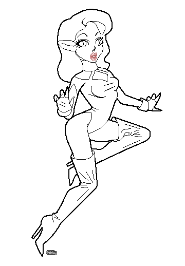
Once you finalize the lineart, you might consider submitting it to The Lines Den as it's quite nice.
|
|
|
IP Logged |
|
|
GeorgiePie
Midshipman
Joined: 07 November 2007 Location: United States Online Status: Offline Posts: 89 |
Posted: 11 November 2007 at 9:49pm |
|
Alright, 'nother edit of the lines. I changed her expression as a suggestion by Skaka, I think it looks better this way... crits for the face please.
Also, fixed up her outfit a bit, it was kinda lagging. What do y'all think?
I also edited her stomach.
 Start, and now.
Wow, thanks for the wonderful compliment, I shall submit it just because you suggested for me to.
Maybe you will have a go at the lines?
Edit-
just realized what Metaru ment about her right arm being too long, I will fix it ASAP!
Edit-
 Got that left arm shorter, how does it look?
Edited by GeorgiePie - 11 November 2007 at 10:18pm |
|
|
IP Logged |
|
|
Hatch
Admiral
Joined: 05 August 2015 Online Status: Offline Posts: 1387 |
Posted: 11 November 2007 at 10:17pm |
|
I love her new outfit, especially the boots.
I like the new expression, too, but I don't think the eyes look quite as surprised as the lips, if that makes sense. |
|
|
IP Logged |
|
|
GeorgiePie
Midshipman
Joined: 07 November 2007 Location: United States Online Status: Offline Posts: 89 |
Posted: 11 November 2007 at 10:20pm |
|
Good, I was hoping it would be better then the last outfit XD
Yes, I understand what you mean, I was feeling that way as well... I'll try working on it!
Edit-
 How does this look?
(ignore the gasp, it's just me being silly, not going to stay part of this piece)
Edited by GeorgiePie - 11 November 2007 at 11:16pm |
|
|
IP Logged |
|
|
Skaka
Commander
Joined: 31 October 2007 Online Status: Offline Posts: 183 |
Posted: 12 November 2007 at 1:33am |
|
This is starting to look really awesome :) Love her expression, as if to say 'Well I never!" :P
No crits from me though. |
|
|
Ars longa, vita brevis.
|
|
|
IP Logged |
|
|
Metaru
Commander
Joined: 28 December 2025 Online Status: Offline Posts: 3305 |
Posted: 12 November 2007 at 5:34am |
|
glad to be helpful. now, its a good moment to start the colour part of this thread.
note that you forogot to add the thick outline arround her wrists
|
|
|
I ate leel's babies
|
|
|
IP Logged |
|
|
GeorgiePie
Midshipman
Joined: 07 November 2007 Location: United States Online Status: Offline Posts: 89 |
Posted: 12 November 2007 at 1:49pm |
|
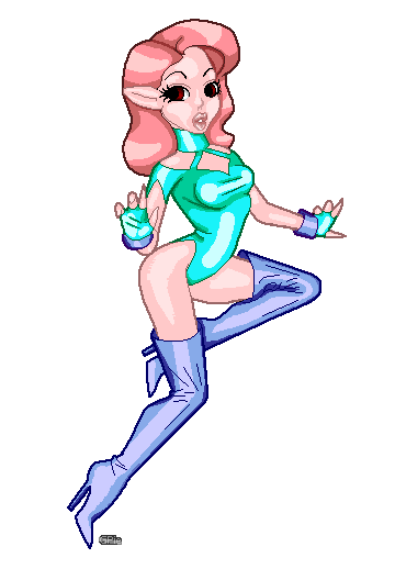
Some fast coloring, just to get an idea of how the palette will look.
Any suggestions/crits?
  Any crits for the lines? I want to make sure they are just right before I go any further.
|
|
|
IP Logged |
|
|
Skaka
Commander
Joined: 31 October 2007 Online Status: Offline Posts: 183 |
Posted: 12 November 2007 at 1:58pm |
|
Nooo go back to the green-skinned alien girl we all used to know and love! other than that it looks fine :P
|
|
|
Ars longa, vita brevis.
|
|
|
IP Logged |
|
|
GeorgiePie
Midshipman
Joined: 07 November 2007 Location: United States Online Status: Offline Posts: 89 |
Posted: 12 November 2007 at 2:05pm |
|
If you want it to go back, do you think you could suggest some colors? *big smile*
|
|
|
IP Logged |
|
|
Skaka
Commander
Joined: 31 October 2007 Online Status: Offline Posts: 183 |
Posted: 12 November 2007 at 2:11pm |
|
*scrolls up*
Green skin and purple latex clothing XD For the hair I'd do something more like purple or blueish (if you've played halo then think of the blue-ish hue of purple that the covenant tech uses). |
|
|
Ars longa, vita brevis.
|
|
|
IP Logged |
|
|
GeorgiePie
Midshipman
Joined: 07 November 2007 Location: United States Online Status: Offline Posts: 89 |
Posted: 12 November 2007 at 3:01pm |

Happy? XD
Just kidding, how does this look?
|
|
|
IP Logged |
|
|
Skaka
Commander
Joined: 31 October 2007 Online Status: Offline Posts: 183 |
Posted: 12 November 2007 at 3:27pm |
|
Exactly what I meant ^^ Can't wait to see the finished version:P Also really like the Cyan coloring over her eyes :P Once again no CC from me 'cause it looks like u know what you're doing :)
|
|
|
Ars longa, vita brevis.
|
|
|
IP Logged |
|
|
Hatch
Admiral
Joined: 05 August 2015 Online Status: Offline Posts: 1387 |
Posted: 12 November 2007 at 4:23pm |
|
Gah, I much preferred the humanoid colors.
Edited by Hatch - 12 November 2007 at 4:22pm |
|
|
IP Logged |
|
|
GeorgiePie
Midshipman
Joined: 07 November 2007 Location: United States Online Status: Offline Posts: 89 |
Posted: 12 November 2007 at 5:10pm |
|
Lol, maybe I will do two versions? Anyway, I wanted to update with much more progress but I feel a bit stuck on how awful the hair is turning out, I would like to get crits and suggestions if you please.
 |
|
|
IP Logged |
|
|
Skaka
Commander
Joined: 31 October 2007 Online Status: Offline Posts: 183 |
Posted: 13 November 2007 at 8:11am |
|
maybe shade it in kinda 'strands' as in just around the edges of where the shades meet make a few jaggy lines so it looks like there are different strands of hair changing shades.
|
|
|
Ars longa, vita brevis.
|
|
|
IP Logged |
|
|
GeorgiePie
Midshipman
Joined: 07 November 2007 Location: United States Online Status: Offline Posts: 89 |
Posted: 14 November 2007 at 11:17am |
|
See, I was wondering if I should go for a real look.... was kind of going cartoony, lemme do an edit and see how the strands look.
Edit-
 Not sure how much I'm liking this, but it does look better in some ways
 Heh, if you sit back, kinda space off a bit it looks good XD
Edited by GeorgiePie - 14 November 2007 at 12:25pm |
|
|
IP Logged |
|
|
Hatch
Admiral
Joined: 05 August 2015 Online Status: Offline Posts: 1387 |
Posted: 14 November 2007 at 1:52pm |
|
It's better in theory, but your strands (clumps, actually) are far too uniform. It would probably look better if, for example, the nearest strand were angled back a bit more to indicate that it was tucked behind her ear. Maybe a little more chaos generally?
EDIT: Also, it sort of looks like it has ridges. My hair tends to lay more or less flat against my head, with a more or less even highlight across the strands. Seems like hers shouldn't be any different. Edited by Hatch - 14 November 2007 at 2:55pm |
|
|
IP Logged |
|
|
Skaka
Commander
Joined: 31 October 2007 Online Status: Offline Posts: 183 |
Posted: 14 November 2007 at 3:37pm |
|
Hmm looks nice but not exaactly what I meant. I'll post an edit to morrow to better explain my meaning :P
|
|
|
Ars longa, vita brevis.
|
|
|
IP Logged |
|
|
GeorgiePie
Midshipman
Joined: 07 November 2007 Location: United States Online Status: Offline Posts: 89 |
Posted: 15 November 2007 at 8:16pm |
|
Yes, please do XD I think I'm at that point were I'll just get worse and worse... I should never work so long on a piece XD
|
|
|
IP Logged |
|
|
Hatch
Admiral
Joined: 05 August 2015 Online Status: Offline Posts: 1387 |
Posted: 15 November 2007 at 9:14pm |
|
I might do it a bit more like this:
-> 
Looks a bit plasticky, yeah. 
You can ignore the tendrils and such, I was just messing around (for that matter I guess you could ignore the whole thing) |
|
|
IP Logged |
|
|
Skaka
Commander
Joined: 31 October 2007 Online Status: Offline Posts: 183 |
Posted: 16 November 2007 at 12:04am |
|
No point in me doing an edit Hatch just did what I meant perfectly :P
|
|
|
Ars longa, vita brevis.
|
|
|
IP Logged |
|
|
GeorgiePie
Midshipman
Joined: 07 November 2007 Location: United States Online Status: Offline Posts: 89 |
Posted: 17 November 2007 at 10:49am |
|
Ah, yes, I know the style you are talking about.
 A bit like this? (yes, I know, this is sloppy. Just an example.)
Edited by GeorgiePie - 17 November 2007 at 11:39am |
|
|
IP Logged |
|
|
Hatch
Admiral
Joined: 05 August 2015 Online Status: Offline Posts: 1387 |
Posted: 17 November 2007 at 11:48am |
|
Looks way better. Still seems a bit too uniform and ridged to me, but definitely a huge improvment!
|
|
|
IP Logged |
|
|
Skaka
Commander
Joined: 31 October 2007 Online Status: Offline Posts: 183 |
Posted: 17 November 2007 at 4:36pm |
|
Yeah that's pretty much what I mean ^^ Looking great so far :P
|
|
|
Ars longa, vita brevis.
|
|
|
IP Logged |
|
|
Hyrule_SwordsMa
Seaman 
Joined: 18 October 2007 Online Status: Offline Posts: 25 |
Posted: 17 November 2007 at 4:39pm |
|
yes, looks much better, but you must predefine a path for the hair. I mean the hair goes always the same way, you must make some parts of the hair go over another and in another direction.
Hope I made my self clear (!) lol :P |
|
|
IP Logged |
|
|
GeorgiePie
Midshipman
Joined: 07 November 2007 Location: United States Online Status: Offline Posts: 89 |
Posted: 17 November 2007 at 9:29pm |
|
You guys are all so very helpful, but I have to say, it's suppose to be a bit uniform, it is cartoon/comic style after all. I really don't want her hair to look to normal, it will make it hard to pull off her cartoony looks.
This is real as I wish to make the hair look... now, besides making the hair look like a human, I think we'll move on... at least for now XD
(Don't take this wrong please!)
|
|
|
IP Logged |
|
|
herbert_west
Seaman
Joined: 11 November 2007 Location: United States Online Status: Offline Posts: 31 |
Posted: 18 November 2007 at 9:43pm |
|
These lines (I don't like the extra crinkles you put in the boots), the green and purple color, and the latest hair should do nicely.
 Great character! Reminds me a bit of John Kricfalusi. Great character! Reminds me a bit of John Kricfalusi.
Edited by herbert_west - 18 November 2007 at 9:48pm |
|
|
IP Logged |
|
|
GeorgiePie
Midshipman
Joined: 07 November 2007 Location: United States Online Status: Offline Posts: 89 |
Posted: 18 November 2007 at 10:42pm |
|
I was wondering about those wrinkles... I think I'm moving more and more away from the style I need to keep XD
Does anyone else agree about all the lines in the boots? |
|
|
IP Logged |
|
|
Skaka
Commander
Joined: 31 October 2007 Online Status: Offline Posts: 183 |
Posted: 19 November 2007 at 12:06am |
|
Yeah I'd go back to the skin-tight latex look if I were you. I just noticed me and you are the same in the way that we post like extremely long wip threads XD
|
|
|
Ars longa, vita brevis.
|
|
|
IP Logged |
|
| Page of 2 Next >> |
| |
||
Forum Jump |
You cannot post new topics in this forum You cannot reply to topics in this forum You cannot delete your posts in this forum You cannot edit your posts in this forum You cannot create polls in this forum You cannot vote in polls in this forum |
|


