| Active TopicsSearchRegisterLogin |
| WIP (Work In Progress) | |
| |
  |
| Author | Message |
|
7Soul
Midshipman 
Joined: 10 April 2021 Online Status: Offline Posts: 87 |
  Topic: End of the World Topic: End of the WorldPosted: 16 February 2008 at 4:58pm |
|
Not the end of the world you are thinking, but the old flat-world theory about the horizon ^^
I need some c&c about the waterfalls, are they ok? Do they look like waterfalls? (the right side of the image)  Wip2:  3:  4: 
(pacience to read what i write, english is not my main lenguage) Edited by Ails - 17 February 2008 at 2:35pm |
|
 IP Logged IP Logged |
|
|
greenraven
Commander 
Joined: 08 September 2016 Online Status: Offline Posts: 2598 |
Posted: 16 February 2008 at 11:18pm |
|
Don't worry about your English, it's fine.
 The water looks like ice to me. Maybe you should have the water go all the way down. |
|
 "pwnage comes with patience, practice and planning." ~ Jalonso "pwnage comes with patience, practice and planning." ~ Jalonso 
|
|
|
IP Logged |
|
|
Miumau0
Commander
Joined: 26 January 2007 Online Status: Offline Posts: 118 |
Posted: 17 February 2008 at 3:13am |
|
Yep, water is more like ice. Use lil bit more green color to water and it could look better. Yes, and make the all water go down. :)
|
|
|
IP Logged |
|
|
7Soul
Midshipman
Joined: 10 April 2021 Online Status: Offline Posts: 87 |
Posted: 17 February 2008 at 8:36am |
|
|
|
|
IP Logged |
|
|
BlackDragon
Commander
Joined: 13 May 2014 Location: United States Online Status: Offline Posts: 729 |
Posted: 17 February 2008 at 10:01am |
|
The water still looks like ice. The angles should be smooth and not come to a point. |
|
|
IP Logged |
|
|
Inventrix
Midshipman
Joined: 01 January 2008 Online Status: Offline Posts: 77 |
Posted: 17 February 2008 at 10:10am |
|
I circled the part of the water that looks best.
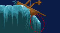 See how you made it nice and smooth a fall? That's what water does when flowing off of the edge of something. It doesn't form swirls or lumps or anything, just a nice smooth sheet. Also, it'd just part around the ship. There wouldn't be a little spray to the side like that, it'd just be falling off downwards on either side and not as much underneath. |
|
|
IP Logged |
|
|
leel
Commander
Joined: 29 June 2005 Online Status: Offline Posts: 3001 |
Posted: 17 February 2008 at 10:43am |
|
if there's a LOT of water then it's not just gonna fall straight down. Think of any other object. Let's say you have a ball on a table, if you push it gently and it slowly rolls to the edge of the table, it'll fall right down. But if you apply more force it'll project and land further away.
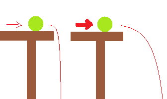 Granted this isn't anywhere near close to an actual projectile since I did it in 2 minutes on a laptop. But you get the point. SO is the edge of the world gonna have a LOT of water (as in oceans) pouring over the side with great force, or be like a little stream that just falls straight down off the edge? Seeing as there's a ship in the picture, I'll assume it's the first option. NOW is where you get to look at refs. Your lowest part of the water is the darker color. This is wrong. When in the air, the water breaks apart into drops.. that's not a good way to explain it, but still - it turns white. not clear with a bluish/greenish tint. White.. with a bluish/greenish tint. PICS!  Note how the water in mid air is WHITE and how it pushes away from the edge.  now this one is a less 'powerful' example, but it shows well what happens to the water in midair.  Now Kira is right in that the water falls in pretty straight lines. But it doesn't mean that the lines have to be all absolutely vertical, and ALL perfectly parallel. (Physics. It works, bitches.) |
|
|
IP Logged |
|
|
7Soul
Midshipman
Joined: 10 April 2021 Online Status: Offline Posts: 87 |
Posted: 17 February 2008 at 2:35pm |
|
Thx for the comments leel, they were very useful. But about the water, one thing i didnt wanted to was to make it white. It just need to look like water, no need to look real
Update: I choose to move the water down a bit, and add more details to the ship and to the backscene. Added a moon and a sea monster, as you can see
|
|
|
IP Logged |
|
|
BlackDragon
Commander
Joined: 13 May 2014 Location: United States Online Status: Offline Posts: 729 |
Posted: 17 February 2008 at 3:09pm |
|
The moon is beautiful!
I don't like how the scales on the dragon are all the same. They should be different sizes and shapes.
Still work on the water. I think you should take this in a more realistic direction. Like Fool's work.
|
|
|
IP Logged |
|
|
leel
Commander
Joined: 29 June 2005 Online Status: Offline Posts: 3001 |
Posted: 17 February 2008 at 3:12pm |
|
Why don't you want it to be white? I mean it doesn't have to be pure white, light blue or whatever will work too.
The thing is that it DOESN'T look like water, because your shading is inverse.
But hey, it's your piece, I'm not gonna force you to do anything. If you wanna half ass it, that's totally fine. Whatever floats your boat.
Get it? It's a pun.
|
|
|
IP Logged |
|
|
7Soul
Midshipman
Joined: 10 April 2021 Online Status: Offline Posts: 87 |
Posted: 17 February 2008 at 3:14pm |
|
Forgot to tell, i have a pallet limitation of 16 colors. I cant add a more realistic effect to the water (i wanted to make it semi-transparento to show the sea bottom under it)
@leel If you could show me some pixel reference of a waterfall, i would apreciate it, cuz my skills dont allow me to make a white/light blue waterfall, without making if look flat Edited by Ails - 17 February 2008 at 3:16pm |
|
|
IP Logged |
|
|
leel
Commander
Joined: 29 June 2005 Online Status: Offline Posts: 3001 |
Posted: 17 February 2008 at 3:36pm |
|
OMG Long post.
I gave you plenty of references. Use google to find more. I can't tell you step by step where to put the pixels, you just have to look really really close at the pictures and figure out what it is about them that gives the waterfall depth. Just look at the first one - notice the little bumps all over, it's low contrast, has a nice smooth motion..
I see what you're saying about it being realistic and showing the bottom of the sea but.. frankly this isn't a very good composition, you can't show the sea bottom from this angle, and if it wasn't in the thread title I wouldn't have known it's the edge of the world. The whole thing is divided in half basically, which is a no-no - you want the eye to move around the entire picture plane, not just focus on the left where all the action is going on. It's not balanced.
It's good that you're trying to stick to a limited pallete, but I hope these colors aren't your final. They're all too generic - you have dark blue sky, light blue water, brown ship. They're not unified - each color has its own ramp, no hue shifts, they're just boring and predictable. One of the main points of using a limited color scheme is that you're reusing recycling colors, that everything is harmonious and belongs together.
You haven't achieved that, so further work on the pallete is necessary.
The dragon needs more contrast, and again - composition-wise he's not in a good place. You're just crowding all the action on one side, and the angle doesn't work. And the arch behind the head makes little sense as well, that's one uncomfortable looking dragon.
It may come off as harsh, and I assure you, I'm not looking to insult you or anything, but this piece either needs a major overhaul or, as much as I try to avoid saying this - it might be a lost cause.
I realize this is probably more in depth than what you were looking for, but as someone new to pixel art (and maybe art in general, I don't know) it's an important lesson to learn from the very start: art requires a lot of thought and planning. It's VERY important, and usually only 3 types of artists can just 'wing it' and succeed and they are:
1. people with an insane amount of natural talent
2. people who've spend years and years studying composition to the point where it's second nature to them
3. some incredibly lucky shmuck who just threw paint on a canvas and managed to make it look good.
I encourage you to get books/research online the elements and principles of design, so you know what makes a good composition. Because if you're trying to figure things out as you go, it'll be very VERY hard work and in the end you'll end up with a poor result anyway.
Remember, thought and planning.
Now go study those waterfall refs!
|
|
|
IP Logged |
|
|
7Soul
Midshipman
Joined: 10 April 2021 Online Status: Offline Posts: 87 |
Posted: 17 February 2008 at 5:31pm |
|
Uh nice post...
Im not pro, thats why im here ^^ thanks for all your comments, they will not only be useful now, but in future works too im sure. I see some works here with awesome palletes, i think how can they find so perfect colors, i cant do that Dont expect me to make the ultimate piece, what you see here is pretty much the final work (although, i ll work on the pallete and the dragon) About the dragon's body, he is like entering the water and then coming out. But i see your interpretation, i work on that too Thx for all the help ;) |
|
|
IP Logged |
|
|
BlackDragon
Commander
Joined: 13 May 2014 Location: United States Online Status: Offline Posts: 729 |
Posted: 17 February 2008 at 5:45pm |
|
I think you are lazy. You say you come here to improve, yet you can't if you don't work.
You can do it! Just work harder at it. You will see yourself improving.
|
|
|
IP Logged |
|
|
leel
Commander
Joined: 29 June 2005 Online Status: Offline Posts: 3001 |
Posted: 17 February 2008 at 5:52pm |
|
No one is pro.
Ok.. so some people here are pretty freakin pro, but.. that's beside the point. The main thing I wanted to get across is that art is work. You need to actively go LEARN about colors and composition and things like that, be it through books or tutorials or just studying the pieces we have in the PJ hall of fame. The absolute worst thing you can do is say "I'm new, I can't do this yet." NO EXCUSES If you get in the mindset that something is out of your league, that you'll just get around to learning the color theory later, you will stall yourself. Your goal is to do the absolute best you can do. That means you have to experiment, think, observe, read, and most importantly practice until your hands fall off. Don't just settle for "it's pretty good for a newbie" You'll be surprised at what you can do, if you just keep at it. I'm always so reluctant to take crits, because I think 'well.. I made it this way on purpose' and 'but I wanted it to look this way' and it's totally fine if you feel this way too (which I know you do, because you wanted the water to be dark at the bottom) Well, you can keep thinking that, but go ahead and take the critique anyway. Listen to what other people are saying, get many opinions and try to test them all out. Sure, sometimes people might be wrong and your original version may be better, but you don't know that until you try. Don't limit yourself, just because you're new. Argh. Another freaking long post. Someone shut me up already. |
|
|
IP Logged |
|
|
greenraven
Commander
Joined: 08 September 2016 Online Status: Offline Posts: 2598 |
Posted: 17 February 2008 at 5:56pm |
|
Never, keep talking, I enjoy long posts.
I'll just add in my two cents and scurry away: Failure is just another step in the learning process. It's only a bad thing if you don't do anything about it. |
|
|
"pwnage comes with patience, practice and planning." ~ Jalonso
|
|
|
IP Logged |
|
|
7Soul
Midshipman
Joined: 10 April 2021 Online Status: Offline Posts: 87 |
Posted: 17 February 2008 at 5:57pm |
|
Calm down, im doing some changes now, i finally decided to try to make that more white water =/ but i think ill have problems to keep the pallete limit
|
|
|
IP Logged |
|
|
leel
Commander
Joined: 29 June 2005 Online Status: Offline Posts: 3001 |
Posted: 17 February 2008 at 6:08pm |
|
hurrah! Peer pressure at its best :D
|
|
|
IP Logged |
|
| |
||
Forum Jump |
You cannot post new topics in this forum You cannot reply to topics in this forum You cannot delete your posts in this forum You cannot edit your posts in this forum You cannot create polls in this forum You cannot vote in polls in this forum |
|
