| Active TopicsSearchRegisterLogin |
| WIP (Work In Progress) | |
| |
  |
| Author | Message |
|
absinthelord
Midshipman 
Joined: 12 February 2007 Online Status: Offline Posts: 76 |
  Topic: Grave Escape <--Pixel Art Topic: Grave Escape <--Pixel ArtPosted: 27 May 2008 at 5:09pm |
|
I am designing a simple game entitled "Grave Escape". In the game, you are a young boy locked in a graveyard. You must find the key and escape while avoiding the horrors within.
Essentially it is a maze game, with the graves making up the walls of the maze. Even though it is a simple game, I would like to show the highest quality pixel art I can, perhaps mimicking a Final Fantasy or Secret of Mana style. Here is a sample of the tiles I've created so far:  I'd really like to push the limits on this, so any c+c would be appreciated! |
|
 IP Logged IP Logged |
|
|
QuaziGNRLnose
Midshipman
Joined: 16 September 2018 Online Status: Offline Posts: 81 |
Posted: 27 May 2008 at 5:52pm |
|
i think it has some depth issues seeing as its tiled so bad, if youre gonna make a game with only one room, this small, you should really think about making it without tiles
|
|
|
IP Logged |
|
|
absinthelord
Midshipman
Joined: 12 February 2007 Online Status: Offline Posts: 76 |
Posted: 27 May 2008 at 5:56pm |
|
Obviously the game does have more than one room, or I wouldn't bother using tiles.
Tiled so bad? Do you mean that the tiles are obvious? I'm afraid I don't understand "depth issues". The art lacks depth? Contrast, perhaps? |
|
|
IP Logged |
|
|
Metaru
Commander 
Joined: 28 December 2025 Online Status: Offline Posts: 3305 |
Posted: 27 May 2008 at 5:58pm |
|
a small tip i would point is that the bottom of the wall tiles should have grass, or else, they would look as if they wee floating over the ground. like you did with the other structures.
|
|
|
I ate leel's babies
|
|
|
IP Logged |
|
|
absinthelord
Midshipman
Joined: 12 February 2007 Online Status: Offline Posts: 76 |
Posted: 27 May 2008 at 8:59pm |
|
That's a good tip. I'm trying a different type of grass here... I'm not sure which one I like better. I kind of like the mound effect with the other grass, but this tiles and looks better, I think.
 |
|
|
IP Logged |
|
|
Metaru
Commander
Joined: 28 December 2025 Online Status: Offline Posts: 3305 |
Posted: 27 May 2008 at 10:46pm |
|
indeed. i looks better. just the dirt on the graves should be more... uniform, more like a tube, so these wouldn't look like cliff edges. something like this maybe?
 (ignore the dithering) |
|
|
I ate leel's babies
|
|
|
IP Logged |
|
|
Garrett
Commander
Joined: 04 May 2008 Online Status: Offline Posts: 147 |
Posted: 28 May 2008 at 1:08pm |
|
I'd also suggest to make some shadows, I think this should fix, only in part maybe, the flatness issue
|
|
|
You'll hear your steps making no noise
|
|
|
IP Logged |
|
|
absinthelord
Midshipman
Joined: 12 February 2007 Online Status: Offline Posts: 76 |
Posted: 28 May 2008 at 1:21pm |
|
Yes, that's good... I want to give the impression of freshly turned earth, so I'll texture it a bit....
 I'm also trying to break up the monotony a bit. Added some cracks to the graves, flowers (should they stay or go?), and I'm thinking of adding vines to some of the walls. Maybe corner pieces to the stone walls as well... How do the open graves look? Edited by absinthelord - 28 May 2008 at 1:21pm |
|
|
IP Logged |
|
|
absinthelord
Midshipman
Joined: 12 February 2007 Online Status: Offline Posts: 76 |
Posted: 28 May 2008 at 1:38pm |
|
This is true... The question is, dithered shadows to save colors (left) or darker shades of everything (right)?
 |
|
|
IP Logged |
|
|
AmigaPixel
Seaman 
Joined: 30 April 2008 Location: Australia Online Status: Offline Posts: 14 |
Posted: 28 May 2008 at 5:24pm |
|
How many colours are do you want to use all together in your game? I suppose it really depends on the target system, if the game requires a modern PC to run, you can use as many colours as you want, but you really would only need one extra, darker green colour (which looks like you've added here). The dithering doesn't look as good as the true shadow, and traditionally dithered shadows were mainly used for sprites because they'd need to move around above the tiles, darkening them under your character. For stationary tiles, it's always best to use non-dithered colours. This also helps if your character is going to have a dithered shadow under him, because if you move one dither pattern over another, it flashes from dithered to full-black as you move over it.
Looking cool so far, keep up the good work. |
|
|
IP Logged |
|
|
absinthelord
Midshipman
Joined: 12 February 2007 Online Status: Offline Posts: 76 |
Posted: 28 May 2008 at 7:28pm |
|
Originally posted by AmigaPixel How many colours are do you want to use all together in your game? I suppose it really depends on the target system, if the game requires a modern PC to run, you can use as many colours as you want, but you really would only need one extra, darker green colour (which looks like you've added here). The dithering doesn't look as good as the true shadow, and traditionally dithered shadows were mainly used for sprites because they'd need to move around above the tiles, darkening them under your character. For stationary tiles, it's always best to use non-dithered colours. This also helps if your character is going to have a dithered shadow under him, because if you move one dither pattern over another, it flashes from dithered to full-black as you move over it. Looking cool so far, keep up the good work. Good point. I'll keep the dithered shadows for the game character. I have added a few shadows... hopefully this will give it a bit more depth:  |
|
|
IP Logged |
|
|
Metaru
Commander
Joined: 28 December 2025 Online Status: Offline Posts: 3305 |
Posted: 28 May 2008 at 7:35pm |
|
now everything has been placed over a black box D:
be more subtle with those shadows... they're eating a lot of space from the ground. remember this is going to have a very dark feel given by the palette used, so shadows arent-or better shouldn't be- that big. they are also drawing too much attention from the viewver. in my honest opinion, you don't need to have shadows for the elements in the background, as the point of view used doesn't require the use of depth. |
|
|
I ate leel's babies
|
|
|
IP Logged |
|
|
Garrett
Commander
Joined: 04 May 2008 Online Status: Offline Posts: 147 |
Posted: 29 May 2008 at 5:06am |
|
Well, metaru have his opinion, I have mine and you hare yours, I suppose ;)
But before you remove completely the shadows, which I would have done inclined and not so long, focalize what you are looking for, because with no shadows the game would seem less refined, I suppose. Every cool ambient has a cool illumination too. Anyway I got you are using tiles: don't know anything about what you are using to make the game, but it would be nicer to make the shadows using transparent-semitransparent tiles, like RPGmaker. |
|
|
You'll hear your steps making no noise
|
|
|
IP Logged |
|
|
absinthelord
Midshipman
Joined: 12 February 2007 Online Status: Offline Posts: 76 |
Posted: 29 May 2008 at 5:20pm |
|
Originally posted by Metaru now everything has been placed over a black box D: be more subtle with those shadows... they're eating a lot of space from the ground. remember this is going to have a very dark feel given by the palette used, so shadows arent-or better shouldn't be- that big. they are also drawing too much attention from the viewver. in my honest opinion, you don't need to have shadows for the elements in the background, as the point of view used doesn't require the use of depth. After some research on popular top-down games, I was quite surprised to find that the shadows are minimal. Usually just areas under tables and so on... SOM2 has some cool illumination and shadowed tiles (or at least gives the illusion of such) I'm going to try and split the difference with it, but there will be inconsistencies and problems. If the stones have shadows, so should the back wall, making tiling difficult and loosing the effect of grass growing on the front edges (it would be too dark). Here's what I have in tiles so far without the shadows....  If someone has something to add on the shadows, I'd love to see an example. |
|
|
IP Logged |
|
|
Metaru
Commander
Joined: 28 December 2025 Online Status: Offline Posts: 3305 |
Posted: 29 May 2008 at 6:30pm |
|
don't be afraid and increase the saturation of the set a bit. is it a dark ambient? yes. is it interesting/atractive... not sure.
you might want to check Adams Family Values(SNES) and get some surprises 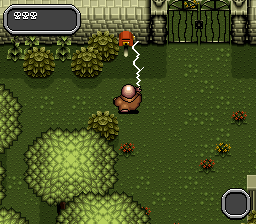 |
|
|
I ate leel's babies
|
|
|
IP Logged |
|
|
absinthelord
Midshipman
Joined: 12 February 2007 Online Status: Offline Posts: 76 |
Posted: 29 May 2008 at 7:05pm |
|
Ooooo, I like that gate!! And the colors do look good and spooky while still being vibrant. I think I'll play around with this, thanks...
|
|
|
IP Logged |
|
|
grave
Commander
Joined: 27 November 2019 Online Status: Offline Posts: 127 |
Posted: 30 May 2008 at 1:51am |
|
You cant escape me!!!
:P I just couldnt help myself.
This is turning out real nice. Id say go with the darker colors insead of dithering unless you really want to save colors.
|
|
|
IP Logged |
|
|
Peach
Commander
Joined: 08 May 2008 Location: Italy Online Status: Offline Posts: 239 |
Posted: 30 May 2008 at 3:01am |
|
Originally posted by absinthelord Ooooo, I like that gate!! And the colors do look good and spooky while still being vibrant. I think I'll play around with this, thanks... I do think your color choice is more moon-enlightened, while the AddamsF. is more sunny. |
|
|
IP Logged |
|
|
DJPieSlice
Seaman
Joined: 29 May 2008 Online Status: Offline Posts: 6 |
Posted: 30 May 2008 at 12:30pm |
|
Hmm . . . maybe these can create some depth?:
*Choose a lightsource other than the top of the map *The shadow should be casted with the side opposing the lightsource. In your old shadow demo, the shadow of the large coffin thing is too long. *Not all of the tombstones need to be facing the viewer, you know. Then again, how would I know x_x |
|
|
IP Logged |
|
|
Metaru
Commander
Joined: 28 December 2025 Online Status: Offline Posts: 3305 |
Posted: 31 May 2008 at 1:02am |
|
I insist: depth is not really created by shadows(in this case, in this point of view) because Perspective doesn't exist, therefore making the use of shadows unnecesary(and almost imposible) since the only lightsource posible is the one placed above the field(or in the determined case of a lightsource placed on the field, e.g a campfire.). Thats why most popular top down games only cast a shadow below the characters and structures with elements below it.
|
|
|
I ate leel's babies
|
|
|
IP Logged |
|
|
Garrett
Commander
Joined: 04 May 2008 Online Status: Offline Posts: 147 |
Posted: 31 May 2008 at 5:47am |
|
Indubitably true, but doing so that graveyard seems etremely flat to me.
Unless the stile is meant to be so, but he said he wanted "to show the highest quality pixel art" he can. This is not the highest quality for anyone, I suppose.  This is an high quality shadowy ambient. I know the point of view is different, tough still monometric, what i want to show is the quality, not the style. The angel statue seems a sheet of stone, and above all every grave si seen frontally. I suggest you to make saome variations, both in the grass and in the graves: for example a broken cross, a rotated angel, something saying "hey this is not flat'n'paste-land!"; may your immagination help you out  |
|
|
You'll hear your steps making no noise
|
|
|
IP Logged |
|
|
Metaru
Commander
Joined: 28 December 2025 Online Status: Offline Posts: 3305 |
Posted: 31 May 2008 at 10:16am |
|
since is a tile based game, it may be comprensible that some things may look repetitive. but indeed, you should have a wider variety of object at your disposal.
and we have only seen a screen of the earliets stages. |
|
|
I ate leel's babies
|
|
|
IP Logged |
|
|
absinthelord
Midshipman
Joined: 12 February 2007 Online Status: Offline Posts: 76 |
Posted: 31 May 2008 at 4:11pm |
|
Originally posted by Metaru since is a tile based game, it may be comprensible that some things may look repetitive. but indeed, you should have a wider variety of object at your disposal. and we have only seen a screen of the earliets stages. I agree, there should be more stuff around (fences, maybe a crypt, etc.) I'm a little bothered by the grass. even though the grass looks okay and tiles fine, the patterns are breaking up and making other details and elements of my graveyard very hard to see... I'm going to try experimenting with a dirt ground with scattered grass growing here and there.... As for the graves, graves generally all face in one direction in a cemetery (usually east). At least they do in the US. I do think, however, that maybe some of the graves can be tilted or broken, like it is an old graveyard. everything does look a little too uniform. I wouldn't say it looks "flat", but too ordered and uniform. |
|
|
IP Logged |
|
|
absinthelord
Midshipman
Joined: 12 February 2007 Online Status: Offline Posts: 76 |
Posted: 31 May 2008 at 5:08pm |
|
Here's an example with the dirt and scattered grass and a turned grave. Some small shadows as well.... (quickly done).
 This seems like it has a few more possibilities. |
|
|
IP Logged |
|
|
jalonso
Admiral 
Joined: 29 November 2022 Online Status: Offline Posts: 13537 |
Posted: 31 May 2008 at 7:04pm |
|
lol, I'm scrolling and looking for the first time and just thinking 'where are the wrought iron fences',
This last tiny bit is flawless for your project as described by you. Edit: this one is the flawless one
Edited by jalonso - 31 May 2008 at 7:12pm |
|
|
|
|
|
IP Logged |
|
|
Garrett
Commander
Joined: 04 May 2008 Online Status: Offline Posts: 147 |
Posted: 01 June 2008 at 3:02am |
|
Oh I forgot about that grave direction issue, and also forgot about american cemetery! (I saw few samples in some war films...)
I also think the ground is a good idea. Now seems more desaolate, gives more atmosphere! I sugest, in the final game, to give even more the grave feeling, to add fog I like also the "scattered grass", looks more detailed than the flat one. Maybe make also some more imperfections, like a tile with some random stones or some tall grass spots. Now is the wall that looks out of place to me... Still don't know how you can fix that, just a feeling; sorry I cannot be more helpful |
|
|
You'll hear your steps making no noise
|
|
|
IP Logged |
|
|
absinthelord
Midshipman
Joined: 12 February 2007 Online Status: Offline Posts: 76 |
Posted: 01 June 2008 at 12:01pm |
|
Thanks Jalonso, I appreciate that. It is coming close to what I wanted. Here's a collection of almost all of the different tiles I've done thus far (though I doubt I'll use all the tiles I've made in the final game, but rather a few).
 |
|
|
IP Logged |
|
|
jalonso
Admiral
Joined: 29 November 2022 Online Status: Offline Posts: 13537 |
Posted: 01 June 2008 at 3:14pm |
|
hmmmm? is that highlight on the iron fences needed...too clean and shiny, me thinks. Maybe changing them colors to the blue shades used in the stones?
|
|
|
|
|
|
IP Logged |
|
|
absinthelord
Midshipman
Joined: 12 February 2007 Online Status: Offline Posts: 76 |
Posted: 01 June 2008 at 3:29pm |
|
Yeah, I wasn't caring too much for that either the more I looked at it.... How about something like this? (ignore the arrangement, I'm just testing the tiles). I also didn't put in the grass this time. I wonder if it is really necessary?
 EDIT: I broke up the pattern of the rails a bit more with some gray... Edited by absinthelord - 01 June 2008 at 3:53pm |
|
|
IP Logged |
|
|
jalonso
Admiral
Joined: 29 November 2022 Online Status: Offline Posts: 13537 |
Posted: 01 June 2008 at 3:38pm |
|
Yup, that's way nicer.
I found the grass a key ingredient. I kinda likes that something was 'living' without the need for life. That it was just a little bit looked nice too. Of course something like a crow would do the same but the tiny splash of green really worked for me : | Do as you think its best, I'm just devil's advocatin' Edited by jalonso - 01 June 2008 at 3:39pm |
|
|
|
|
|
IP Logged |
|
|
absinthelord
Midshipman
Joined: 12 February 2007 Online Status: Offline Posts: 76 |
Posted: 01 June 2008 at 4:06pm |
|
Ok, here's a shot with the grass and some reworked fence railings. I also "roughened" the edges of the ground as to not have any abrupt straight edges. I think it's nearly there.
 |
|
|
IP Logged |
|
|
jalonso
Admiral
Joined: 29 November 2022 Online Status: Offline Posts: 13537 |
Posted: 01 June 2008 at 4:13pm |
 |
|
|
|
|
|
IP Logged |
|
|
Metaru
Commander
Joined: 28 December 2025 Online Status: Offline Posts: 3305 |
Posted: 01 June 2008 at 4:57pm |
|
let me say, this new tileset you have is excelent.
|
|
|
I ate leel's babies
|
|
|
IP Logged |
|
|
absinthelord
Midshipman
Joined: 12 February 2007 Online Status: Offline Posts: 76 |
Posted: 01 June 2008 at 8:23pm |
|
everyone, thanks for all the terrific suggestions. Now I'm at the point where I really need help... I need to animate decent sprites. The ghost is proving to be more of a challenge, as I'm having to animate moving "fabric" like material. Here's the sprite base for the ghost:
|
|
|
IP Logged |
|
|
Metaru
Commander
Joined: 28 December 2025 Online Status: Offline Posts: 3305 |
Posted: 01 June 2008 at 9:43pm |
|
not that bad, but before saying anything it would be a good idea of there is some kind of technical restriction for the sprites(this is #colors, #frames, max size, etc.)
|
|
|
I ate leel's babies
|
|
|
IP Logged |
|
|
absinthelord
Midshipman
Joined: 12 February 2007 Online Status: Offline Posts: 76 |
Posted: 01 June 2008 at 10:22pm |
|
Originally posted by Metaru not that bad, but before saying anything it would be a good idea of there is some kind of technical restriction for the sprites(this is #colors, #frames, max size, etc.) Well, my tile sizes have been 32 x 32, so the sprites should be roughly about that size. A little taller than 32 is ok, as this game is being made using depth sorting, but definitely no taller than 64. No frame restrictions, and no real color restrictions here, as I'm using Flash to create this game. |
|
|
IP Logged |
|
|
steven
Midshipman
Joined: 07 October 2014 Online Status: Offline Posts: 13 |
Posted: 02 June 2008 at 12:03am |
|
I think everything is great, do you think the grave on the left is a little too square compared to the right one?
keep up the good work. |
|
|
IP Logged |
|
|
Garrett
Commander
Joined: 04 May 2008 Online Status: Offline Posts: 147 |
Posted: 02 June 2008 at 2:47am |
|
I like everything but the angel
 Really well done! The ghost seems okay, but the animation is not as smooth as the tentacles in your avatar! |
|
|
You'll hear your steps making no noise
|
|
|
IP Logged |
|
|
jalonso
Admiral
Joined: 29 November 2022 Online Status: Offline Posts: 13537 |
Posted: 02 June 2008 at 6:38am |
|
Perhaps a simple 50/50 with transparency along the bottom, live a V shape, or even staggered?
|
|
|
|
|
|
IP Logged |
|
|
absinthelord
Midshipman
Joined: 12 February 2007 Online Status: Offline Posts: 76 |
Posted: 02 June 2008 at 2:04pm |
|
Originally posted by jalonso Perhaps a simple 50/50 with transparency along the bottom, live a V shape, or even staggered? Yeah, I tried a couple different bottoms on the ghost. The trick with the pointed one was to not make it look like a giant sperm cell. Here's a couple: What about the transparency or staggering? Can you give me an example? |
|
|
IP Logged |
|
|
jalonso
Admiral
Joined: 29 November 2022 Online Status: Offline Posts: 13537 |
Posted: 02 June 2008 at 8:15pm |
|
One their own on a blk BG its easy to pick the flaws, and laugh at the sperminess.
Show it on the tiles to see the how it blends in. Maybe some of the grave browns (not the ground) sprinkled at the edges can help too in blending. Like leave the colors as they are and change tones at the bottom in a way that reads as transparent over the dirt, ya know? |
|
|
|
|
|
IP Logged |
|
|
absinthelord
Midshipman
Joined: 12 February 2007 Online Status: Offline Posts: 76 |
Posted: 03 June 2008 at 7:40pm |
|
The ghost looks great on the tiles.... The last thing I need to deal with i the boy, the main character. Here's the initial design:
It's a simple four frame animation, makes for easy coding. He needs to have a black outline to show up well against the background and still retain a color value that is complementary to it. Human sprites are not my strongest thing, so any comments and suggestions are welcome. |
|
|
IP Logged |
|
|
Garrett
Commander
Joined: 04 May 2008 Online Status: Offline Posts: 147 |
Posted: 04 June 2008 at 10:26am |
|
slow it down

|
|
|
You'll hear your steps making no noise
|
|
|
IP Logged |
|
|
absinthelord
Midshipman
Joined: 12 February 2007 Online Status: Offline Posts: 76 |
Posted: 05 June 2008 at 6:46pm |
|
Yeah, it was a bit fast. No matter, I've decided that the hero needs to be a little more on the vulnerable side, so I dug out some old Charas sprite bases and edited them up:
And it goes well with the background. I created this death sequence which I love (inspired by Dragon's Lair): |
|
|
IP Logged |
|
| |
||
Forum Jump |
You cannot post new topics in this forum You cannot reply to topics in this forum You cannot delete your posts in this forum You cannot edit your posts in this forum You cannot create polls in this forum You cannot vote in polls in this forum |
|
