| Active TopicsSearchRegisterLogin |
| Resources and Support | |
| |
  |
| Author | Message |
|
x-death
Commander 
Joined: 09 February 2019 Location: Australia Online Status: Offline Posts: 151 |
  Topic: learning to hue-shift Topic: learning to hue-shiftPosted: 07 December 2008 at 6:40pm |
|
Originally posted by x-death well i'm trying to learn to hue-shift. have tried trial and error btu it hasn't worked out probably because i just don't know nearly enough to be able to try. having there being no tutorials at all for this i wanted to know if someone could teach me. i have so many questions on this like were do i begin, should i start with a mid-tone or darkest tone, what are good values to start with, should i use rgb values to hue-shift or just the hue option that's above saturation. should i change lum with it when i change it or what, and how much should i be increasing values by? so can someone help me out? don't worry everyone i know enough about how to do this now. so thanks to all you helped or at least though or tried to help me. Edited by x-death - 14 December 2008 at 6:28pm |
|
 IP Logged IP Logged |
|
|
Hapiel
Rear Admiral 
Joined: 30 June 2023 Online Status: Offline Posts: 3266 |
Posted: 08 December 2008 at 11:39am |
|
You can hardly make a tutorial for this, because its all done on your own feeling. However there are some reads here:
http://www.wayofthepixel.net/pixelation/index.php?topic=2836.0 |
|
|
IP Logged |
|
|
Larwick
Commander
Joined: 18 July 2024 Online Status: Offline Posts: 4015 |
Posted: 08 December 2008 at 11:57am |
|
If you show an example of your attempts, we could break down what you're doing wrong, that is if you're doing anything wrong at all.
|
|
 
|
|
|
IP Logged |
|
|
x-death
Commander
Joined: 09 February 2019 Location: Australia Online Status: Offline Posts: 151 |
Posted: 08 December 2008 at 6:43pm |
|
Originally posted by Lollige You can hardly make a tutorial for this, because its all done on your own feeling. However there are some reads here: http://www.wayofthepixel.net/pixelation/index.php?topic=2836.0 thanks i read though it and there are good artist but it doesn't help at all, in the way of teaching me how to do it. Originally posted by Larwick If you show an example of your attempts, we could break down what you're doing wrong, that is if you're doing anything wrong at all. well if i could hue-shift at all i wouldn't be here asking how to do it. see i don't even know were to start. |
|
|
IP Logged |
|
|
Hapiel
Rear Admiral
Joined: 30 June 2023 Online Status: Offline Posts: 3266 |
Posted: 09 December 2008 at 2:20am |
|
You start by drawing some thing, and than shifting the HUE!
For example, you draw something with the upper palette  and end up with the lower palette because you shifted the hue! First step: DRAW SOMETHING! we will do the next step together ok? |
|
|
IP Logged |
|
|
x-death
Commander
Joined: 09 February 2019 Location: Australia Online Status: Offline Posts: 151 |
Posted: 09 December 2008 at 6:24pm |
|
i have so many questions on this like were do i begin, should i start with a mid-tone or darkest tone, what are good values to start with, should i use rgb values to hue-shift or just the hue option that's above saturation. should i change lum with it when i change it or what, and how much should i be increasing values by? that is all my questions for an example of what i'm drawing for the sake of practise i will just use a circle or a square. but saying "shift the hue" really doesn't help i learned more from the definition of hue-shifting then that. |
|
|
IP Logged |
|
|
Saboteur
Commander
Joined: 29 January 2018 Online Status: Offline Posts: 888 |
Posted: 09 December 2008 at 6:44pm |
|
Go find a tutorial on listening to what people are telling you.
Read that a couple times. |
|
|
"I was minding my own business and walking across a pebbled path, and a Duck started giving me the business."
|
|
|
IP Logged |
|
|
x-death
Commander
Joined: 09 February 2019 Location: Australia Online Status: Offline Posts: 151 |
Posted: 09 December 2008 at 6:46pm |
|
there are none. well none that even begin to touch any of the question in my first post; which are also posted in a quote above.
|
|
|
IP Logged |
|
|
Larwick
Commander
Joined: 18 July 2024 Online Status: Offline Posts: 4015 |
Posted: 09 December 2008 at 8:35pm |
|
x-death, Lollige posted a great
example of hue shifting, and from it you should be able to answer some
of your questions, at least vaguely - so please don't act like he's
done nothing at all.
However i will clarify for ya, because i can see how people aren't specifically touching on your points. i have so many questions on this like were do i begin, should i start with a mid-tone or darkest tone Starting from a midtone would probably be the way to go, since you're new to it. However when you come more accustomed to hue-shifting you'll see you really can start from any point on your colour ramp. Red going directly into green or a lot of green going into red only right at the end of the ramp in the shadows, for example. what are good values to start with, should i use rgb values to hue-shift or just the hue option that's above saturation. I personally do it as i'm choosing colours while pixelling. Sometimes i will exaggerate the palette with a filter to see whether i would like a stronger certain tone in the piece though. When hue shifting, try not to look so much at the colours values as much as the colours themselves on your screen (as long as your screen is properly configured). should i change lum with it when i change it or what You will need to change more than just the hue in hueshifting, since you are also dealing with shadow and highlight tones. Typically, a shadow will have lower saturation than a highlight. Also some hues will appear brighter on the screen at certain luminances than others (yellow for example, in comparison to blue) and so when hueshifting you should take that into account, and fix any contrast issues that are created. how much should i be increasing values by? This completely depends on how dramatic you want the hueshifting to be. I personally enjoy subtle hueshifting that is not really noticeable on first glance. It's enough to add life to otherwise plain ramps, but not too much to be negatively noticeable. So yes, it depends entirely on the situation. Trial and error will always help. Hope that helps you! Any more questions, just ask. Edited by Larwick - 09 December 2008 at 8:54pm |
|
|
|
|
|
IP Logged |
|
|
skamocore
Admiral 
Joined: 07 April 2021 Online Status: Offline Posts: 3866 |
Posted: 09 December 2008 at 9:29pm |
|
I made an edit of your grass tile. Have a look at the colours I've used:
 |
|
|
IP Logged |
|
|
x-death
Commander
Joined: 09 February 2019 Location: Australia Online Status: Offline Posts: 151 |
Posted: 10 December 2008 at 6:53pm |
|
Originally posted by Larwick x-death, Lollige posted a great example of hue shifting, and from it you should be able to answer some of your questions, at least vaguely - so please don't act like he's done nothing at all. However i will clarify for ya, because i can see how people aren't specifically touching on your points. i have so many questions on this like were do i begin, should i start with a mid-tone or darkest tone Starting from a midtone would probably be the way to go, since you're new to it. However when you come more accustomed to hue-shifting you'll see you really can start from any point on your colour ramp. Red going directly into green or a lot of green going into red only right at the end of the ramp in the shadows, for example. what are good values to start with, should i use rgb values to hue-shift or just the hue option that's above saturation. I personally do it as i'm choosing colours while pixelling. Sometimes i will exaggerate the palette with a filter to see whether i would like a stronger certain tone in the piece though. When hue shifting, try not to look so much at the colours values as much as the colours themselves on your screen (as long as your screen is properly configured). should i change lum with it when i change it or what You will need to change more than just the hue in hueshifting, since you are also dealing with shadow and highlight tones. Typically, a shadow will have lower saturation than a highlight. Also some hues will appear brighter on the screen at certain luminances than others (yellow for example, in comparison to blue) and so when hueshifting you should take that into account, and fix any contrast issues that are created. how much should i be increasing values by? This completely depends on how dramatic you want the hueshifting to be. I personally enjoy subtle hueshifting that is not really noticeable on first glance. It's enough to add life to otherwise plain ramps, but not too much to be negatively noticeable. So yes, it depends entirely on the situation. Trial and error will always help. Hope that helps you! Any more questions, just ask. skamocore: um ok, thanks i think... larwick: ok so i know what to do with tones and such. how ever i know know that i have to change, hue, lum and sat values in order to hue shift but my question is would it be better to just use those normal three values (meaning hue, lum and sat) to get my colors or should i change the rgb values to get them? because i know you should choose them according to eye but sometimes knowing these things can be good as well...and as for values i take it there aren't really any set values you increase or decrease by? i always thought there would have been though... and i know he was trying to help and it probably was helpful stuff but to a complete beginner like me that doesn't have as much skills as all of you well it doesn't really mean as much when questions weren't answered directly. see using it as an example at the end yeah sure. but when nothing was answered it really mean't very little. |
|
|
IP Logged |
|
|
Saboteur
Commander
Joined: 29 January 2018 Online Status: Offline Posts: 888 |
Posted: 10 December 2008 at 7:26pm |
|
Howwwwwww is this so confusing. It baffles me, it does.
It is a HUE shift. Do your colour ramps as you normally would. Don't think about hue shifting. Now, once you have your whole colour ramp, from your darkest shade to your lighest shade, select your darkest shade and change the HUE (JUST THE HUE!) to a COOL colour (if you don't know what a cool colour is, go read some colour theory "tutorials"). Shades shift to a cool colour. Highlights shift to a warm colour. Reason I said GO READ A TUTORIAL ON "HOW TO LISTEN TO WHAT PEOPLE ARE TELLING YOU (and was hilariously and ironically not read) is because you've been given way more than enough information to figure out what hue shifting is through trial and error. You're just not willing to do the work, and keep pushing people to do the work for you. Iono about anyone else, but that's gettin' on me nerves. The problem, as usual, is not the fact that there's no perfect tutorial or that people aren't giving you good enough advice, the problem is that you're not hearing the advice and you're not understanding the tutorials. Your next post should include an example of how you've actually tried to hueshift, regardless of whether or not it looks terrible. |
|
|
"I was minding my own business and walking across a pebbled path, and a Duck started giving me the business."
|
|
|
IP Logged |
|
|
Hapiel
Rear Admiral
Joined: 30 June 2023 Online Status: Offline Posts: 3266 |
Posted: 11 December 2008 at 6:31am |
|
Please, as I said before, DRAW SOMETHING!
That will be step 1 IT DOES NOT MATTER WHAT YOU DRAW, but I would prefer if it would not be black and white, and if it was not a grass tile. Not a random circle, but draw something. For this example a nail or so was used, but what you draw can be even a lot smaller. 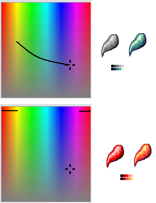 If you did draw something, only than we are going to help you further ok? |
|
|
IP Logged |
|
|
Larwick
Commander
Joined: 18 July 2024 Online Status: Offline Posts: 4015 |
Posted: 11 December 2008 at 10:47am |
|
It will help us to help you if you do draw something, as explaining creative and artistic techniques is quite difficult using words alone.
Saboteur is correct that quite often the shadows will be desaturated and cool, whereas highlights will be saturated and hot. You can use this fundamental knowledge to your advantage when picking colours. |
|
|
|
|
|
IP Logged |
|
|
x-death
Commander
Joined: 09 February 2019 Location: Australia Online Status: Offline Posts: 151 |
Posted: 11 December 2008 at 6:46pm |
|
sorry guys i should have posted something from the massive list of practicing sprites i was doing. while you were all posting.
well i whipped this together shows you my current skills. i didn't look at the values at all i just made a color ramp and moved the lum value up a bit every time.  i put this together its suppose to be an alien spike not sure just how well i did that but is this enough for you guys or do you need me to make something else? |
|
|
IP Logged |
|
|
Larwick
Commander
Joined: 18 July 2024 Online Status: Offline Posts: 4015 |
Posted: 11 December 2008 at 10:08pm |
|
This is a very nice example of hue shifting. :)
You're going from a dull blueish shade to a bright yellow, through greens. When in use it gives the impression of a green object in a shadowed environment (because your shadow colours are more prominent) with a distant bright light. The way you've actually constructed it would make me think it had a very bumpy or rough texture, perhaps wet due to the way it is highlighted. As far as the actual ramp goes, your 3 mid-tones are too close (you missed out one of them in the bar at the bottom) in terms of brightness. It would actually look okay if you used the highlight more but also darkened it so it was smoother in-keeping with the rest of the ramp, and perhaps got rid of the redundant midtone. Basically i see no problems with this in terms of hue shifting skill. I would say though that this is probably quite a strong shift of hue, since it is going through 3 different primary/secondary colours. It definitely gives a sci-fi vibe. Edited by Larwick - 11 December 2008 at 10:11pm |
|
|
|
|
|
IP Logged |
|
|
x-death
Commander
Joined: 09 February 2019 Location: Australia Online Status: Offline Posts: 151 |
Posted: 12 December 2008 at 9:32pm |
|
i think it is ok. but see i just can't seem to get the tones right. it all looks like the same tone when i use it and it appears being horrible. that is the main problem now.
|
|
|
IP Logged |
|
|
jalonso
Admiral
Joined: 29 November 2022 Online Status: Offline Posts: 13537 |
Posted: 12 December 2008 at 9:40pm |
|
If pixelart generally requires patience then color selection, hue shifting and color conservation requires double the patience. Keep at it, keep showing your progress.
|
|
|
|
|
|
IP Logged |
|
|
x-death
Commander
Joined: 09 February 2019 Location: Australia Online Status: Offline Posts: 151 |
Posted: 12 December 2008 at 9:53pm |
|
you guys have any suggestion which could help my selections?
even edits of mine may help Edited by x-death - 12 December 2008 at 9:53pm |
|
|
IP Logged |
|
|
jalonso
Admiral
Joined: 29 November 2022 Online Status: Offline Posts: 13537 |
Posted: 12 December 2008 at 10:02pm |
|
You have to understand that colors in art are far too subjective and dependent on what it is you are trying to create. Add to this that a tree could be in all sorts of lighting conditions not to mention have more than one light source.
There is no formula...its art. |
|
|
|
|
|
IP Logged |
|
|
Hapiel
Rear Admiral
Joined: 30 June 2023 Online Status: Offline Posts: 3266 |
Posted: 13 December 2008 at 2:54am |
|
In my opinion you know enough of hue shifting you need to know now, so
you can continue with more serious drawings and implement your
knowledge in there.
|
|
|
IP Logged |
|
|
x-death
Commander
Joined: 09 February 2019 Location: Australia Online Status: Offline Posts: 151 |
Posted: 14 December 2008 at 6:24pm |
|
at the start of this topic i didn't know a thing but it wasn't until i sen your ramp things on the color wheel that i began to understand and i then started looking into things and started seeing the bigger picture.
lol so thanks i guess. |
|
|
IP Logged |
|
|
Evilagram
Commander
Joined: 05 August 2008 Location: United States Online Status: Offline Posts: 168 |
Posted: 20 January 2009 at 1:46am |
|
I just wrote a long thing in another thread that had a short stint involving hue shifting.
Make your highlights warm/cool, and the shadows the opposite.
Generally as you progress from highlight to shadow you should try to go from low saturation to high saturation, back to low saturation.
For example, with grass, a good hue shift is to start with the warm color yellow, and shift down to green, which is a cool color.
With something like fires, you should start with a nice yellow. The brightest color should be white of course. Fire hue shifts down to red. Although both red and yellow are warm colors, red is much warmer than yellow is. Be sure to get the "shine" of the fire in there. Fire, unlike most objects shouldn't have any saturation shift.
With a white object, you should hue shift based upon the lighting. If it's the sun, go for a warm hue shift, like yellow. A torch might have an orange hue shift. In general with white objects you should go with, no saturation white/light grey, low saturation highlight color, no saturation black/grey (depending on lighting).
Hue saturation is useful in bringing life to a piece, and the principles behind it are relatively simple. Edited by Evilagram - 20 January 2009 at 1:52am |
|
|
IP Logged |
|
|
Evilagram
Commander
Joined: 05 August 2008 Location: United States Online Status: Offline Posts: 168 |
Posted: 20 January 2009 at 11:59am |
|
And here it is in pictures. (sorry for the double post)
 A simple tutorial on color theory. I skimped on some of the pixel art. Went with a sort of knee in order to circumvent the classic ball cliche. Edited by Evilagram - 20 January 2009 at 11:59am |
|
|
IP Logged |
|
| |
||
Forum Jump |
You cannot post new topics in this forum You cannot reply to topics in this forum You cannot delete your posts in this forum You cannot edit your posts in this forum You cannot create polls in this forum You cannot vote in polls in this forum |
|
