| Active TopicsSearchRegisterLogin |
| WIP (Work In Progress) | |
| |
  |
| Author | Message |
|
TMH
Commander 
Joined: 28 December 2008 Online Status: Offline Posts: 291 |
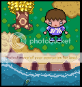
  Topic: aniimalcrossing 2-d Topic: aniimalcrossing 2-dPosted: 26 January 2009 at 12:09pm |
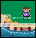 look yummy huh but oviously the green isnt doon Edited by TMH - 26 January 2009 at 12:09pm |
|
 IP Logged IP Logged |
|
|
Zeratanus
Commander
Joined: 03 December 2020 Online Status: Offline Posts: 576 |
Posted: 26 January 2009 at 2:11pm |
|
I think the ground's got the feel of Animal Crossing's graphics pretty nicely. The character though needs a lot of work. It looks like an AC boy, yes, but he doesnt match the upward angle the ground is at. The AC character's bodies are also a fair deal smaller than that - very bigheaded folk.
Off to a good start though, keep at it |
|
|
IP Logged |
|
|
TMH
Commander
Joined: 28 December 2008 Online Status: Offline Posts: 291 |
Posted: 26 January 2009 at 5:12pm |
|
well the animal crossing guy is like that because i was making it like an rpg (you now the screen is slanty but the character is stangly walking whyle laying on his/her back)
|
|
|
IP Logged |
|
|
TMH
Commander
Joined: 28 December 2008 Online Status: Offline Posts: 291 |
Posted: 26 January 2009 at 5:58pm |
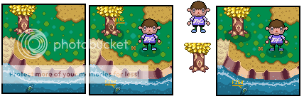 more stuff i added and changed |
|
|
IP Logged |
|
|
slasher
Midshipman 
Joined: 17 March 2005 Location: Singapore Online Status: Offline Posts: 41 |
Posted: 27 January 2009 at 6:06am |
|
Maybe the outline of the tree trunk could be of a lighter colour? Cause it's kind of stands out. Just a suggestion though. Overall, nice work there!
 |
|
|
IP Logged |
|
|
TMH
Commander
Joined: 28 December 2008 Online Status: Offline Posts: 291 |
Posted: 27 January 2009 at 12:43pm |
|
thank you
|
|
|
IP Logged |
|
|
Hapiel
Rear Admiral 
Joined: 30 June 2023 Online Status: Offline Posts: 3266 |
Posted: 28 January 2009 at 1:54am |
|
I do not understand why the guy needs to be like that. I agree with Zeratanus that he should be viewed more from top, and if you want him to look more like the original animal crossing he indeed needs a way bigger head too. That has nothing to do with if this will become an RPG or not..
|
|
|
IP Logged |
|
|
TMH
Commander
Joined: 28 December 2008 Online Status: Offline Posts: 291 |
Posted: 28 January 2009 at 4:31am |
|
i kinda agree with you on that but ive tried to do that and it didn't look very good so i just kept the one i had
|
|
|
IP Logged |
|
|
Zeratanus
Commander
Joined: 03 December 2020 Online Status: Offline Posts: 576 |
Posted: 28 January 2009 at 10:50am |
|
psh! You dont improve by giving up when something doesnt look good! You try and try until it does! Besides, you're already posting in the WIP forum here, why not let us help you on that too?
|
|
|
IP Logged |
|
|
TMH
Commander
Joined: 28 December 2008 Online Status: Offline Posts: 291 |
Posted: 28 January 2009 at 1:46pm |
|
yea i know i just really wanted to get this done so i tried the bigger head again
howse look:?  old new:? |
|
|
IP Logged |
|
|
Metaru
Commander
Joined: 03 February 2020 Online Status: Offline Posts: 3305 |
Posted: 29 January 2009 at 2:40am |
|
take ou her mouth, its just messing too much with the nose. and stick to apoint of view. is either a front view or a topdown view. it can't be both.
|
|
|
I ate leel's babies
|
|
|
IP Logged |
|
|
Hapiel
Rear Admiral
Joined: 30 June 2023 Online Status: Offline Posts: 3266 |
Posted: 29 January 2009 at 4:39am |
|
Way better for top view!
The mouth has indeed lost its function, and the foots are still viewed from the side, but the body and the face are better now! |
|
|
IP Logged |
|
|
TMH
Commander
Joined: 28 December 2008 Online Status: Offline Posts: 291 |
Posted: 29 January 2009 at 6:20am |
 k i redid the feets |
|
|
IP Logged |
|
|
Zeratanus
Commander
Joined: 03 December 2020 Online Status: Offline Posts: 576 |
Posted: 29 January 2009 at 6:39am |
|
Indeed that looks much more AC like :D
the only major issue i have now is that the body is still seen from the side. what I mean is if you're looking from that high of an angle where the shirt meets the pants would form a curve, showing the curve of the body. Like the head is now, really. I started to edit it to show what I mean but i have to get ready for classes. I did notice, however, that the body isnt symmetrical. you may want to look into that. |
|
|
IP Logged |
|
|
TMH
Commander
Joined: 28 December 2008 Online Status: Offline Posts: 291 |
Posted: 29 January 2009 at 7:07am |
|
ill give it a try(i got all day, hurray for snow days) lol
edit: 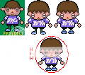 made his body smaller but i dont know how to do what you were aying about curve ... (kinda tried here but still looks side view) made his body smaller but i dont know how to do what you were aying about curve ... (kinda tried here but still looks side view)Edited by TMH - 29 January 2009 at 7:22am |
|
|
IP Logged |
|
|
Zeratanus
Commander
Joined: 03 December 2020 Online Status: Offline Posts: 576 |
Posted: 29 January 2009 at 8:12am |
|
I actually like the bigger body more, but I had some time here at work (hurray for down time at work before classes :P) so I managed to make my edits:
changes: -- feet made 1 pixel longer (to help with the angle) -- curve made in the shirt -- moved the pants/feet up 1 (kept the height the same and it's a bit more "from above, i think) -- moved the arms in and shrunk the shoulders, but the arms maybe need to be moved out away from the body?may be too close in my version i think now that I look at it. Does that help? :) Edited by Zeratanus - 29 January 2009 at 8:12am |
|
|
IP Logged |
|
|
TMH
Commander
Joined: 28 December 2008 Online Status: Offline Posts: 291 |
Posted: 29 January 2009 at 3:08pm |
|
yes it does i will try what you did
ter da 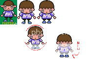 Edited by TMH - 29 January 2009 at 3:20pm |
|
|
IP Logged |
|
|
Zeratanus
Commander
Joined: 03 December 2020 Online Status: Offline Posts: 576 |
Posted: 30 January 2009 at 9:37am |
|
Looks sweet :D. Way more AC style than the first version dontcha think? :)
but now that he's significantly larger than the first version you'll have to revamp the tree to be a bit bigger :\ or you can try to scale the new version down but that may get to small for details like the triangle nose and such. |
|
|
IP Logged |
|
|
TMH
Commander
Joined: 28 December 2008 Online Status: Offline Posts: 291 |
Posted: 30 January 2009 at 3:54pm |
|
yup, almost done lol
|
|
|
IP Logged |
|
|
TMH
Commander
Joined: 28 December 2008 Online Status: Offline Posts: 291 |
Posted: 30 January 2009 at 7:30pm |
 think i should put it in the gallery now? |
|
|
IP Logged |
|
|
Zeratanus
Commander
Joined: 03 December 2020 Online Status: Offline Posts: 576 |
Posted: 30 January 2009 at 7:36pm |
|
Just two things I think - the guy's outline is very dark - it really stands out fromt he rest of the pic. He should probably have some kind of shadow too.
otherwise it looks good to me :D |
|
|
IP Logged |
|
|
r1k
Commander
Joined: 01 April 2014 Online Status: Offline Posts: 336 |
Posted: 30 January 2009 at 7:37pm |
|
almost, but theres one small thing thats been bothering me, which is you need to make the circles in the grass in the shadow under the tree darker.
|
|
|
IP Logged |
|
|
Hapiel
Rear Admiral
Joined: 30 June 2023 Online Status: Offline Posts: 3266 |
Posted: 31 January 2009 at 1:17am |
|
Those 'cliffs' or whatever they are. Define them a bit more, and maybe give them all the same color? That is whats bothering me.
Furthermore it is getting close to perfect :) |
|
|
IP Logged |
|
|
Zeratanus
Commander
Joined: 03 December 2020 Online Status: Offline Posts: 576 |
Posted: 31 January 2009 at 10:22am |
|
well animal crossing does have those kinds of miss-matched cliff colors:
 but perhaps the colors could be improved, as the darkest ones are rather dark.. |
|
|
IP Logged |
|
|
TMH
Commander
Joined: 28 December 2008 Online Status: Offline Posts: 291 |
Posted: 31 January 2009 at 3:07pm |
|
here is the final copy (i think any way)
 and for the ledge i took the colors strate from this screen shot of accf   sry pretty big |
|
|
IP Logged |
|
|
Hapiel
Rear Admiral
Joined: 30 June 2023 Online Status: Offline Posts: 3266 |
Posted: 31 January 2009 at 4:20pm |
|
Anyway, it looks bad on the 3d, and even worse on the 2d in my opinion. You don't neeeed to do everything as it is in the game, especially not if other things make your artwork better :)
|
|
|
IP Logged |
|
|
TMH
Commander
Joined: 28 December 2008 Online Status: Offline Posts: 291 |
Posted: 01 February 2009 at 7:39am |
|
well the 2d oviosly dosnt look as good as 3d because its not 3d
|
|
|
IP Logged |
|
|
Zeratanus
Commander
Joined: 03 December 2020 Online Status: Offline Posts: 576 |
Posted: 01 February 2009 at 5:30pm |
|
It's just part of AC's style (though I dont personally remember it being the colors of the 2nd picture... but I dont feel like putting it in and checking lol.
I wouldnt say it needs changing but if you want to change something I'd lighten the darkest strips in the cliff a little bit. |
|
|
IP Logged |
|
|
Metaru
Commander
Joined: 03 February 2020 Online Status: Offline Posts: 3305 |
Posted: 01 February 2009 at 5:54pm |
|
Originally posted by TMH well the 2d oviosly dosnt look as good as 3d because its not 3d saying that in a pixel art based site its pretty damn retarded. Edited by Metaru - 01 February 2009 at 5:54pm |
|
|
I ate leel's babies
|
|
|
IP Logged |
|
|
TMH
Commander
Joined: 28 December 2008 Online Status: Offline Posts: 291 |
Posted: 01 February 2009 at 6:07pm |
|
no what i ment is that you cant make a 2d mockup better than the game yur mockin up
|
|
|
IP Logged |
|
|
Metaru
Commander
Joined: 03 February 2020 Online Status: Offline Posts: 3305 |
Posted: 01 February 2009 at 6:44pm |
|
Originally posted by TMH no what i ment is that you cant make a 2d mockup better than the game yur mockin up no you said "of course 2D can't look good because is not 3D". and the quote is also a lame excuse wich can be easily beaten by taking a quick look at the gallery. at the very start of this thread i pointed what was wrong with this image, and i'm still wondering why you haven't fixed it. Edited by Metaru - 01 February 2009 at 6:44pm |
|
|
I ate leel's babies
|
|
|
IP Logged |
|
|
Zeratanus
Commander
Joined: 03 December 2020 Online Status: Offline Posts: 576 |
Posted: 01 February 2009 at 8:29pm |
|
haven't fixed what? You mentioned the mouth, which is removed, and the perspective. Now the perspective isnt perfect, no, but it far from what it started as, and has improved a fair deal since your post. So instead of yelling at him why not give him some tips to improve or advice that amounts to more than "YOU'RE DOING IT WRONG!"?
|
|
|
IP Logged |
|
|
TMH
Commander
Joined: 28 December 2008 Online Status: Offline Posts: 291 |
Posted: 02 February 2009 at 4:09am |
|
Originally posted by Metaru no you said "of course 2D can't look good because is not 3D". and the quote is also a lame excuse wich can be easily beaten by taking a quick look at the gallery. at the very start of this thread i pointed what was wrong with this image, and i'm still wondering why you haven't fixed it. dude, thats not what i ment, any way i did change what u said and got rid of tha mouth. a while ago! |
|
|
IP Logged |
|
|
Evilagram
Commander
Joined: 05 August 2008 Location: United States Online Status: Offline Posts: 168 |
Posted: 02 February 2009 at 5:20am |
|
The tree looks a tad odd. Too square.
Notice that the trees in the picture actually are trapezoids, not rectangles.
The part where the trunk joins the root on the sides looks awkward too.
|
|
|
IP Logged |
|
|
Metaru
Commander
Joined: 03 February 2020 Online Status: Offline Posts: 3305 |
Posted: 02 February 2009 at 8:33am |
 you could use way less colors and use a better contrast. by the way, the last drawing of the terrain you made has already over 69 colors, so i'll let any of the people saying this was ready/done what has to be changed on that. Edited by Metaru - 02 February 2009 at 8:36am |
|
|
I ate leel's babies
|
|
|
IP Logged |
|
|
Quake
Commander
Joined: 03 September 2008 Online Status: Offline Posts: 190 |
Posted: 02 February 2009 at 9:00am |
|
am i doing it right?
 Mines on left, his is on right. |
|
|
IP Logged |
|
|
TMH
Commander
Joined: 28 December 2008 Online Status: Offline Posts: 291 |
Posted: 03 February 2009 at 6:08am |
|
ok thank you everyone for the help and i am gonna submit the final copy!
|
|
|
IP Logged |
|
|
Metaru
Commander
Joined: 03 February 2020 Online Status: Offline Posts: 3305 |
Posted: 03 February 2009 at 11:48am |
|
Originally posted by Quake am i doing it right? Mines on left, his is on right. good job, thats the edit i just made. |
|
|
I ate leel's babies
|
|
|
IP Logged |
|
|
Quake
Commander
Joined: 03 September 2008 Online Status: Offline Posts: 190 |
Posted: 03 February 2009 at 12:18pm |
|
olol, sorry :P
|
|
|
IP Logged |
|
|
skooba-dude
Commander
Joined: 24 October 2007 Online Status: Offline Posts: 104 |
Posted: 03 February 2009 at 6:28pm |
 quick but severe edit, mainly for shading and jaggedness, increased constrast, changed heaps of colours.You don't have to use this, I just wanted to see what could be improved.
|
|
|
|
|
|
IP Logged |
|
|
Metaru
Commander
Joined: 03 February 2020 Online Status: Offline Posts: 3305 |
Posted: 03 February 2009 at 7:53pm |
|
Originally posted by skooba-dude
quick but severe edit, mainly for shading and jaggedness, increased constrast, changed heaps of colours.You don't have to use this, I just wanted to see what could be improved.good job for you too making an edit over the edit i made. |
|
|
I ate leel's babies
|
|
|
IP Logged |
|
|
skooba-dude
Commander
Joined: 24 October 2007 Online Status: Offline Posts: 104 |
Posted: 03 February 2009 at 8:38pm |
|
woops, sorry.XD
|
|
|
|
|
|
IP Logged |
|
| |
||
Forum Jump |
You cannot post new topics in this forum You cannot reply to topics in this forum You cannot delete your posts in this forum You cannot edit your posts in this forum You cannot create polls in this forum You cannot vote in polls in this forum |
|
