| Active TopicsSearchRegisterLogin |
| WIP (Work In Progress) | |
| |
  |
| Author | Message |
|
geminoid
Commander 
Joined: 04 June 2008 Online Status: Offline Posts: 121 |
  Topic: "The Tattooist" Topic: "The Tattooist"Posted: 26 July 2009 at 10:22pm |
|
The lineart is based on a photograph that was taken of me a couple of days ago while tattooing my friends leg.
The WIP stages are there, except for the lineart. Im not referencing the photo anymore with the exception of the line art ive already used., and am seeing how I can get the textures an colours from memory alone. I have about an hours work put into it and wanted to get some thoughts before going further 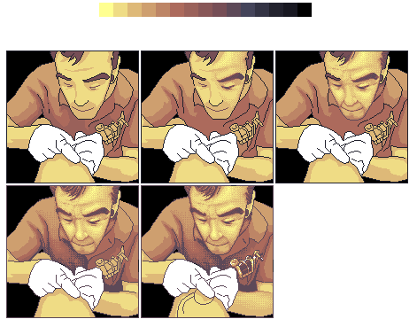 Figured id see if anyone had some input Edited by geminoid - 26 July 2009 at 10:56pm |
|
 IP Logged IP Logged |
|
|
Zeratanus
Commander
Joined: 03 December 2020 Online Status: Offline Posts: 576 |
Posted: 27 July 2009 at 12:18am |
|
That looks awesome so far :D
the only thing I'd say is watch that Tattoo - make sure it stays with the arm's forshortened perspective and the curve of the arm. I don't know what the tattoo will be of but right now i'd say the circle thats there now is a bit iffy- making the lower part of it slightly bigger than the upper part might get it better into the perspective. Really diggin' it so far though. |
|
|
IP Logged |
|
|
geminoid
Commander
Joined: 04 June 2008 Online Status: Offline Posts: 121 |
Posted: 27 July 2009 at 12:53am |
|
The lines of the tattoo are pretty temporary for now. I just threw them down because im in the early stages of figuring out how to get the right effect.
I should also mention that after a base coat of dithering is applied to my own arms, i need to figure out how to get my own 2 sleeves of tattoos in the picture. That part will likely come last. The foreground tattoo will need more curvature. The tattoo being done is all black and white, similar to tribal, so It should be easier. I will reference the photo when i come to that though. ;) |
|
|
IP Logged |
|
|
geminoid
Commander
Joined: 04 June 2008 Online Status: Offline Posts: 121 |
Posted: 27 July 2009 at 3:41am |
|
A bit of an update. Gradually fixing little things here and there...Layed out the early stages of both mine, and my friends tattoos. Throwing in darker lines in places i need to edit and tweak a bit.
 |
|
|
IP Logged |
|
|
JosephSeraph
Commander
Joined: 09 August 2016 Online Status: Offline Posts: 55 |
Posted: 27 July 2009 at 4:43am |
|
Cool!I thought I was going to be the first pixelArtist/Tattooist xD
(my mother is a attooist, and she'll teach me :p)
Anyways, glad to se a tattooist here. So, for the PA. The indicative finger seem a bit odd, as well as the hand too small, i mean, not enough tall, but it's thivk enough. Other than that, it's pretty awesome :D
|
|
|
IP Logged |
|
|
Hatch
Admiral 
Joined: 05 August 2015 Online Status: Offline Posts: 1387 |
Posted: 27 July 2009 at 9:03am |
|
Can you post your reference photo?
Nice work so far :) |
|
|
IP Logged |
|
|
jeremy
Rear Admiral 
Joined: 25 November 2024 Location: New Zealand Online Status: Offline Posts: 1704 |
Posted: 27 July 2009 at 9:45pm |
|
Seconded to what Hatch said. The pallette's nice but are you sticking firmly to it for some reason? If not, a comparatively green tone would be very handy for aaing the tats, especially your (Older ones) and on the gun (Which is beautifully done, by the way :) ) The piece entire is rather overdithered, face especially could benefit from less roughness.Nice piece, look forward to its progress.
|
|
|
IP Logged |
|
|
geminoid
Commander
Joined: 04 June 2008 Online Status: Offline Posts: 121 |
Posted: 27 July 2009 at 11:50pm |
|
As I said, Ive been sort of avoiding actually even looking at the reference pic until I was further into the peice. Partly because I wanted to sort of test my cognition/photographic memory, and party because I wanted to get more of (what i remembered it to look like anyhow) of the tattoo visible then was origionally in the photograph. However, at this point in things, (I havent worked on this since i posted the last update...tried to get a good sleep in before going further) now that I have some tattoos laid into the piece, I can reference a more solid source, being the photograph, and figure out where my "photographic memory" has failed me.
TL;DR I was trying not to look at the pic. But now Im gonna. Here is the origional Photo, and a photo of the tattoo itself. 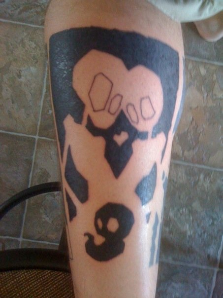 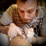 (now that i look at it my memory is not so good.) |
|
|
IP Logged |
|
|
jeremy
Rear Admiral
Joined: 25 November 2024 Location: New Zealand Online Status: Offline Posts: 1704 |
Posted: 28 July 2009 at 4:06am |
|
Ah. That certainly puts it into context (Cute tat :D). I thought you to be asian from the PA; The corners of the eyes are going up to far in relation to the reference, they could also be lowered and the U-shape... Deepened? You eyebrows are nowhere near that bushy too. You currently look toothless and wizened, the mouth needs to be played around with a bit more- like } rather than )Here's an edit, cut down on the dither and added that greener colour I mentioned in my earlier post.
 (I know from experience that this may look absolutely nothing like you :P)
Oh, also be careful doing the hands. There's a fair bit of foreshortening on them, that should be a challenge ;)
Damnit what have they done to imageshack? D: >:(
|
|
|
IP Logged |
|
|
geminoid
Commander
Joined: 04 June 2008 Online Status: Offline Posts: 121 |
Posted: 28 July 2009 at 4:15am |
|
Actually i quite like that green. I was skeptical, but it works. Especially for the stubble effect in the face, which was giving me some troubles.
Theoretically, I could use that to make the eyebrows significantly less bushy as well. Still have to tweak some aspects of the tattoo...move the heads closer together and stuff. With the subjects right hand, is where im thinking im going to have the most troubles. I am thinking i will darken the reds in the tattoo a bit, to add some contrast to the proximity of the gloves. With a bit of a (i hate to say it) pillowshade in some spots, I may be able to give the look of a focal difference in depth maybe? Still mulling it over I guess. |
|
|
IP Logged |
|
|
ellie-is
Commander
Joined: 12 September 2021 Online Status: Offline Posts: 706 |
Posted: 28 July 2009 at 8:11am |
|
Like I said on charas, you look more bald in the PA than you actually are. You should add some more hair and stuff. :P
|
|
|
IP Logged |
|
|
geminoid
Commander
Joined: 04 June 2008 Online Status: Offline Posts: 121 |
Posted: 28 July 2009 at 12:42pm |
|
lol. I was confused dude. I thought you meant I look more bald in real life then I do in the PA.lol.
I honestly think much of the baldness might just be from the crop of the image, if Im not wrong. |
|
|
IP Logged |
|
|
ellie-is
Commander
Joined: 12 September 2021 Online Status: Offline Posts: 706 |
Posted: 28 July 2009 at 1:13pm |
|
No, I meant the PA. Lol.
Maybe it is the crop of the image, but you should either make it bigger, or add some hair. Someone looking at it might not realize its just the crop of the image. |
|
|
IP Logged |
|
|
geminoid
Commander
Joined: 04 June 2008 Online Status: Offline Posts: 121 |
Posted: 28 July 2009 at 1:36pm |
|
I think if I move the side-hairline a touch inward, it should fix that
|
|
|
IP Logged |
|
|
AngelOTG
Commander
Joined: 28 February 2009 Online Status: Offline Posts: 258 |
Posted: 28 July 2009 at 2:57pm |
|
I think Jeremy's face edit is something you should try to follow. As-is, the face looks grainy. Plus, there's a lot of subtle definition in the face that is missing in your's.
Btw, that's a cool tattoo. :D |
|
|
IP Logged |
|
| |
||
Forum Jump |
You cannot post new topics in this forum You cannot reply to topics in this forum You cannot delete your posts in this forum You cannot edit your posts in this forum You cannot create polls in this forum You cannot vote in polls in this forum |
|
