| Active TopicsSearchRegisterLogin |
| WIP (Work In Progress) | |
| |
  |
| Author | Message |
|
kenpokis
Commander 
Joined: 09 January 2010 Online Status: Offline Posts: 202 |
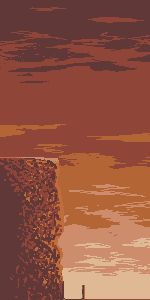
  Topic: Between a rock and a hard place Topic: Between a rock and a hard placePosted: 21 February 2010 at 3:59pm |
|
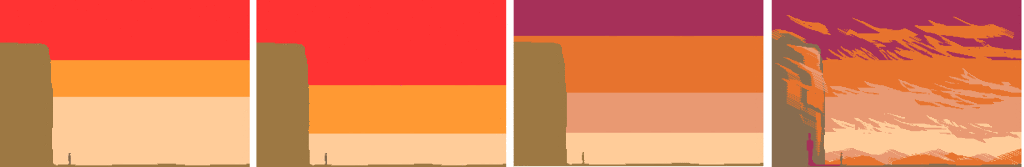
Hey guys. Decided I would get working on my pixel skills some more. If you want to call it that. Anyways here's a few minutes of work. I think it's the sky palette but something doesn't seem right. Hopefully I can work on my textures more this piece. Anyways here it is.
 |
|
 IP Logged IP Logged |
|
|
onek
Commander
Joined: 19 May 2009 Online Status: Offline Posts: 416 |
Posted: 21 February 2010 at 4:48pm |
|
this is still pretty basic... maybe whats bothering u about the sky is the gradient, normally, if u want this twilight feeling.. the bright parts are minor to the dark parts, that means to enlarge the red and the orange planes.... also i would add a bit of a blueish tone the darker it gets... heres an edit to illustrate... maybe the final edit can give u some ideas aswell, i added some background layers to give more depth coz right now it look very flat
 Edited by onek - 21 February 2010 at 4:48pm |
|
|
IP Logged |
|
|
kenpokis
Commander
Joined: 09 January 2010 Online Status: Offline Posts: 202 |
Posted: 22 February 2010 at 3:31pm |
|
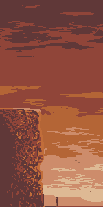
Hey, thanks for the great edit. Definitely like what you did with the guy's shadow. Here is my update. Is it ok if I use your sky palette onek?
 |
|
|
IP Logged |
|
|
onek
Commander
Joined: 19 May 2009 Online Status: Offline Posts: 416 |
Posted: 22 February 2010 at 3:39pm |
|
yeah sure why ever not....
|
|
|
IP Logged |
|
|
kenpokis
Commander
Joined: 09 January 2010 Online Status: Offline Posts: 202 |
Posted: 22 February 2010 at 3:58pm |
|
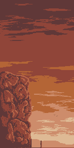
Here is a quick update. I feel like i'm copying you onek, but I can't help it your edit is so lovely. You summed up what I had in mind. Anyways here.
 |
|
|
IP Logged |
|
|
onek
Commander
Joined: 19 May 2009 Online Status: Offline Posts: 416 |
Posted: 22 February 2010 at 4:55pm |
|
yeah true its kinda copied... maybe try some diffrent texturing for the rock and the sky or use a diffrent palette
|
|
|
IP Logged |
|
|
kenpokis
Commander
Joined: 09 January 2010 Online Status: Offline Posts: 202 |
Posted: 22 February 2010 at 6:22pm |
|
Yea I think i'm going to try a different texture. Don't want to be a copy cat.
|
|
|
IP Logged |
|
|
Manupix
Commander
Joined: 05 November 2024 Online Status: Offline Posts: 771 |
Posted: 22 February 2010 at 7:16pm |
|
Looks promising!
I have a big composition issue: the very thin ground looks weird on its own, and unbalanced regarding the big mass of cliff. If they have the same kinds of values, they should be roughly of equal area. Or the smallest one should be darker, to compensate for 'weight'. |
|
|
IP Logged |
|
|
kenpokis
Commander
Joined: 09 January 2010 Online Status: Offline Posts: 202 |
Posted: 22 February 2010 at 7:43pm |
|
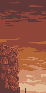
Ok another update. Need to rework the sky. Looking up ref's now. Just changed a few things. And thanks manupix that means a lot coming from you.
 |
|
|
IP Logged |
|
|
kenpokis
Commander
Joined: 09 January 2010 Online Status: Offline Posts: 202 |
Posted: 23 February 2010 at 2:08pm |
|
Here's a rough sky edit:
 Edit: Ok guys I'm stuck, I don't know what else to do with this. Took out cacti and fixed a few clouds. Also added a little AA to the ground. Really guys any help would be helpful, I'm kinda stuck between a rock and a hard place on this ^^.  Edited by kenpokis - 24 February 2010 at 3:57pm |
|
|
IP Logged |
|
|
kenpokis
Commander
Joined: 09 January 2010 Online Status: Offline Posts: 202 |
Posted: 28 February 2010 at 11:35am |
|
Sorry for triple post guys. Little color update, not sure if I like it.
 |
|
|
IP Logged |
|
|
Manupix
Commander
Joined: 05 November 2024 Online Status: Offline Posts: 771 |
Posted: 28 February 2010 at 12:58pm |
|
The cliff is now lost in the sky contrast and noise.
It should be darker, even darker than the darkest sky tone I think. And yeah, some refs would be useful! ;) The sky looks good, but too noisy / scribbly. There isn't enough difference btw the 2 medium tones, too much btw the 2 darkest. Something might be a little wrong too about which tones are highly saturated, and which not. Again, refs! Maybe you didn't understand my previous comment about the cliff? I'm still having a problem with it! |
|
|
IP Logged |
|
|
onek
Commander
Joined: 19 May 2009 Online Status: Offline Posts: 416 |
Posted: 28 February 2010 at 1:24pm |
|
agree with manupix, look up references! and should rly change the cliff, in tone and execution...
changing the compostion would also bring u a good deal further with this, change the dimensions, id say u cut of a lot of the right part, i think it would add an air of oppresion which could suit the pic quite well, also u get rid of a few thousand (!) pixels and its gonna be a whole lot easier to call it finished some day suggestion  Edited by onek - 28 February 2010 at 1:51pm |
|
|
IP Logged |
|
|
Robinhood
Commander
Joined: 18 May 2009 Online Status: Offline Posts: 245 |
Posted: 28 February 2010 at 5:53pm |
|
I disagree. With pixels like this the extra part to the background is just part of the concept.
Nice edit onek :> Edited by TheRobinHood - 28 February 2010 at 5:54pm |
|
|
IP Logged |
|
|
kenpokis
Commander
Joined: 09 January 2010 Online Status: Offline Posts: 202 |
Posted: 01 March 2010 at 2:44pm |
|
Ok guys thanks for the comments. Still working on some things but here's
a basic edit. You were right about the canvas thing, can't believe
something like that how much it changes the feel of a piece. Anyways
here we go.
 |
|
|
IP Logged |
|
|
onek
Commander
Joined: 19 May 2009 Online Status: Offline Posts: 416 |
Posted: 01 March 2010 at 4:07pm |
|
nice... getting better..
"...can't believe something like that how much it changes the feel of a piece"..... yeah indeed, composition is a very important thing. there are certain universal rules that are pleasing to the eye. look up things like golden ratio for example... |
|
|
IP Logged |
|
|
Robinhood
Commander
Joined: 18 May 2009 Online Status: Offline Posts: 245 |
Posted: 02 March 2010 at 2:18pm |
|
Urgh. Wikipedia is always hard to understand.
"Throughout history, the ratio for length to width of rectangles of
1.61803 39887 49894 84820 has been considered the most pleasing to the
eye" I found this website a lot easier to understand.But yeah, I found that pretty cool. -psst, kenpokis, take that into consideration- Edited by TheRobinHood - 02 March 2010 at 2:19pm |
|
|
IP Logged |
|
|
kenpokis
Commander
Joined: 09 January 2010 Online Status: Offline Posts: 202 |
Posted: 02 March 2010 at 5:26pm |
|
Ok, math isn't my strong point, and I tried my best to understand it, but I have no clue what this is about. Could guys try to help explain this to me, sorry for my ignorance. Anyways I changed things just a tad. Added a third sky color.
 |
|
|
IP Logged |
|
|
Hatch
Admiral 
Joined: 05 August 2015 Online Status: Offline Posts: 1387 |
Posted: 02 March 2010 at 5:43pm |
|
Most people find rectangles that are roughly between a square and a rectangle that's twice as long as it is wide to be the most aesthetically pleasing. Well, most of the time, maybe. That's it. Sometimes it looks good, sometimes it doesn't. The absurdly precise figure of 1.61803398874989484820 is hogwash. Just do what looks good.
|
|
|
IP Logged |
|
|
kenpokis
Commander
Joined: 09 January 2010 Online Status: Offline Posts: 202 |
Posted: 02 March 2010 at 8:27pm |
|
Oh alright I got it now, thanks. You are talking about the canvas size. I'm pretty happy with it now. Time to add some more shading to the cliff now I guess.
|
|
|
IP Logged |
|
|
kenpokis
Commander
Joined: 09 January 2010 Online Status: Offline Posts: 202 |
Posted: 04 March 2010 at 3:36pm |
|
Little bit of a color edit, I really need help on shading the cliff. Studied your edit a little onek but still can't figure out how to get it to look right. Anyways.
 |
|
|
IP Logged |
|
|
onek
Commander
Joined: 19 May 2009 Online Status: Offline Posts: 416 |
Posted: 04 March 2010 at 5:13pm |
|
use references... maybe could be a good onethis..
colors look very nice imo |
|
|
IP Logged |
|
|
Clovvach
Midshipman 
Joined: 07 July 2024 Online Status: Offline Posts: 62 |
Posted: 04 March 2010 at 8:07pm |
|
I like it, actually, looks like it has really good potential. The very top of the piece looks a little bit scribbly, though... perhaps cleaning it up? :P
|
|
|
IP Logged |
|
|
kenpokis
Commander
Joined: 09 January 2010 Online Status: Offline Posts: 202 |
Posted: 04 March 2010 at 8:20pm |
|
You are correct that is scribbled. Thanks onek considering it is mainly your palette :P. Going to work on it some more right now.
EDIT:  Edited by kenpokis - 04 March 2010 at 9:01pm |
|
|
IP Logged |
|
|
kenpokis
Commander
Joined: 09 January 2010 Online Status: Offline Posts: 202 |
Posted: 07 March 2010 at 4:31pm |
|
I really can't get a good shading for the back of the rock. Would it look alright to leave it like it is?
Edited by kenpokis - 09 March 2010 at 2:24pm |
|
|
IP Logged |
|
|
RollerKingdom
Commander
Joined: 11 January 2009 Online Status: Offline Posts: 388 |
Posted: 08 March 2010 at 5:35pm |
|
I've made a rock before that looks a bit around this
maybe it would be helpful for some ideas |
|
|
IP Logged |
|
|
kenpokis
Commander
Joined: 09 January 2010 Online Status: Offline Posts: 202 |
Posted: 08 March 2010 at 5:35pm |
|
lol hey thanks might work on this a bit more now.
Edit: [-.-] I hate rock I hate rock I hate rocks!!! I've been looking up a bunch of refs but I still can't get this right. I have no idea what to do. Any help is greatly appreciated. Edited by kenpokis - 09 March 2010 at 4:33pm |
|
|
IP Logged |
|
|
kenpokis
Commander
Joined: 09 January 2010 Online Status: Offline Posts: 202 |
Posted: 09 March 2010 at 8:12pm |
|
Double post. Ok what do you think about the bottom extrusion I put in there? I think i'm having perspective issues, maybe that's why I can't get the shading right. Anyways, here it is.
 |
|
|
IP Logged |
|
|
jalonso
Admiral
Joined: 29 November 2022 Online Status: Offline Posts: 13537 |
Posted: 09 March 2010 at 8:23pm |
|
Rocks can be tough, be patient and don't give up. I think that ref by Roller pretty much explains it all : |
|
|
|
|
|
|
IP Logged |
|
|
kenpokis
Commander
Joined: 09 January 2010 Online Status: Offline Posts: 202 |
Posted: 09 March 2010 at 8:27pm |
|
Thanks for the encouragement jalonso! Do you think the shading on the newest edit is on the right track?
|
|
|
IP Logged |
|
|
Dhr. Bosch
Commander
Joined: 01 February 2016 Location: Netherlands Online Status: Offline Posts: 215 |
Posted: 10 March 2010 at 1:03am |
|
it's probably more convincing to use the midtone on the tops of the rocks, the lightest tone for the fronts and a darkest for the backs. take a good look at onek's reference, you can indeed generally reduce the amount of coulours of the cliffs to three, but because the rocks are quite square the colours never go Lightest->Mid->darkest which gives them a semi round feeling, rather it goes:
Lightest->mid Darkest try to emphasize the shape you imagine the rocks to have. Clearly define in your head where it's upside is, where it's front is and where it's back is and then show that through shading. think 3D! good luck |
|
|
Vanitas, vanitatum omnia vanitas
|
|
|
IP Logged |
|
|
jalonso
Admiral
Joined: 29 November 2022 Online Status: Offline Posts: 13537 |
Posted: 10 March 2010 at 4:40pm |
|
Just a general idea of how I do rocks that may simplify the process for you.
 Some things you make from dark to light, others, like rocks, seem to work best from light to dark... for me anyways. Rocks for me are of of the hardest thing to pixel. |
|
|
|
|
|
IP Logged |
|
|
kenpokis
Commander
Joined: 09 January 2010 Online Status: Offline Posts: 202 |
Posted: 10 March 2010 at 7:09pm |
|
Thanks for the tip jalonso. Will try to edit this tomorrow.
|
|
|
IP Logged |
|
|
kenpokis
Commander
Joined: 09 January 2010 Online Status: Offline Posts: 202 |
Posted: 23 April 2010 at 6:25pm |
|
Ok finnally got a real sloppy edit on this. Still needs work but tell me watcha think of the general idea.
 |
|
 !Strange Atoll - The Amazing Wilbot Game Project! !Strange Atoll - The Amazing Wilbot Game Project! |
|
|
IP Logged |
|
|
jalonso
Admiral
Joined: 29 November 2022 Online Status: Offline Posts: 13537 |
Posted: 23 April 2010 at 8:52pm |
|
One month and this is what you show us...Chop, Chop!
|
|
|
|
|
|
IP Logged |
|
| |
||
Forum Jump |
You cannot post new topics in this forum You cannot reply to topics in this forum You cannot delete your posts in this forum You cannot edit your posts in this forum You cannot create polls in this forum You cannot vote in polls in this forum |
|
