| Active TopicsSearchRegisterLogin |
| Collaborations/Challenges | |
| |
  |
| << Prev Page of 3 Next >> |
| Author | Message |
|
Danori
Seaman 
Joined: 29 July 2014 Online Status: Offline Posts: 20 |
  Posted: 04 July 2012 at 9:34am Posted: 04 July 2012 at 9:34am |
|
Originally posted by Kravvon Nar'roth
+ a stomach. So only one more to go: 
Going to attempt a brain to complete the set, but I dunno if I can pull off a satisfactory squiggly look at this scale... @Frogger5: Hehe, means I must be doing something right. Nice shading on the diamond there, BTW. @gogglecrab: Thanks mate. :) Re: your piece, I think it might benefit from a bit higher contrast, specifically a darker background to make the items stand out a bit more. Also, watch out for banding on the outlines. ;) @Dawnbringer & Mrmo Tarius: Yum! Zombie: The Adventure Game! :D |
|
 IP Logged IP Logged |
|
|
ultimaodin
Commander 
Joined: 04 May 2010 Location: Australia Online Status: Offline Posts: 162 |
Posted: 04 July 2012 at 9:41am |
|
Update on the ailment cure set:
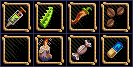 Added a magic candle for blind, Salt Water Candy for Mute (since salt water even in candy form is good for your vocals) and an all ailment pill. Not overly happy with the remedy capsule. I still have no idea what to do for the paralysis/shock cure item. Might just move onto the third set. |
|
|
The world is but a shadow of emotion, cast in shades of grey.
|
|
|
IP Logged |
|
|
Desterrado
Seaman
Joined: 16 March 2011 Online Status: Offline Posts: 7 |
Posted: 04 July 2012 at 10:33am |
|
Well. I do like this challenge. An awful lot. Very rare does one come up that I'm comfortable with and have time to complete or even work on. The plan is 2 per day, starting yesterday, and a preview over Sunday.
I'm using the default PaintDotNet palette because my 16col palette isn't going great and this one is surprisingly  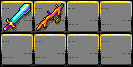 Edited by Desterrado - 04 July 2012 at 2:57pm |
|
|
IP Logged |
|
|
Kravvon Nar'roth
Seaman
Joined: 05 March 2010 Online Status: Offline Posts: 39 |
Posted: 04 July 2012 at 11:16am |
|
Meh brains. :(

Oh well. I'll probably do a little tweaking, but I think this version is pretty much as good as I can make it. |
|
|
IP Logged |
|
|
Dredlockz
Seaman
Joined: 07 November 2020 Online Status: Offline Posts: 21 |
Posted: 04 July 2012 at 11:47am |
|
Hey duders, great site you have here!
It's inspiring to see all the talent around here. I just started with Pixel Art, so I'm gonna play it safe for now and go with a Minecraft-inspired inventory. But my personal challenge is to only use the original 4-color Gameboy palette. 
Edit: also, any and all feedback is greatly appreciated! Also, first post  Edited by Dredlockz - 04 July 2012 at 11:49am |
|
|
IP Logged |
|
|
DawnBringer
Commander
Joined: 11 August 2024 Online Status: Offline Posts: 568 |
Posted: 04 July 2012 at 1:09pm |
|
Might actually finish this thing?...

Any suggestions for another object? Thinking about stealing Kravvons brain idea since I'd like to put weight on the pink color for the last gizmo. |
|
|
IP Logged |
|
|
Kravvon Nar'roth
Seaman
Joined: 05 March 2010 Online Status: Offline Posts: 39 |
Posted: 04 July 2012 at 1:32pm |
|
Originally posted by DawnBringer Go for it! No such thing as too many brains. ;)Any suggestions for another object? Thinking about stealing Kravvons brain idea since I'd like to put weight on the pink color for the last gizmo. (Also I'd love the opportunity to be able to see how you go about pixelling a brain, since I rather struggled with it myself.) |
|
|
IP Logged |
|
|
Mhyre
Midshipman 
Joined: 24 July 2011 Online Status: Offline Posts: 54 |
Posted: 04 July 2012 at 2:36pm |
|
Update :)

|
|
|
IP Logged |
|
|
Nevercreature
Commander
Joined: 04 July 2022 Online Status: Offline Posts: 164 |
Posted: 04 July 2012 at 2:58pm |
 ...  I think yours are much better... |
|
|
IP Logged |
|
|
DawnBringer
Commander
Joined: 11 August 2024 Online Status: Offline Posts: 568 |
Posted: 04 July 2012 at 3:03pm |
|
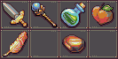
Ok, tha brainz is far from polished yet - but I would do it something like this:

|
|
|
IP Logged |
|
|
top_
Seaman
Joined: 07 April 2015 Location: Germany Online Status: Offline Posts: 12 |
Posted: 04 July 2012 at 4:50pm |
|
Time to make some pixel again...
First wip: 
|
|
|
IP Logged |
|
|
Ashkin
Seaman
Joined: 06 May 2012 Online Status: Offline Posts: 35 |
Posted: 04 July 2012 at 5:59pm |
 Further progress. @DawnBringer Cool stuff, I especially like that vial's perspective. How the heck do you fit a palm tree in your pocket, though? @Nevercreature I think it's pretty good. I like the mushroom especially. @Kravvon Awesome. Edited by Ashkin - 04 July 2012 at 6:26pm |
|
|
IP Logged |
|
|
Gavralcraw
Midshipman
Joined: 25 August 2011 Online Status: Offline Posts: 73 |
Posted: 04 July 2012 at 8:01pm |
 Duct Tape... or is it toilet paper? Pretty sure Duct tape would come in handy in anyones inventory...
|
|
|
IP Logged |
|
|
Ashkin
Seaman
Joined: 06 May 2012 Online Status: Offline Posts: 35 |
Posted: 04 July 2012 at 11:02pm |
 Finished. |
|
|
IP Logged |
|
|
Lazer24exe
Seaman
Joined: 08 March 2012 Online Status: Offline Posts: 2 |
Posted: 05 July 2012 at 2:10am |
|
I'm just a beginner, but i wanted try out one of the challenges, but I don't think I did this right could U give me some advice My thing has to many colors. Edited by Lazer24exe - 05 July 2012 at 2:39am |
|
|
IP Logged |
|
|
Mrmo Tarius
Commander
Joined: 12 February 2022 Online Status: Offline Posts: 367 |
Posted: 05 July 2012 at 3:09am |
|
Advice: use the attached template :)
|
|
|
IP Logged |
|
|
Dredlockz
Seaman
Joined: 07 November 2020 Online Status: Offline Posts: 21 |
Posted: 05 July 2012 at 5:30am |
|
I'm done. Mmmh, I guess It can't participate for not being completely about a "new/original" game. Oh well, it was still fun. Specially writing that "TNT" label. @Ashkin: Awesome dude! Loved the smartphone detail, those text messages. I was a bit confused with the last item, is it a pack of smokes? It could have one of them outside or coming out to be clearer maybe? Edited by Dredlockz - 05 July 2012 at 5:38am |
|
|
IP Logged |
|
|
Fanton
Seaman
Joined: 05 July 2012 Online Status: Offline Posts: 4 |
Posted: 05 July 2012 at 5:38am |
|
Can I do something like him?

That is not only the eight squares 32x32 but also a little backgrund? |
|
|
IP Logged |
|
|
Dredlockz
Seaman
Joined: 07 November 2020 Online Status: Offline Posts: 21 |
Posted: 05 July 2012 at 5:43am |
|
@Fanton: That was just his work canvas, you can see Ashkin's final image a few posts before yours.
|
|
|
IP Logged |
|
|
Fanton
Seaman
Joined: 05 July 2012 Online Status: Offline Posts: 4 |
Posted: 05 July 2012 at 5:50am |
|
Thanks for the quick answer.
Anyway, this is my "wip": 
I'm quite sure I'll submit this one, without other edits :) |
|
|
IP Logged |
|
|
Gamamoto
Seaman
Joined: 10 May 2016 Online Status: Offline Posts: 26 |
Posted: 05 July 2012 at 6:59am |
|
Here is my wip, I think i'm donne with the items lines.
 In case you don't recognize 'em : scythe, map, ham, flask, jewel chest, feather, frying pan, rope. Update :  I'm struggling with colors and the feather :/ Edited by Gamamoto - 05 July 2012 at 8:50am |
|
|
IP Logged |
|
|
fawful
Commander
Joined: 06 July 2023 Online Status: Offline Posts: 122 |
Posted: 05 July 2012 at 8:04am |
 |
|
|
IP Logged |
|
|
Graindolium
Commander
Joined: 16 October 2011 Online Status: Offline Posts: 181 |
Posted: 05 July 2012 at 9:33am |
 |
|
|
IP Logged |
|
|
saurion
Seaman
Joined: 31 May 2006 Online Status: Offline Posts: 4 |
Posted: 05 July 2012 at 1:00pm |
|
Started the colors on one, getting the line art cleaned up for the other, and backgrounds aren't set.

Death to the vampire (writers): the world is ending because of bad vampire novels (insert long convoluted plot points  ) and you must hunt them down where or when ever they are. ) and you must hunt them down where or when ever they are.
Box of matches Can of gasoline Novel from your next target Poison apple Key Flux capacitor Bullets / shell Meat mallet 
My little mad scientist - Aiming for a silver/yellow palatte Equipment Tools (in image cleaning) Rubber Glove Test rat w/ ear Radiological mateials Biological materials Chemicals ? Edited by saurion - 05 July 2012 at 1:25pm |
|
|
IP Logged |
|
|
saurion
Seaman
Joined: 31 May 2006 Online Status: Offline Posts: 4 |
Posted: 05 July 2012 at 1:07pm |
|
Originally posted by Gamamoto
Update :
I'm struggling with colors and the feather :/ Have you tried just doing a notching of the feather to imply it's nature or only highlighting the central vein? Edited by saurion - 05 July 2012 at 1:07pm |
|
|
IP Logged |
|
|
Mr.Fahrenheit
Commander
Joined: 01 April 2015 Online Status: Offline Posts: 238 |
Posted: 05 July 2012 at 1:33pm |
|
Had a try at making a "gangsta" adventure game using DB's pallete for the first time. I cant seem to shade the tooth very well without making it look terrible. Also I cant seem to make the coins very interesting. Any tips?

|
|
|
IP Logged |
|
|
Witpickles
Seaman
Joined: 25 July 2016 Online Status: Offline Posts: 8 |
Posted: 05 July 2012 at 4:32pm |
|
WIP
 I hope you enjoy the direction I'm taking it =D |
|
|
IP Logged |
|
|
Friend
Commander
Joined: 01 April 2015 Online Status: Offline Posts: 710 |
Posted: 05 July 2012 at 5:11pm |
|
Originally posted by Mr.Fahrenheit Had a try at making a "gangsta" adventure game using DB's pallete for the first time. I cant seem to shade the tooth very well without making it look terrible. Also I cant seem to make the coins very interesting. Any tips? I think most of your issues are in presentation and implying detail that adds subtle but crucial readability detail. Some ideas off the top of my head to improve pres. and readability. (note you can always opt for a more neutral background color, and have all of your objects vividly colored or high in contrast from the background for an easier way to improve on both) -change the perspective of the can so you can sort of see the top of it. That way you can add a texture and metal to the top to make it readable as a can without the text. Then you can erase the "can o'" part and simply have whup ass on the can. Also make the text color more readable from the can. The background green isn't helping the yellow either. Gun is a bit dull looking. Maybe have the top barrel slightly metallic. Glasses should be moved to the right a bit and have the part that goes on your ears longer and show the downward curve better at the end of them. Maybe for the coins have a gold stack in the middle (maybe change the perspective to a slightly more downward angle and again try a subtle glint) and have silver coins scattered around the stack of gold. The colors for the gold tooth seem off and don't imply gold. Try dark yellow ambers and bright yellows for highlights. Use google images for choosing colors. |
|
|
IP Logged |
|
|
Flashia
Seaman
Joined: 04 July 2012 Online Status: Offline Posts: 4 |
Posted: 05 July 2012 at 6:34pm |
|
Hello! Here's my WIP:
http://imageshack.us/photo/my-images/515/8inventorysubmit.png/ Oh, I'm sorry: You say it was finished? Well, I'd like to spice up the background, not to mention any improvements on the items themselves. Especially the key and potion...  EDIT: It seems that the inventory isn't loading. *sigh* Hold on a minute... Best I can do is a link, for now. It seems that the image function won't cooperate. Edited by Flashia - 05 July 2012 at 6:43pm |
|
|
IP Logged |
|
|
Voltali obscur
Midshipman
Joined: 20 May 2016 Online Status: Offline Posts: 16 |
Posted: 05 July 2012 at 7:09pm |
|
Tried DB awesome palette (
 ) )  Still need to find two last items. |
|
|
IP Logged |
|
|
Lazer24exe
Seaman
Joined: 08 March 2012 Online Status: Offline Posts: 2 |
Posted: 05 July 2012 at 11:30pm |
|
I made it 16 colors this time
heres the old version of it I love some advice, please 
|
|
|
IP Logged |
|
|
failureboy
Midshipman
Joined: 06 October 2019 Online Status: Offline Posts: 51 |
Posted: 06 July 2012 at 2:23am |
|
@Lazer24, your format is wrong. You are required to use the exact dimensions given in the challenge (your boxes are too rectangular).
I like the improvements, though. All the items look better. |
|
|
IP Logged |
|
|
ShdwFrg
Seaman
Joined: 03 July 2012 Online Status: Offline Posts: 3 |
Posted: 06 July 2012 at 2:44am |
|
@Lazer24exe You used the example from monkey island, not the template. (the boring one)
|
|
|
IP Logged |
|
|
Gamamoto
Seaman
Joined: 10 May 2016 Online Status: Offline Posts: 26 |
Posted: 06 July 2012 at 3:54am |
|
Update, i redid the feather, but I find my that my colors are not really good, and i'd like some advice to improve my palette.
 Edited by Gamamoto - 06 July 2012 at 4:26am |
|
|
IP Logged |
|
|
8-bit Tom
Seaman
Joined: 14 March 2012 Online Status: Offline Posts: 7 |
Posted: 06 July 2012 at 7:38am |
|
Wip of the contents of the Tenth Doctor's Time-lord pockets. They're bigger on the inside. I'm also experimenting with DB's Pallete. The restricted size and colors are really tough.

Update: I don't know if I'll finish before I'm away from my tools for the weekend...  Edited by 8-bit Tom - 06 July 2012 at 11:58am |
|
|
IP Logged |
|
|
Sublyme
Seaman
Joined: 21 August 2011 Online Status: Offline Posts: 5 |
Posted: 06 July 2012 at 12:04pm |
|
Post apocalyptic backpack, hopefully il be able to finish it in time :/
 |
|
|
IP Logged |
|
|
Losm
Seaman
Joined: 10 January 2024 Online Status: Offline Posts: 20 |
Posted: 06 July 2012 at 12:37pm |
|
Originally posted by Voltali obscur
Tried DB awesome palette ( )? Still need to find two last items.
The staff and gem-thingy (the one on the bottom right) look really cool! Edited by Losm - 06 July 2012 at 12:37pm |
|
|
IP Logged |
|
|
Mhyre
Midshipman
Joined: 24 July 2011 Online Status: Offline Posts: 54 |
Posted: 06 July 2012 at 2:36pm |
|
I'm done with mine, quite happy with it.
Thoughts? |
|
|
IP Logged |
|
|
failureboy
Midshipman
Joined: 06 October 2019 Online Status: Offline Posts: 51 |
Posted: 07 July 2012 at 3:21am |

I need one more icon. I think these fit well together except for the bonsai tree. Will also be tweaking the background color (might use different ones for each icon. Hope to get done in time *fingers crossed* Thoughts?? |
|
|
IP Logged |
|
|
Mr.Fahrenheit
Commander
Joined: 01 April 2015 Online Status: Offline Posts: 238 |
Posted: 07 July 2012 at 8:46am |
|
Thanks for all the useful advice Friend; Here're my items now

Any more C+C? Edit: made one with a brighter background 
Which ones better? Edited by Mr.Fahrenheit - 07 July 2012 at 9:48am |
|
|
IP Logged |
|
|
Gamamoto
Seaman
Joined: 10 May 2016 Online Status: Offline Posts: 26 |
Posted: 07 July 2012 at 10:39am |
|
I think the brighter one is better, I find it more readable.
Edited by Gamamoto - 07 July 2012 at 10:39am |
|
|
IP Logged |
|
|
gogglecrab
Commander
Joined: 17 November 2014 Online Status: Offline Posts: 104 |
Posted: 07 July 2012 at 10:41am |
|
Well here's another WIP, Don't know if I'll get it done in time Still needs some work.
 |
|
|
IP Logged |
|
|
Gamamoto
Seaman
Joined: 10 May 2016 Online Status: Offline Posts: 26 |
Posted: 07 July 2012 at 11:08am |
|
Hope It's better :
 Comments would be a plus. |
|
|
IP Logged |
|
|
Mr.Fahrenheit
Commander
Joined: 01 April 2015 Online Status: Offline Posts: 238 |
Posted: 07 July 2012 at 11:29am |
|
Maybe increase the contrast for the browns against the background.
|
|
|
IP Logged |
|
|
Gamamoto
Seaman
Joined: 10 May 2016 Online Status: Offline Posts: 26 |
Posted: 07 July 2012 at 12:16pm |
|
Is it better now ?

Fuu, it looks quite flat isn't it ? Edited by Gamamoto - 07 July 2012 at 12:17pm |
|
|
IP Logged |
|
|
Mr.Fahrenheit
Commander
Joined: 01 April 2015 Online Status: Offline Posts: 238 |
Posted: 07 July 2012 at 12:21pm |
|
A lot lot of your stuff seems unshaded you may want to add some shading. Also if you can make it so some colors can dither to make new ones you may be able to squeeze in some anti aliasing.
|
|
|
IP Logged |
|
|
Friend
Commander
Joined: 01 April 2015 Online Status: Offline Posts: 710 |
Posted: 07 July 2012 at 1:35pm |
|
Originally posted by Mr.Fahrenheit Thanks for all the useful advice Friend; Here're my items now
Any more C+C? Edit: made one with a brighter background
Which ones better? Neither work that well because they are just way too noisy. The darker one is a little bitter because the neutral grey lets the objects pop a little more, since the only objects that are neutral colored are the gun and glasses. Try darkening the grey background noise to be a lot less noticeable. Also try brightening the grey background just a tad to help the gun and glasses visibility. For the gold tooth, you might want to try something more like this:  Try adding creases in the bandana. Try getting rid of the dithering on the can to make whup ass more readable. It's still pretty hard to read. Edited by Friend - 07 July 2012 at 1:35pm |
|
|
IP Logged |
|
|
Witpickles
Seaman
Joined: 25 July 2016 Online Status: Offline Posts: 8 |
Posted: 07 July 2012 at 2:03pm |
|
Hoping to finish tonight.
3 more to go! 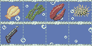 |
|
|
IP Logged |
|
|
Voltali obscur
Midshipman
Joined: 20 May 2016 Online Status: Offline Posts: 16 |
Posted: 07 July 2012 at 2:14pm |
|
Thank you Losm c:
Gamamoto: try making some shadings as suggested. Also, avoid colors that cannot be used on several items, for instance the 2 pinkish tones skyrocket your colour count but you only use it for one item. 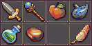 Sword, magic scepter, heartshaped fruit, ocarina, whatever potion, polished red gem, feather. Wasn't home for long, i just added one item, still one to do! x.x |
|
|
IP Logged |
|
|
DawnBringer
Commander
Joined: 11 August 2024 Online Status: Offline Posts: 568 |
Posted: 07 July 2012 at 2:36pm |
|
@Voltali: Nice work. You have accidently used a 17th color; pure black on the Scepter. May I suggest you use the medium-grey or blue color to interpolate the greens on the potion (rather than bright-grey). Also; the liquid isn't level.
Edited by DawnBringer - 07 July 2012 at 2:51pm |
|
|
IP Logged |
|
| << Prev Page of 3 Next >> |
| |
||
Forum Jump |
You cannot post new topics in this forum You cannot reply to topics in this forum You cannot delete your posts in this forum You cannot edit your posts in this forum You cannot create polls in this forum You cannot vote in polls in this forum |
|
