| Active TopicsSearchRegisterLogin |
| WIP (Work In Progress) | |
| |
  |
| << Prev Page of 3 Next >> |
| Author | Message |
|
iggybork
Midshipman 
Joined: 09 January 2010 Location: United States Online Status: Offline Posts: 62 |
  Posted: 31 January 2010 at 5:11pm Posted: 31 January 2010 at 5:11pm |
|
The forward tree issue will be solved once you shade the tree. Also, you may want to lighten the snow a tad - it's starting to blend with the sky.
I like the latest color edit, especially on the left-hand grass. You're getting there!
|
|
 IP Logged IP Logged |
|
|
kenpokis
Commander 
Joined: 09 January 2010 Online Status: Offline Posts: 202 |
Posted: 31 January 2010 at 5:35pm |
|
Working on the shading of the tree. How is the shadow coming? I'm not
sure how it should look, but I gave it a shot anyways.
|
|
|
IP Logged |
|
|
CDpixel
Seaman 
Joined: 28 January 2010 Online Status: Offline Posts: 9 |
Posted: 31 January 2010 at 5:37pm |
|
So I read through this whole thread, and you've improved a tremendous amount. Unfortunately, I haven't pixeled anything in a while, so I can't give much critique. Kepp working on it.
|
|
|
IP Logged |
|
|
iggybork
Midshipman
Joined: 09 January 2010 Location: United States Online Status: Offline Posts: 62 |
Posted: 01 February 2010 at 12:13am |
|
Good start! But remember that pine trees are made up of branches, some of which face forward and slightly to the left, which will catch the sun. Also note the reflected light on the edge of the shadow side of the tree.
You should realize by this point that every time you have a question about shading, all I'm doing is flickr searching or google image-hunting for something relevant. xD
|
|
|
IP Logged |
|
|
jeremy
Rear Admiral 
Joined: 25 November 2024 Location: New Zealand Online Status: Offline Posts: 1704 |
Posted: 01 February 2010 at 12:34am |
|
Looks good. Like iggy said stock photography (Or a plain GIS) is a great place for reference. Your darker green on the yellow side is a bit too dark, and I'd recommend increasing the contrast and saturation in places.
|
|
|
IP Logged |
|
|
kenpokis
Commander
Joined: 09 January 2010 Online Status: Offline Posts: 202 |
Posted: 01 February 2010 at 11:30am |
|
lol Yea you would think after the 5th flickr picture I would realize just to go there, but you know you have to be smart to figure that one out. lol
@Jeremy Which dark green are you talking about? The back of the hill closest to us? In what places do you think I should saturate? |
|
|
IP Logged |
|
|
jeremy
Rear Admiral
Joined: 25 November 2024 Location: New Zealand Online Status: Offline Posts: 1704 |
Posted: 01 February 2010 at 1:38pm |
|
Yeah that green. Doesn't look like there's too much of a dip there.
The mountains should probably be bluer and desaturated, and foreground elements have more saturation :) |
|
|
IP Logged |
|
|
Manupix
Commander
Joined: 07 May 2026 Online Status: Offline Posts: 771 |
Posted: 01 February 2010 at 4:05pm |
|
Radical improves!
3 things: Sharp cast shadow = clear sky = strong sunlight = dark shadow. (usually) Not so dark shadow = something to diffuse sunlight = (usually) blurry shadow. So you've got 2 options! Colors: much better, but I have a feeling all are mid-saturated (except mountains). Nothing keeps you from saturated foreground colors, as long as it's not all-100% sat, nor those greens-out-of-your-brain. (speaking of colors: Jeremy, that edit! <3) And it's time someone asked: what about that frame? :S |
|
|
IP Logged |
|
|
kenpokis
Commander
Joined: 09 January 2010 Online Status: Offline Posts: 202 |
Posted: 01 February 2010 at 4:33pm |
|
Haha I think I understand what you're saying. I'll will update here in a minute. Aaah the frame. Well i've been putting that off, as I have no clue how to approach it. It's inevitable though, but I figured I would get the picture down, before I worked on it.
Edit: messed with the colors a little bit, not sure if it's even that noticeable. Guess i'm going to start shading next, if nothing further needs to be changed. Edited by kenpokis - 01 February 2010 at 4:49pm |
|
|
IP Logged |
|
|
kenpokis
Commander
Joined: 09 January 2010 Online Status: Offline Posts: 202 |
Posted: 02 February 2010 at 11:59am |
|
Ok, update. I attempted to texture the river. Key word "Attempted". Anyways, going to work on the picture frame some if I can. Also need to add the tree shadows. I can't believe I have accomplished what I have. Thanks to all that have helped me.
Edit: what is with me and forgetting the picture?!?! Edited by kenpokis - 02 February 2010 at 12:01pm |
|
|
IP Logged |
|
|
Ninja Crow
Commander
Joined: 02 June 2009 Online Status: Offline Posts: 323 |
Posted: 03 February 2010 at 1:40pm |
|
Great great work here, kenpokis - more than I'm brave enough yet to attempt. Though now I'm rather inspired now to try a landscape of my own.
|
|
|
IP Logged |
|
|
kenpokis
Commander
Joined: 09 January 2010 Online Status: Offline Posts: 202 |
Posted: 03 February 2010 at 1:44pm |
|
Haha, thank you. I never would have imagined I could accomplish this. Luckily I have great peers pushing me to my full potential. Thanks to all that are helping me. A little update. I scrapped the water, and am doing it over. I also saturated some of the foreground a tad. Gotta get the shadows down, and I think i'll be close to finished. You know actually think i'm going to play around with the colors a bit more before I update. Gimme a few.
Edit: I tried to give the colors more of a sunset feel. Slightly adjusted the hue to a reddish color. Anyways here it is. Edited by kenpokis - 03 February 2010 at 2:03pm |
|
|
IP Logged |
|
|
kenpokis
Commander
Joined: 09 January 2010 Online Status: Offline Posts: 202 |
Posted: 04 February 2010 at 1:32am |
|
Alright guys, I know I haven't really been updating much, but I need some help. I really just can't get this river to look right. I've been using a reference picture, but idk what it is. I'm also working on the shading of the trees. What should I do for the mid tree since it is shadowed by the hill.
|
|
|
IP Logged |
|
|
iggybork
Midshipman
Joined: 09 January 2010 Location: United States Online Status: Offline Posts: 62 |
Posted: 04 February 2010 at 7:55am |
|
Link your reference?
The mid tree needs to be a little bigger first, but the shading won't be hard. Your lightsource is above and off to the right - the light will hit the top of the mid tree, and the shadow will run down the hill toward the river.
|
|
|
IP Logged |
|
|
kenpokis
Commander
Joined: 09 January 2010 Online Status: Offline Posts: 202 |
Posted: 04 February 2010 at 12:56pm |
|
Reference:
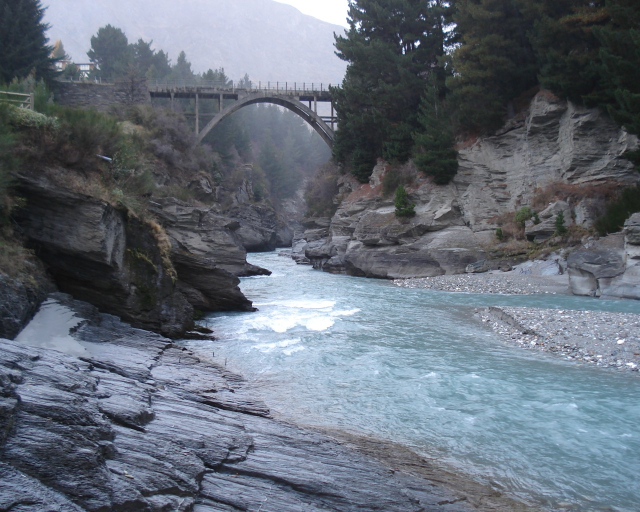 I had to download it, so I just uploaded it. I'm working on the mid tree right now. I think this piece is taking longer than it should, but hopefully I get it done within a couple of days. |
|
|
IP Logged |
|
|
RollerKingdom
Commander
Joined: 11 January 2009 Online Status: Offline Posts: 388 |
Posted: 04 February 2010 at 2:55pm |
|
I think this one looks better than the latest update |
|
|
IP Logged |
|
|
Manupix
Commander
Joined: 07 May 2026 Online Status: Offline Posts: 771 |
Posted: 04 February 2010 at 4:42pm |
|
Let's tweak that ref: resize to about your piece pixel size, and color-reduce 0.0:
 Rather noisy, isn't it? Meaning it's not a very good ref. There is however one interesting thing: the water is darker in the fg and gets progressively lighter as it gets further. The white surf is important too, even if it's not very nice here. I agree with RK in respect to this: the version he prefers had those white horizontal lines which could pass for surf and / or reflections. Check my former edit too, Your latest water colors look good, except a lack of white (or almost white). The time you spend on this piece is well spent even if you were at it another month. You're learning the basics, you've got to learn them on something. That will still be there by the time you'll have buried the piece under piles of awesome new work.  Edited by Manupix - 04 February 2010 at 4:44pm |
|
|
IP Logged |
|
|
kenpokis
Commander
Joined: 09 January 2010 Online Status: Offline Posts: 202 |
Posted: 04 February 2010 at 5:16pm |
|
Alright I recolored the river to the newest edit, but kept the white from the older version. I believe it still needs some more but tell me what you think.
|
|
|
IP Logged |
|
|
Manupix
Commander
Joined: 07 May 2026 Online Status: Offline Posts: 771 |
Posted: 04 February 2010 at 5:36pm |
|
There is however one interesting thing: the water is darker in the fg and gets progressively lighter as it gets further. =) |
|
|
IP Logged |
|
|
RollerKingdom
Commander
Joined: 11 January 2009 Online Status: Offline Posts: 388 |
Posted: 04 February 2010 at 5:41pm |
|
Improved much huh xD just like when i spent time working on my mock up Keep going, |
|
|
IP Logged |
|
|
kenpokis
Commander
Joined: 09 January 2010 Online Status: Offline Posts: 202 |
Posted: 04 February 2010 at 7:14pm |
|
Haha. Ok I tried to give the fg a darker color. Tell me if it looks any better.
|
|
|
IP Logged |
|
|
kenpokis
Commander
Joined: 09 January 2010 Online Status: Offline Posts: 202 |
Posted: 05 February 2010 at 11:33pm |
|
Update:
Added a shadow to the mid tree, and also added grass on the bank. Not sure if they look right or not though. Tried to add a shadow to fg tree, but it looked terrible. Having trouble on it, hope to update again soon. Any tips on the shadow are appreciated. |
|
|
IP Logged |
|
|
jalonso
Admiral 
Joined: 29 November 2022 Online Status: Offline Posts: 13537 |
Posted: 05 February 2010 at 11:41pm |
|
I can't believe how much you have tried, and tried to work on this. Its a rare thing and you are awesome in your efforts...
...will you finally make those three birds not be so perfectly aligned... ...I keep waiting for them to be fixed. Are they even needed? One thing I would add is that you not fear bringing colors from one area into another. Bg mountain #2's color can be used in the snowcap of BG mountain #1. Dk. grey of mountain #1 can be use on big tree. All grey may be in water, etc. |
|
|
|
|
|
IP Logged |
|
|
kenpokis
Commander
Joined: 09 January 2010 Online Status: Offline Posts: 202 |
Posted: 06 February 2010 at 12:05am |
|
Thank you jalonso for that kind compliment. I think i'm working on this so hard, is because I never imagined I could accomplish something like this, even if it isn't that great. Ah the birds. I'm not sure what it is, but I have an attachment to them. I think it balances out the fg tree nicely and adds a bit of wildlife. I did make them a bit unaligned now, but tell me if you think even more. I'm not sure what you mean about the mountains. Are you wanting me to take the back color and put it on the front snowcap? I will try this and see. Thanks again to all helping me with this.
|
|
|
IP Logged |
|
|
Manupix
Commander
Joined: 07 May 2026 Online Status: Offline Posts: 771 |
Posted: 06 February 2010 at 6:17am |
|
Ok I tried to give the fg a darker color. Tell me if it looks any better. That's the idea, but you can go much, much wilder. It's barely visible now. Mostly add white specks in the distance. Rivers shine a lot in a landscape. While you're at it, why not break those linear banks: add rocks, outcrops, shadows, foam, pools, stuff... Brown means earth: rivers don't flow in freshly dug trenches. Either rock, sand or vegetation. Look at this (by photographer Carl Warner. Check this awesome portfolio!). Yes, that river is made of ham! =<8) You can't replicate it directly because your river flows away, into that faraway plain. Still, there should be some inspiration there, as well as about color use! And I totally agree with jal about color mixing too. |
|
|
IP Logged |
|
|
kenpokis
Commander
Joined: 09 January 2010 Online Status: Offline Posts: 202 |
Posted: 06 February 2010 at 10:57am |
|
Ok a little bit of an update. Still working on some of the things manupix pointed out. Edited birds, and worked on river color. Added a little grass on the bank if you can even tell.
Edit: omg jalanso just now saw your post. *runs to read* Edited by kenpokis - 06 February 2010 at 10:58am |
|
|
IP Logged |
|
|
jalonso
Admiral
Joined: 29 November 2022 Online Status: Offline Posts: 13537 |
Posted: 06 February 2010 at 10:58am |
|
So I downloaded your latest piece to inspect closely and found 56 colors
 General coloring guide; When coloring always try to use colors already being used. If a new color is needed and before you add a new one try to see if adjusting an already used color works. If you can't, only then add a color.  First image is your 56 color original. Second image is a 19 color version using your own colors. Notice here that there is almost no visual change. Third image uses a unified and adjusted palette (22 colors). This I drew quickly and my intention is only to show you how colors can be used anywhere to enhance and develop forms and add depth and detail. I am not saying you need to go ALL detail realism or anything like that. Just showing color interaction. Use this as a learning tool and reference and try not to be influenced by it* Take note of the birds using 3 colors and variations  *This can be hard and is the downside of editing any piece. |
|
|
|
|
|
IP Logged |
|
|
kenpokis
Commander
Joined: 09 January 2010 Online Status: Offline Posts: 202 |
Posted: 06 February 2010 at 11:42am |
|
Thank you so much jalonso. I re-edited a lot of my colors to at least be
used in 2 spots. I like the river a lot more now, and I believe the
birds look better too.
|
|
|
IP Logged |
|
|
Ninja Crow
Commander
Joined: 02 June 2009 Online Status: Offline Posts: 323 |
Posted: 06 February 2010 at 12:52pm |
|
@ Jalonso:
@ kenpokis: I really like this new version.
Mind if I ask about a few points?
|
|
|
IP Logged |
|
|
RollerKingdom
Commander
Joined: 11 January 2009 Online Status: Offline Posts: 388 |
Posted: 06 February 2010 at 1:03pm |
|
Jalonso when you die may i hve some of your organs?
God that edit is so perfect LOL keep going Kenkopis, i think you could work more on the sky as well |
|
|
IP Logged |
|
|
kenpokis
Commander
Joined: 09 January 2010 Online Status: Offline Posts: 202 |
Posted: 06 February 2010 at 2:12pm |
|
Ok a little update. Worked on a few things you guys pointed out. Still going to work on the tree shading and the sky. I'm going to look up some sky references to see what I can do.
|
|
|
IP Logged |
|
|
Ninja Crow
Commander
Joined: 02 June 2009 Online Status: Offline Posts: 323 |
Posted: 06 February 2010 at 6:09pm |
|
I actually prefer the edges of the grass to be rounder (like a scallop shape, just not regular or repeating of course!) rather than jagged. But if you keep the jagged, you need to tilt the 'spikes' of brown on the right bank toward the right - not up or to the left.
I also noticed that the mountain base isn't flat anymore, but the ground appears to dip a bit, which makes it weird that the water right next to it hasn't flowed into the depression. Want to try making the ground climb up (like foothills) rather than dip down? |
|
|
IP Logged |
|
|
kenpokis
Commander
Joined: 09 January 2010 Online Status: Offline Posts: 202 |
Posted: 06 February 2010 at 9:32pm |
|
A little update. Edited the bank a tad, and i'm not sure what you mean
exactly ninja.
|
|
|
IP Logged |
|
|
Ninja Crow
Commander
Joined: 02 June 2009 Online Status: Offline Posts: 323 |
Posted: 07 February 2010 at 2:52pm |
|
All the grass spikes on the right bank appear to be perfectly vertical, rather than a diagonal on the same 'plane' as the green (which the little tree with the shadow is sitting on).
Eh, assuming that's the part I didn't make clear.... |
|
|
IP Logged |
|
|
Manupix
Commander
Joined: 07 May 2026 Online Status: Offline Posts: 771 |
Posted: 08 February 2010 at 6:44am |
|
Please break that linear trench, or else insert the excavator that made it! ;D
On the color side, you're somewhat back to 'grass is green and green is grass'. Ok for skipping the yellow grass, but see jal's edit again: that undefinable yelloreen is so vibrant. Not only by itself, but from interaction with other colors near and far. Also mix, mix, mix and reuse all over! Birds: I see one flying on his back, one square root and one sensible fella. Check some refs... Also they're too big I think. |
|
|
IP Logged |
|
|
kenpokis
Commander
Joined: 09 January 2010 Online Status: Offline Posts: 202 |
Posted: 08 February 2010 at 3:02pm |
|
New update. Ninja I was going for a overhanging grass apparence with that. I'm not sure if you knew that already, but probably did.
It seems like i'm having trouble with color. Fixed the birds some. Thanks guys. EDIT: I messed with the grass color a little more. I think it looks better. Edited by kenpokis - 08 February 2010 at 7:54pm |
|
|
IP Logged |
|
|
Ninja Crow
Commander
Joined: 02 June 2009 Online Status: Offline Posts: 323 |
Posted: 09 February 2010 at 12:00pm |
|
Overhang perpendicular to the path of the river (as on the left bank). All the grass tufts on the right bank point directly toward the viewer in an unnatural way.
|
|
|
IP Logged |
|
|
Shrub
Midshipman
Joined: 22 January 2008 Location: United Kingdom Online Status: Offline Posts: 59 |
Posted: 09 February 2010 at 2:26pm |
|
Such a wonderful thread - it's great to see the progression of this piece.
We can all learn something or other from this thread. |
|
|
IP Logged |
|
|
kenpokis
Commander
Joined: 09 January 2010 Online Status: Offline Posts: 202 |
Posted: 09 February 2010 at 10:57pm |
|
Tried to edit the bank grass, but can't seem to get it to look decent.
I'm trying to give it a curve look with the vertical overhanging, to
kinda show that you are looking at the side of the bank somewhat. Tried
to add a front tree shadow, and it didn't work out. Need to look at your
guys edits. There's not much left to do besides the frame, which is
going to be a pain. Anyways, basically just a bump.
|
|
|
IP Logged |
|
|
jeremy
Rear Admiral
Joined: 25 November 2024 Location: New Zealand Online Status: Offline Posts: 1704 |
Posted: 09 February 2010 at 11:09pm |
|
What you have on the far bank's overhang is banding, where the 2 tones of grass are hugging each other like a staircase. I think now you can start to AA the trees and everything.
|
|
|
IP Logged |
|
|
kenpokis
Commander
Joined: 09 January 2010 Online Status: Offline Posts: 202 |
Posted: 10 February 2010 at 12:13am |
|
Alright so banding=bad? I'm assuming. Now I need to figure out how to AA, lol. How do you AA?
|
|
|
IP Logged |
|
|
Manupix
Commander
Joined: 07 May 2026 Online Status: Offline Posts: 771 |
Posted: 10 February 2010 at 10:07am |
|
Yes, banding = bad.
Sorry, I just had to change that straight river! Introduced rocks, a sandy beach, kept a little brown earth between rock and grass. Changed shadow directions, they do a lot to convey the angle of the slope. Broke the borders between different grass colors. Gave a little detail to that faraway plain, and just began joining it to the mountain. Distant river: short white dots do better to make it look shiny, than a continuous line. I didn't make a very good job of it though, I probably surrounded it in too light tones. Shifted mountain hues: > pinks for the lightest, > purple for the medium. You had 3 similar hues, made it look just grey. Shifted darkest green > blues, added another bluish green. The other greens still have similar hues, difficult to change at this point without affecting the whole color balance. AA: check the differences between the 2 versions. Most important: AA (like dithering, and more generally refining) must be checked every few pixels at 100 or 200%. There's no way you can do it quickly and mechanically. One single pixel can very much ruin a whole part of the piece! It's a long and tedious job, but it's so cool to actually watch progress going on. For this reason, it must also be done last on a piece, when you are firmly sure about your coloring and shading. However, it is also the occasion to refine line details. You might see local defects unseen before, or some line might look wrong when AAed or dithered around: don't hesitate making local changes as necessary. Also ask yourself before starting a new zone: what do I want to aa this border for? just smoothing a jaggy line, or super-smoothing a transition (forest edge)? Always try picking existing colors first, create a new one if really necessary. Most important is a good choice of value (light/dark); a dissimilar hue is usually not that bad unless too saturated. Generally greys, browns and the most desat colors can be used almost everywhere. |
|
|
IP Logged |
|
|
kenpokis
Commander
Joined: 09 January 2010 Online Status: Offline Posts: 202 |
Posted: 10 February 2010 at 11:54am |
|
Again I love that edit manupix. Ah, the river, I wish I could do
something like that, but i'm afraid that would take me at least a week
to look half as good as that. Been working on some texture a bit, and
also added a far off set of trees, to break up the ground at the
mountain's base. Not sure if it looks right, but ya know progress.
|
|
|
IP Logged |
|
|
wenruto
Commander
Joined: 19 January 2021 Location: United States Online Status: Offline Posts: 115 |
Posted: 10 February 2010 at 2:23pm |
|
Hey that Looks Good..... It Looks Like You Have Improved Alot in Here Congratzz Edited by wenruto - 10 February 2010 at 2:26pm |
|
|
Earn free stuff by searching like Google

|
|
|
IP Logged |
|
|
kenpokis
Commander
Joined: 09 January 2010 Online Status: Offline Posts: 202 |
Posted: 11 February 2010 at 12:08pm |
|
Hey, thanks for the compliment. I thought about something like that, but I can't draw deer O__O. I was hoping to achieve the wildlife with the birds.
|
|
|
IP Logged |
|
|
kenpokis
Commander
Joined: 09 January 2010 Online Status: Offline Posts: 202 |
Posted: 11 February 2010 at 7:53pm |
|
Ok, new color edit on the frame. I've been trying to give the frame a wood texture and am getting no where. Tried to give it a grainy appearance but just doesn't seem to work. Maybe I just need to work with it some more. Anyways, just a color change. Oh yea removed banding too.
Edited by kenpokis - 11 February 2010 at 8:08pm |
|
|
IP Logged |
|
|
RollerKingdom
Commander
Joined: 11 January 2009 Online Status: Offline Posts: 388 |
Posted: 11 February 2010 at 7:59pm |
|
The landscape is so gorgeous, It was great watching it.. Good effort buddy! for the frame, if you want a wood texture just search wood on PJ gallery and study some of them and try to make your own or at least a diff palette
|
|
|
IP Logged |
|
|
Ninja Crow
Commander
Joined: 02 June 2009 Online Status: Offline Posts: 323 |
Posted: 12 February 2010 at 1:56pm |
|
Looking great (removing the banding really helps).
Can we see a yellow-green highlight on the rightside tree next? |
|
|
IP Logged |
|
|
kenpokis
Commander
Joined: 09 January 2010 Online Status: Offline Posts: 202 |
Posted: 12 February 2010 at 2:11pm |
|
lol it has some but I think it blends in with the grass to much to see. Will try a different hue.
Edit: ok real quick edit, don't know if it even does anything. Edited by kenpokis - 12 February 2010 at 2:20pm |
|
|
IP Logged |
|
|
Ninja Crow
Commander
Joined: 02 June 2009 Online Status: Offline Posts: 323 |
Posted: 12 February 2010 at 2:30pm |
|
You don't have to show the highlight on the point of the tree, since it would blend with the grass (this can be a cool effect) just on the lower part - therefore not needing a new shade, and also making the forms fuse together so they look like they belong together.
Also, can you roughen up where the trunk of the big tree on the left enters the ground? Oh yeah, and I forgot to mention that I like the textured shadow edges you have all over the hills! |
|
|
IP Logged |
|
| << Prev Page of 3 Next >> |
| |
||
Forum Jump |
You cannot post new topics in this forum You cannot reply to topics in this forum You cannot delete your posts in this forum You cannot edit your posts in this forum You cannot create polls in this forum You cannot vote in polls in this forum |
|
 =) I think if you add some kind of deer herd on that far right side or near the river it would kinda look more environmental kind..... but that was just my Opinion....
 keep up the great work