| Active TopicsSearchRegisterLogin |
| WIP (Work In Progress) | |
| |
  |
| << Prev Page of 4 Next >> |
| Author | Message |
|
V U L C A N
Seaman 
Joined: 10 January 2015 Online Status: Offline Posts: 3 |
  Posted: 10 January 2015 at 3:11pm Posted: 10 January 2015 at 3:11pm |
|
Was really enjoyable to read through this topic and see your progress as a new pixel artist there were alot of tips i picked up on. Nice job^_^
|
|
 IP Logged IP Logged |
|
|
RebeaLeion
Commander 
Joined: 04 October 2017 Online Status: Offline Posts: 321 |
Posted: 11 January 2015 at 1:21am |
|
Yes ! I replaced old-screenshot in previous posts to keep the replies in tag. There will be more in the future, when there are things to show or improve. I mean you can improve every time.
|
|
|
IP Logged |
|
|
RebeaLeion
Commander
Joined: 04 October 2017 Online Status: Offline Posts: 321 |
Posted: 15 January 2015 at 1:17pm |
|
so I am working on this easy title / mainly font (Arvesia) :
in motion: https://www.youtube.com/watch?v=ToVnEzL9aQY here's current version ( older version of font is in vid only) : 
Game is freeware one but I d like to make it a "better" looking freeware anyway. So how to make this font to look more pro-like. I say this because I know title screen is very important one. Tho I am nearly still novice I d like to make it somehow better. It does not look right/good. But I can't figure it out... How to improve the font? I plan to separate mountains and tree in the future, so those will be 3 differently moving patterns. Each of its own speed pace to add more depth.(like those clouds behind). I am still not sure about sky gradient, but there might be some. Edited by RebeaLeion - 15 January 2015 at 1:39pm |
|
|
IP Logged |
|
|
PixelSnader
Commander
Not a troll! Joined: 08 January 2026 Online Status: Offline Posts: 3194 |
Posted: 16 January 2015 at 8:14am |
|
Two parts; your font itself doesn't look very good, and the materials/depth aren't very well realized. I'd go over to a font site, pick something you like, turn it in to 1 bit, then pixelshift a couple times to get a 3d effect, and then try to make it look like actual rock or whatever material you like.
|
|
|
▄▄█ ▄▄█ ▄█▄ ▄█▄ |
|
|
IP Logged |
|
|
RebeaLeion
Commander
Joined: 04 October 2017 Online Status: Offline Posts: 321 |
Posted: 17 January 2015 at 12:04pm |
|
Thanks for tip! I will definietly revamp the font completely when I will get back to work on title. I am jumping from one thing to another but... eventually I ll return to title again.
Here are some lushes for another part of forest where there will be more flowers. I think its ok, i post it as it might help to some novice-pixelartist, who's just starting with pixels. It's really simple. I made red flower first, all I did to get new colors for yellow flowers was that I toned selected red flower (adjust RGB colors with slide bars to change red flower to yellow value quickly, no need to mix manually or to use different palette).  Edited by RebeaLeion - 17 January 2015 at 12:31pm |
|
|
IP Logged |
|
|
RebeaLeion
Commander
Joined: 04 October 2017 Online Status: Offline Posts: 321 |
Posted: 19 January 2015 at 11:11am |
|
I might use some feedback on the following :
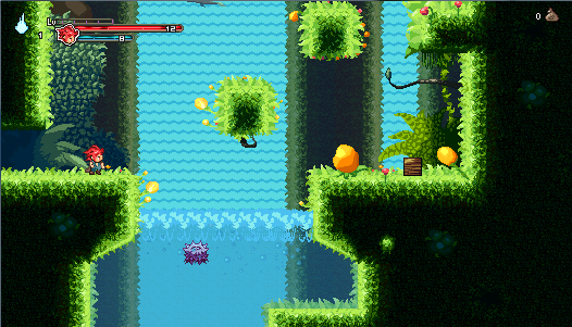
I think it's decent but I am sure it has some flaws which I am not aware of. What do you think of dark-green blue flowers within the grass (floor tile) EDIT: here's older version but in motion 
note : underwtaer is not done, there will be background and more stuff. I did like 3 types of waterfall and then I choosed the simpliest one as it's less distracting. Edited by RebeaLeion - 19 January 2015 at 3:20pm |
|
|
IP Logged |
|
|
Iscalio
Commander
Joined: 29 March 2023 Online Status: Offline Posts: 224 |
Posted: 19 January 2015 at 11:36am |
|
Looking very solid, compared with the starting stuff.
One issue I had was that you have spiky foreground plants that look dangerous but are actually not in the play area. It's a cool effect to have them on both sides of you, foreground and background side, but as a new player I'd be afraid of hurting myself on them thinking they were a hazard. I'd also wonder if having them in game could hide enemies you need to avoid. |
|
|
IP Logged |
|
|
Yuelyan
Seaman
Joined: 05 December 2014 Online Status: Offline Posts: 21 |
Posted: 21 January 2015 at 12:29am |
|
Hello,
I've been following your thread for a while and I have to say you're one of my inspirations for pixel art. :P On the other hand, your waterfall could use some highlights. And the part where the water crashes down at the bottom could use a bit of water spray. Like a few pixels here and there. In my opinion, I prefer the water to have downward streaks rather horizontal waves. If you want to keep the horizontal wave style, then I still suggest adding a bit of highlight to give it depth since everything in your background seems to have depth. Also, wha program do you use to do your pixel art? I've been only doing mine on MSPaint...but I love to find a program that's free and specifically targets Pixel art with more options such as layers, transparency, rotation, etc. Edited by Yuelyan - 21 January 2015 at 12:34am |
|
|
IP Logged |
|
|
RebeaLeion
Commander
Joined: 04 October 2017 Online Status: Offline Posts: 321 |
Posted: 21 January 2015 at 6:03am |
|
Originally posted by Yuelyan
Also, wha program do you use to do your pixel art? I've been only doing mine on MSPaint... Thank you! Here on PJ are very talented artists and I m trying to follow their tips/threads too. It helps in general. I kinda agree, this thread is quite good for starters as it covers some basics there in previous posts. When I look at forum - there're similiar threads like this one and those threads help as well. I suggest you to get rid of MS Paint asap. That's the worst thing which limits you to all degrees. (some might argue, but thats my opinion). MS Paint is the worst thing you can use for pixelart (limited undo, no layers, etc.). I cant recommend any free as I am not using one. I use graphicsgale which is commercial (but not expensive!). GraphicsGale is superb to MS paint and very friendly. It costs not much (10-20usd? cant remember) + any next new update (new version) is free. This is my tree for starters tutorial using graphicsgale (lighting is a bit messed there i know, but it covers basic) https://www.youtube.com/watch?v=97O1ELnOKxk that aside. I gave up on pixel font for Title screen (Yes  ) I tried something I think I understood what Pixelsnader meant but it didnt work x_x (I decided to shorten deadline/amount of time on the Title Screen). Therefore I used combined digital (photoshop) + pixel graphic. It's not entirely pixelart now. ) I tried something I think I understood what Pixelsnader meant but it didnt work x_x (I decided to shorten deadline/amount of time on the Title Screen). Therefore I used combined digital (photoshop) + pixel graphic. It's not entirely pixelart now.
https://www.youtube.com/watch?v=vYNhy7bIhrc Edited by RebeaLeion - 21 January 2015 at 9:56am |
|
|
IP Logged |
|
|
PixelSnader
Commander
Not a troll! Joined: 08 January 2026 Online Status: Offline Posts: 3194 |
Posted: 21 January 2015 at 10:15am |
|
Using different tools won't make your art skills any better. This is 100%, while this 98% (used gimp to combine the animation frames) made in MSpaint. While it is limited, so is pixel art in general, and so is a traditional pencil.
In that video you're doing there is nothing that I can't do in Paint, in terms of practicality. Heck, you're not even properly using the program; it has a built in palette manager so why use blobs? Layers are nice, but note how they cause you to accidentally floodfill the canvas instead of just the tree trunk? Again. Tools cannot make an artist. 
7~8 minutes Also, wanna know some things MS paint does better than Gale? [Ctrl]+[scroll] to zoom in and out. [Ctrl]+[+] or[Ctrl]+[-] to make brush larger/smaller Drag canvas borders to resize. Can scale selections (instead of whole canvas) by numerical value instead of just a dragbox. Handy for working in isometric. [ctrl]+ drag or [ctrl]+[arrow] a selection to copy, instead of copy pasting. Can be really handy when stretching a pole or something, or pixelshifting for 3D like I mentioned. Partially replace a color; rightclick-erase to replace foreground color with background color, without affecting rest of the image, and not relying on a palette. Yes this is marginal use... but can you name another program that does this? |
|
|
▄▄█ ▄▄█ ▄█▄ ▄█▄ |
|
|
IP Logged |
|
|
RebeaLeion
Commander
Joined: 04 October 2017 Online Status: Offline Posts: 321 |
Posted: 21 January 2015 at 11:59am |
|
I never did pixelart in MS Paint. I mostly did edits of things such as drawing new stuff over snesrip tilest (RPG maker tilesets used a lot of snes rips, i often edited them for custom-need). The very limited undo 4-5 steps caused me a lot of troubles when I decided I need to go 15+ steps back to redraw/edit things differently. Pherhaps that's why I am not using MS paint futher. In my opinion MS paint ( windows7 version ) is user-interface unfriendly so I am not working with it.
Those usable MS paints were in 98/XP. I do not know those shortcuts you mentioned as I never used them in MS paints. I am still using zoom out/in or click to select tool. Your tree in 7-8 minutes is stunning me. I would do such attempt 20+ if not close to an half hour (in Gale). You're right that tool does not make an artist but experience and knowledge do. Your pixelart is nice. That aside I still prefer graphics gale over Ms paint. For me it's just a need. I often take bad steps and draw things completely off then I realize that I messed the basics and I need more than 5 undos and layer helps me a lot too. Originally posted by PixelSnader
it has a built in palette manager so why use blobs? Layers are nice, but note how they cause you to accidentally floodfill the canvas instead of just the tree trunk? 1) I use blobs because I m used to them from MS Paint ( I used MS paint for years, I am using gale for 8 months); even GG has built in palette manager, I will still go for blobs. Force of habit. 2) Yes, it happens. Then I have go to ctrl+z. This is (heck) don't judge it please. My first hume sprite I ever created (in MS paint) before I got Gale. http://4.bp.blogspot.com/-3W6QRm3gEc8/VMALcoJN_iI/AAAAAAAABzo/fjRD7BvYaLU/s1600/__Quick_EDO.png I did game in 800x400 back then and I didnt know pixelart has some things to follow(pixel size,shadows,lights... etc.) I was lost without PJ and I looked at a lot of pixel sites. Sprite was based on based on http://www.raywenderlich.com/14865/introduction-to-pixel-art-for-games Then I got graphics Gale and I could do this animation on frames. not to MS sheet it like before (viz. pic). That's why I started to like it more than MS paint. For starters I would recommend something more flexible over Ms paint. I am still using paint XP for quick selection (from old times when I edited stuff) as I find this the fastest tool for "Select" tool. I would not recommend MS paint windows7 tho. But it's anyone's choice. If you're good with it and you can do crazy stuff (in a good way - nicepixelart) in it, why not. If I would be used to MS paint I would not trade either. Edited by RebeaLeion - 21 January 2015 at 12:37pm |
|
|
IP Logged |
|
|
PixelSnader
Commander
Not a troll! Joined: 08 January 2026 Online Status: Offline Posts: 3194 |
Posted: 21 January 2015 at 2:28pm |
|
I'm using Windows 8 which as far as I know has the same MsPaint as Windows 7.
Goes up to 50 undoes. I'm not sure what you think is wrong with the interface of it? It's bigger, yeah, but the program itself is so minimal that it's still pretty clean, compared to stuff like Photoshop etcetera. It definitely has it limitations and I'm in no way discrediting GraphicsGale. I'm just saying that people hating on MSP kind of irks me because it mostly does what it should. I don't understand why it f**ks up *.gif though. |
|
|
▄▄█ ▄▄█ ▄█▄ ▄█▄ |
|
|
IP Logged |
|
|
RebeaLeion
Commander
Joined: 04 October 2017 Online Status: Offline Posts: 321 |
Posted: 22 January 2015 at 5:21am |
|
Originally posted by PixelSnader
I'm using Windows 8 which as far as I know has the same MsPaint as Windows 7. Goes up to 50 undoes. I'm not sure what you think is wrong with the interface of it? It's bigger, yeah, but the program itself is so minimal that it's still pretty clean, compared to stuff like Photoshop etcetera. It definitely has it limitations and I'm in no way discrediting GraphicsGale. I'm just saying that people hating on MSP kind of irks me because it mostly does what it should. I don't understand why it f**ks up *.gif though. Your explaination of MSP was fair enough. I never examined MS paint 7 onward. For some reason I thought win7 ms paint had the same number of undoes as its ancestors XP, if it has more undoes than 5 then it's ok I guess. Layer is just an addition and undo lock after 5 undoes was my main knot with MS paint. Everyone prefers something else. GraphicsGale sure can be more flexible, but of course you can make same results in both MS Paint and GG. Edited by RebeaLeion - 22 January 2015 at 5:44am |
|
|
IP Logged |
|
|
Iscalio
Commander
Joined: 29 March 2023 Online Status: Offline Posts: 224 |
Posted: 22 January 2015 at 6:04am |
|
I use Photoshop, but at least in my version there's no option to clearly display gif animation. In my current project I have to replace the files in the game itself to check animations or take the frames to Flash CS to animate them in a development environment. le sigh.
Is there a program that people would recommend for gif or general pixel animation? |
|
|
IP Logged |
|
|
Yuelyan
Seaman
Joined: 05 December 2014 Online Status: Offline Posts: 21 |
Posted: 22 January 2015 at 12:59pm |
|
Originally posted by Iscalio I recommend Piskel for doing your pixel art and animation frames. They even have layers! I just joined them! But I wish they had like an undo button... (maybe they have one and I haven't found it yet...)I use Photoshop, but at least in my version there's no option to clearly display gif animation. In my current project I have to replace the files in the game itself to check animations or take the frames to Flash CS to animate them in a development environment. le sigh. Is there a program that people would recommend for gif or general pixel animation? |
|
|
IP Logged |
|
|
PixelSnader
Commander
Not a troll! Joined: 08 January 2026 Online Status: Offline Posts: 3194 |
Posted: 22 January 2015 at 6:58pm |
|
Just tried piskel. It's pretty okay, considering it's a free web app.
It, uh, has undo if you press [ctrl]+[z]. Didn't even bother looking for a button in the app, just muscle memory. =P I give it a wibbly wobbly tentative thumbsup; 
Personally I (currently, often) use MSpaint to make sheets, and then check how they look in the free version of GameMaker, in the app. And when I'm satisfied with it. I export it through gimp; GM doesn't make *.GIFS loop. I know that sounds incredibly convoluted, but really, going from paint to an updated animation in GM is [alt]+[tab],[ctrl]+, [enter]. I like working with sheets because they give me an overview of the whole sprite/project. |
|
|
▄▄█ ▄▄█ ▄█▄ ▄█▄ |
|
|
IP Logged |
|
|
RebeaLeion
Commander
Joined: 04 October 2017 Online Status: Offline Posts: 321 |
Posted: 25 January 2015 at 2:03pm |
|
I decided to cancel this pixel-based game I was working on. I have more reasons for it.
I might still draw some pixelart just for fun in the future. :) Thank you for the feedback you gave me in this thread, I learnt something. EDIT2016: This project's status is hiatus. I think in the next year or two there wont be any work on this, but in the further future there might be. |
|
|
IP Logged |
|
|
Yuelyan
Seaman
Joined: 05 December 2014 Online Status: Offline Posts: 21 |
Posted: 25 January 2015 at 2:30pm |
|
Originally posted by RebeaLeion Nuuuuu! My inspiration! That's too bad you decided to cancel this game...because it looked like you put so much work in it... I decided to cancel this pixel-based game I was working on. I have more reasons for it. Final vid of my pixelart progress [720p I uploaded it in higher quality]: https://www.youtube.com/watch?v=TDvzHEg-_Gk I might still draw some pixelart just for fun in the future. :) Thank you for the feedback you gave me in this thread, I learnt something.  Wish you luck on your next project. |
|
|
IP Logged |
|
|
Hapiel
Rear Admiral 
Joined: 30 June 2023 Online Status: Offline Posts: 3266 |
Posted: 25 January 2015 at 3:24pm |
|
That is a pity! Your video shows that there was a lot of content finished, it looks fun!
|
|
|
IP Logged |
|
|
Limes
Commander
Joined: 15 September 2021 Online Status: Offline Posts: 683 |
Posted: 25 January 2015 at 3:41pm |
|
whhaaaaaat cancel it!!?! I would totally play that and you've made so much progress!
|
|
|
|
|
|
IP Logged |
|
|
RebeaLeion
Commander
Joined: 04 October 2017 Online Status: Offline Posts: 321 |
Posted: 29 January 2015 at 11:06am |
|
nothing will change about game develop. I stopped and that's it.
However I am doing some pixelart for fun as I mentioned above ! New trees are based on pixelsnader's tree (simple, yet awesome). So I tried something in similiar style, also I finally cleared the grass and it's better too! :) 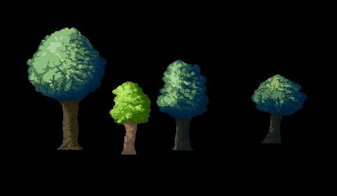
Edited by RebeaLeion - 31 January 2015 at 11:21pm |
|
|
IP Logged |
|
|
Iscalio
Commander
Joined: 29 March 2023 Online Status: Offline Posts: 224 |
Posted: 29 January 2015 at 5:26pm |
|
I had a teacher who did background painting for disney at some point in his career and I think for Lilo and Stitch maybe they went to hawaii and at some point they painted leaves and grass.
What I remember from what he told us was that they discovered the tops of the leaves? grass? were yellowish and the undersides tended to be blue-green. I guess this was due to the way the light hit a semi-translucent object. You could try a tree or grass test where you try to implement this distinction between light side and shadow side, though I'm not sure how you'd most easily accomplish it. Though not exactly the same thing this is a very similar to the concept. The same tree has yellow greens and blue greens despite all the leaves being technically the same base color. The use of both in the same object seems to make it a much more appealing tree than if it only had blue green leaves or yellow green leaves.  Edited by Iscalio - 29 January 2015 at 5:35pm |
|
|
IP Logged |
|
|
RebeaLeion
Commander
Joined: 04 October 2017 Online Status: Offline Posts: 321 |
Posted: 31 January 2015 at 4:43am |
|
Iscalio, i might try to experiment more with a colours in the future, it's note excatly the thing, but I toned trees in wider colour range here:

I did this assets update lately for fun as I tried to reach more readable pixelart. folks told me my work was noisy, messy, etc. and that I should avoid it. it still is here and there but I m trying to improve in this direction. I m Still practicing pixelart and I will for some time because it's quite fun to be creative. :-)) Edited by RebeaLeion - 31 January 2015 at 5:31pm |
|
|
IP Logged |
|
|
RebeaLeion
Commander
Joined: 04 October 2017 Online Status: Offline Posts: 321 |
Posted: 01 February 2015 at 6:28am |
|
I improved grass (again?). I might use some feedback on it. Upper is original.
Is this what you mean that grass was noisy? I think I made it clean - now. Edit: is there a way to setup google chrome somehow that when i click pictures here on forum, they won't blur? if I sacle by clicking it blurs pixels :( at every threads.  Edited by RebeaLeion - 01 February 2015 at 6:29am |
|
|
IP Logged |
|
|
eishiya
Commander
Joined: 04 August 2022 Online Status: Offline Posts: 1109 |
Posted: 01 February 2015 at 8:35am |
|
There are extensions you can get for Chrome that'll get rid of the blur. I don't know why Chrome doesn't listen to the CSS, it's the only major browser that doesn't support for image-interpolation: nearest-neighbour in some form.
I think the old grass was better. The new grass is repetitive and the walkable area is so cleanly delineated, it looks like a green table-cloth rather than grass. If you want the walkable area to be clean, you should focus on defining the general walkable plane, not just a line that separates the walkable from the vertical. The actual boundaries between walkable and vertical can be irregular/organic, as long as it's clear which plane is which. Because of that sharp boundary, your new grass looks more like bright green rocks or pavement rather than grass. The blades being so huge also look weird compared to how tiny the character is. |
|
|
IP Logged |
|
|
RebeaLeion
Commander
Joined: 04 October 2017 Online Status: Offline Posts: 321 |
Posted: 01 February 2015 at 9:40am |
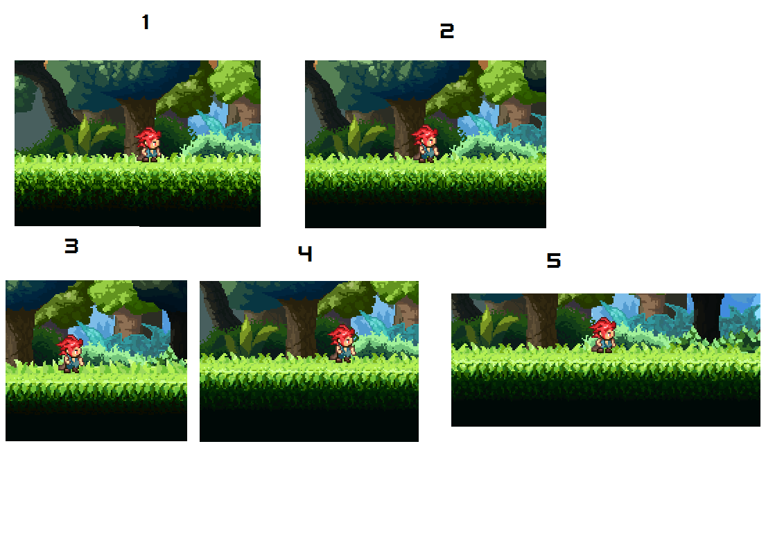
Thanks for previous feedback about grass, I made some hybrids and that lead me to 4 and 5 grass, I think 5 is the best now, clean but still not so repetetive. Edited by RebeaLeion - 01 February 2015 at 11:09am |
|
|
IP Logged |
|
|
eishiya
Commander
Joined: 04 August 2022 Online Status: Offline Posts: 1109 |
Posted: 01 February 2015 at 6:47pm |
|
I think #5 is a nice compromise, but it still has what looks like a nearly-solid bright line running across it that ruins the organic shape. The leaves being so large is still odd to me. If it's meant to be a bunch of leafy plants rather than grass, I think it might help to emphasise the clumpiness a little (might be easier if you introduce a couple of extra tiles instead of having one repeating tile).
|
|
|
IP Logged |
|
|
RebeaLeion
Commander
Joined: 04 October 2017 Online Status: Offline Posts: 321 |
Posted: 06 February 2015 at 5:55am |
|
So I can do small sprites like snails, small goblins, fishes, crows, etc. But when it comes to bigger I am kinda lost.
I tried gobmama, she was even bigger at the start than these 3 currents: But bigger the sprite, uglier it becomes and I am losing control and it does not fit in the forest that I created. Can't figure out why. Small goblin is ok, because it's small sprite but mama I don't know. I think the smaller is the best, but it still misses something or I draw it badly.  Edited by RebeaLeion - 06 February 2015 at 5:58am |
|
|
IP Logged |
|
|
Lakelezz
Commander
Joined: 28 January 2023 Online Status: Offline Posts: 172 |
Posted: 06 February 2015 at 6:21am |
|
Try to work more with contrasts on her dress and head as you did with your little goblins.
The dress is so bright on the left and suddenly the right side is cut off by the shadow. However the light would still hit the right side, would not it? I prefer the third version. The first one is too small in comparison to the little goblins while the second one has no real volume on her body. Specially the second one has a strong shadow right below her chest but nearly any dark shadows on her right side. I still wonder where light comes from, haha. The teeth are not that easy to read as well. Though in my point of view the teeth from the second version are the best right now. Maybe go for something similar to the little goblins and try to stress the teeth with a well placed outline and maybe 1px shade. Hopefully my feedback was not too rough... It was not meant to be :) Edited by Lakelezz - 06 February 2015 at 6:22am |
|
|
IP Logged |
|
|
RebeaLeion
Commander
Joined: 04 October 2017 Online Status: Offline Posts: 321 |
Posted: 06 February 2015 at 6:27am |
|
Thanks for feedback, I will try to rework mamas and post new samples. Here's quick goblin fighter or something like that. I will make mama with frying pan.

EDIT : improved 
EDIT 2 : animated  Edited by RebeaLeion - 06 February 2015 at 7:59am |
|
|
IP Logged |
|
|
RebeaLeion
Commander
Joined: 04 October 2017 Online Status: Offline Posts: 321 |
Posted: 09 February 2015 at 10:39am |
|
another attempt :

2nd EDIT, I put more pixels into face but not sure if its better than 1st 
3rd EDIT, i know i m not so good at this, but I am also never happy. This is final (?). I think 3rd is the best. 
here I just changed design:  Edited by RebeaLeion - 09 February 2015 at 11:45am |
|
|
IP Logged |
|
|
SuperTurnip
Commander
Joined: 25 March 2026 Online Status: Offline Posts: 301 |
Posted: 09 February 2015 at 2:19pm |
|
The new design is a smart move, because it connects the arms to the body much better. It also makes the the placement of the hips/legs much clearer.
I think the head is oddly light in colour compared to the rest. Something you should be careful with across all of your assets is contrast, as things in the background are getting more and more distracting whilst characters are a little unbalanced in terms of lighting/shading. Perhaps a little more atmospheric perspective would help the background (all background elements are closer to the sky colours the further away they are from the playing area, it can work wonders). As for the characters, just constantly step away and check on how balanced the brightness of different parts are. You're doing better and better, so just keep at it and remember to update your old assets to match your growing skills. Happy pixeling! |
|
|
IP Logged |
|
|
adamgoldfav
Seaman
Joined: 07 February 2015 Online Status: Offline Posts: 38 |
Posted: 10 February 2015 at 7:57pm |
|
Man, I'm jealous! You're really god at this and very determined... I hope I can learn as well as you did! :3
 
|
|
|
IP Logged |
|
|
Limes
Commander
Joined: 15 September 2021 Online Status: Offline Posts: 683 |
Posted: 10 February 2015 at 9:28pm |
|
Originally posted by adamgoldfav
You're really god at this Woah now lets not bring religion into this 
|
|
|
|
|
|
IP Logged |
|
|
RebeaLeion
Commander
Joined: 04 October 2017 Online Status: Offline Posts: 321 |
Posted: 11 February 2015 at 12:52pm |
|
I am an amateur, lol. Try to browse gallery a bit more, you will find some really awesome pixelart there and if you will find something simple, try to study it :) how are the lights, cracks, etc. It helps me sometimes to catch a glimpse. Thanks adamgoldfav anyway, I am sure he meant good not god!
i m wiping on my sprite: Originally posted by SuperTurnip
I think the head is oddly light in colour compared to the rest. indeed, thanks. Added new lighting. 
I think the next goblin try will be that mama. Edited by RebeaLeion - 14 February 2015 at 3:23pm |
|
|
IP Logged |
|
|
RebeaLeion
Commander
Joined: 04 October 2017 Online Status: Offline Posts: 321 |
Posted: 14 February 2015 at 4:12am |
|
I tried another NPC, following the same style. I had to use my character's sprite as reference. I used colours from palettes withiing colour thread, it helps me greatly.
MIO, the Witch - progress sheet 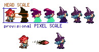
EDIT: now I made this withch into an avatar Edited by RebeaLeion - 15 February 2015 at 6:49am |
|
|
IP Logged |
|
|
RebeaLeion
Commander
Joined: 04 October 2017 Online Status: Offline Posts: 321 |
Posted: 16 February 2015 at 5:54am |
|
So I was working on rubbish now, actually. I had it like practice, I did all animations less than in 10 hours as I didn't want to spend days on this test.
https://www.youtube.com/watch?v=SVysSUEz2QQ#t=37 Walk I did however very carefully. I tried walking to be best as possible. Edited by RebeaLeion - 16 February 2015 at 10:29am |
|
|
IP Logged |
|
|
mauzel
Seaman
Joined: 15 February 2015 Online Status: Offline Posts: 11 |
Posted: 16 February 2015 at 7:12am |
|
I just looked through this thread---very cool to see your progress over time.
|
|
|
IP Logged |
|
|
nohEal
Seaman
Joined: 22 February 2015 Online Status: Offline Posts: 1 |
Posted: 23 February 2015 at 4:55pm |
|
Thanks you guys for giving time to post these. I got inspired looking at this thread. I started learning pixel art again.
Edited by nohEal - 23 February 2015 at 4:55pm |
|
|
IP Logged |
|
|
Iscalio
Commander
Joined: 29 March 2023 Online Status: Offline Posts: 224 |
Posted: 07 April 2015 at 9:38am |
|
I found this thread again! Wanted to reference something.
BTW I note in your 1-5 grass pictures that the character looks like they are hovering or pushed back toward the background because of where their feet touch the grass. I think bringing the character a few pixels down into the "middle" of the "flat" grass surface area would help make them look more grounded in the center of the walking space. Also a semitransparent shadow might help show the character is touching the ground. |
|
|
IP Logged |
|
|
RebeaLeion
Commander
Joined: 04 October 2017 Online Status: Offline Posts: 321 |
Posted: 10 April 2015 at 9:59am |
|
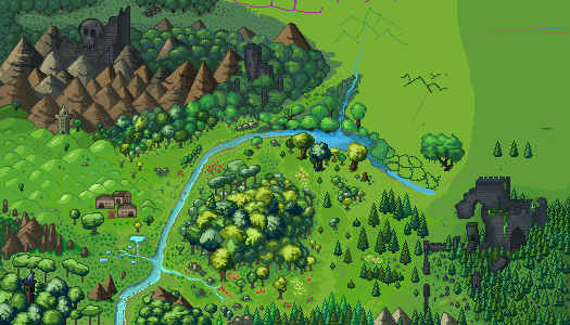
oh thank you for reviving this thread. That reminded me, I am working on this map picture, however my pixels arent the best I hope you might give me some feedback on this project before I do more bad than good. How you like terrain, mountains, if something is out of place etc. I will continue in this style as it is as I do things :-) i plan to post this one in gallery when its done.
I m working on this slowly, 1 month + now, when i have mood. and i have no pre-made picture how it will look at final shape, I just draw what comes to mind. 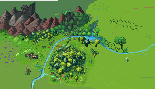
edit : very small update, I decided smaller mountains will be better 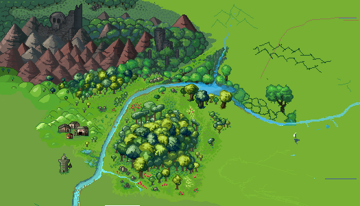 Edited by RebeaLeion - 11 April 2015 at 3:10am |
|
|
IP Logged |
|
|
RebeaLeion
Commander
Joined: 04 October 2017 Online Status: Offline Posts: 321 |
Posted: 11 April 2015 at 10:41pm |
|
I toned mountains a bit, also I am using some assets from my old map (which i did year ago using CS, so there might be something digitalized - however I m trying to overhandcraft those things as can be seen on new map aka skull castle old vs new).
Toned Mountains (i think they re better now !) + new village + new toned trees below mountains (not so bright now as in above), hand crafted textures over old castles. I think this is just my style I learned and I will mix things like this for eternity :) I wish i could draw or to figure things out a little better but i did this like whole day yesterday. Especially ground terrain, I dont know it's messy to me but I can't figure way how to do terrains texture for this map, i tried few more samples but this was the best. I would appreciate any help anyways. :-) 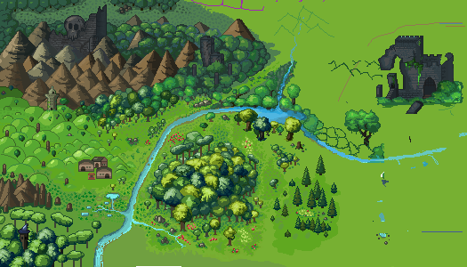
another Update : 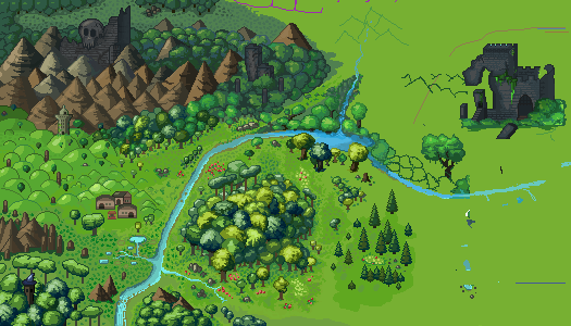
edit : i think hills looked weird so I tried to fix them. 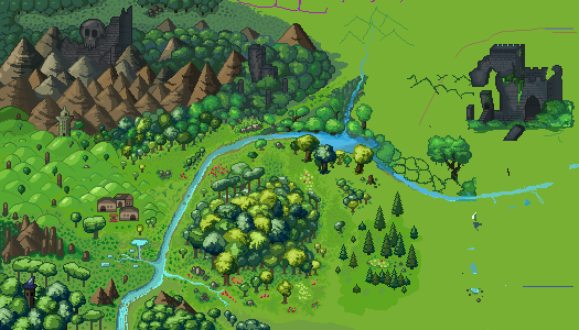
edit 2 : without those weird pillars 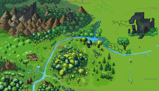 Edited by RebeaLeion - 13 April 2015 at 9:01am |
|
|
IP Logged |
|
|
Zizka
Commander
Joined: 07 May 2021 Online Status: Offline Posts: 143 |
Posted: 12 April 2015 at 4:19am |
|
You're improving so fast since you first began.
|
|
|
IP Logged |
|
|
RebeaLeion
Commander
Joined: 04 October 2017 Online Status: Offline Posts: 321 |
Posted: 17 April 2015 at 6:33am |
|
progressing with map so I can upload it to gallery, i may still use some help/feedbacks on this thing.
 Edited by RebeaLeion - 17 April 2015 at 6:34am |
|
|
IP Logged |
|
|
RebeaLeion
Commander
Joined: 04 October 2017 Online Status: Offline Posts: 321 |
Posted: 18 April 2015 at 10:58am |
|
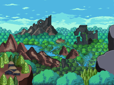
I finished practice map for gallery, yay.
Arvesia is still in WIP, but I do not think of that I will release it somehow. It's just fun to put and mash all tileset that i create together. Here's dungeon mockup : EDIT2016: sorry link is missing. but can be see below anyway§ |
|
|
IP Logged |
|
|
SuperTurnip
Commander
Joined: 25 March 2026 Online Status: Offline Posts: 301 |
Posted: 19 April 2015 at 7:19pm |
|
That dungeon is looking really nice. I think the curtains are awkward compared to the smoothness of the ground and background. Keep working on making things consistent in style. Your technical work is getting much more impressive!
For the map, your upper-right corner is weak. You don't need to fill it with detail though. You could even cut it out, put a natural border around the map if you want (clouds, mountains, water, or something else). Keep up the good work! |
|
|
IP Logged |
|
|
RebeaLeion
Commander
Joined: 04 October 2017 Online Status: Offline Posts: 321 |
Posted: 20 April 2015 at 6:03am |
|
What is wrong with curtains - i tried to make them without noisy things. Are those any better ? the first looked more lively to me.
1 - orig. 
2 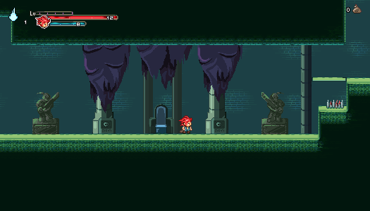
3 
fixed lights of 3 
4 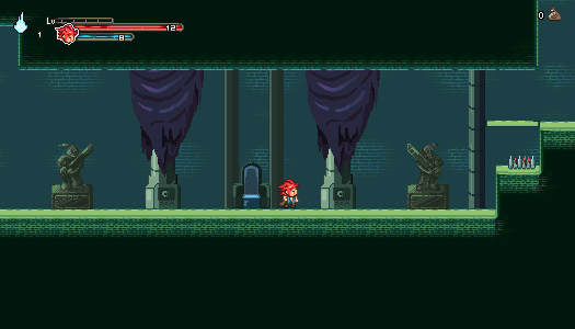
5 - same as 4, but without that crazy lighting, um... 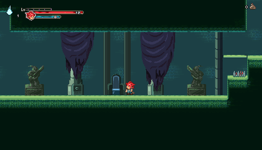
so what curtains do you think are better ? I still think 1 is the best as it fits the best into the place. I appreciate feedbacks tho, i m not sure how to improve it here, so 1st works for me. Edited by RebeaLeion - 25 April 2015 at 2:00am |
|
|
IP Logged |
|
|
RebeaLeion
Commander
Joined: 04 October 2017 Online Status: Offline Posts: 321 |
Posted: 21 April 2015 at 11:53am |
|
dungeon mockup in motion :
https://www.youtube.com/watch?v=SPWb-6zgUL8 i tried some skeleton sprite, i think anim needs a little more work, its not easy :  Edited by RebeaLeion - 21 April 2015 at 12:16pm |
|
|
IP Logged |
|
|
RebeaLeion
Commander
Joined: 04 October 2017 Online Status: Offline Posts: 321 |
Posted: 22 April 2015 at 7:46am |
|
new skeleton animation, tho it looks like some kind of mudman or something like that. I think new skelet is much better, so i consider it finished for idle
 Edited by RebeaLeion - 22 April 2015 at 8:01am |
|
|
IP Logged |
|
|
RebeaLeion
Commander
Joined: 04 October 2017 Online Status: Offline Posts: 321 |
Posted: 24 April 2015 at 1:42pm |
|
since i did practice map, i started to work on even better map now. in style without outlines (based on feedbacks in gallery) therefore I created arvesian concept sheet # 3 just for fun, those are mockups/models and pictures only. game was postponed some time ago (i implented dungeons tiles into the project to make short vid mockup).

I plan to create arvesian map for my gallery, when i have more completed i will post wip map in the next post in case i need to verify or need some feedback on it before releasing it. Edited by RebeaLeion - 24 April 2015 at 2:30pm |
|
|
IP Logged |
|
| << Prev Page of 4 Next >> |
| |
||
Forum Jump |
You cannot post new topics in this forum You cannot reply to topics in this forum You cannot delete your posts in this forum You cannot edit your posts in this forum You cannot create polls in this forum You cannot vote in polls in this forum |
|
