| Active TopicsSearchRegisterLogin |
| WIP (Work In Progress) | |
| |
  |
| Author | Message |
|
cele1989
Commander 
Joined: 25 December 2021 Location: Belgium Online Status: Offline Posts: 163 |
  Topic: [WIP] multitasking woman Topic: [WIP] multitasking womanPosted: 06 April 2010 at 4:11am |
|
Hello, It's vacation and no homework is bothering me so I'm back @pixeljoint for a new WIP
 . . I'm trying to achief a sort of self portrait for my portal site. I want to represent a really busy woman, since I'm very versatile and good at a lot of stuff. Above the hands I want to put a clickable icon, which would lead you to a different topic on my site. So here is a sketch of how I see it:  The next thing I will do is clean up the lines, but I need to be shore if the basic structure is okay... So any C+C is very welcome! |
|
 IP Logged IP Logged |
|
|
onek
Commander
Joined: 19 May 2009 Online Status: Offline Posts: 416 |
Posted: 06 April 2010 at 4:26am |
|
hm this is huge!... tooo huge!
if ur going to pixel it id say reduce it drastically, like 10x or so.... otherwise ull be working on this till the end of times Edited by onek - 06 April 2010 at 4:26am |
|
|
IP Logged |
|
|
cele1989
Commander
Joined: 25 December 2021 Location: Belgium Online Status: Offline Posts: 163 |
Posted: 06 April 2010 at 4:55am |
|
I resized a little bit, but I'm afraid I can't go any smaller. This will be in the center of the webpage and contain the navigation on the hands. If I small it down more I think it's hard to do the navigation and it will lose it effect if it's to thiny.
But it's very symmetric, so some things I might be able to copy past and save time. Here it is:  |
|
|
IP Logged |
|
|
onek
Commander
Joined: 19 May 2009 Online Status: Offline Posts: 416 |
Posted: 06 April 2010 at 5:27am |
|
yeah i understand, but u can make it 2x or 3x in the end , than u also get a kinda 8 bit-ish look, which, for me, looks lovely
|
|
|
IP Logged |
|
|
jeremy
Rear Admiral 
Joined: 25 November 2024 Location: New Zealand Online Status: Offline Posts: 1704 |
Posted: 06 April 2010 at 5:28am |
|
This may be some inspiration
|
|
|
IP Logged |
|
|
cele1989
Commander
Joined: 25 December 2021 Location: Belgium Online Status: Offline Posts: 163 |
Posted: 06 April 2010 at 5:39am |
|
@Jeremy: nice piece... This is the look and feel that I want (well, more femin and dream-like)...Not the 8 bits like Onek said. This example is also very big. So I think it's not impossible...anyway almost done cleaning up...
|
|
|
IP Logged |
|
|
cele1989
Commander
Joined: 25 December 2021 Location: Belgium Online Status: Offline Posts: 163 |
Posted: 06 April 2010 at 6:30am |
|
update:
 and:  Edited by cele1989 - 06 April 2010 at 7:10am |
|
|
IP Logged |
|
|
cele1989
Commander
Joined: 25 December 2021 Location: Belgium Online Status: Offline Posts: 163 |
Posted: 07 April 2010 at 12:08am |
|
I made the legs bigger, they seemed to small for me... and I added some basic colours, to get an idea. Try the shading as next step maybe... I don't know, I have the feeling something is missing...but I don't know what....
 @Onek: I think I have done a lot these days, I'm very happy with the progress of my work. So do you still think it's unable to manage this piece? BTW: I didn't mean to offend you, I just have a centain thing in my mind. I do appreciate your help, but I just don't like the 8-bits look. It's a matter of what a you prefer, I guess ;) |
|
|
IP Logged |
|
|
cele1989
Commander
Joined: 25 December 2021 Location: Belgium Online Status: Offline Posts: 163 |
Posted: 07 April 2010 at 1:29am |
|
face went pretty good, hair is still crap
 Edited by cele1989 - 07 April 2010 at 1:29am |
|
|
IP Logged |
|
|
cele1989
Commander
Joined: 25 December 2021 Location: Belgium Online Status: Offline Posts: 163 |
Posted: 07 April 2010 at 11:54am |
|
new update please C+C me!
 |
|
|
IP Logged |
|
|
dpixel
Commander
Joined: 03 February 2015 Online Status: Offline Posts: 564 |
Posted: 07 April 2010 at 1:31pm |
|
For more dream-like, maybe cover up with more wild, flowing hair where the arms meet the body. Very cool idea, but my eye is confused with that area. Also, the hips look a little too far forward...making her legs seem short. Maybe it's the inseam of the pants too high near the crotch. Hard to say.
Great job though.
EDIT:
Super rough edit on the legs. Maybe it was more of a perspective issue.
Anyway take it for what it's worth.
 Edited by dpixel - 07 April 2010 at 2:01pm |
|
|
|
|
|
IP Logged |
|
|
Cubeshaped
Seaman 
Joined: 30 March 2010 Location: United States Online Status: Offline Posts: 5 |
Posted: 07 April 2010 at 9:19pm |
|
I can't help seeing her ironing her clothes, talking on a telephone and cellphone at the same time, driving, taking care of an infant child, vacuuming, taking a shower, and etc. I can't wait to see how this pixel piece turns out.
|
|
|
IP Logged |
|
|
Elk
Commander
Joined: 12 May 2024 Online Status: Offline Posts: 483 |
Posted: 07 April 2010 at 10:38pm |
|
still too huge for you
make it atleast 50% I advice you to only do this if you have experience with CG Edited by Elk - 07 April 2010 at 10:38pm |
|
|
IP Logged |
|
|
r1k
Commander
Joined: 01 April 2014 Online Status: Offline Posts: 336 |
Posted: 08 April 2010 at 1:13am |
|
its kind of been bothering me, her hair looks like it has way too much volume, it looks like she has a bullbous head. I did a quick edit
 |
|
|
IP Logged |
|
|
cele1989
Commander
Joined: 25 December 2021 Location: Belgium Online Status: Offline Posts: 163 |
Posted: 08 April 2010 at 3:48am |
|
I edited the legs and the hair. If the hair is smaller, the face looks so big. And I like big hairdo's. I like it with extreme volume. And as I said it has to look more dream-like. I think the idea of the flowing hair was very good! Here is a quick sketch. Let me know if it's okay, and if I should continue or not.
 another question: why are you so against me doing this. Even if I might have not so much experience, it is good to try I think. You can only learn things by doing it. So I don't see the point. I have a reason for making it so big, because I need it for my intro page of my website! |
|
|
IP Logged |
|
|
Elk
Commander
Joined: 12 May 2024 Online Status: Offline Posts: 483 |
Posted: 08 April 2010 at 4:06am |
|
because you dont know where to put the shading with all that space, thats what I mean with CG experience
|
|
|
IP Logged |
|
|
cele1989
Commander
Joined: 25 December 2021 Location: Belgium Online Status: Offline Posts: 163 |
Posted: 08 April 2010 at 4:17am |
|
by CG you mean computer graphics or what?
and about the position of shading...I do have some drawing and painting experience. I've been to art school for 10 years (8 hours/week) ...I have some general knowledge. I don't have so much experience with computer art, I must admit, but I just want to learn it... Edited by cele1989 - 08 April 2010 at 4:17am |
|
|
IP Logged |
|
|
dpixel
Commander
Joined: 03 February 2015 Online Status: Offline Posts: 564 |
Posted: 08 April 2010 at 4:49am |
|
A lot here are critical. I find it's the nature of the beast here at pixel joint. Which can be a good thing at times. As for pixel art, this is a big piece. But it's definately worth finishing. The added hair looks good. It kind of breaks up the arms meeting the body thing. Maybe even some longer hair behind her. Maybe down to her waist (don't over do it though).
And like r1k mentioned...it is a bit poofy and bulbus on the top for my taste.
|
|
|
|
|
|
IP Logged |
|
|
jeremy
Rear Admiral
Joined: 25 November 2024 Location: New Zealand Online Status: Offline Posts: 1704 |
Posted: 08 April 2010 at 5:40am |
|
Whether or not you end up finishing/scaling down, it's sure to be a great learning experience.
Anatomical reference is just as important for this many-armed creature, the shoulders just sorta blend together in a blob of blobbiness. Check out Posemaniacs, I'm sure you'll be able to find cross-legged and in multitude-of-arm-position models there. One thing that can really help you to *feel* what your pixelling. Try blocking in your basic tones and then refining(like dpixel did), or you can get sorta trapped in the lines. Colours are quite blah; liven them by upping saturation and utilising hue-shifting. A two-colours-in-each-ramp look is really difficult to work with. At a glance I think that the shoulders could use some more definition, legs lengthened (again, looking at dpixel's edit) and the head is a bit too high/big. Here's a paintover, again it's not important this early on to dither, my face especially looks scrappy because of the slaphazard colour placement, but it shows where to refine much more effectively than black lines! 
Keep at it! >:o |
|
|
IP Logged |
|
|
cele1989
Commander
Joined: 25 December 2021 Location: Belgium Online Status: Offline Posts: 163 |
Posted: 08 April 2010 at 6:34am |
|
@dpixel & Jeremy: Thanks for helping me with the piece and not keep saying I need to scale down. In my opinion it is worth finishing and it seems you agree, so thanks for that!
@Jeremy: I definitely see your point. The colours on the arms look brighter. The shoulders have more shape, and the mouth is more realistic. I think I would have a hard time doing the scrappy thing, I'm used to the outlines for years, I always start with shape, not colour. But it's fun to turn it over, and working it a different way. Anyway I still don't get the hue and saturation thing. I always found colours the hardest on computers. In painting it's just mixing red, blue, yellow, black and white. With computers it is a whole lot different. I'm using MS paint...so can you give me an example of making a pallet using paint? With the hue and saturation? In mean time I had been working on the T-shirt, so here it is:  Edited by cele1989 - 08 April 2010 at 6:36am |
|
|
IP Logged |
|
|
jeremy
Rear Admiral
Joined: 25 November 2024 Location: New Zealand Online Status: Offline Posts: 1704 |
Posted: 08 April 2010 at 7:02am |
|
sure.
Computer colour selection (especially pixel art) is different, because (again, specifically in pixel art) you're not scumbling/glazing the lighter tone so that the darker shows through; what you put down is what's there in the 100% opacity world of pixel art. This is why you've got a creamish colour for all of your highlights, which'd work in pigments but here just washes everything out. Same goes for the use of strong black. In my really quick skin palette (especially the red and blue DX ) the basic sort of theory for different shades is used; midtones are the most saturated, shadows are generally purpler and highlights are generally yellower, because oh the sun or other yellow lights being the generic light colour, and shadows retreating towards complimentary colours etc. 
Your palette however has too much contrast between light and dark, and the green shadows make the skin look sallow (even for a redhead ;) ) A couple of other things which could become stumbling blocks: Completely desaturated greys are boring. That black shadow on green is waaay too harsh. Try not using black or white at all! Mix up your palette ramps. I sort of started to do that with the hair and skin ramps, and the blue could easily go into jeans and shirt with some tweaking. SCIENTIFIC DIAGRAM 
And one last thing: Don't be afraid to make drastic changes, palette or otherwise! The great thing about CG art is that you can copy into a new file and undo mistakes. |
|
|
IP Logged |
|
|
dpixel
Commander
Joined: 03 February 2015 Online Status: Offline Posts: 564 |
Posted: 08 April 2010 at 10:16am |
|
The way her mid section is shaded looks like she's still slouching. If she was sitting up straight that would be darker. I mean...this looks like some sort of yoga pose and posture would be important. Anyway I like to play with hair so I make another edit. Mainly on the top and right side. The left side stills need work. I'm a guy so I tried to make her look more attrative...lol
|
|
|
|
|
|
IP Logged |
|
|
cele1989
Commander
Joined: 25 December 2021 Location: Belgium Online Status: Offline Posts: 163 |
Posted: 08 April 2010 at 1:03pm |
|
@Jeremy: Thanks for the good explanation...I've heard about this hue and saturation, but never understood how I should use it. I think I get it now. If I correctly understood the shadows and highlights should be desaturated and the mid-tones more saturated.
@dpixel: Wow, that hair is totally it! Shadows look better indeed. Thanks for the edit. I will look carefully at it and try to do the same :D. And about the attractive part,... well I already left the ugly things out, like my freckles...I'm totally going from nottie to hottie :D. |
|
|
IP Logged |
|
|
dpixel
Commander
Joined: 03 February 2015 Online Status: Offline Posts: 564 |
Posted: 08 April 2010 at 1:18pm |
|
I did tone down the hue and saturation of the green. I'm not sure if it was needed though. I was just playing around.
I didn't know this was a self image. And who said freckles were ugly?
Also that little point on the tip of the chin was bothering me, so I removed it. lol
|
|
|
|
|
|
IP Logged |
|
|
cele1989
Commander
Joined: 25 December 2021 Location: Belgium Online Status: Offline Posts: 163 |
Posted: 08 April 2010 at 1:45pm |
|
yes it is
 ... ...I don't like my freckles... the big ones look like pimples btw, I don't have 10 arms...it is symbolic for being very busy with a lot of different things :p Edited by cele1989 - 08 April 2010 at 1:46pm |
|
|
IP Logged |
|
|
dpixel
Commander
Joined: 03 February 2015 Online Status: Offline Posts: 564 |
Posted: 08 April 2010 at 2:02pm |
|
I'm sure your freckles are cute. Don't get me started and show you with an edit with freckles. |
|
|
|
|
|
IP Logged |
|
|
Buddy90
Commander
Joined: 27 October 2009 Online Status: Offline Posts: 141 |
Posted: 08 April 2010 at 6:36pm |
|
The shirt is the best part in my opinion, and I actually like the black shadow. Although I think more time should be spent on the arms and the legs, they still seem a little off somehow...
As was said before, some defining shoulders for each arm would help them out, especially if you place some of them in front of each other to give it more depth. I think the perspective on the legs is off, I'm not sure where though. Also, the hands are way too detailed and as a result they look too manly. Make them skinnier and don't draw the lines on the palms/fingers (I don't know what they're called..) And I just...don't like the dithering, lol. I think going more crazy with the black shadow would make this pop, that's my favorite part. Have more fun with the colors too, even if it may not make much sense at first. Putting a bit more red into the skin or blue in the clothes may help make them pop. I hope my comment isn't too critical, and I'm no one to talk since I tried something similar and couldn't finish, heh. Anyway, good luck. |
|

|
|
|
IP Logged |
|
|
cele1989
Commander
Joined: 25 December 2021 Location: Belgium Online Status: Offline Posts: 163 |
Posted: 09 April 2010 at 2:49am |
|
@Jeremy, dpixel, Buddy90: I learned a lot from your advise. Thank you so much! I'll give it a shot today ^_^.
|
|
|
IP Logged |
|
|
cele1989
Commander
Joined: 25 December 2021 Location: Belgium Online Status: Offline Posts: 163 |
Posted: 09 April 2010 at 5:35am |
|
little edit:
 |
|
|
IP Logged |
|
|
jeremy
Rear Admiral
Joined: 25 November 2024 Location: New Zealand Online Status: Offline Posts: 1704 |
Posted: 09 April 2010 at 5:51am |
|
Lip edit

Handy reference for lips, eyes, nose and ears I've found from personal experience that it's better to draw glasses on after the eye area's done. |
|
|
IP Logged |
|
|
cele1989
Commander
Joined: 25 December 2021 Location: Belgium Online Status: Offline Posts: 163 |
Posted: 09 April 2010 at 7:27am |
|
are the colours better now?
|
|
|
IP Logged |
|
|
Buddy90
Commander
Joined: 27 October 2009 Online Status: Offline Posts: 141 |
Posted: 09 April 2010 at 9:37pm |
|
it's definitely better for sure. much more interesting now :)
|
|
|
|
|
|
IP Logged |
|
|
dpixel
Commander
Joined: 03 February 2015 Online Status: Offline Posts: 564 |
Posted: 09 April 2010 at 10:44pm |
|
Jeremy's face edit is really cool but it really toned down the face and makes the hair look too bright. In my opinion the face should be the brightest and the hue shifting from green to pink makes it look a little washed out. Like I said before I'm looking for attractive.
With Jeremy's face tone I think the brightness of everything else should be toned down. It really all depends on the look you're going for. And the hair could use some more contrast and there's some strands that don't make sense. Kind of think about the way the hair would naturally sit (unless you looking for wind). Don't be afraid to use the super dark color either. That will give the hair more depth and more interest. And think of the way the light would hit it or not. And remember lights look lighter next to darks and vice versa. Her bottom half still looks like its like 10 inches to far forward. And I don't think shading would correct that. Think of the camera angle. I'm thinking more like this: http://wwwdelivery.superstock.com/WI/223/1747/PreviewComp/SuperStock_1747R-3668.jpg The knees would pointing more up than down. Oh the wonderful world of pixel art...lol Still love the arms and hands.  |
|
|
|
|
|
IP Logged |
|
|
Slemboll
Midshipman 
Joined: 13 January 2009 Online Status: Offline Posts: 61 |
Posted: 10 April 2010 at 3:38pm |
|
I think you should give the lessvoume. Or maybe do something simular to r1k`s edit. Right now it looks HUGE |
|
|
IP Logged |
|
|
cele1989
Commander
Joined: 25 December 2021 Location: Belgium Online Status: Offline Posts: 163 |
Posted: 12 April 2010 at 7:04am |
 I did a quick recolor of the skin, but I still need to work on it. (shading, highlights, placement,... remove the lines from the hands). I used Jeremy's lip edit as reference, but I made more of a smile. I think the legs and the body got a major shape change. I want the legs at the bottom of the circle, it feels more balanced. So I made the knees more point up, I made the core a bit longer and replaced the breast. They where to high with the longer core. You say the skin colors have improved, but I keep getting the impression it's to tanned. I have a really pale skin...So It doesn't really look like me anymore...I must say there is more dept with the darker colors. Maybe it's a good idea, after finishing the girl in front to darken the background to look her more pale??? I really like the hair. It has extreme volume, but I like extreme volume. I don't feel like changing it. I get the feeling dpixel also likes big haircuts ^_^ . I hope the shape is right...so I can continue shading pants and stuff, so I don't have to do twice as much work. Edited by cele1989 - 12 April 2010 at 7:09am |
|
|
IP Logged |
|
|
theguy
Commander
Joined: 03 November 2023 Online Status: Offline Posts: 417 |
Posted: 12 April 2010 at 8:04am |
|
on the arms the shadows have way too much contrast but the highlights have too little.
|
|
|
IP Logged |
|
|
cele1989
Commander
Joined: 25 December 2021 Location: Belgium Online Status: Offline Posts: 163 |
Posted: 12 April 2010 at 10:58am |
|
I know it was a quick recolor with the MS paint eraser. I have to work on the arms, I know. My priority is with the shape. I hate when I start off with the color, then have to edit the shape, and because of that, redoing the color. So my major question is: is the shaper
|
|
|
IP Logged |
|
|
Buddy90
Commander
Joined: 27 October 2009 Online Status: Offline Posts: 141 |
Posted: 12 April 2010 at 3:30pm |
|
This is why we said to start off small, because changing shape is alot easier (among other reasons). But I'm not going to beat a dead horse.
Personally, I don't think the legs and arms are quite ready yet. The angle on the legs is better, but now theyre too skinny and small. Try looking at some photos on google images to get a feel for that position. The arms still look too weird without shoulders. I like the colors, but if you want to give it a more pale complexion, then just change the color ramp. Right now, its more red-red-violet ish, so instead just focus alot more on yellows, oranges, and orange-reds. Also whites (or near whites). Looking at paintings and such might help more than photos in this case. Keep working on this. You're doing good, it's certainly getting better. :) |
|
|
|
|
|
IP Logged |
|
|
dpixel
Commander
Joined: 03 February 2015 Online Status: Offline Posts: 564 |
Posted: 12 April 2010 at 5:03pm |
|
Ultimately, you're the one who has to be happy with it. We can offer our opinions which are all different especially when it comes to color. If you want it big, then leave it big (especially if you have a plan in mind for the web site). If you want it to look more like you, then make it that way.
The shape of the hips and abdomen are off still. Try to darken those parts up quite a bit. And like Buddy90 mentioned, look for a reference. And I hear ya about redrawing stuff after it's colored. I used to do that all the time. It's good for practice though. :-) Another thing, doing this in paint would drive me crazy. I would suggest the free version of graphicsgale: http://www.humanbalance.net/gale/us/ At least you would have better palette control and make it easier to make changes. EDIT:
I made a quick leg edit on her right side mostly. Still needs work but I think you can get the idea....
 Edited by dpixel - 13 April 2010 at 2:21pm |
|
|
|
|
|
IP Logged |
|
|
slym
Commander
Joined: 04 January 2024 Online Status: Offline Posts: 116 |
Posted: 14 April 2010 at 5:17pm |
|
I would leave the bottom two arms how they are, and make the rest of the arms look like a sketch (like a pencil type of thing).
|
|
|
IP Logged |
|
|
cele1989
Commander
Joined: 25 December 2021 Location: Belgium Online Status: Offline Posts: 163 |
Posted: 15 April 2010 at 2:30pm |
|
quick update (I'm tired)
changed skin colour changed light source changed legs a little add flags + sketch icons work on hair and shirt  |
|
|
IP Logged |
|
|
chaleeman
Seaman
Joined: 19 April 2007 Online Status: Offline Posts: 2 |
Posted: 21 April 2010 at 4:10am |
|
I did a quick edit to show you a more natural perspective of your sprite, 'cause it may be me, but I think the perspective is a bit
incorrect?
it's a very messy job and the legs got butchered in the process  editing it more thoroughly I could get more hours doing so... |
|
|
IP Logged |
|
|
cele1989
Commander
Joined: 25 December 2021 Location: Belgium Online Status: Offline Posts: 163 |
Posted: 24 April 2010 at 3:04am |
|
@chaleeman: I don't know about your edit. I think she's now more looking like a dwarf, or she's not sitting straight up.
|
|
|
IP Logged |
|
|
cure
Commander
Joined: 23 March 2022 Online Status: Offline Posts: 2859 |
Posted: 25 April 2010 at 1:34pm |
|
slight edit of a few things:
 |
|
|
IP Logged |
|
|
onek
Commander
Joined: 19 May 2009 Online Status: Offline Posts: 416 |
Posted: 26 April 2010 at 10:13am |
|
Originally posted by cele1989
quick update (I'm tired) ...too big, eh?! ^^ nah, keep it big then... anyways i see a lot of issues, right now, most with the overall design.... all the stuff makes it very busy i cant imagine how u wanna put it in order, also it distracts a lot from the main element, the girl.... another design issue is that with the flags it gets a kind of militaristic-feel which clashes a lot with the hinduistic look u intended!... i think it would make much more sense to put small icons around her, also that could be a nice try for u in small scale pixeling ;D... i quite like hair and face but anatomy is way off, neck is too long, head too big, legs too short (and also in a strange position, arms look rather stiff.... heres an edit building up on ThereIsNoCure's one (at this stage color count is a bit high for my liking aswell, reduced it to 10 and couldnt resist to use NES palette) 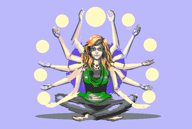
|
|
|
IP Logged |
|
|
cele1989
Commander
Joined: 25 December 2021 Location: Belgium Online Status: Offline Posts: 163 |
Posted: 18 May 2010 at 3:30am |
|
@Onek, I must say that I like this edit so much! I totally gives it that mysterious look! The colors are great! The shape is good. There aren't really things that still bother me when I look at your example. The picture makes sense. Well It might be a good idea to remove the flags, but then I have to come up with another solution for the languages on the site. Can I use your edit to continue with? I don't have much time anymore because of school. But once the exams are over I'll continue! Can't wait to get my site finished!
|
|
|
IP Logged |
|
|
skamocore
Admiral 
Joined: 07 April 2021 Online Status: Offline Posts: 3866 |
Posted: 18 May 2010 at 3:58am |
|
Ah, so now do you see why people were saying that you should work on a much smaller canvas? I reckon you should have another go and try working at 1/4 of this size; it will afford you much greater control at a pixel level and you can always upscale it in the end.
About the languages, you could easily have them represented as floating orbs with flag colours. Or you could just put them in a separate location ie. in the corner somewhere. Edited by skamocore - 18 May 2010 at 3:58am |
|
|
IP Logged |
|
|
onek
Commander
Joined: 19 May 2009 Online Status: Offline Posts: 416 |
Posted: 18 May 2010 at 6:06am |
|
@ cele: thx, my pleasure.. ^^
sure u can use it, but u should still clean it up, since its a rly dirty edit... about size and stuff: another nice way would be to make it like 1/4 or whatever and then instead of upscaling it with 'nearest neighbour' u could also convert the pixel image to vectors. there are ways to do that automatically, with adobe Illustrator, for instance... with abit of refining it can look rly nice and will save u a lot of time ... heres how it would look for my edit 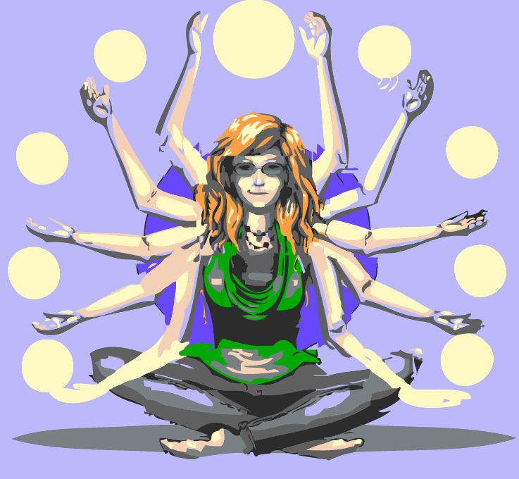 Edited by onek - 18 May 2010 at 6:06am |
|
|
IP Logged |
|
|
cele1989
Commander
Joined: 25 December 2021 Location: Belgium Online Status: Offline Posts: 163 |
Posted: 18 May 2010 at 9:35am |
|
looks nice ;)
|
|
|
IP Logged |
|
| |
||
Forum Jump |
You cannot post new topics in this forum You cannot reply to topics in this forum You cannot delete your posts in this forum You cannot edit your posts in this forum You cannot create polls in this forum You cannot vote in polls in this forum |
|


