| Active TopicsSearchRegisterLogin |
| WIP (Work In Progress) | |
| |
  |
| Page of 2 Next >> |
| Author | Message |
|
Froppe
Seaman 
Joined: 31 July 2010 Online Status: Offline Posts: 23 |
  Topic: improve my pixelart Topic: improve my pixelartPosted: 31 July 2010 at 5:08pm |
|
Hi, this is my first post here. I have been lurking around here for a while and decided it was time to register.
i been trying to learn to pixelart for a while now and i want some help how i can improve my art
 this is what i got so far, any ideas how i can improve it? |
|
 IP Logged IP Logged |
|
|
Xamllew
Midshipman 
Joined: 22 August 2009 Location: United States Online Status: Offline Posts: 51 |
Posted: 31 July 2010 at 5:48pm |
|
First thing you need to improve on is your human anatomy, specifically proportions of the face, your character has several issues with positioning of parts and proportions of certain parts, for example, his nose is much too far down.
Take a look at this and look at where each piece of the face is on the grid. http://i269.photobucket.com/albums/jj50/innisart/Blog%20Images/Beauty/gc_1.jpg Edited by Xamllew - 31 July 2010 at 5:52pm |
|
|
IP Logged |
|
|
Froppe
Seaman
Joined: 31 July 2010 Online Status: Offline Posts: 23 |
Posted: 31 July 2010 at 6:19pm |
|
IP Logged |
|
|
W M
Commander 
Joined: 08 November 2015 Online Status: Offline Posts: 132 |
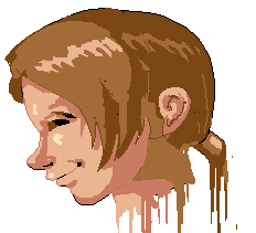
Posted: 31 July 2010 at 9:52pm |
 Sorry, please ignore the style change, thick lines, and scratchyness of my edit. Essentially what I was trying to show you is that you need to shorten the widht of the head, line up the ear halfway across the head, move the eve down, straighten the jaw, and add a little cotrast/hue shifting in your picture. My edit is far from refined, but hopefully it shows the proper positioning of most of the facial features. Edited by W M - 31 July 2010 at 9:56pm |
|
|
IP Logged |
|
|
Froppe
Seaman
Joined: 31 July 2010 Online Status: Offline Posts: 23 |
Posted: 01 August 2010 at 8:16am |
|
so i decided to remake the picture and try to follow your help.

this is what i got so far. is this better?
|
|
|
IP Logged |
|
|
onek
Commander
Joined: 19 May 2009 Online Status: Offline Posts: 416 |
Posted: 01 August 2010 at 8:42am |
|
looks much better now... but i think u should go smaller, maybe half the size heres an edit i made, maybe it can help with shading and colors and such... i think ur colors were much too bright and saturated, i also added a bit of hue shift to make them more interesting...
 another thing id like to point out is, that u shouldnt aa in this early stage, cause if u have to rework stuff like general shape, all the work was for nothing,... keep aa for the final refinements
Edited by onek - 01 August 2010 at 10:39am |
|
|
IP Logged |
|
|
Froppe
Seaman
Joined: 31 July 2010 Online Status: Offline Posts: 23 |
Posted: 01 August 2010 at 11:16am |
|
IP Logged |
|
|
cure
Commander
Joined: 23 March 2022 Online Status: Offline Posts: 2859 |
Posted: 01 August 2010 at 12:14pm |
|
looks tons better. did you use a reference?
quick edit:  |
|
|
IP Logged |
|
|
W M
Commander
Joined: 08 November 2015 Online Status: Offline Posts: 132 |
Posted: 01 August 2010 at 4:37pm |
|
Big improvement! The character has a lot more.... character now! :D
Now don't be afraid to blow in large areas when you're shading -- just remember where your lightsource is, shade his head as those you were shading the basic shapes that it's built out of, and you're good to go.  |
|
|
IP Logged |
|
|
RoboBOT
Seaman
Joined: 21 May 2008 Online Status: Offline Posts: 30 |
Posted: 01 August 2010 at 10:06pm |
 Here's a bit of an edit, working off of cure's edit. What I did: 1 - The nose. Yours curves rather a lot, and flattens out below the eye. If you look at most people in profile, you'll see that the nose is much straighter and doesn't flatten out before the eye. In fact, the nose slopes all the way to your brow line. 2 - The forehead. I made is slant backwards more. If you look at most people in profile, you'll see that foreheads do slant a bit. 3 - The lips/mouth. First, I made the mouth line much shorter, because in profile the lips don't extend that far back. I didn't mess with the chin (looks nice) or the neck (at this stage it looks fine) or the hair (I'm useless on hair) or the ear. The ear I think is a bit big and too far back on the head, but I didn't want to tackle that on the edit (ears are hard...) Looking good so far! Keep improving on the basic shape, then work on the shading. There's no point in shading until the shape looks correct, right? The best way to keep improving is to look at lots of references! Try an image search for people in profile, I'm sure you'll find plenty. |
|

|
|
|
IP Logged |
|
|
Froppe
Seaman
Joined: 31 July 2010 Online Status: Offline Posts: 23 |
Posted: 02 August 2010 at 5:21am |
|
First of all i want to thanks everyone that have posted in this thread, thanks you so much :)
also i do have reference that i been looking on http://th00.deviantart.net/fs22/PRE/f/2008/030/0/c/Judeau_from_Berserk_Wallpaper_by_Ceomyris.jpg
i am sorry that i didnt post that :(. i dont want it to look exactly the same.
Anyway here is my new update
 I changed some stuff but i dont want to change it to much because i want it to have the same style.
1. A changed the nose and the mouth and tried to follow what you said
2. Also the forehead is now more backwards
3. I also fixed the hair a bit because i didnt like it
4. I tried to change the ear so i would be smaller but i dont know if you can notice that so much.
Thanks for all help
/Froppe
|
|
|
IP Logged |
|
|
onek
Commander
Joined: 19 May 2009 Online Status: Offline Posts: 416 |
Posted: 02 August 2010 at 9:47am |
|
id leave the mouth as it was...., looks kinda strange now
|
|
|
IP Logged |
|
|
RoboBOT
Seaman
Joined: 21 May 2008 Online Status: Offline Posts: 30 |
Posted: 02 August 2010 at 9:40pm |
|
Ah, now that I've seen your reference I see where you're coming from. I'm not a big fan of the illustration you're working off of, but if that's what you're going for then you're not far off.
You should work on cleaning up your lines, though. Here's a mini tutorial from elsewhere in this forum (not created by me):  And here's a bit of an edit showing how you should clean up some of your lines and make curves smoother:  I didn't fix the entire image, but you get the point. Once your lines are nice and smooth, then you can start thinking about shading. |
|
|
|
|
|
IP Logged |
|
|
Froppe
Seaman
Joined: 31 July 2010 Online Status: Offline Posts: 23 |
Posted: 03 August 2010 at 6:23am |
|
i think i agree with the mouth so i took it back.
here is an update :
 i tried to clean up all the lines that i could see. Edited by Froppe - 03 August 2010 at 6:26am |
|
|
IP Logged |
|
|
RoboBOT
Seaman
Joined: 21 May 2008 Online Status: Offline Posts: 30 |
Posted: 03 August 2010 at 10:22am |
|
Much cleaner! Some of your curves need a bit of smoothing, though. The chin seems a bit pointed, and the nose a bit angular. Also, the odd shaped bulge in front of his eye needs fixing (take a look at my edit to see what I mean). Also, I'd consider changing the shape of the back of his neck as cure suggested. As is, the neck seems a bit wide and misshapen.
Looking good, though! Keep going! |
|
|
|
|
|
IP Logged |
|
|
Froppe
Seaman
Joined: 31 July 2010 Online Status: Offline Posts: 23 |
Posted: 03 August 2010 at 11:30am |
|
oh i tought he meant i should shade that part.
but here is what i got now
 i tried to fix the things you said. so i think it looks good now. but you always find something that looks wierd ^^ |
|
|
IP Logged |
|
|
ekobor
Commander
Joined: 20 February 2018 Online Status: Offline Posts: 194 |
Posted: 03 August 2010 at 1:43pm |
|
You're still dealing with a few odd things in your anatomy. I'm not an expert by any means, but this is what I noticed:
Your neck does not flow from the skull, and extends down too far -- we should see the shoulder from how far you've shown. This is a male character? The jawline seems weak. I see that it is following from your reference. There is no need to follow it that closely; pulling errors from your reference will only magnify them. Your ear is quite far back; it seems that the cranium is extended backwards, which seems to cause this and the neck issues. Your chin, nose, and bridge are slightly off in their curvatures. I did this edit just to show a little what I mean... it's not great, I didn't clean the lines even. But I just wanted to show the neck shape and ear placement mostly. 
|
|
|
IP Logged |
|
|
cure
Commander
Joined: 23 March 2022 Online Status: Offline Posts: 2859 |
Posted: 03 August 2010 at 3:42pm |
|
i think you've made the head a lot smaller in your edit, and the eye placement was better before.
nevertheless, the ear and neck changes stand. I would pay attention to what ekobar's saying about the skull. always keep the underlying anatomy in mind, especially the skeletal structure. drawing a good bust/head means knowing what the skull and jaw look like and how the skull relates to the spine. |
|
|
IP Logged |
|
|
Froppe
Seaman
Joined: 31 July 2010 Online Status: Offline Posts: 23 |
Posted: 04 August 2010 at 11:57am |
|
hi, i just wanted to say that i am trying to improve his ear and neck but everything i do looks wierd. is it better if i restart so i can get a better shape of the head?
also i want to say that i appreciate all your help with this. but i also want to say that this do not have to become perfect. remember that i am not on the same skill level as you guys ^^
"update"
oups i mean that it didnt have to be perfect  . . Edited by Froppe - 06 August 2010 at 1:15pm |
|
|
IP Logged |
|
|
cure
Commander
Joined: 23 March 2022 Online Status: Offline Posts: 2859 |
Posted: 04 August 2010 at 1:11pm |
|
it wouldn't be a bad idea. when/if you do restart, draw out the underlying forms of the anatomy then post that before adding coloring, detail, hair, etc if you want us to adjust any issues at their source and not have to rework areas later.
we realize that different members have different skill levels, which is why we're imparting our knowledge to you. with proper guidance you should (and will) be able to construct a good human head. |
|
|
IP Logged |
|
|
Froppe
Seaman
Joined: 31 July 2010 Online Status: Offline Posts: 23 |
Posted: 04 August 2010 at 2:16pm |
|
so i tried to make a new one here is what i got right now. its probably looking wierd but i only want to know if the shape is good this time so i can continue my work
|
|
|
IP Logged |
|
|
StepDragon
Commander
Joined: 03 April 2010 Online Status: Offline Posts: 258 |
Posted: 04 August 2010 at 3:11pm |
|
It definately looks better, but there are a few things that catch my eye.
1, the head still semms a bit thick maybe reduce its width. 2, the angle of the forhead dosen't look sharp enough, as if it will touch the top of his har (which would mean he would have a bald spot, i don't think that's what you're going for) 3, the nose seems a little small compared to the rest of the features of the face. 4, the ear seems a little far into the back of the head. 5, the neck and chin could use a bit more curving to them. Seeing improvement, keep it up! |
|
|
IP Logged |
|
|
ekobor
Commander
Joined: 20 February 2018 Online Status: Offline Posts: 194 |
Posted: 04 August 2010 at 3:16pm |
|
Yes, I know I made some errors in my edit ^^;;
Working too fast, not taking time to clean... It leads to booboos D= Your neck is looking a fair bit better, but should flare outwards more at the base, for a start; there are very few straight lines in human anatomy (or nature in general for that matter!) I would also take a look at your jawline again, it seems to flow too smoothly: As you can see the jaw bone is almost a 90 degree angle Skull Which translates (especially in males) to a 'stronger', or more defined and angular jawline :see here, here: (doesn't want to hyperlink D<) http://s3.hubimg.com/u/943930_f260.jpg and here. I'd also look at the nose bridge and try and smooth it out just a bit; also placing a place-holder for the eye now can really help center the features of the face. All in all though you have a great start there (Though I will add to the list of people saying that it is easier to work smaller ;) ) Edited by ekobor - 04 August 2010 at 3:20pm |
|
|
IP Logged |
|
|
Froppe
Seaman
Joined: 31 July 2010 Online Status: Offline Posts: 23 |
Posted: 04 August 2010 at 4:12pm |
|
here is an update again

i tried to do everything that you said. looks good to me but a aint to expert :P.
also its feels like im not getting anywhere. i can see that i improve but im still at the begining. but i guess i get better the more i do.
also thanks again for all your help
|
|
|
IP Logged |
|
|
cure
Commander
Joined: 23 March 2022 Online Status: Offline Posts: 2859 |
Posted: 04 August 2010 at 6:21pm |
|
might be useful to google images of skulls/photographs of real people in profile.
 |
|
|
IP Logged |
|
|
Froppe
Seaman
Joined: 31 July 2010 Online Status: Offline Posts: 23 |
Posted: 05 August 2010 at 6:25am |
|
|
|
|
IP Logged |
|
|
onek
Commander
Joined: 19 May 2009 Online Status: Offline Posts: 416 |
Posted: 05 August 2010 at 7:29am |
|
the very first version was waaay better
|
|
|
IP Logged |
|
|
Pragz
Commander
Joined: 09 August 2009 Location: Ireland Online Status: Offline Posts: 136 |
Posted: 05 August 2010 at 7:35am |
|
His head resembles a fortune-cookie in terms of shape. Should be more circular. ):
|
|
|
Hello - I'm new here. :)
|
|
|
IP Logged |
|
|
cure
Commander
Joined: 23 March 2022 Online Status: Offline Posts: 2859 |
Posted: 05 August 2010 at 9:43am |
|
if you ignore any glaring problems now, they will only become bigger problems later, and more difficult to fix. also notice the indentation between the top of the nose's slope and the beginning of the brow. ear is still waaaay too far back, and the skull is too long (like an animals rather than the more or less circular human skull.)
|
|
|
IP Logged |
|
|
Froppe
Seaman
Joined: 31 July 2010 Online Status: Offline Posts: 23 |
Posted: 05 August 2010 at 11:07am |
|
update......
 i added a skull next to the face to see the shape of the head. but honesly i dont understand why you think it looks so bad Edited by Froppe - 05 August 2010 at 2:11pm |
|
|
IP Logged |
|
|
StepDragon
Commander
Joined: 03 April 2010 Online Status: Offline Posts: 258 |
Posted: 05 August 2010 at 2:36pm |

Use the reference you have. I didn't do much to the mouth or chin, because I was focusing on the size / shape of the head. I hope this helps illustrate a few things. |
|
|
IP Logged |
|
|
cure
Commander
Joined: 23 March 2022 Online Status: Offline Posts: 2859 |
Posted: 05 August 2010 at 3:48pm |
|
very useful overlay. you can see that the jawline doesn't cut straight
back, cut curves up to meet the ear. you see that the mouth you've got
cuts back as far as the molars.
here is an edit:  |
|
|
IP Logged |
|
|
Froppe
Seaman
Joined: 31 July 2010 Online Status: Offline Posts: 23 |
Posted: 06 August 2010 at 1:23pm |
|
if i do follow the things that you say it wont look as my reference, my goal was to make a picture that was similar to that. http://th00.deviantart.net/fs22/PRE/f/2008/030/0/c/Judeau_from_Berserk_Wallpaper_by_Ceomyris.jpgEdited by Froppe - 06 August 2010 at 3:46pm |
|
|
IP Logged |
|
|
onek
Commander
Joined: 19 May 2009 Online Status: Offline Posts: 416 |
Posted: 06 August 2010 at 2:30pm |
|
if i do follow the things that you say it wont look as my reference, my goat was to make a picture that was similar to that.
i totally agree...
this thread seems to be stuck somehow.... theres a lot of anatomy chatter going on, but come on guys its anime, its not supposed to be a photorealistic portrait....
i think its since like 25 posts that there isnt any improvement here, more likely the opposite...
the first new take on this was actually quite promising, at that point u should have moved on to the next stage, like shading, instead u got confused by some blahblahblah by people not accepting some specific style....
i donno, ...
heres another edit with the promising lineart i was talking about to illustrate that there wasnt really anything wrong with it
maybe it helps u to move on
 Edited by onek - 06 August 2010 at 3:02pm |
|
|
IP Logged |
|
|
Delicious
Rear Admiral 
Joined: 18 January 2015 Online Status: Offline Posts: 273 |
Posted: 06 August 2010 at 4:30pm |
|
In my opinion, even if you are producing an anime-styled piece, basic knowledge of anatomy is important.
Anyways, I did a small sketch-over based on that reference. Perhaps it could help you?  I also agree to Cure's post down below. v Edited by Delicious - 06 August 2010 at 7:57pm |
|
|
IP Logged |
|
|
cure
Commander
Joined: 23 March 2022 Online Status: Offline Posts: 2859 |
Posted: 06 August 2010 at 5:03pm |
|
we're not asking him to make it as realistic as our edits, he's free to stylize as he wishes- but abstraction is most efficient when there is a clear understanding of the forms on which the abstractions are based. which anatomy crit applies only to realism, and not to anime? (in fact, every anatomy crit i've seen thus far applies to the reference that the artist says he's attempting to emulate)
and why make it look just like the reference? you should make it your own way, and only use the reference as, well, a reference. if you're trying to make fanart of a specific character, then I can see where you're coming from (which is why it's important to state your intended goal in the beginning, so we know what you're trying to achieve). Even then, I think it'd be more interesting to do a pre-existing character in your own way, but if you want to achieve a very specific style, then we should know that, so that we don't point you in the wrong direction. |
|
|
IP Logged |
|
|
Froppe
Seaman
Joined: 31 July 2010 Online Status: Offline Posts: 23 |
Posted: 07 August 2010 at 12:17pm |
|
onek that looks awesome ^^ but i want mine to be not as dark as it. looks kinda scary :P  coloring is something i want to become better at. delicious that looks good, i like it. but i dont want to works on the shape anymore, but mabye i will fix something later.
also i want to say that i am sorry for being such lousy threadmaker. i often dosent use forum. but at this one i have something to talk about :P.
also i want to make my picture in my own style with colors and such
|
|
|
IP Logged |
|
|
Delicious
Rear Admiral
Joined: 18 January 2015 Online Status: Offline Posts: 273 |
Posted: 07 August 2010 at 1:52pm |
|
Much improved. Before you get into the fine details, maybe just smooth out the jaggedy/sharp pixels? The shading on the ear is quite awkward as well.
|
|
|
IP Logged |
|
|
Froppe
Seaman
Joined: 31 July 2010 Online Status: Offline Posts: 23 |
Posted: 08 August 2010 at 10:02am |

i fixed the ear a bit. i used the shape from your picture delicious, hope you dont mind. :P
also i dont know where you mean sharp pixels.
anyway i dont know how to improve from here so it looks better, should i use more colors so u can see the shading more?
|
|
|
IP Logged |
|
|
cure
Commander
Joined: 23 March 2022 Online Status: Offline Posts: 2859 |
Posted: 08 August 2010 at 11:03am |
|
i'd either lose the outlines or make them much darker, they're barely visible atm. if the shading is not visible, it's due to low contrast and not a lack of colors.
sharp pixels are jaggies. trace over the outline in your mind, notice where there are little jumps in the outline that make it jagged and form tiny angles? try smoothing those out. ear is still really far back, the jawline shouldn't just dive out to meet the ear, the ear should be adjusted to fit the jawline. right now the back of the jaw slopes far back, it should be more vertical  tbh i still think it'd be advantageous to work a bit smaller (especially since you're a beginner- forces you to focus on the pixels). understandable if you wouldn't want to start over yet again though (although you wouldn't lose much work resizing, the outlines will need to be fixed up a lot anyway) Edited by cure - 08 August 2010 at 4:30pm |
|
|
IP Logged |
|
|
Delicious
Rear Admiral
Joined: 18 January 2015 Online Status: Offline Posts: 273 |
Posted: 08 August 2010 at 12:49pm |
|
Nah, I don't mind. Here are some sharp lines I found, try smoothing them out if you can. I suggest you apply Cure's criticism before doing so, though.

|
|
|
IP Logged |
|
|
Froppe
Seaman
Joined: 31 July 2010 Online Status: Offline Posts: 23 |
Posted: 09 August 2010 at 1:27pm |
 i dont think i should fix the ear because then it looks all wierd so i need to fix the other parts. and then i could just restart. also i tried to smoothing out the parts that you said i should do.
now i dont want to work more on the shape. i want to learn how to use colors right. because when i do it, its nothing special but when is see other members pixelart they look awesome. like onek did in this thread
|
|
|
IP Logged |
|
|
Delicious
Rear Admiral
Joined: 18 January 2015 Online Status: Offline Posts: 273 |
Posted: 09 August 2010 at 4:35pm |
|
Well, before we could properly give you criticism on using colors "right", we need to see you try.
I edited a photograph (made it black and white and up'd the contrast) of a mans face were the angle and light source seem similar to that of your piece, so I thought it could help. 
Edited by Delicious - 09 August 2010 at 4:36pm |
|
|
IP Logged |
|
|
cure
Commander
Joined: 23 March 2022 Online Status: Offline Posts: 2859 |
Posted: 09 August 2010 at 4:37pm |
|
well, it looks weird now, moving it would actually make it less weird. i don't think it's that you feel you shouldn't, but that you don't want to, because you forsee the work that will be required. this is probably not the best way to approach a wip, but I understand that you've been stuck at this stage for a while and you're anxious to continue. If the piece were smaller (it is best for all newcomers to work with small canvases until they've gained some mastery of pixeltech) then it would take less work to readjust, which is one reason smaller canvases are recommended.
as it is the ear is nowhere near that far from the eye, so you've got a very large side of the head. the hair placement conceals this empty expanse of skin, so perhaps that is what makes it look more "correct" than it really is. I think it's a large enough problem to warrant fixing, but if you'd like to proceed and get this piece over with i definitely see where you're coming from, you shouldn't get worn out and bored with a piece too early. so if you're really unwilling to fix it, just keep this knowledge in mind for next time and proceed as you wish. -also, focus on the forms of the face (cheekbones, brow, etc etc) and work them out with shadow and highlight, colors can be easily adjusted towards the end. you can work on color and form at the same time of course, but form (the mounds and valleys of the head and face) should be the primary focus at this point Edited by cure - 09 August 2010 at 5:01pm |
|
|
IP Logged |
|
|
Froppe
Seaman
Joined: 31 July 2010 Online Status: Offline Posts: 23 |
Posted: 10 August 2010 at 4:47am |

ok i guess is better to follow what you guy think is the best thing to do so i made it smaller
its around 65% of the orignial head. i think the ear i still farback but im not sure. im sure there is new mistakes now so i wanted to hear what you have to say before i countinue. also delicious thanks for that picture im sure i will help me Edited by Froppe - 10 August 2010 at 4:55am |
|
|
IP Logged |
|
|
cure
Commander
Joined: 23 March 2022 Online Status: Offline Posts: 2859 |
Posted: 10 August 2010 at 8:05am |
|
it's useful to know where certain features line up in relation to others. if you look in the mirror, you'll notice the top of your ears match up with the eyes, and the bottom of the ears match up with the bottom of the nose. due to the curvature of the spine and where it meets the skull, the back of the neck should slope up to meet the skull. right now, the ear is positioned the way it would be if the head were looking directly forward, but since the head is tilted down, i rotated the ear to fit it. i think the forehead could still slope back a bit more, so i drew the shape of the head on my edit in case you find it helpful. remember that the jaw doesn't cut straight back, but slopes up at an angle, until it's more or less under the ear, at which point it travels straight up to meet it (the slope may not always be as extreme as that in my edit, however)
useful results from googling "head in profile"/related terms: 1 2 3 4 5 6 7 8 edit:  and though it isn't shown in my edit, i think the way the ponytail pulls the mass of hair could be altered, right now there's a general unfocused mass toward the back of the head, but i think it would look better if the mass toward the ponytail remained the same, but you lost some mass toward the top of the back of the head, so that it's obvious the ponytail is 'pulling' the hair with its weight (see my last couple reference images, or google something similar to "ponytail profile" to see what i mean). Edited by cure - 10 August 2010 at 8:24am |
|
|
IP Logged |
|
|
Froppe
Seaman
Joined: 31 July 2010 Online Status: Offline Posts: 23 |
Posted: 10 August 2010 at 3:23pm |
 i tried to fix what you said with the ear and stuff. almost feel like this picture is to hard for me to do. |
|
|
IP Logged |
|
|
Pumpkinbot
Commander
Joined: 05 May 2009 Online Status: Offline Posts: 202 |
Posted: 10 August 2010 at 5:03pm |
|
Originally posted by Froppe Don't give up! I did on a crapload of projects, and now I regret it! This has potential, just DON'T GIVE UP!i tried to fix what you said with the ear and stuff. almost feel like this picture is to hard for me to do. Now...First, his nose is at a 90 degree angle. Look in the mirror at your own nose. Does it really do that? Second, I'm actually going to congratulate you on making the neck too thick, 'cause people tend to make them too thin. :P Anyway, if I were you, I'd erase the hair and draw the head bald, and then do the hair. It'll make it look a lot better. :) |
|
|
IP Logged |
|
|
cure
Commander
Joined: 23 March 2022 Online Status: Offline Posts: 2859 |
Posted: 10 August 2010 at 7:16pm |
|
you're getting better with every post! stick with it, and we'll continue providing any help we can until it's finished. this is completely within your abilities to complete, just stay determined and you'll see it through.
nose definitely slopes more than a real life nose, but it seems stylized and you're not going for hyper-realistic, so i don't think it'll be too much of a problem. still think the neck is a problem though, maybe fix it up and we can get to some shading? just need to take a little nick out of it.  Edited by cure - 10 August 2010 at 7:18pm |
|
|
IP Logged |
|
|
Froppe
Seaman
Joined: 31 July 2010 Online Status: Offline Posts: 23 |
Posted: 11 August 2010 at 12:25pm |
 fixed the hair abit also the neck.  here is one with the same as the other one but i fixed the nose a bit, but not much. i let you decide wich one looks best.
also i found this http://media.animevice.com/uploads/0/321/21558-judeau_1_large.jpg mabye it is a little better reference then the other one but i guess it dosent matter much now anyway Edited by Froppe - 11 August 2010 at 12:28pm |
|
|
IP Logged |
|
| Page of 2 Next >> |
| |
||
Forum Jump |
You cannot post new topics in this forum You cannot reply to topics in this forum You cannot delete your posts in this forum You cannot edit your posts in this forum You cannot create polls in this forum You cannot vote in polls in this forum |
|


