| Active TopicsSearchRegisterLogin |
| WIP (Work In Progress) | |
| |
  |
| Author | Message |
|
Xuiryus
Seaman 
Joined: 20 September 2010 Online Status: Offline Posts: 11 |
  Topic: Pillar Topic: PillarPosted: 21 September 2010 at 10:56am |
|
So I've attempted to recreate a pillar from star wars (very badly I might add) I've had some serious loss of faith in my skills recently and I wanna try and go back to basics to build a stronger foundation.
I really need help on the most basic of things...pallet selection light sources etc...everything basically.. Anyways pillar and reference.  Edited by Xuiryus - 21 September 2010 at 10:56am |
|
 IP Logged IP Logged |
|
|
onek
Commander 
Joined: 19 May 2009 Online Status: Offline Posts: 416 |
Posted: 21 September 2010 at 11:27am |
|
are u sure u looked at the reference when u made that?... coz it looks quite nothing like it... O__O
|
|
|
IP Logged |
|
|
cure
Commander
Joined: 23 March 2022 Online Status: Offline Posts: 2859 |
Posted: 21 September 2010 at 11:41am |
|
try not to start too many wip threads at once. if you're working on multiple projects, you can condense them in a single thread.
your pillar is the same width all the way up, whereas the reference has three different layers of thickness. also, the lines that cut across it are at diagonals, and not horizontals as in your image. not sure how closely you're trying to mimic the original, but those are the primary differences. |
|
|
IP Logged |
|
|
Xuiryus
Seaman
Joined: 20 September 2010 Online Status: Offline Posts: 11 |
Posted: 21 September 2010 at 11:43am |
|
Yes thats what I'm saying I've had a total loss of faith in my abilities and I'm looking for help. I can't seem to do anything without getting discouraged almost instantly.
The Tardis I added to my gallery is probably the best example of my abilities and the "pillar" above is my worst. |
|
|
IP Logged |
|
|
jalonso
Admiral 
Joined: 29 November 2022 Online Status: Offline Posts: 13537 |
Posted: 21 September 2010 at 11:45am |
|
Pillar isn't bad it just doesn't replicate the Star Wars one. Be patient and stick thru one thing at a time. Makes work easier if you learn one thing/skill and carry it to the next project. Pixelart likes patience.
|
|
|
|
|
|
IP Logged |
|
|
Xuiryus
Seaman
Joined: 20 September 2010 Online Status: Offline Posts: 11 |
Posted: 21 September 2010 at 11:51am |
|
The pillar is something new I created to attempt to get help on rebuilding my skills. I forgot to mention that the pillar I've created is meant to be seen from a frontal angle and not sidewards like in the screencap.
I attempted to upload an edited version with changed width however I accidentally overwrote the original pillar, so please see the original post for the edited pillar. |
|
|
IP Logged |
|
|
jalonso
Admiral
Joined: 29 November 2022 Online Status: Offline Posts: 13537 |
Posted: 21 September 2010 at 12:46pm |
|
"So I've attempted to recreate a pillar from star wars" is your original post. 2 very skilled pixelartists and I have said the same thing to you who is admittedly learning/polishing skills. What are the chances that you would be right, and if so, what c+c are you looking for?
Regardless of what angle you are showing the column if you want it to be as your ref, needs to look like your ref. Loads of c+c, help and tips will be found here but if people notice it goes unused that flow does stop...just sayin'  Edited by jalonso - 21 September 2010 at 2:06pm |
|
|
|
|
|
IP Logged |
|
|
Berserk
Seaman
Joined: 05 August 2010 Online Status: Offline Posts: 28 |
Posted: 21 September 2010 at 2:00pm |
|
Even from the angle you say you want to draw the pillar, it's not quite right. The proportions and shape of the two sheaths are different in your reference than in your art. I would recommend looking at the reference very carefully and maybe even measuring the proportions to make you art more accurate. Furthermore, I think the angle you've chosen is less interesting because it doesn't show the interesting geometry involved in the column. Play to your source's strengths.
Also, I would reconsider the colors you're using. They don't look bad, but your reference has very different colors and the lighting in the ref is more interesting than what you've drawn (notice how there seem to be two different lightsources--an orange light from the right side and a bluish light from the left). So maybe try to imitate your ref more closely. You're just going to have to knuckle down and work at it some more before you can get more specific help than what these guys already gave you. |
|
|
IP Logged |
|
|
Xuiryus
Seaman
Joined: 20 September 2010 Online Status: Offline Posts: 11 |
Posted: 21 September 2010 at 4:28pm |
|
I'm sorry if it seemed I was ignoring comments made by some of the
members here, I can assure you it wasn't intentional and I'll be more
careful in the future.
I've taken a few ideas on board while remaking this and I have to agree the geometry is much more interesting when taken from the reference picture rather than attempting a forward facing look. Although the colouring and lighting still needs some work I believe this is a great improvement. |
|
|
IP Logged |
|
|
jalonso
Admiral
Joined: 29 November 2022 Online Status: Offline Posts: 13537 |
Posted: 21 September 2010 at 6:21pm |
|
It's better. Maybe too many colors and dithering on this seems inappropriate. Try to make those curves consistent.
|
|
|
|
|
|
IP Logged |
|
|
Xuiryus
Seaman
Joined: 20 September 2010 Online Status: Offline Posts: 11 |
Posted: 21 September 2010 at 6:38pm |
|
Changed the dithering to more of a messy spill into each colour (not sure if theres a term for this) Think it gives it a sorta marble/stone look. Will do more tomorrow :)
|
|
|
IP Logged |
|
|
jalonso
Admiral
Joined: 29 November 2022 Online Status: Offline Posts: 13537 |
Posted: 21 September 2010 at 7:15pm |
|
That's dithering too, just more free-form than the 50/50 you had before. Its best if you don't dither as straight lines tho. Try to follow the curve of the column and it will help it round it :)
Look at your ref image, that column has blues, purples and yellows to create your browns. |
|
|
|
|
|
IP Logged |
|
|
Berserk
Seaman
Joined: 05 August 2010 Online Status: Offline Posts: 28 |
Posted: 21 September 2010 at 10:11pm |
|
What are you making this pixel for? A standalone piece or part of something bigger? Is it supposed to be an exact replica of the column, or are you just inspired by it?
|
|
|
IP Logged |
|
|
Xuiryus
Seaman
Joined: 20 September 2010 Online Status: Offline Posts: 11 |
Posted: 22 September 2010 at 2:47am |
|
It's for a small star wars based area in a game. The pillar should be very similar in design but it doesn't have to be an exact perfect copy. As long as it follows the same design/look it'll be fine.
I'll try improving it later on today and hopefully I'll make some better progress. |
|
|
IP Logged |
|
|
Xuiryus
Seaman
Joined: 20 September 2010 Online Status: Offline Posts: 11 |
Posted: 22 September 2010 at 5:57pm |
|
I was wondering if anyone could offer advice on picking better colours for this? I can't seem to do anything but different shades of the same brown. I attempted to show a blueish looking light source but it just looked weird...
Edit: Case and point Edited by Xuiryus - 22 September 2010 at 6:04pm |
|
|
IP Logged |
|
|
jalonso
Admiral
Joined: 29 November 2022 Online Status: Offline Posts: 13537 |
Posted: 22 September 2010 at 6:18pm |
|
Check the 'I don't get it' color thread. This might work for you since its made from one color ramp.
This was posted by onek on a recent WIP thread onek: ...a technique for nice, natural color ramps that I'm recently using, is to spice up the colors simply by putting some 10% opacity fill of (full!) blue, magenta, red and yellow, from dark to bright, the result then (because of the full tones) looks very comic-ish, (sometimes thats nice too...)... if I'm not satisfied, I pretty much try to edit the colors as I would do editing a photo, meaning 'color balance', 'hue/ saturation', contrast etc editing... maybe this makes it more clear 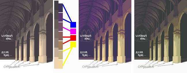
|
|
|
|
|
|
IP Logged |
|
|
Berserk
Seaman
Joined: 05 August 2010 Online Status: Offline Posts: 28 |
Posted: 22 September 2010 at 7:06pm |
|
I like the way that blue highlight looks--it looks like there could be a lightsaber duel off to the left
 Edited by Berserk - 22 September 2010 at 7:06pm |
|
|
IP Logged |
|
|
jalonso
Admiral
Joined: 29 November 2022 Online Status: Offline Posts: 13537 |
Posted: 23 September 2010 at 1:51pm |
|
OT

|
|
|
|
|
|
IP Logged |
|
| |
||
Forum Jump |
You cannot post new topics in this forum You cannot reply to topics in this forum You cannot delete your posts in this forum You cannot edit your posts in this forum You cannot create polls in this forum You cannot vote in polls in this forum |
|
