| Active TopicsSearchRegisterLogin |
| WIP (Work In Progress) | |
 Topic: First serious work Topic: First serious work |
  |
| Author | Message |
|
|RedNosE|
Seaman 
Joined: 04 February 2011 Online Status: Offline Posts: 2 |
  Topic: First serious work Topic: First serious workPosted: 05 February 2011 at 2:30pm |
|
First of all I am new to the forum and do not know if this is the correct area. This is my first job taken seriously, I want you to rate and tell me what I should improve and what to avoid.
I used this template: 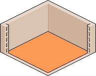
Result: 
|
|
 IP Logged IP Logged |
|
|
cure
Commander 
Joined: 23 March 2022 Online Status: Offline Posts: 2859 |
Posted: 05 February 2011 at 3:02pm |
|
try using less saturated colors. the shadows aren't consistent, I assume your light source is overhead, yet the computer desk casts no shadow directly below, instead it behaves as if the light is coming from the right, at about floor level. the border around the window is a bit thick and makes it looks like a frame (window is also a peculiar shape, maybe that's common where you're from). Computer screen seems a bit short.
|
|
|
IP Logged |
|
|
|RedNosE|
Seaman
Joined: 04 February 2011 Online Status: Offline Posts: 2 |
Posted: 05 February 2011 at 3:49pm |
|
Okay, I will improve soon I'll post the result.
|
|
|
IP Logged |
|
|
vlad61
Midshipman 
Joined: 22 April 2015 Online Status: Offline Posts: 96 |
Posted: 06 February 2011 at 8:01pm |
|
The cracks and spider webs are out of place. Or maybe try making them fit by adding more age to the room. as of now it doesnt look like its very old at all
|
|
|
IP Logged |
|
| |
||
Forum Jump |
You cannot post new topics in this forum You cannot reply to topics in this forum You cannot delete your posts in this forum You cannot edit your posts in this forum You cannot create polls in this forum You cannot vote in polls in this forum |
|
