| Active TopicsSearchRegisterLogin |
| WIP (Work In Progress) | |
| |
  |
| Author | Message |
|
saji82NO
Seaman 
Joined: 12 December 2011 Online Status: Offline Posts: 13 |
  Topic: WIP potential character idea of mine Topic: WIP potential character idea of minePosted: 13 December 2011 at 9:30pm |
|
Please don't steal this!!!!
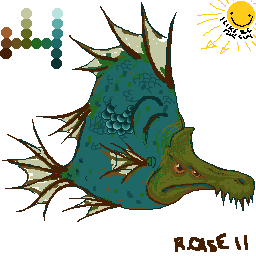
First time posting here and having my intellectual property jacked would be something like a turd... lol anyways here it is so far, like the title says WIP. 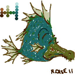 What is thought of the color set? Obviously there is more work to be done. Im starting really rough and will work down into the details. I will post as I complete more of it. 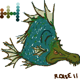 Added a bit of lining to define the shape better. I guess its not horrible... Added a bit of lining to define the shape better. I guess its not horrible... BTW it has 4 eyes, not 2, hence two on one side lol i know Im weird. Edited by saji82NO - 13 December 2011 at 10:16pm |
|
 IP Logged IP Logged |
|
|
tanuki
Commander 
Joined: 01 April 2014 Online Status: Offline Posts: 333 |
Posted: 13 December 2011 at 11:04pm |
|
It's looking better as you work. Starting out rough is usually how I do things too. I've never seen a finished product from you so I don't know for sure just how detailed or refined you're going to go, but I'm hoping you keep going much further with this because it has a lot of potential.
The colors are working fairly well so far, though I'd normally have at least one color that's darker than the darkest that you have. Probably some sort of dark blue or purple. Don't worry about people stealing things, since this site has no tolerance for it and normally the only issue I ever see is sometimes new people posting here not knowing what a rip is. It's not something you need to bother warning people about around here. Edited by tanuki - 13 December 2011 at 11:49pm |
|
|
IP Logged |
|
|
saji82NO
Seaman
Joined: 12 December 2011 Online Status: Offline Posts: 13 |
Posted: 14 December 2011 at 8:33am |
 Started smoothing out the external contours. Am I headed in the right direction as far as procedure? Started smoothing out the external contours. Am I headed in the right direction as far as procedure?Thanks tanuki for posting. Yeah I am not on the best machine for graphic anything(bare bones dell laptop) and the darkest blue looks close to black for me. I may need to adjust the display but I have nothing to compare it to lol. Im building a better PC for artistic purposes, programming, and just in general(games ;) ). Maybe then with a better monitor I can pick up slight differences in colors. I dont think I want to change it at this point just as an exercise. I wanted to work with strictly 16 color choices. For the final project where I hope to use this fish I will probably have to change the palette. (something along the lines of a hellspawn fish sent to earth to destroy all aquatic goodness and happiness scrolling shooter type game, dont steal that either!) So I may need a bit more brilliant palette or a few brighter options to contrast. Anyways its fun doing this pixel stuff. |
|
|
IP Logged |
|
|
saji82NO
Seaman
Joined: 12 December 2011 Online Status: Offline Posts: 13 |
Posted: 14 December 2011 at 6:42pm |
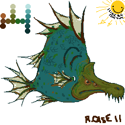 A little more work done. added a goofy sun to help me visualize light direction and to lighten up my day... waka waka waka... tweaked the palette a bit after converting to grayscale just to see shade relationships. A little more work done. added a goofy sun to help me visualize light direction and to lighten up my day... waka waka waka... tweaked the palette a bit after converting to grayscale just to see shade relationships. Im getting a bit nervous about shading it. I want it to be rather dak but the palette is relatively light. I also want contrast... i wonder if i can have everything? Well off to kickboxing I go. Any tips or suggestions are welcomed. |
|
|
IP Logged |
|
|
saji82NO
Seaman
Joined: 12 December 2011 Online Status: Offline Posts: 13 |
Posted: 14 December 2011 at 10:51pm |
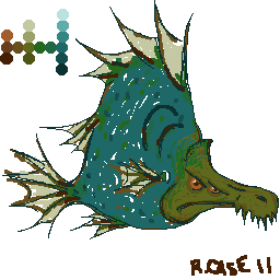
 Maybe Ill do that for the scales? A little like the way tattoo artists handle the Koi tattoos Maybe Ill do that for the scales? A little like the way tattoo artists handle the Koi tattoos
|
|
|
IP Logged |
|
|
Delicious
Rear Admiral 
Joined: 18 January 2015 Online Status: Offline Posts: 273 |
Posted: 15 December 2011 at 12:11am |
|
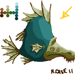
You're getting nervous about the shading because you seem to just be diving right into it. You should consider blocking out the shadows and highlights before you start texturing your piece, otherwise it'll look very odd when you progress. Make sure you have a strong shadow structure before you even consider doing those scales!

Really bad example, but it should help get the point across. Make sure you don't skip that step, it's very important to block out your piece before you go into the detail. Colors are also a bit bland and icky, but that can easily be fixed later on. Hope that helps! |
|
|
IP Logged |
|
|
saji82NO
Seaman
Joined: 12 December 2011 Online Status: Offline Posts: 13 |
Posted: 15 December 2011 at 8:24am |
|
whoa! ha nice thanks, apparently i jumped the gun. I will take a few steps back and do some more blocking out before I detail.
Lol your quick example looks closer to my original thought than what it was ending up becoming as I worked on it. The icky palette was intentional to some degree. If I ever get to making this into a game character I wanted it to be icky dark bland nasty etc. in contrast to the background and "bad" guys(actually good and happy little aquatic creatures) and their bright and energetic color sets. Although I wanted one palette for the entire game, that would mean I need to change this one to accommodate the bright stuff. Thanks again for the input I will process it through the day and post as I get something done later on. |
|
|
IP Logged |
|
|
saji82NO
Seaman
Joined: 12 December 2011 Online Status: Offline Posts: 13 |
Posted: 15 December 2011 at 5:34pm |
  Hug help Delicious! Thank you, that post got me off in a better direction. I really like your interpretation but it still must be mine so I went back over the first image, filled it in better and blocked out the shading. I think itll go much better now. I was envisioning the fins as the lighter greenish color but looking back at your depiction Im starting to like the red fins. I think it balances the colors off and provides representation of the 3 major light colors. Oof oof coming from painting with paint and canvas makes color theory in light difficult... I have to start replacing yellow with green. In pigment yellow is the a primary not green. Update* Yours still has better dimension. I wish I had more formal arts training. I went to a highschool specifically aimed at arts instruction(i was in visual arts) but its been so long that Ive lost it. The second png is a bit more work. I think Ill go back and hit the shadows like you have done and move the light source a bit behind the viewer to add the other side of the fish. right now mine looks like someone splayed it down the center and plopped it cut side down. Edited by saji82NO - 15 December 2011 at 6:30pm |
|
|
IP Logged |
|
| |
||
Forum Jump |
You cannot post new topics in this forum You cannot reply to topics in this forum You cannot delete your posts in this forum You cannot edit your posts in this forum You cannot create polls in this forum You cannot vote in polls in this forum |
|
