| Active TopicsSearchRegisterLogin |
| WIP (Work In Progress) | |
 Topic: WIP: Chamber of Dispair Topic: WIP: Chamber of Dispair |
  |
| Author | Message |
|
Anfiniti
Seaman 
Joined: 09 October 2015 Online Status: Offline Posts: 7 |
  Topic: WIP: Chamber of Dispair Topic: WIP: Chamber of DispairPosted: 24 March 2012 at 12:32am |
|
I want to try pixel art with a larger size than I'm used to, so I'm trying to make this.
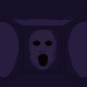 I'm not too experienced, so any critique or advice is welcome. |
|
 IP Logged IP Logged |
|
|
Anfiniti
Seaman
Joined: 09 October 2015 Online Status: Offline Posts: 7 |
Posted: 24 March 2012 at 9:14pm |
|
Hmm...
|
|
|
IP Logged |
|
|
crozier
Commander 
Joined: 08 May 2023 Online Status: Offline Posts: 190 |
Posted: 25 March 2012 at 7:41am |
|
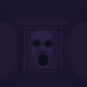
Up the contrast. And perhaps add an even lighter color forthe tip of the nose and forehead.
The mouth could also be fixed to appear more realilistic.
|
|
|
IP Logged |
|
|
Partack
Commander
Joined: 20 October 2011 Online Status: Offline Posts: 260 |
Posted: 25 March 2012 at 8:41am |
|
Originally posted by crozier
The mouth could also be fixed to appear more realilistic. how? |
|
|
IP Logged |
|
|
smk
Commander
Joined: 22 February 2009 Online Status: Offline Posts: 150 |
Posted: 29 March 2012 at 9:12am |
|
An example of the contrast, these are probably not the colors YOU are looking for, but they'll give you an idea of how it might be better:
You need to make the details stand out more with bigger darkness/lightness differences between the colors. |
|
|
IP Logged |
|
|
Long
Commander
Joined: 21 July 2022 Online Status: Offline Posts: 101 |
Posted: 30 March 2012 at 12:05am |
|
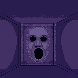
This does indeed bring out the details more, thought it destroys the mood/the feeling of darkness/uneasiness it was emitting imo.
|
|
|
IP Logged |
|
|
smk
Commander
Joined: 22 February 2009 Online Status: Offline Posts: 150 |
Posted: 30 March 2012 at 2:11am |
|
True, but as it stands it has way too little contrast, and feels very desaturated. Perhaps a colors or two more might help. Hmm...
Edited by smk - 30 March 2012 at 2:11am |
|
|
IP Logged |
|
|
jeremy
Rear Admiral 
Joined: 25 November 2024 Location: New Zealand Online Status: Offline Posts: 1704 |
Posted: 30 March 2012 at 3:26am |
|
You need some kind of focal point - through contrasting colours next to each other probably. Circle tool eyes look unnatural, give some kind of curve to them. Why is the mouth asymmetrical?
Here's an idea on making it more interesting; the mouth glow is p. bad:  |
|
|
IP Logged |
|
| |
||
Forum Jump |
You cannot post new topics in this forum You cannot reply to topics in this forum You cannot delete your posts in this forum You cannot edit your posts in this forum You cannot create polls in this forum You cannot vote in polls in this forum |
|
