| Active TopicsSearchRegisterLogin |
| WIP (Work In Progress) | |
| |
  |
| Author | Message |
|
AirStyle
Commander 
Joined: 13 November 2017 Online Status: Offline Posts: 376 |
  Topic: Head and Shoulders Topic: Head and ShouldersPosted: 15 July 2012 at 7:08am |
|
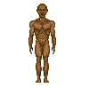
I need a little help on the pixels for this piece.

I'm having a hard time trying to get the shading on the arms and legs to look right. Plus the head's details are weird. They look right to me, but it also looks too big and...well...he's ugly. How can I fix these problems in a couple pixels? |
|
 IP Logged IP Logged |
|
|
Yuran
Commander
Joined: 10 November 2024 Online Status: Offline Posts: 329 |
Posted: 15 July 2012 at 9:46am |
|
I hope this will help you
P.S. I rebooted the picture)) A web site gives me a strange links Я перезагружал картинку )) А сайт как-то странно делает мне линки, в общем через задницу х_х Edited by Yuran - 15 July 2012 at 10:16pm |
|
|
IP Logged |
|
|
cure
Commander
Joined: 23 March 2022 Online Status: Offline Posts: 2859 |
Posted: 15 July 2012 at 10:43am |
|
the edit is good, but the legs are still too short and the thighs looks too close together- I imagine he gets lots of chafing. I would look to Yuran's edit to fix readability issues though.
|
|
|
IP Logged |
|
|
AirStyle
Commander
Joined: 13 November 2017 Online Status: Offline Posts: 376 |
Posted: 15 July 2012 at 1:42pm |
|
readability issues....what are those?
|
|
|
IP Logged |
|
|
Mr.Fahrenheit
Commander
Joined: 01 April 2015 Online Status: Offline Posts: 238 |
Posted: 15 July 2012 at 2:22pm |
|
When you cant easily understand what is going on in the picture. Some ways to fix them are upping contrast by changing brightness, saturation, or hue of the pixels.
|
|
|
IP Logged |
|
|
AirStyle
Commander
Joined: 13 November 2017 Online Status: Offline Posts: 376 |
Posted: 15 July 2012 at 3:20pm |
|
okay, so what base colors do you guys use for skin complections? I normally use low-saturated oranges, with a tinge of red, but is there anything else?
|
|
|
IP Logged |
|
|
Yuran
Commander
Joined: 10 November 2024 Online Status: Offline Posts: 329 |
Posted: 15 July 2012 at 9:54pm |
|
Reduce your torso and move above the pelvic portion, knees in place (or perhaps better to shift slightly below) to the head did not seem large because man looks very young bodybuilder.
But first, torso and legs, then most likely you will not have to change his head - a pity to lose the details. Color change it is not built using the pixel, you have time to pick up color after (just suggest to the gradients of gray, so as not to complicate the perception). So, the proportion ... You're probably the way it conceived, and of detail is better to verify the anatomical examples - Google to help for you. 
Уменьши торс и передвинь выше тазовую часть, колени на месте(а может лучше сместить чуть ниже), чтобы голова не казалась большой - человечек выглядит малолетним культуристом. Но вначале торс и ноги, тогда, скорее всего, тебе не прийдётся менять его голову - жаль терять детали. Цвета менять это не строить пикселями, ты успеешь подобрать их после (предлогаю просто градиенты серого, чтоб не усложнять восприятие). И вообще, пропорции... Ты наверное так всё и задумывал, а детализированность лучше проверяй по анатомическим примерам - гугл в помощь. Edited by Yuran - 15 July 2012 at 10:26pm |
|
|
IP Logged |
|
| |
||
Forum Jump |
You cannot post new topics in this forum You cannot reply to topics in this forum You cannot delete your posts in this forum You cannot edit your posts in this forum You cannot create polls in this forum You cannot vote in polls in this forum |
|
